Website Hero Section Sizes: Responsive Dimensions and Layout
There is no universal hero size. Build a flexible section that fits content, reserves image space, and adapts its crop across viewports.
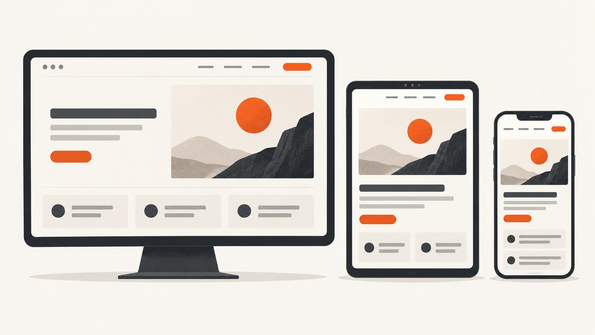
There is no universal pixel width or height for a responsive website hero section. The correct size depends on the content, viewport, image composition, and what must remain visible on small screens. Let the heading, supporting text, and call to action determine the section’s minimum height; let the container determine its width; and use an aspect ratio only when the media needs a stable shape.
Avoid publishing a desktop/mobile pair such as “1440 × 600” as a standard. Fixed dimensions can cause clipped text, horizontal scrolling, or excessive empty space. Responsive design adapts to a range of devices rather than targeting one screen size. MDN describes responsive web design as an approach that adapts layouts to different viewport sizes.
1. What size should a website hero section be?
Use a fluid width and a content-driven height. A practical starting point is:
- A full-width section with horizontal padding expressed in responsive units.
- A readable content column, usually constrained by a max-width.
- A media region with an explicit
aspect-ratiowhen its shape is known. - A minimum height only when it supports the composition; never use a rigid height that can clip text.
For a text-led hero, the section may be only as tall as the content plus vertical padding. For an image-led hero, reserve space for the image and decide whether the image should crop or remain fully visible. CSS aspect-ratio expresses a preferred width-to-height ratio and helps the browser reserve space before media loads, reducing layout shift. See MDN’s aspect-ratio guidance.
Should a hero section be 100vh?
Usually, do not make every hero exactly 100vh. A fixed viewport height can push important content below the fold, clip a wrapped heading, or behave unexpectedly with mobile browser controls and user zoom. If a full-screen introduction is intentional, use a minimum such as min-height: 100svh or min-height: 100dvh with generous content padding, and verify that the content still fits. A content-driven height is safer for most marketing pages and applications.
2. A responsive hero implementation
The following example uses a two-column layout that collapses naturally when the content no longer fits. It does not assume a particular desktop or mobile pixel size.
<meta name="viewport" content="width=device-width, initial-scale=1">

<section class="hero" aria-labelledby="hero-title">
  <div class="hero__content">
    <p class="hero__eyebrow">Analytics for product teams</p>
    <h1 id="hero-title">See what your customers do next.</h1>
    <p class="hero__summary">
      Understand activation, retention, and revenue in one place.
    </p>
    <div class="hero__actions">
      <a class="button button--primary" href="/signup">Start free</a>
      <a class="button button--secondary" href="/demo">Book a demo</a>
    </div>
  </div>

  <div class="hero__media">
    <img
      src="/images/dashboard-960.webp"
      srcset="/images/dashboard-640.webp 640w,
              /images/dashboard-960.webp 960w,
              /images/dashboard-1440.webp 1440w"
      sizes="(max-width: 800px) 100vw, 50vw"
      width="1440"
      height="1100"
      alt="Product analytics dashboard showing activation trends"
      fetchpriority="high"
    >
  </div>
</section>
:root {
--content-max: 72rem;
--page-gutter: clamp(1rem, 4vw, 4rem);
--section-space: clamp(3rem, 9vw, 8rem);
}
.hero {
width: min(100%, var(--content-max));
margin-inline: auto;
padding: var(--section-space) var(--page-gutter);
display: grid;
grid-template-columns: minmax(0, 1fr) minmax(0, 1fr);
align-items: center;
gap: clamp(2rem, 6vw, 6rem);
}
.hero__content {
max-width: 38rem;
}
.hero h1 {
margin-block: 0.5rem 1.25rem;
font-size: clamp(2.25rem, 5vw, 5rem);
line-height: 0.98;
text-wrap: balance;
}
.hero__summary {
max-width: 34rem;
font-size: clamp(1.05rem, 1.5vw, 1.35rem);
line-height: 1.5;
}
.hero__media {
aspect-ratio: 13 / 10;
overflow: hidden;
border-radius: 1rem;
}
.hero__media img {
display: block;
width: 100%;
height: 100%;
object-fit: cover;
object-position: 50% 50%;
}
.hero__actions {
display: flex;
flex-wrap: wrap;
gap: 0.75rem;
margin-top: 2rem;
}
@media (max-width: 50rem) {
.hero {
grid-template-columns: 1fr;
gap: 2rem;
}
.hero__content {
max-width: none;
}
}
The viewport declaration makes the layout use the device width on narrow screens. MDN documents this configuration and web.dev recommends preserving zoom and using flexible layouts.
3. Choosing the hero image ratio and crop
Section height and image ratio are separate decisions. The section must fit text; the image can have its own stable frame. For a media frame that should fill its box, use object-fit: cover. It preserves the image’s ratio while cropping edges. Set object-position to keep a face, product, or other focal subject in view. For an image that must be completely visible, use object-fit: contain and accept empty space around it. web.dev’s responsive-images guide covers object-fit, positioning, dimensions, and loading behavior.
| Requirement | Recommended behavior |
|---|---|
| Subject must fill a designed frame | object-fit: cover; tune object-position |
| Entire screenshot, diagram, or product UI must remain visible | object-fit: contain; design for possible letterboxing |
| Image shape should remain stable while loading | Set aspect-ratio or matching width/height attributes |
| Different crops are needed on mobile | Use a <picture> source or separate art-directed asset |
Always provide intrinsic width and height attributes when known. The browser can reserve the correct ratio before downloading the image, preventing surrounding content from jumping. Do not lazy-load a prominent above-the-fold hero image; web.dev advises loading it promptly. Use fetchpriority="high" only when that image is genuinely the most important resource, because prioritizing it affects other downloads.
4. Desktop, tablet, and mobile layout decisions
Choose breakpoints when the content requires a layout change, not because a device list says a breakpoint is standard. Resize the viewport until the heading, copy, buttons, and image no longer fit comfortably in the current arrangement, then switch layouts.
- Wide viewports: two columns can work when both columns retain readable widths and the gap does not become excessive.
- Intermediate widths: reduce the gap, allow type to scale with
clamp(), or move the media below the text before either column becomes cramped. - Narrow widths: stack content, keep buttons reachable, and avoid fixed heights that clip wrapped text.
- Large text or zoom: test at increased text size and browser zoom; users must be able to read and operate the hero without horizontal scrolling.
Do not use a desktop image export’s pixel dimensions as the rendered hero dimensions. CSS display size, source selection, and pixel density are separate concerns. Use srcset and sizes to let the browser choose an appropriate resource.
5. Testing checklist for a hero section
- Open the page at narrow, medium, and wide viewport widths.
- Use the longest realistic heading and supporting copy.
- Increase browser zoom or text size and check for clipping.
- Check for horizontal overflow caused by fixed widths, long words, or oversized buttons.
- Confirm the image crop keeps the intended subject visible.
- Disable images temporarily and verify that the text and controls still form a usable layout.
- Check that reserved image space prevents content from moving as the image loads.
- Confirm the hero image is requested promptly when it is above the fold.
- Review keyboard focus order and visible focus styles for every call to action.
- Check contrast and provide meaningful alternative text when the image conveys information.
6. Common problems and fixes
| Problem | Likely cause | Fix |
|---|---|---|
| Text is cut off on phones | Fixed height or 100vh |
Use content-driven height, padding, and a suitable min-height |
| Horizontal scrolling appears | Fixed-width child, oversized image, or unbroken text | Use max-width: 100%, minmax(0, 1fr), and responsive type |
| Important subject is cropped | object-fit: cover with a centered focal point |
Adjust object-position or provide an art-directed mobile image |
| Image leaves unwanted empty bars | object-fit: contain |
Use cover if cropping is acceptable, or match the frame ratio to the asset |
| Layout jumps while loading | No intrinsic dimensions or reserved media ratio | Add width/height or aspect-ratio |
| Hero loads slowly | Oversized source, render-blocking work, or lazy loading | Use responsive sources, compressed formats, and avoid lazy-loading the above-the-fold image |
| Buttons wrap awkwardly | Rigid row layout or excessive text | Allow flex-wrap, stack actions at narrow widths, and preserve touch-friendly spacing |
| Mobile content sits behind browser controls | Assuming 100vh equals the visible viewport |
Prefer content-driven height or dynamic/small viewport units with padding |
7. Performance, reliability, and accessibility
Use the smallest image that meets the displayed size and density. Generate modern formats where your browser support policy allows, provide a fallback, and avoid shipping a desktop-sized asset to every phone. Reserve the image’s dimensions, keep the critical CSS small, and avoid JavaScript that must run before the hero becomes usable.
Reliability comes from allowing content to grow. Headings change during localization, browsers apply different font metrics, and users zoom. A flexible grid and intrinsic media ratio continue to work when those conditions change; a rigid pixel height does not.
Keep the heading as a real heading, preserve a logical DOM order, and make the primary action keyboard accessible. Do not remove the browser’s zoom capability. If text overlays an image, verify contrast at every crop position.
8. Inspecting responsive heroes with ScreenshotNeo
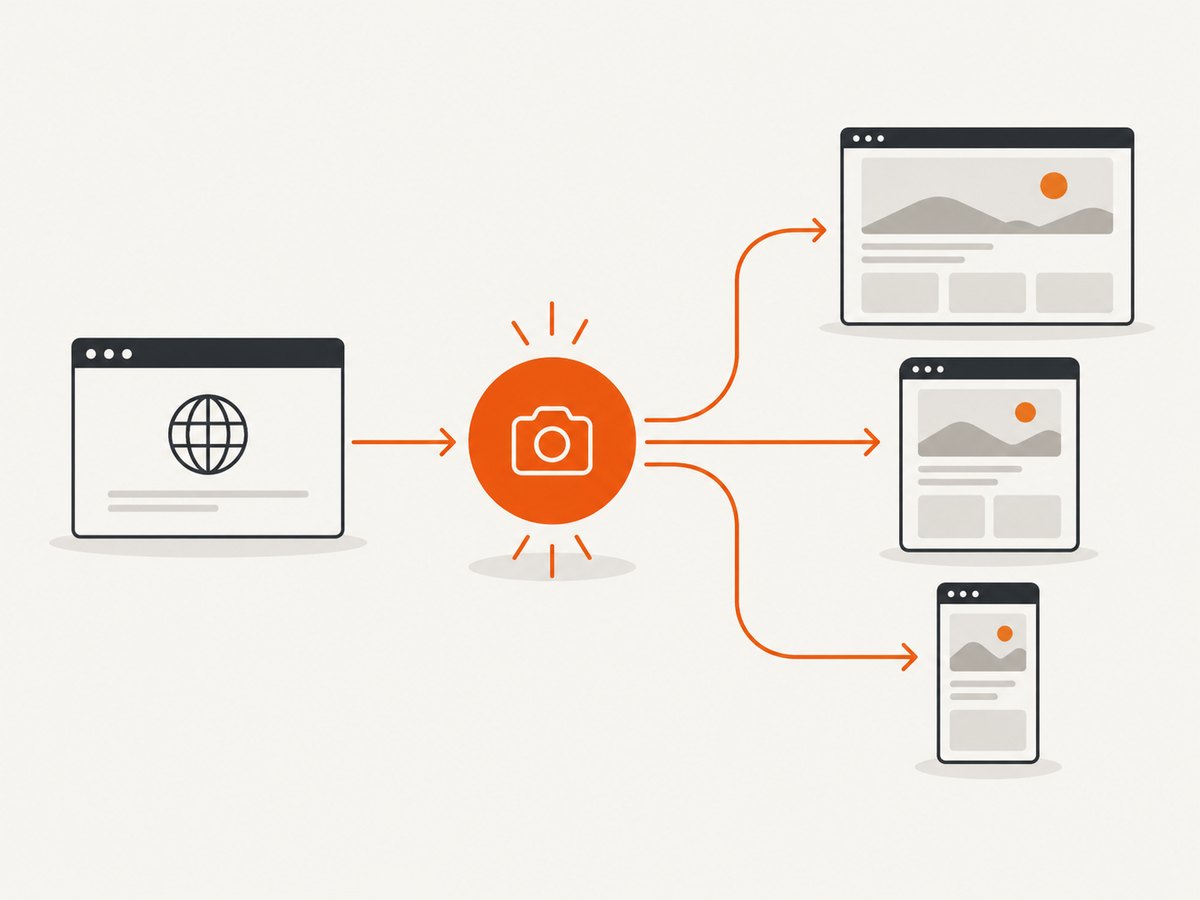
ScreenshotNeo is a website screenshot API and MCP server for developers. You can capture the same page at different viewport presets or custom dimensions to review line wrapping, image crops, and responsive overflow. Its full-page capture loads lazy images, and it can capture one element by CSS selector, apply custom CSS or JavaScript, set dark mode, emulate devices, and wait for a selector, delay, or network idle. See the ScreenshotNeo API documentation for the available options.
Or skip the browser setup
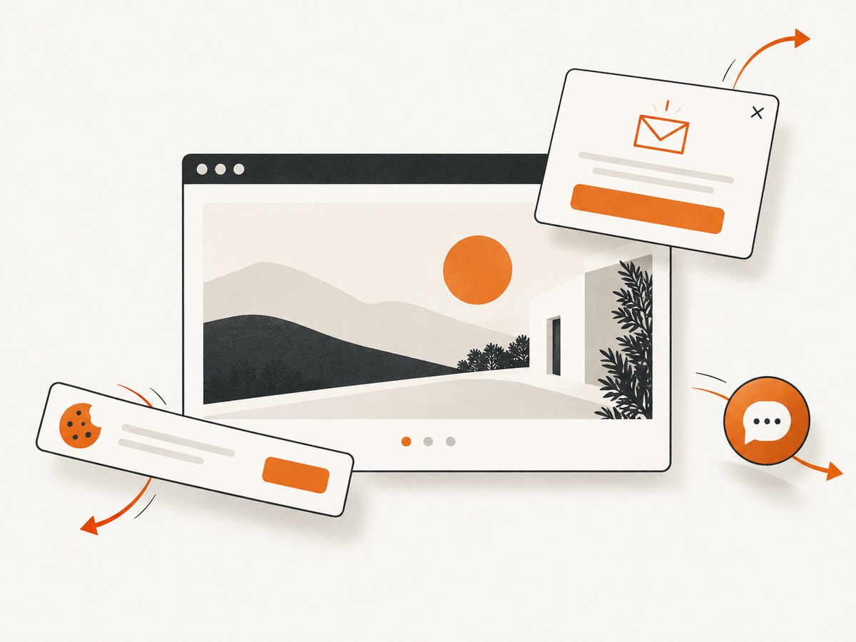
One GET request returns a PNG, JPEG, WebP, or PDF. Cookie and consent banners, newsletter popups, and chat widgets are removed before the shot. Bot checks, blank pages, timeouts, failed loads, and cache hits are not billed, and response headers report the page verdict and billing status. An MCP server lets Claude, Cursor, and other MCP clients use take_screenshot, get_page_info, and capture_pdf. The Free plan includes 1,000 screenshots per month without a card; paid plans start at $5 for 3,000 shots.
curl -G "https://api.screenshotneo.com/v1/shot" \
  -d access_key=YOUR_API_KEY \
  --data-urlencode url=https://example.com \
  -o hero.webp
import requests
r = requests.get(
"https://api.screenshotneo.com/v1/shot",
params={"access_key": "YOUR_API_KEY", "url": "https://example.com"},
timeout=90,
)
r.raise_for_status()
open("hero.webp", "wb").write(r.content)const q = new URLSearchParams({
access_key: 'YOUR_API_KEY',
url: 'https://example.com'
});
const res = await fetch(`https://api.screenshotneo.com/v1/shot?${q}`);
if (!res.ok) throw new Error(`HTTP ${res.status}`);
const data = Buffer.from(await res.arrayBuffer());
await import('node:fs/promises').then(fs => fs.writeFile('hero.webp', data));Use a custom viewport or device preset when comparing desktop and mobile captures. Use a selector capture for just the hero, custom CSS to outline layout boundaries, and caching with a chosen TTL when repeatedly reviewing the same URL. Async jobs, signed webhooks, bulk capture of up to 100 URLs per call, signed links, usage reporting, and the OpenAPI specification are available when you need to automate review at scale.
Create a free ScreenshotNeo account to get 1,000 screenshots each month with no card.
9. Cost and workflow considerations
For occasional manual checks, local browser tools are enough. For repeatable reviews across branches, viewport presets, or many URLs, an API avoids maintaining browser launch code and makes captures reproducible. ScreenshotNeo bills only clean shots; failed loads and cache hits cost nothing. Plans are Free (1,000/month), Starter ($5 for 3,000), Growth ($15 for 15,000), Pro ($39 for 60,000), Scale ($99 for 250,000), and Business ($249 for 1,000,000). Yearly billing provides two months free, and every feature is included on every plan.
10. FAQ
What is the best hero image size for desktop and mobile?
There is no universal pair. Choose a source set and a crop that preserve the subject at the sizes your layout actually renders, then verify the result at narrow and wide widths.
Is a 16:9 hero always correct?
No. Use the ratio that suits the composition and available space. A product screenshot may need a wider frame; a portrait subject may need a taller one.
Should the hero image be background CSS or an img element?
Use an <img> when the image conveys content, needs alternative text, or benefits from responsive sources. A CSS background can suit decorative imagery, but it requires extra work for accessibility and responsive loading.
How do I stop a hero from shifting during load?
Declare image dimensions or an aspect-ratio on the media box, then load an appropriately sized source.
When should I change the layout breakpoint?
Change it where the current arrangement becomes cramped, causes overflow, or harms reading—not at a device width selected without checking the content.


