Website Image Banner Ideas
Explore practical website image banner ideas, with design guidance, responsive code, accessibility checks, and implementation tips for real pages.
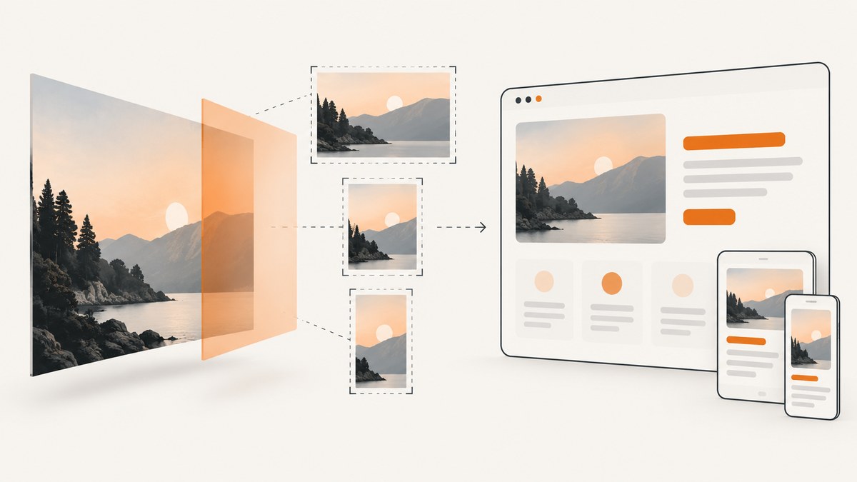
A strong website image banner communicates a page’s purpose in seconds. The right concept depends on your audience, page goal, layout, crop behavior, and asset weight. Use the gallery below to choose a direction, then implement it with live HTML text, responsive image sources, explicit dimensions, and contrast checks.
1. Start with the page goal and audience
Write one sentence before choosing an image: “This banner helps audience understand or do goal.” An orientation banner for a nonprofit, a product launch hero, and a destination page need different imagery and hierarchy.
- Choose one focal point that supports the goal.
- Set a reading order: headline, supporting detail, then action when an action is needed.
- Reserve a quiet area for live text if copy overlays the image.
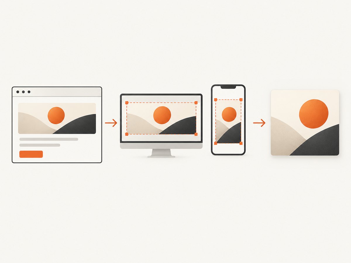
- Keep essential content inside a safe central area so narrow crops do not remove it.
2. Website image banner ideas to adapt
Purpose-matched hero photograph
Use one relevant photograph that quickly signals the product, service, place, or experience. Keep the subject away from crop-prone edges and leave negative space where the headline will sit. This is a practical adaptation of Adobe’s banner guidance, not a claim that photographs convert better than other formats. Adobe’s banner gallery offers examples.
Text-led image with a soft overlay
Add a translucent color layer or scrim so short copy remains legible over a photograph. Check contrast against the final crop; an overlay does not guarantee readable text. Adobe discusses scrims in its hero-image guidance.
Minimal brand-color banner
Use a solid color or restrained gradient, one short message, and a small brand detail when photography would distract. This approach is easy to update and often produces a lightweight asset.
Layered illustration and graphic shapes
Combine an illustration or photo with a few shapes to create depth. Limit the number of layers so the focal point and message remain clear.
Small editorial collage
Use a controlled group of images when a collection, event, or destination cannot be represented by one subject. Establish one dominant image, then test the composition at phone width.
Product or seasonal feature
Make one product, service, or timely offer the visual anchor. Keep detail copy short and place specifications in the page content rather than baking them into the image.
Brand-led banner
Use brand colors, a logo where appropriate, and a short motto when recognition is the main goal. Keep the wording as live HTML so it can resize, translate, and work with assistive technology. Google’s image style guidance covers accessible image use.
| Idea | Message fit | Crop resilience | Update effort |
|---|---|---|---|
| Purpose-matched photo | High when subject is specific | Medium; protect the focal point | Medium |
| Overlay photo | High for short headlines | Medium; contrast changes with crop | Medium |
| Brand-color field | High for simple announcements | High | Low |
| Layered illustration | High for abstract or technical ideas | Medium | Medium |
| Collage | High for collections | Low to medium | High |
3. A practical banner design process
- Define the goal. Decide whether the banner orients, explains, promotes, or drives an action.
- Choose one focal image or graphic. Remove details that do not support the goal.
- Set hierarchy. Keep the headline first, supporting copy second, and CTA third.
- Mark a safe area. Keep faces, products, and essential copy away from edges that may be cropped.
- Build a master. Retain the original image, copy, spacing, and color values so seasonal variants stay consistent.
- Preview real crops. Check the actual desktop and mobile containers after export and compression.
- Review accessibility. Test contrast, keyboard focus, alt text, and live text before publishing.
4. Responsive implementation and performance
There is no universal banner pixel size. Start with the rendered content container and provide alternatives that match its sizes. Use srcset for resolution changes and picture when the subject or crop needs art direction. Include explicit dimensions or an aspect ratio so the browser can reserve space.
<picture>
  <source media="(max-width: 640px)" srcset="/images/banner-mobile-640.webp 640w, /images/banner-mobile-960.webp 960w">
  <source media="(min-width: 641px)" srcset="/images/banner-wide-1280.webp 1280w, /images/banner-wide-1920.webp 1920w">
  <img src="/images/banner-wide-1280.webp" width="1280" height="640" alt="Team reviewing a product prototype">
</picture>
Serve an image near its displayed dimensions and compress it. For an important above-the-fold hero, leave loading at the default eager behavior; a framework may expose fetch priority for especially important images. Lazy-load below-the-fold banners. web.dev notes that serving desktop-sized images to mobile devices can deliver “2–4x more data” in its contextual comparison, so measure your own pages rather than assuming a universal result. See responsive image guidance and image performance guidance.
Give the banner a stable aspect ratio:
.hero {
  aspect-ratio: 2 / 1;
  overflow: hidden;
}
.hero img {
  width: 100%;
  height: 100%;
  object-fit: cover;
  object-position: 50% 50%;
}
Change object-position when the subject sits to one side. Use modern formats where your delivery stack supports them, keep a fallback source, and inspect the compressed result at the real rendered size.
5. Accessibility and text treatment
- Keep headlines, supporting copy, and CTA labels as HTML text.
- Use concise alt text when the image conveys information; use
alt=""when it is decorative. - Check contrast after the final crop and overlay. WCAG’s Level AAA enhanced contrast explanation states that text and images of text have a ratio of at least 7:1, with exceptions including 4.5:1 for large-scale text; identify the conformance level accurately when making a claim. See the W3C explanation.
- Do not make image-only wording the sole way to understand or operate the page.
- Ensure the CTA remains keyboard reachable and has a visible focus style.
6. A complete HTML/CSS banner example
<section class="hero" aria-labelledby="hero-title">
  <picture>
    <source media="(max-width: 640px)" srcset="/images/studio-mobile.webp">
    <img src="/images/studio-wide.webp" width="1600" height="800" alt="Designer arranging materials on a studio table">
  </picture>
  <div class="hero__scrim" aria-hidden="true"></div>
  <div class="hero__content">
    <h1 id="hero-title">Make every launch easier to understand</h1>
    <p>A clear visual system for your next product page.</p>
    <a class="button" href="/work with us">See the work</a>
  </div>
</section>
.hero { position: relative; aspect-ratio: 2 / 1; isolation: isolate; overflow: hidden; }
.hero picture, .hero img, .hero__scrim { position: absolute; inset: 0; width: 100%; height: 100%; }
.hero img { object-fit: cover; object-position: 60% 50%; z-index: -2; }
.hero__scrim { background: rgba(0,0,0,.38); z-index: -1; }
.hero__content { max-width: 42rem; padding: clamp(1.5rem, 5vw, 5rem); color: #fff; }
.button { display: inline-block; padding: .75rem 1rem; background: #fff; color: #111; }
@media (max-width: 640px) { .hero { aspect-ratio: 4 / 3; } .hero__content { padding: 1.25rem; } }Replace the paths, wording, and colors with your own assets. Keep the CTA destination valid and test the page with images disabled to confirm the text still communicates the goal.
7. Troubleshooting checklist
| Symptom | Likely cause | Fix |
|---|---|---|
| Subject is cut off on phones | Desktop crop reused at a narrow ratio | Use a mobile art-directed source or adjust object-position. |
| Headline disappears into the photo | Insufficient contrast or a busy background | Strengthen the scrim, move the text to quiet space, or use a solid field; verify contrast again. |
| Layout jumps while loading | No intrinsic dimensions or aspect ratio | Add width/height or CSS aspect-ratio. |
| Hero feels slow | Oversized source or excessive compression work | Serve a size near the rendered dimensions, compress it, and avoid lazy-loading the above-the-fold hero. |
| Text is unavailable to screen readers | Copy was baked into the bitmap | Move the wording into HTML and use alt text only for the image’s meaning. |
| Banner looks different between devices | Uncontrolled crop or color-management differences | Test real breakpoints, define focal positioning, and inspect the exported files. |
8. Or skip the browser setup
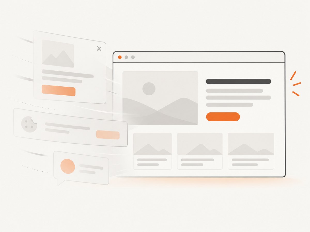
If you need reference screenshots of your banner ideas across pages or breakpoints, ScreenshotNeo provides a website screenshot API and MCP server. It accepts a URL and returns PNG, JPEG, WebP, or PDF. Before capture it accepts cookie or consent banners and removes more than 60 known consent platforms, newsletter popups, and chat widgets; each step can be turned off. Bot checks, blank pages, timeouts, failed loads, and cache hits cost nothing, and the response identifies the result with X-Page-Verdict and X-Billed headers.
See the ScreenshotNeo API documentation. A one-call capture looks like this:
curl -G "https://api.screenshotneo.com/v1/shot" -d access_key=YOUR_API_KEY --data-urlencode url=https://stripe.com -o shot.webpimport requests
r = requests.get("https://api.screenshotneo.com/v1/shot", params={"access_key": "YOUR_API_KEY", "url": "https://stripe.com"}, timeout=90)
open("shot.webp", "wb").write(r.content)const q = new URLSearchParams({ access_key: 'YOUR_API_KEY', url: 'https://stripe.com' });
const res = await fetch(`https://api.screenshotneo.com/v1/shot?${q}`);For banner review workflows, relevant options include full-page capture with lazy images loaded, element capture by CSS selector, dark mode, device presets or custom viewports, retina scale, custom CSS and JavaScript, click actions, hidden selectors, waits for a selector, delay or network idle, blocked ads/trackers/requests, custom headers/cookies/user agent, timezone and geolocation, transparent backgrounds, resizing, a chosen cache TTL, signed links, asynchronous jobs with signed webhooks, bulk capture of up to 100 URLs per call, and a usage API. The MCP server exposes take_screenshot, get_page_info, and capture_pdf for Claude, Cursor, and other MCP clients.
Use caching when the page is unchanged, async jobs for large batches, and bulk capture for up to 100 URLs per call. Keep timeouts realistic for pages that load remote fonts or images. A failed load or bot check is not billed, but your client should still inspect the verdict headers and retry only transient failures.
Pricing includes 1,000 shots per month free with no card; Starter is $5 for 3,000, Growth $15 for 15,000, Pro $39 for 60,000, Scale $99 for 250,000, and Business $249 for 1,000,000. Yearly billing gives two months free, and every feature is on every plan. Create a free ScreenshotNeo account to start with 1,000 screenshots a month and no card.
9. FAQ
What dimensions should a website banner use?
Use the dimensions implied by your actual layout and breakpoints. There is no single correct size; provide responsive alternatives and reserve space with intrinsic dimensions or an aspect ratio.
Should text be part of the image?
Keep essential text in HTML. It remains selectable, translatable, resizable, and available to assistive technology.
Should a hero image be lazy-loaded?
Leave an important above-the-fold hero at the default eager behavior. Lazy-load images that begin below the fold.
How can I know whether an idea works?
Compare versions against the same goal using your own analytics or experiments. The cited design sources provide guidance, not a universal conversion winner.
Can I capture only the banner instead of the whole page?
Yes. ScreenshotNeo supports capture of one element by CSS selector, as well as full-page capture and custom viewport sizes.


