Website Image Banner Templates: Design, Code, and Responsive Examples
Choose, customize, and code responsive website image banner templates with practical layouts, image sizing, accessibility, and implementation guidance.
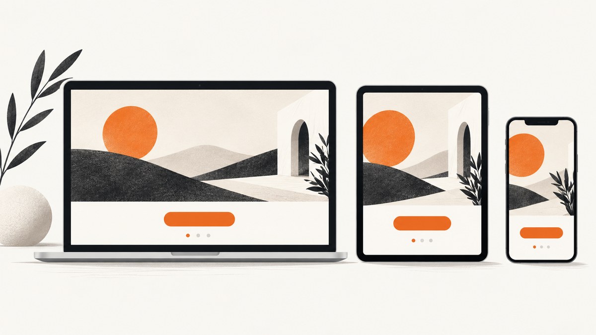
Website image banner templates work best when they organize a message, supporting copy, visual, and action into a layout that survives different screen sizes. There is no single correct banner dimension: the right ratio and crop depend on your page layout, content, and how the banner behaves on mobile.
Start with the page goal, reserve space for the real heading and button, then create responsive image variants. A useful banner keeps its subject and essential text visible when the viewport narrows.
What a website banner should contain
A banner is usually a prominent homepage or landing-page area that presents an action or highlights important information. The California Web Standards pattern identifies these common parts:
- A concise title
- A short description
- An image or visual graphic
- An optional caption
- A button or other call to action
The pattern shows a feature banner spanning the content area on desktop and the screen width on mobile. Its mobile stacking order places the image, caption, title, description, and button in sequence. Treat that as a documented layout pattern rather than a universal rule. California Web Standards explains the banner pattern.
How to choose a template
1. Define the page goal
Write the one action or message the banner must support before selecting a design. Examples include starting a trial, viewing a product, reading a feature story, or finding a service. The template should make that action easy to find.
2. Match the available content
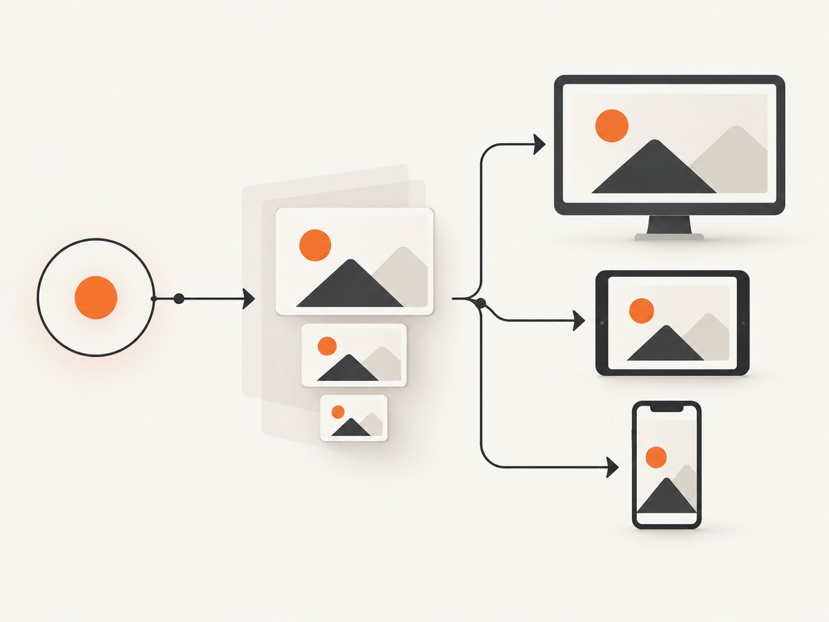
Choose a composition that fits the actual headline length, supporting copy, image subject, and button label. Leave enough empty space for text instead of selecting a visual that only works with placeholder copy. Canva’s web-design guidance recommends choosing imagery that fits the audience and message and directing attention toward the call to action. See Canva’s web design basics.
3. Check desktop and mobile arrangements
Ask whether the image can move above or below the text on narrow screens, whether the subject remains visible after cropping, and whether the heading remains readable without overlapping busy detail. A desktop-wide composition may need a separate mobile crop or an art-directed layout.
4. Compare templates using these criteria
| Criterion | What to inspect |
|---|---|
| Purpose and CTA | Does the hierarchy make the intended action obvious? |
| Responsive behavior | Can the layout stack or rearrange cleanly on small screens? |
| Crop flexibility | Can the subject stay visible with cover, contain, or a different mobile asset? |
| Text space | Is there room for the real heading and supporting copy? |
| Replaceable imagery | Can you swap the image without breaking the composition? |
| Export and implementation | Are the assets available in formats and sizes your site can serve? |
Banner dimensions and aspect ratios
Do not treat a named pixel size as a universal website banner standard. Measure the rendered container in your design and produce image candidates for the widths your visitors actually receive. A fixed ratio can be useful when the layout requires predictable space, but the ratio should follow the design rather than dictate it.
- Use a wide composition for a desktop hero when the subject and text remain legible across the content width.
- Prepare a tighter crop or alternate asset for narrow screens when the desktop subject would become too small.
- Keep critical words and faces away from edges that may be cropped.
- Reserve space for the heading and button in the layout, not inside a decorative image alone.
For fixed display boxes, object-fit: cover fills the box and crops excess image; object-fit: contain preserves the entire image and may leave empty space. Adjust the focal point with object-position. web.dev’s responsive images guide covers crop behavior and sizing.
Responsive HTML and CSS template
This complete example uses a semantic banner, intrinsic dimensions, a responsive image candidate list, and a mobile layout. Replace the URLs, copy, and dimensions with your own assets.
<section class="hero" aria-labelledby="hero-title">
  <div class="hero__content">
    <p class="hero__eyebrow">New collection</p>
    <h1 id="hero-title">Make your next launch easier to understand</h1>
    <p class="hero__description">
      A short sentence explains the value before the visitor chooses an action.
    </p>
    <a class="hero__button" href="/get-started">Get started</a>
  </div>
  <figure class="hero__media">
    <picture>
      <source
        media="(max-width: 640px)"
        srcset="/images/hero-mobile-640.webp 640w,
                /images/hero-mobile-960.webp 960w"
        sizes="100vw"
      >
      <img
        src="/images/hero-1280.webp"
        srcset="/images/hero-640.webp 640w,
                /images/hero-960.webp 960w,
                /images/hero-1280.webp 1280w,
                /images/hero-1920.webp 1920w"
        sizes="(max-width: 900px) 100vw, 50vw"
        width="1920"
        height="1200"
        alt="Person arranging product cards on a desk"
        fetchpriority="high"
      >
    </picture>
    <figcaption>A brief optional caption supports the image.</figcaption>
  </figure>
</section>
:root {
--content-max: 72rem;
--space: clamp(1.25rem, 3vw, 4rem);
}
.hero {
display: grid;
grid-template-columns: minmax(0, 1fr) minmax(0, 1fr);
gap: var(--space);
align-items: center;
max-width: var(--content-max);
margin-inline: auto;
padding: var(--space);
}
.hero__content { max-width: 38rem; }
.hero h1 { font-size: clamp(2rem, 5vw, 4.5rem); line-height: 1.05; }
.hero__description { font-size: 1.125rem; line-height: 1.6; }
.hero__button { display: inline-block; padding: .8rem 1.1rem; background: #111; color: #fff; border-radius: .4rem; }
.hero__media img { display: block; width: 100%; height: auto; aspect-ratio: 16 / 10; object-fit: cover; object-position: 50% 50%; }
.hero__media figcaption { margin-top: .5rem; font-size: .875rem; }
@media (max-width: 640px) {
.hero { grid-template-columns: 1fr; padding: 1.25rem; }
.hero__media { order: -1; }
.hero__media img { aspect-ratio: 4 / 3; }
}
The width and height attributes let the browser reserve the image’s aspect ratio before it loads, reducing layout shifts. srcset and sizes let the browser choose an appropriate candidate; keep a normal src fallback. Google’s Image SEO documentation lists responsive markup and supported image formats.
Choosing image formats and exports
Use the format that matches the artwork and delivery constraints. JPEG, PNG, WebP, SVG, GIF, and AVIF can all be appropriate in different situations; logos and simple vector artwork may suit SVG, while photographs often benefit from a compressed raster format. Verify that the format works in your target browsers and image pipeline.
- Export several widths rather than one oversized file.
- Compress without removing important detail from text or faces.
- Keep a fallback source when using
pictureorsrcset. - Use an accessible text alternative for informative images; use an empty
altfor purely decorative images.
Loading, performance, and accessibility
Above-the-fold hero images
Do not lazy-load a genuinely above-the-fold hero image. A high fetch priority can help a vital Largest Contentful Paint image, but use it sparingly because it may compete with other resources. web.dev documents hero-image loading guidance.
Below-the-fold banners
Add loading="lazy" to banners that begin below the initial viewport so their downloads can wait until they are likely to be needed. Do not apply lazy loading to every image automatically.
Accessibility checklist
- Use one clear heading hierarchy and a descriptive button label.
- Provide useful
alttext when the image conveys information. - Maintain readable contrast between text and its background.
- Do not put essential copy only inside the image.
- Ensure the CTA is keyboard reachable and has a visible focus state.
- Test at narrow widths, zoomed text, and reduced-motion settings.
Common banner problems and fixes
| Problem | Likely cause | Fix |
|---|---|---|
| The subject is cut off on phones | The desktop crop is reused at every width. | Use a mobile source, change object-position, or redesign the composition. |
| Text becomes unreadable | Text is embedded in a busy image or scales below a usable size. | Move copy into HTML, add contrast, and reserve a text column. |
| Layout jumps while loading | The image has no intrinsic dimensions. | Set accurate width and height attributes or an explicit aspect ratio. |
| Mobile downloads a huge file | There is only one large src candidate. |
Generate width variants and provide srcset plus sizes. |
| Hero delays page rendering | It is lazy-loaded or competes with too many high-priority resources. | Remove lazy loading for the hero and reserve priority for the genuinely vital image. |
| Image has unwanted empty bars | contain preserves the whole image inside a different ratio. |
Use cover when cropping is acceptable, or match the container ratio. |
| Banner fails in older clients | Only newer formats or markup are supplied. | Keep a conventional src fallback and verify format support. |
Previewing a banner at real viewport sizes
Inspect the banner at the widths your analytics show, plus a very narrow phone width and a wide desktop width. Check the crop, heading wraps, button position, contrast, and whether the image still supports the message. Capture representative pages during review so design changes can be compared consistently.
Or skip the browser setup
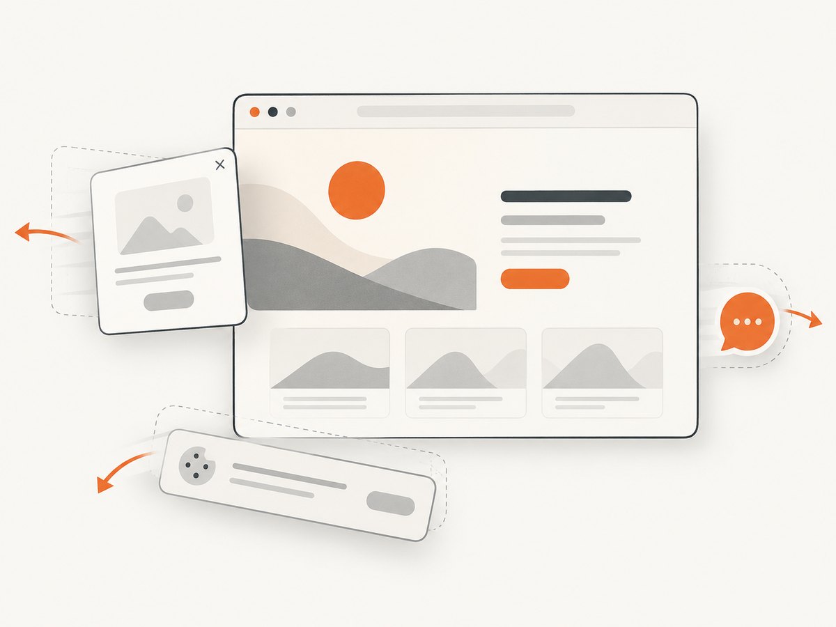
If you need screenshots of banner templates, landing-page variants, or responsive states, ScreenshotNeo returns a PNG, JPEG, WebP, or PDF from one GET request. Before capture it accepts cookie and consent banners and removes more than 60 known consent platforms, newsletter popups, and chat widgets; each step can be disabled. Bot checks, blank pages, timeouts, failed loads, and cache hits are not billed, and the response identifies the result with X-Page-Verdict and X-Billed headers.
See the ScreenshotNeo API documentation for all options, including full-page or element capture, device presets, custom CSS and JavaScript, wait conditions, request blocking, headers and cookies, geolocation, caching, signed links, asynchronous jobs, bulk capture, and the usage API.
curl -G "https://api.screenshotneo.com/v1/shot" -d access_key=YOUR_API_KEY --data-urlencode url=https://stripe.com -o shot.webpimport requests
r = requests.get("https://api.screenshotneo.com/v1/shot", params={"access_key": "YOUR_API_KEY", "url": "https://stripe.com"}, timeout=90)
open("shot.webp", "wb").write(r.content)const q = new URLSearchParams({ access_key: 'YOUR_API_KEY', url: 'https://stripe.com' });
const res = await fetch(`https://api.screenshotneo.com/v1/shot?${q}`);ScreenshotNeo also includes an MCP server so Claude, Cursor, and other MCP clients can use take_screenshot, get_page_info, and capture_pdf. The free plan includes 1,000 screenshots per month with no card; paid plans start at $5 for 3,000 screenshots. Create a free ScreenshotNeo account.
FAQ
What is the best website banner size?
There is no universal size. Use the dimensions and crop that fit your container, then provide responsive candidates for the widths you serve.
Should banner text be part of the image?
Keep essential headings and actions in HTML so they remain searchable, accessible, and adaptable. Use the image for visual context.
Should every banner use object-fit: cover?
No. Use cover when filling the box and cropping is acceptable; use contain when preserving the complete artwork matters.
When should a banner be lazy-loaded?
Lazy-load banners that begin below the fold. Let an above-the-fold hero load normally and consider priority only when it is genuinely vital.
Can one template serve desktop and mobile?
Sometimes. If the subject or text becomes too small or is cropped, use a mobile-specific asset or a layout that rearranges the content.


