Website Image Best Practices for Faster, More Accessible Pages
Speed up pages and improve accessibility with responsive formats, correct loading priorities, stable image dimensions, and purposeful alt text.
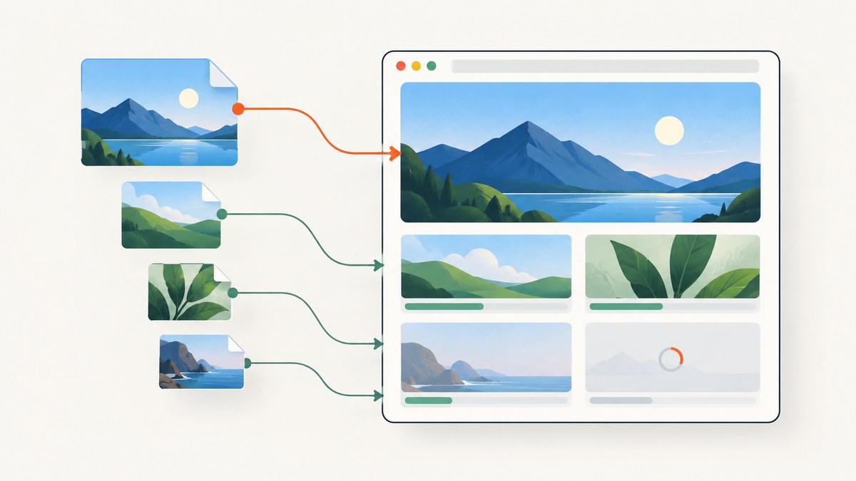
To make website images faster and more accessible, serve files close to their rendered size, use AVIF or WebP with a compatible fallback, reserve space with intrinsic dimensions, load the largest visible image eagerly, lazy-load noncritical images, and write alt text according to each image’s purpose. Then check real page performance and accessibility rather than assuming that a smaller file automatically makes a better page.
The practical goal is to send fewer unnecessary bytes without delaying the image that matters most, shifting the layout as files arrive, or making meaningful content unavailable to assistive technology or search crawlers.
1. Start with the image’s job and rendered size
Before choosing a format or adding attributes, identify what the image does and how large it appears at each viewport. A 2,000-pixel-wide source rendered at 400 CSS pixels often transfers detail the visitor cannot see. Responsive images let the browser choose a suitable candidate instead of forcing every device to download the same large file. Lighthouse identifies responsive images and image CDNs as primary ways to avoid serving more pixels than the rendered image needs.
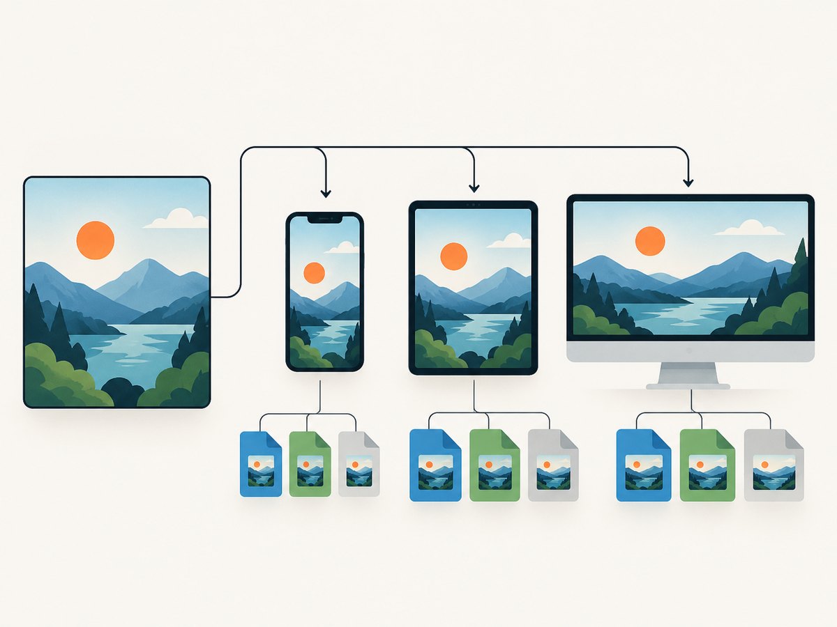
- Measure the image’s rendered width across the layouts you support.
- Generate several source widths that cover those rendered sizes and common pixel densities.
- Use
srcsetto list candidates andsizesto describe the slot width. - Inspect the selected resource in browser developer tools on both narrow and wide viewports.
With width descriptors such as 400w and 800w, sizes describes the expected CSS width of the image slot. The browser uses that information and the device’s display characteristics to select a source. Make the sizes expression match the actual layout; an inaccurate declaration can cause the browser to pick a file that is too large or too small.
<img
  src="product-800.webp"
  srcset="product-400.webp 400w,
          product-800.webp 800w,
          product-1200.webp 1200w"
  sizes="(max-width: 600px) 100vw, 50vw"
  width="800"
  height="600"
  alt="Blue ceramic mug beside a notebook"
>
This example assumes the image fills the viewport on narrow screens and occupies half the viewport on wider screens. Change sizes to match your own grid and breakpoints. Keep a sensible default src for browsers or tools that do not use the candidate list.
2. Choose a modern format and retain a fallback
AVIF can provide smaller files for many images, while WebP is a broad modern option. JPEG and PNG remain useful fallbacks and may be appropriate depending on the source and required behavior. Rather than assuming that a particular format wins for every asset, encode representative files, compare visual quality at the intended dimensions, and measure the resulting transfer size.
Use <picture> with ordered <source> elements for format negotiation. The browser uses the first supported source that matches, with the nested <img> as the fallback. Keep the same image content and responsive sizing logic across sources so a format change does not also change the image’s meaning or intended crop.
<picture>
  <source type="image/avif"
          srcset="hero-400w.avif 400w, hero-800w.avif 800w"
          sizes="(max-width: 600px) 100vw, 50vw">
  <source type="image/webp"
          srcset="hero-400w.webp 400w, hero-800w.webp 800w"
          sizes="(max-width: 600px) 100vw, 50vw">
  <img src="hero-800w.jpg"
       alt="A cyclist riding along a coastal road"
       width="800" height="600"
       fetchpriority="high" loading="eager">
</picture>
For a production site, confirm that every referenced candidate exists, has the expected MIME type, and returns successfully. If an image CDN generates formats on demand, configure its URL and cache behavior carefully and verify the output in the browser. A CDN can reduce manual transformation work, but it adds a delivery dependency and needs correct sizing rules.
3. Reserve layout space to prevent image shifts
Set the image’s intrinsic width and height attributes. The browser can derive the aspect ratio before the image downloads and allocate space, which helps prevent content from moving when the image appears. Use the dimensions of the image file or intended crop, not arbitrary values that distort the ratio.
<img src="article-chart.webp"
     width="1200" height="675"
     alt="Monthly sign-ups rise steadily from January through June">
Responsive CSS can change the displayed size while retaining that ratio:
img {
  max-width: 100%;
  height: auto;
}
When an image needs a deliberately fixed box or art-directed crop, reserve the box with CSS aspect-ratio and use an appropriate object-fit rule. Ensure the reserved ratio matches the final display behavior. Width and height do not make the image load faster; they make the layout predictable while it loads.
4. Set loading priority based on visibility
Do not lazy-load an above-the-fold image or the image likely to be the page’s Largest Contentful Paint (LCP) element. Let the browser discover it promptly with normal or eager loading, and consider fetchpriority="high" when it is clearly the most important image competing for early bandwidth. Avoid marking several images high priority without evidence; that can dilute the priority signal.
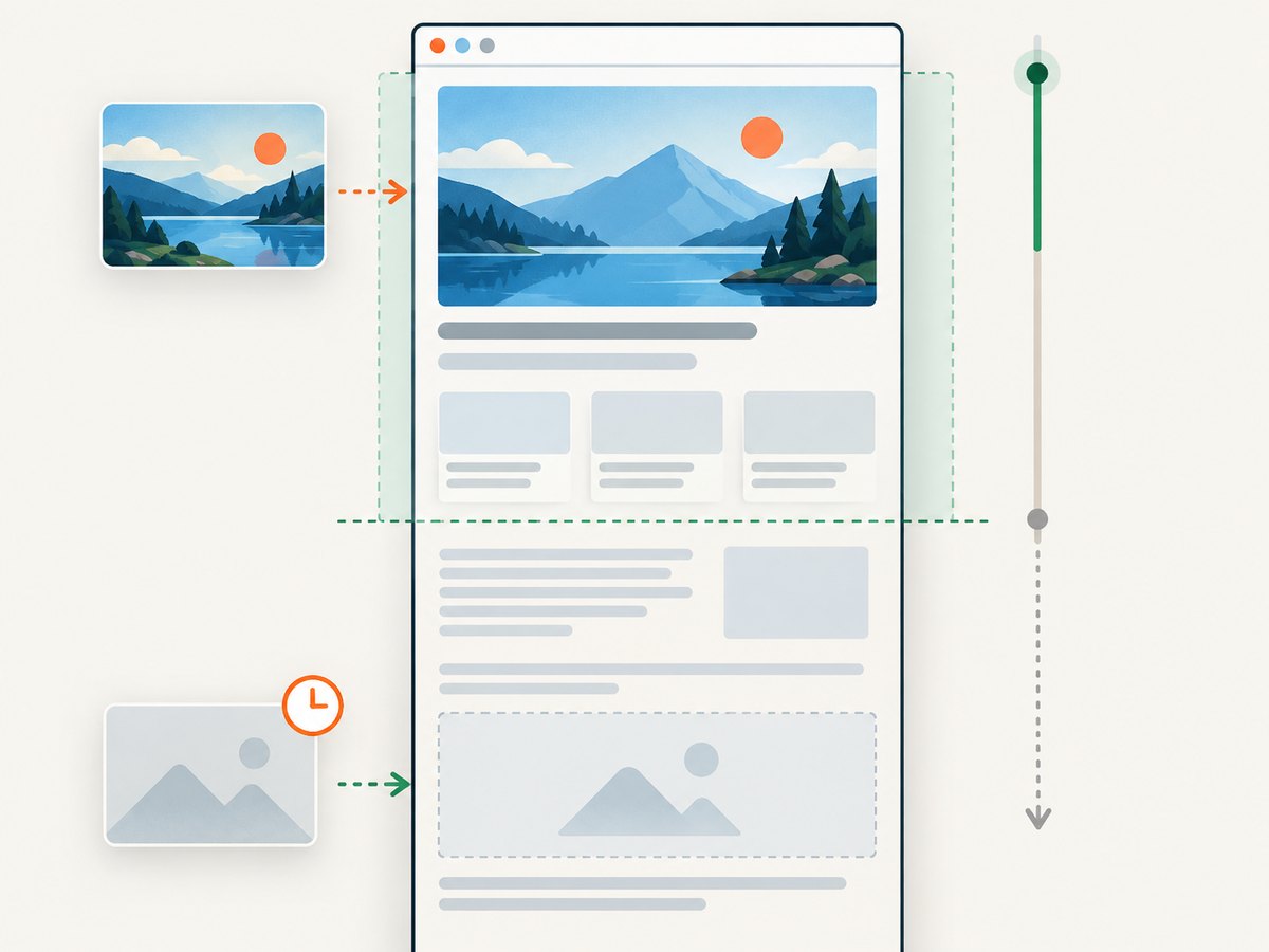
For images below the fold, native loading="lazy" defers fetching until the image is near the viewport. This shortens the critical rendering path and avoids downloading images a visitor never approaches.
<!-- Visible hero image: load promptly -->
<img src="hero.webp" width="1200" height="675"
     alt="Aerial view of a forest beside a river"
     loading="eager" fetchpriority="high">

<!-- Noncritical image lower on the page -->
<img src="author-office.webp" width="800" height="533"
     alt="The author’s desk with a notebook and plant"
     loading="lazy">
Lazy loading is a scheduling choice, not a way to hide content. Google warns that search systems do not scroll or click to discover content, so images and other content must load when they become visible without requiring user interaction. Test with the page at its normal initial position and by scrolling through it; check that image URLs are discoverable in the rendered page and that the loading implementation does not depend on a click.
5. Write alt text that serves the image’s purpose
WCAG 2.2 Success Criterion 1.1.1 requires a text alternative that serves the equivalent purpose for non-text content. The right text depends on the image’s role, not on a generic rule to describe every visible detail.
| Image purpose | Alt text approach | Example |
|---|---|---|
| Informative | Briefly convey the important information or equivalent message. | alt="Bar chart comparing quarterly revenue" |
| Decorative | Use an empty value so assistive technology can skip it. | alt="" |
| Functional link or control | Describe the action or destination, not merely the appearance. | alt="Download the annual report (PDF)" |
Do not use an empty alt value for an image that carries information needed to understand the page. Conversely, avoid repeating nearby text or adding irrelevant visual details to decorative imagery. If words inside an image are essential to its meaning, include those words in the text alternative or provide the equivalent in surrounding text. W3C’s image tutorial covers informative, decorative, and functional images; its H37 technique describes using the alt attribute for a short text alternative.
6. Validate speed, accessibility, and discovery
Use more than one check because no single score tells you whether every image is appropriately sized, accessible, and discoverable. Google’s good Core Web Vitals targets are LCP within 2.5 seconds, INP below 200 milliseconds, and CLS below 0.1. These are page-level outcome measures; image choices can affect them, but other page work also matters.
- Performance: inspect LCP and CLS on representative pages and devices; check image transfer sizes and selected responsive candidates.
- Accessibility: review each image’s purpose and alt text, including linked images and icons; confirm decorative images have empty alt text.
- Discovery: verify below-the-fold images load as they approach the viewport without requiring a click or scroll-triggered script to make them exist.
- Visual quality: inspect compressed results at actual display sizes, especially text, fine lines, and detailed textures.
- Reliability: check missing candidates, broken URLs, incorrect content types, and CDN transformation failures.
For manual format conversion, MDN names Squoosh as a web app for converting images to WebP and AVIF. For automated resizing and transformation, an image CDN can reduce build work; compare that convenience against the added service configuration and delivery dependency. Use the option that fits your publishing workflow and gives you a way to inspect the delivered output.
7. Common image optimization problems
The hero image appears late even though it is compressed
Cause: the critical image is lazy-loaded, discovered late through CSS or JavaScript, or competing with too many high-priority resources. Fix: remove lazy loading for the visible LCP image, make it discoverable in the initial markup where possible, and use fetchpriority="high" only when the image is the clear priority.
The browser downloads an image much larger than its display
Cause: only one oversized source is available, or the sizes value does not match the layout. Fix: generate more width candidates, correct the slot-width expression, and inspect the selected file at several viewport sizes.
Text or content jumps when an image loads
Cause: the browser does not know the image’s aspect ratio before download, or the reserved CSS box differs from the final image. Fix: provide accurate width and height attributes or a matching aspect-ratio.
An image is missing in an older or constrained browser
Cause: the page provides only a format or candidate the browser cannot use, or the fallback URL is invalid. Fix: retain a valid nested <img> source, verify source order and MIME types, and request the fallback URL directly.
A screen reader announces an unhelpful filename
Cause: an informative image has no meaningful alternative text. Fix: write a concise equivalent based on the image’s information or function. Use alt="" when the image is decorative.
A lazy image is absent from search rendering
Cause: the image only loads after an interaction or a custom event that the crawler does not trigger. Fix: use native lazy loading for below-the-fold images, ensure content loads when it approaches the viewport, and inspect the rendered page without clicking controls.
The compressed file looks worse than expected
Cause: one quality setting was applied to every asset despite different content and display needs. Fix: compare formats and quality settings on representative photos, illustrations, and screenshots at their actual display sizes. Keep a higher-quality candidate where visible artifacts affect comprehension.
8. Or skip the browser setup
If you need screenshots of optimized pages to review image rendering across URLs, ScreenshotNeo provides a website screenshot API and MCP server. The API can return PNG, JPEG, WebP, or PDF, and its options include device presets, viewport sizing, full-page capture with lazy images loaded, custom CSS, and waiting for a selector, delay, or network idle. See the ScreenshotNeo API documentation for the available parameters.
curl -G "https://api.screenshotneo.com/v1/shot" \
  -d access_key=YOUR_API_KEY \
  --data-urlencode url=https://stripe.com \
  -o shot.webp
import requests
r = requests.get(
"https://api.screenshotneo.com/v1/shot",
params={"access_key": "YOUR_API_KEY", "url": "https://stripe.com"},
timeout=90,
)
open("shot.webp", "wb").write(r.content)const q = new URLSearchParams({
access_key: 'YOUR_API_KEY',
url: 'https://stripe.com'
});
const res = await fetch(`https://api.screenshotneo.com/v1/shot?${q}`);ScreenshotNeo accepts cookie and consent banners like a visitor and removes more than 60 known consent platforms, newsletter popups, and chat widgets before the capture; each step can be turned off. Bot checks, blank pages, timeouts, failed loads, and cache hits cost nothing, and response headers report the page verdict and billing status. Its MCP server provides take_screenshot, get_page_info, and capture_pdf for Claude, Cursor, and other MCP clients. The Free plan includes 1,000 screenshots per month with no card; paid plans start at $5 for 3,000, and every feature is available on every plan.
Create a free ScreenshotNeo account for 1,000 screenshots a month with no card.
9. Frequently asked questions
What is the best image format for a website, WebP or AVIF?
There is no universal winner for every image. Try AVIF and WebP on representative assets, compare visual quality and file size, and provide a compatible fallback through <picture>.
Should I lazy-load every image?
No. Lazy-load images below the fold; load the visible hero or likely LCP image promptly.
Do width and height attributes make an image responsive?
They reserve the correct aspect ratio and help prevent layout shift. Use responsive CSS and srcset/sizes to control display size and resource selection.
Does alt text help page speed?
Alt text is an accessibility alternative, not an image compression technique. Optimize file size and loading behavior separately.
Which Core Web Vitals should I watch?
For good results, Google’s targets are LCP within 2.5 seconds, INP below 200 milliseconds, and CLS below 0.1. Check page-level outcomes alongside image-specific behavior.


