Website Image Maker Best Practices
Make website images that stay sharp, accessible, responsive, and fast. Choose formats, write useful alt text, and build a repeatable export and QA workflow.
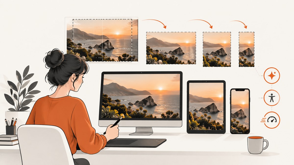
Good website images do more than look polished. They have to fit their layout, communicate their purpose to people using assistive technology, load efficiently on different screens, and remain sharp at the size they are displayed. The practical method is to define what each image does, make a crop for its component, export a small set of suitable sizes and formats, add meaningful HTML alternatives, and check the result on real layouts.
There is no universally best image format or compression setting. Choose based on the image content, the browsers you need to support, and whether compression artifacts are acceptable. For many photographs and raster images, WebP or AVIF are sensible candidates; diagrams, screenshots, logos, and line art may need lossless output to preserve detail.
1. Decide what the image is for
Before editing pixels, decide the image’s role in the page. Its role determines its crop, its HTML treatment, and the text alternative it needs. W3C guidance distinguishes informative, decorative, functional, and complex images; WCAG 2.2 Success Criterion 1.1.1 generally requires a text alternative for non-text content.
| Image purpose | What to do | Example alt treatment |
|---|---|---|
| Informative | Include the key information in a concise text alternative. | alt="A red warning light beside the router's power port" |
| Decorative | Use an empty alternative so assistive technology can skip it. | alt="" |
| Functional | Describe the action or destination, not merely the pictured object. | alt="View the product specifications" |
| Complex chart or diagram | Provide the important relationships or data in nearby text, a table, or a linked long description. A short alt can identify the graphic. | alt="Quarterly revenue by region; details follow" |
Ask what a reader would lose if the image failed to load. If the answer is “nothing,” and the image is purely ornamental, alt="" is usually appropriate. If the image carries information or is the only content inside a link or button, provide an alternative that conveys that information or function. Avoid copying a caption word-for-word when it adds no useful information, and don’t stuff keywords into alt text.
2. Design for the actual slot
Start with the component’s rendered dimensions and aspect ratio, not a generic “web image” size. A wide hero, a square product tile, and a portrait card need different crops. Keep the subject and any essential detail within the crop’s safe area, especially when the same source is used at mobile and desktop widths.
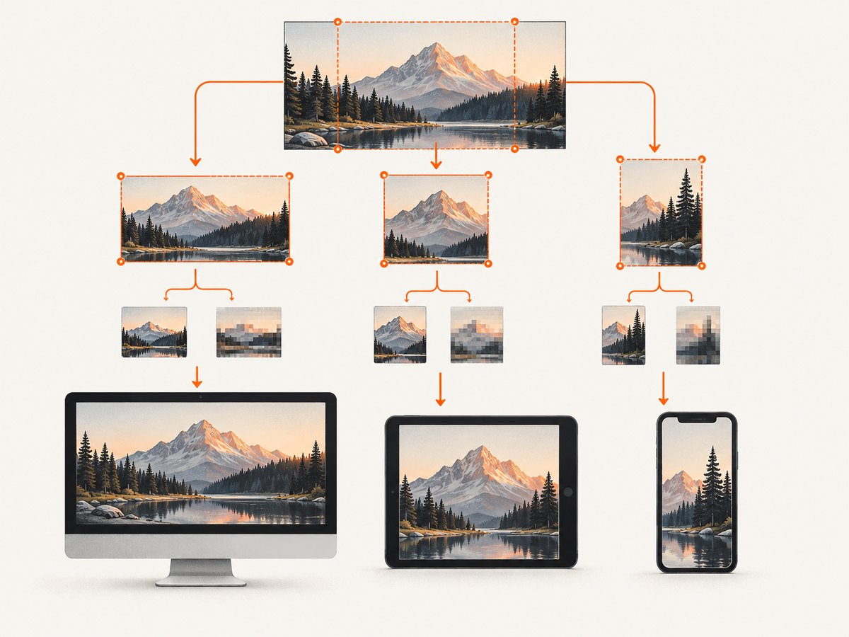
- Record the component’s expected width, height, and aspect ratio at key breakpoints.
- Choose a focal point and crop each composition for the slot. Make a separate mobile crop when the subject would otherwise be lost.
- Export a small set of intrinsic widths near the sizes the page actually renders. Include a larger candidate for high-density displays where detail matters.
- Set the image’s width and height attributes, or reserve the same aspect ratio in CSS, so the browser can allocate space before the file loads.
Do not create a dozen nearly identical files without a reason. Each candidate adds storage and maintenance overhead; the browser’s choice should correspond to realistic rendered widths. Google’s image SEO guidance recommends responsive image markup such as srcset and picture, with a fallback src and explicit dimensions.
3. Select format and compression by content
For photographs and many raster illustrations, compare WebP or AVIF output with the original. MDN recommends considering these formats for raster images because they generally compress better than older formats. That is a general tendency, not a guarantee for an individual asset.
- Photographs: compare lossy WebP or AVIF at several quality settings. Inspect faces, gradients, fine texture, and edges at the intended display size.
- Screenshots, diagrams, logos, and line art: use lossless output when compression artifacts would make small text, thin strokes, or crisp edges look poor. PNG may be appropriate; lossless WebP can also be evaluated where supported.
- Transparency: verify that the selected format preserves alpha and that the page background does not make transparent edges look wrong.
- Compatibility: provide an established fallback such as JPEG for photographs or PNG for graphics when the audience or tooling requires it. Confirm the actual browsers and publishing pipeline you support.
There is no universal quality number to copy. Encoders differ, and image content changes the tradeoff. Compare candidates visually and by encoded byte size. Keep the original source so you can regenerate assets when crops, codecs, or requirements change.
4. Add responsive format and width choices
Use <picture> when choosing between formats or art-directed crops, and keep a regular <img> as the fallback. Use srcset width descriptors with a truthful sizes value so the browser can select a candidate appropriate to the layout.
<picture>
  <source
    type="image/avif"
    srcset="hero-480.avif 480w, hero-960.avif 960w"
    sizes="100vw"
  >
  <source
    type="image/webp"
    srcset="hero-480.webp 480w, hero-960.webp 960w"
    sizes="100vw"
  >
  <img
    src="hero-960.jpg"
    srcset="hero-480.jpg 480w, hero-960.jpg 960w"
    sizes="100vw"
    width="960"
    height="540"
    alt="Descriptive, purpose-focused alternative text"
  >
</picture>
This example assumes the hero can use the full viewport width. If it sits inside a centered content column, use a sizes value that describes that column rather than 100vw. If mobile needs a different crop, add a <source media="..."> with the mobile composition. Preserve the <img> fallback: it supplies the semantic image and its alternative text.
Use width descriptors like 480w only when the candidate file is actually 480 pixels wide. Keep URLs stable when possible so caches can reuse files and crawlers can revisit them.
5. Write alt text that fits the context
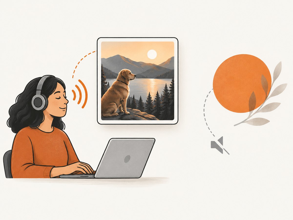
Alt text is not a filename, caption, or keyword field. Describe the useful information or action, with the most important point first. The same photograph may need different alt text in different contexts—or an empty alt if it is decorative next to text that already provides the same information. Google’s image guidance calls alt text the most important image metadata, while W3C emphasizes that alternatives depend on the image’s purpose.
- Be concise, but include the detail needed to understand the image in this page.
- Do not begin with “image of” or “picture of” unless that distinction matters.
- Do not put essential information only in the image; provide it in text as well.
- For charts, make the conclusion or trend available in nearby text, and include the underlying data when readers need to inspect values.
- For linked images, describe the destination or action if the link has no other accessible label.
Review the rendered page with images disabled and, for important flows, with a screen reader or accessibility audit. The page should still communicate the image’s essential meaning and the function of image controls.
6. Keep image loading fast and layout stable
Use dimensions close to the rendered size, serve responsive candidates, and avoid downloading a huge source for a small thumbnail. Reserve layout space with width and height or an equivalent aspect ratio to reduce unexpected movement while images load.
Do not lazy-load the above-the-fold image likely to become the Largest Contentful Paint (LCP). Lazy loading is useful for images below the fold, where it can defer work until the reader approaches them. Google’s Core Web Vitals guidance lists “good” targets of LCP at or below 2.5 seconds, INP below 200 milliseconds, and CLS below 0.1. These are page-level targets, not a promise that changing image format alone will meet them.
Test on a slow connection and on real mobile layouts. Measure the page before and after changes; a smaller file can still be the wrong crop, and an image optimization may not address a page’s main bottleneck. Keep cacheable image URLs stable and change a URL when the file contents change if your cache strategy depends on URL versioning.
7. Make image production repeatable
A reliable image workflow records source files, crop decisions, output dimensions, formats, and alt text alongside the page or content entry. That makes later edits and regeneration less error-prone.
- Inventory: identify where the image appears, its purpose, displayed dimensions, and whether a mobile crop is needed.
- Prepare: retain an editable source; make component-specific crops and safe areas.
- Export: generate only the width candidates used by the layout, then compare format and compression options.
- Implement: add
picture/srcsetas needed, a fallback source, dimensions, and context-specific alt text. - QA: check sharpness, transparency, crop, format loading, alt behavior, and layout shift at desktop and mobile widths.
- Measure: inspect page performance on a slow connection and confirm the above-the-fold image is not deferred.
Screenshot-based visual checks
For pages where exact crop and layout matter, capture the page at the target viewport and compare it with the intended design. A browser screenshot can reveal a mobile crop that cuts off the subject, a transparent image that blends into the wrong background, or a layout shift that is hard to spot in source files. Captures are useful QA evidence, but they do not replace checking the actual image file, alt text, keyboard behavior, or screen-reader experience.
8. Troubleshooting common image problems
| Symptom | Likely cause | Fix |
|---|---|---|
| Image looks blurry on a high-density screen | The largest candidate is too small for the rendered CSS size and device pixel ratio. | Add an appropriately sized candidate and ensure the srcset widths describe the real files. |
| Mobile shows the wrong composition | The desktop crop is being scaled down instead of art-directed. | Provide a mobile crop through a media-specific <source> or use a separate component image. |
| Browser downloads an unexpectedly large file | sizes overstates the rendered width or is missing, or the candidate list lacks a closer match. |
Describe the actual layout in sizes, inspect the selected request in developer tools, and add only useful width candidates. |
| Layout jumps when the image appears | No dimensions or reserved aspect ratio are present. | Set accurate width/height attributes or reserve space with CSS. |
| Image has visible artifacts or jagged edges | Lossy compression is too aggressive for text, thin lines, gradients, or detailed content. | Raise quality or use lossless output; compare at the final display size. |
| Image is missing in one browser | The chosen format or markup is unsupported, or a source URL is incorrect. | Check the network request and console; retain a valid fallback img src and verify source ordering and MIME types. |
| Screen reader announces a filename or useless phrase | Alt text was generated from an asset name or describes appearance without context. | Write a short purpose-focused alternative, or set alt="" if genuinely decorative. |
| Hero image appears late | The likely LCP image is lazy-loaded or unnecessarily large. | Remove lazy loading from the above-the-fold image, serve a suitable candidate, and measure again. |
9. Performance, reliability, and cost considerations
Image optimization has tradeoffs. More variants can reduce bytes for a particular layout but increase storage, build time, and the chance of stale or inconsistent exports. Newer formats can reduce transfer size for some sources but require a fallback decision based on the audience. Lossless output protects detail but may create larger files. Choose by measured page behavior and visual inspection rather than a blanket rule.
Keep original assets and regenerate derivatives deterministically when possible. Use explicit dimensions, stable URLs, and a documented naming scheme so browser caches and publishing systems behave predictably. When a build or image pipeline fails, ensure the page retains a valid fallback source rather than rendering a broken image.
For manual capture-based QA, browser setup and repeated screenshot work can add operational steps. ScreenshotNeo is a website screenshot API and MCP server from Yorker Media. Its API returns screenshots or PDFs, and its stated billing rules say only clean shots are billed; response headers identify page verdict and billing status. Its available features include viewport and device presets, full-page capture, custom CSS and JavaScript, waits, and bulk capture. See [ScreenshotNeo](https://screenshotneo.com) and the [API documentation](https://screenshotneo.com/docs/).
Or skip the browser setup
Capture a page with one request. Replace the target URL with the page you want to inspect; use your ScreenshotNeo API key as YOUR_API_KEY.
curl -G "https://api.screenshotneo.com/v1/shot" \
  -d access_key=YOUR_API_KEY \
  --data-urlencode url=https://stripe.com \
  -o shot.webp
import requests
r = requests.get(
"https://api.screenshotneo.com/v1/shot",
params={"access_key": "YOUR_API_KEY", "url": "https://stripe.com"},
timeout=90,
)
open("shot.webp", "wb").write(r.content)const q = new URLSearchParams({
access_key: 'YOUR_API_KEY',
url: 'https://stripe.com'
});
const res = await fetch(`https://api.screenshotneo.com/v1/shot?${q}`);
if (!res.ok) throw new Error(`Screenshot request failed: ${res.status}`);
await Bun.write('shot.webp', res);ScreenshotNeo removes cookie banners, newsletter popups, and chat widgets before the shot. Bot checks, blank pages, and failed loads are never billed; headers report the page verdict and billing. Its MCP server lets AI agents use screenshot tools. The Free plan includes 1,000 screenshots a month with no card; paid plans start at $5 for 3,000 shots. This can make repeatable visual checks easier, while accessibility and image-file checks still need their own review. Sign up for 1,000 free screenshots a month, with no card required.
FAQ
Should every image have descriptive alt text?
No. Informative and functional images need an appropriate text alternative; decorative images should generally use an empty alt attribute so they are skipped.
Should I convert every image to AVIF?
No. Compare formats for the actual asset and keep the fallback your audience and delivery pipeline require. Text-heavy graphics may need lossless output.
Does a smaller image file automatically improve Core Web Vitals?
No. It can help transfer and rendering, but LCP, INP, and CLS depend on the page as a whole. Measure the page and address the observed cause.
Can screenshots validate accessibility?
They can help inspect visual presentation and crop, but a screenshot cannot establish that alt text, keyboard access, or screen-reader output is correct.


