Website Image Optimizer: Complete Guide to Faster, Responsive Images
Optimize website images by resizing, compressing, using modern formats, and serving responsive files without hurting visual quality or LCP.
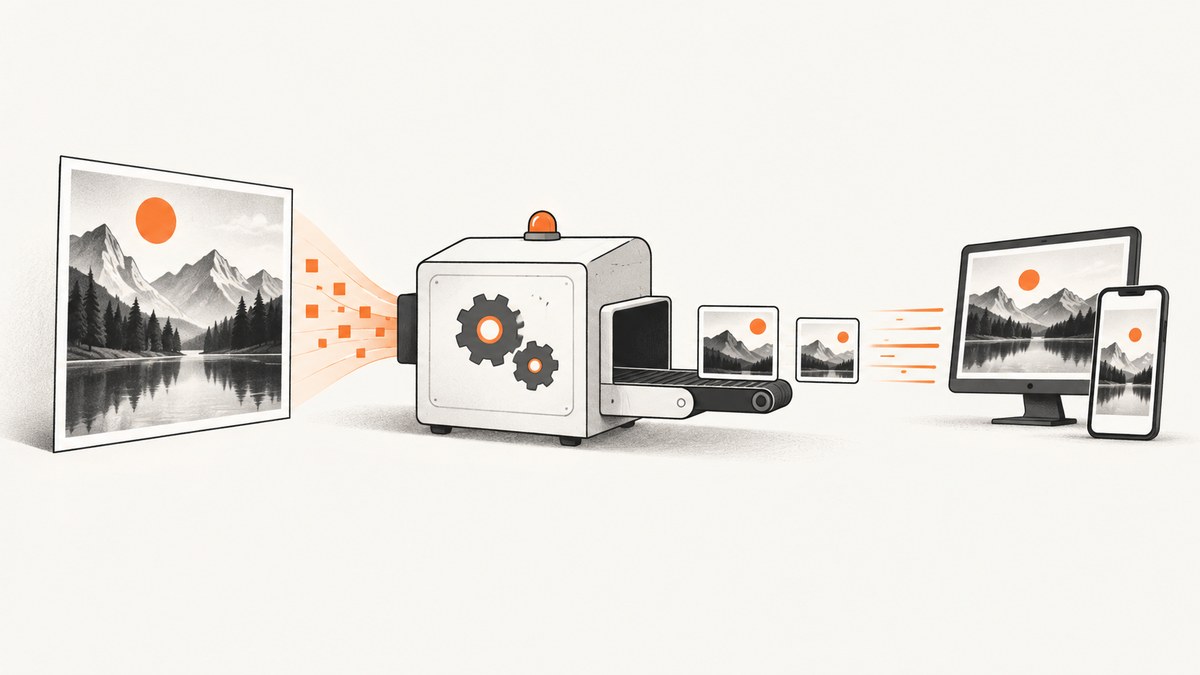
Direct answer: Optimize website images by resizing every source to the largest rendered dimensions you actually need, compressing it to an acceptable quality target, serving WebP or AVIF with suitable fallbacks, and using responsive srcset and sizes. Lazy-load images below the fold, prioritize the main above-the-fold image, reserve its layout space, and verify the result with Core Web Vitals, especially Largest Contentful Paint (LCP). Google defines a good LCP result as 2.5 seconds or less from the start of page load. Images are often the heaviest and most prevalent resource on the web, so reducing their bytes and dimensions is usually the highest-impact first step.
1. What image optimization includes
Image optimization is a delivery process, not one compression command. A useful implementation answers five questions for every image:
- What is the rendered size? A 3,000-pixel source displayed at 600 pixels wastes transfer and decode work.
- Which format fits the content? Photographs, transparency, animation, screenshots, diagrams, and logos have different needs.
- How much quality is acceptable? Lossy compression is efficient for photographs; lossless output protects exact pixels and sharp edges.
- Which variant should each device download? Responsive candidates prevent a phone from downloading a desktop-sized file.
- When should the browser fetch it? The main visible image may need priority; off-screen images can wait.
Optimizing only the file while ignoring markup can still leave a slow page. Conversely, perfect responsive markup cannot compensate for a source that is several times larger than its rendered slot.
2. Inventory images and find the bottleneck
Start with evidence. Run PageSpeed Insights or Lighthouse, inspect the Network panel in browser developer tools, and identify the page’s LCP element. Record the URL, transferred bytes, intrinsic dimensions, rendered dimensions, format, and loading priority.
| What to inspect | What it tells you | Typical action |
|---|---|---|
| Transfer size | Bytes sent over the network | Compress, resize, or change format |
| Rendered versus intrinsic width | Whether the source is oversized | Generate a smaller candidate |
| Waterfall position | When the request starts | Prioritize the LCP image; defer others |
| Decode time | Main-thread cost after download | Reduce dimensions and avoid unnecessarily huge files |
| Layout shift | Whether content moves as images arrive | Add width and height or an aspect-ratio reservation |
Inventory templates as well as individual files. A product grid, article hero, avatar, and background image usually need different width candidates and quality settings. Fix the largest repeated offenders first.
3. Resize to rendered dimensions
Generate an image at the largest width a layout can display, then add a small number of larger-density candidates when needed. For example, a card rendered at 360 CSS pixels might use 360px and 720px candidates. Do not send a 2,400px master to every phone simply because the original camera file is available.
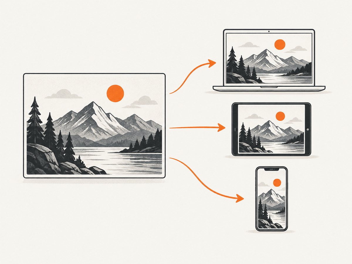
Measure the slot at your breakpoints. Account for gutters, columns, and maximum content width. If a hero can reach 1,200 CSS pixels on a wide screen, a 1,200px or 2,400px candidate may be appropriate depending on device pixel ratio. Keep the original master in storage, but transform it for delivery.
<img
  src="/images/hero-1200.webp"
  srcset="
    /images/hero-480.webp 480w,
    /images/hero-768.webp 768w,
    /images/hero-1200.webp 1200w,
    /images/hero-1800.webp 1800w"
  sizes="(max-width: 700px) 100vw, (max-width: 1200px) 90vw, 1200px"
  width="1200"
  height="675"
  alt="Team reviewing a design on a large screen"
>
The sizes value describes the slot before the browser chooses a srcset candidate. Make it match your CSS. If the image is always 50% of the viewport on desktop, say so instead of using a generic 100vw.
4. Choose JPEG, PNG, WebP, AVIF, or SVG
Compare formats at an acceptable visual quality, not at an arbitrary quality number. Browser support, transparency, animation, encoding time, decoding cost, and fallback complexity all matter. MDN’s image format guidance and Google’s image performance guidance cover the format trade-offs.
| Format | Good fit | Watch for |
|---|---|---|
| JPEG | Photographs and broad legacy compatibility | No alpha transparency; artifacts at aggressive compression |
| PNG | Lossless detail, screenshots, and transparency | Often much larger than modern lossy formats for photos |
| WebP | Photographs, transparency, and many general-purpose images | Keep a fallback when your supported environment requires it |
| AVIF | Very efficient compression and HDR/WCG use cases | Encoding can cost more; verify browser and platform support |
| SVG | Logos, icons, and suitable vector artwork | Do not use for photographic pixels; sanitize untrusted SVG files |
Use the picture element when you need explicit format fallbacks:
<picture>
  <source type="image/avif" srcset="/images/diagram.avif">
  <source type="image/webp" srcset="/images/diagram.webp">
  <img src="/images/diagram.png" width="1200" height="800" alt="System architecture diagram">
</picture>
Test representative outputs at normal viewing size and at 200% zoom. A quality setting that works for a landscape photograph may destroy small text, line art, or faces.
5. Compress without visible damage
Use lossy compression for most photographs and lossless compression when exact pixels, transparency edges, or small text matter. Squoosh provides browser-based inspection and conversion; ImageOptim is a desktop workflow. Export a few quality levels, compare them side by side, and keep the smallest version that preserves the details readers need.
Strip metadata unless you have a reason to retain it. Camera EXIF data can expose location information and adds bytes. Preserve color profiles when color accuracy matters, and check that your pipeline does not accidentally convert a wide-gamut source into dull-looking output.
Automate transformations during upload or build time. A typical pipeline stores the original, creates width variants, emits WebP and optionally AVIF, records dimensions, and publishes immutable URLs. Avoid repeatedly recompressing an already lossy file; transform from the original master whenever possible.
6. Deliver responsive images correctly
Responsive markup lets the browser choose an intrinsic width for the current viewport and density. Cloudflare documents on-demand resizing and responsive delivery, while WordPress documents its generated srcset and sizes behavior.
- Use width descriptors such as
480wwhen candidates represent different intrinsic widths. - Use density descriptors such as
1xand2xwhen the CSS slot is fixed. - Set accurate
sizes; an inaccurate value can make the browser select a file that is too large. - Keep
widthandheightattributes, or set an equivalent CSSaspect-ratio, to reserve space. - Use a CDN or image transformation service when generating and caching every breakpoint yourself becomes costly.
7. Loading priority, lazy loading, and LCP
Lazy-load images that are below the initial viewport:
<img
  src="/images/gallery-600.webp"
  loading="lazy"
  decoding="async"
  width="600"
  height="400"
  alt="Gallery item"
>
Do not blanket-apply loading="lazy" to the main hero or other likely LCP image. It can delay discovery. Let the browser request that image early, and consider a preload only when measurement shows it is needed:
<link rel="preload" as="image" href="/images/hero-1200.webp"
      imagesrcset="/images/hero-768.webp 768w, /images/hero-1200.webp 1200w"
      imagesizes="100vw">
Use preloads sparingly because they compete with CSS, fonts, and other critical resources. After deployment, compare LCP and real-user data rather than assuming a lab improvement is universal.
8. A practical implementation workflow
- Measure: identify the LCP image, largest transfers, and repeated template patterns.
- Define slots: document rendered widths at each breakpoint.
- Generate candidates: resize from originals and choose a small width ladder.
- Encode: create WebP, optionally AVIF, and retain JPEG or PNG fallbacks where needed.
- Write markup: add
srcset, accuratesizes, dimensions, and meaningful alt text. - Set loading: prioritize the LCP image; lazy-load below-the-fold content.
- Cache: serve transformed files with long-lived immutable caching when URLs include a content hash.
- Re-test: run Lighthouse and PageSpeed Insights, then inspect real-user Core Web Vitals after release.
9. Managed image transformation at scale
A managed image CDN is useful when you have many assets, multiple breakpoints, frequent uploads, or a requirement to negotiate formats automatically. Cloudflare describes automatic compression, WebP/AVIF conversion, on-the-fly resizing, responsive delivery, and lazy loading. Before choosing a service, verify cache behavior, transformation limits, quality controls, origin shielding, and current pricing. Do not assume a transformation is cached: inspect response headers and repeated requests.
Keep an origin fallback and a migration plan. A provider outage, an invalid transformation URL, or a cache purge should not make every image disappear. Monitor transformation errors and the percentage of requests served from cache.
10. Troubleshooting common failures
| Symptom | Likely cause | Fix |
|---|---|---|
| Mobile downloads a desktop image | Missing or inaccurate sizes |
Describe the real CSS slot and provide smaller candidates |
| Images look blurry | Largest candidate is below the rendered or density-adjusted width | Add an appropriately sized candidate; avoid repeated upscaling |
| LCP got slower after lazy loading | The LCP image was marked lazy | Remove lazy loading from the principal above-the-fold image |
| Page jumps while loading | No intrinsic dimensions or aspect-ratio reservation | Add width/height or CSS aspect-ratio |
| AVIF fails for some visitors | Unsupported browser or transformation response | Keep a WebP or JPEG/PNG fallback in picture |
| Colors look wrong | Color-profile conversion or wide-gamut handling changed | Check the encoder and test color-managed browsers |
| CDN URL returns 400/404 | Invalid width, format, or source path | Validate parameters, URL-encode the source, and log transformation errors |
| Every request reaches origin | Cache key fragmentation or short TTL | Normalize parameters and choose a cache policy suited to immutable variants |
| Sharp text in screenshots is damaged | Aggressive lossy compression | Use lossless output or a higher quality target for text and line art |
11. Performance, reliability, and cost considerations
Measure transferred bytes, request count, decode time, LCP, and layout shift together. A smaller file can still hurt if it is discovered late, while a fast request can still cause a layout jump without dimensions. Keep the number of candidates manageable; generating dozens of nearly identical widths increases storage, cache keys, and build time.
For reliability, validate uploads, reject unexpectedly large dimensions, and queue expensive AVIF encodes. Cache successful variants and retain the original so a new encoder or quality policy can regenerate them. For cost, compare storage, transformation operations, egress, and cache hit rate. A managed service can reduce engineering work while adding per-request charges, so model traffic at your real image-view volume.
12. Or skip the browser setup
If you need screenshots of optimized pages for documentation, visual regression, or content workflows, ScreenshotNeo returns a clean PNG, JPEG, WebP, or PDF from one GET request. See the ScreenshotNeo API documentation for all options.
curl -G "https://api.screenshotneo.com/v1/shot" -d access_key=YOUR_API_KEY --data-urlencode url=https://stripe.com -o shot.webpimport requests
r = requests.get("https://api.screenshotneo.com/v1/shot", params={"access_key": "YOUR_API_KEY", "url": "https://stripe.com"}, timeout=90)
open("shot.webp", "wb").write(r.content)const q = new URLSearchParams({ access_key: 'YOUR_API_KEY', url: 'https://stripe.com' });
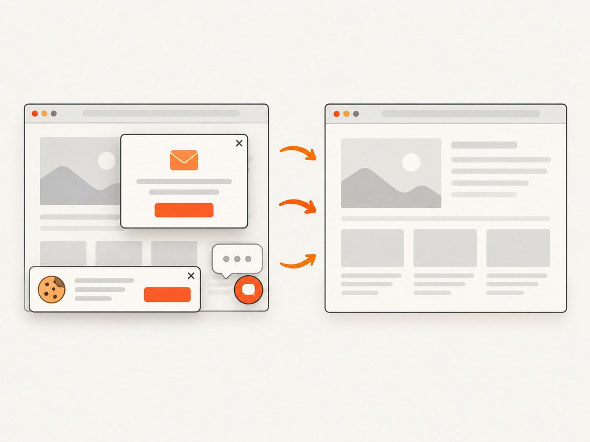
const res = await fetch(`https://api.screenshotneo.com/v1/shot?${q}`);Cookie banners, newsletter popups, and chat widgets are removed before the shot. Bot checks, blank pages, timeouts, failed loads, and cache hits are never billed, and response headers identify the page verdict and billing status. An MCP server lets Claude, Cursor, and other MCP clients take screenshots. The Free plan includes 1,000 screenshots a month with no card; paid plans start at $5 for 3,000 shots. Create a free ScreenshotNeo account.
13. Website image optimization checklist
- Every image is resized to a realistic maximum rendered width.
- Photographs use an efficient lossy format at a reviewed quality target.
- Transparency, animation, screenshots, and vector artwork use suitable formats.
- Responsive images include accurate
srcsetandsizes. - Intrinsic dimensions reserve layout space.
- Only below-the-fold images are lazy-loaded.
- The LCP image is discovered early and tested after deployment.
- Fallbacks exist for modern formats where your support matrix requires them.
- CDN transformations, cache keys, TTLs, and costs are monitored.
- Real-user Core Web Vitals confirm the change.
14. Frequently asked questions
Should every image be WebP or AVIF?
No. Choose based on content, browser support, transparency, animation, encoding cost, and visual quality. Keep a fallback where required.
What quality setting should I use?
There is no universal number. Compare representative images and choose the smallest output that preserves the details readers need.
Is lazy loading always faster?
It reduces work for off-screen images. Applying it to the principal above-the-fold image can delay LCP.
Do width and height attributes change the displayed size?
CSS still controls the final size, while the attributes provide an intrinsic ratio that helps reserve space and prevent layout shifts.
When should I use an image CDN?
Use one when many assets, breakpoints, uploads, or format variants make a self-managed transformation pipeline difficult to operate and monitor.


