Website Image Zoom Effect: Accessible Hover, Click, and Touch Patterns
Build an accessible website image zoom effect with responsive CSS, keyboard support, touch controls, lightboxes, testing guidance, and a ScreenshotNeo shortcut.
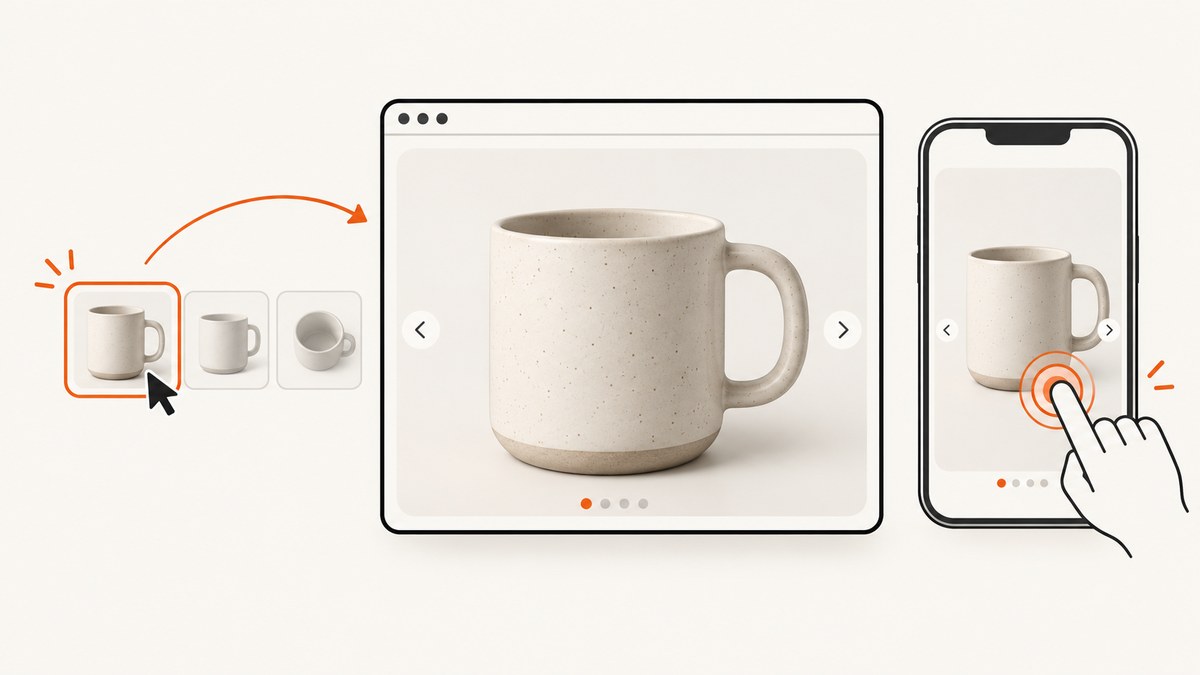
Direct answer: Use a real <img> with meaningful alternative text, keep the source responsive with max-width: 100%; height: auto, and expose zoom through more than hover. A robust pattern combines pointer hover or a lens with a keyboard-focus path and an explicit click or tap control that opens a larger view. The enlarged image should use a sufficiently large source, preserve focus and dismissal behavior, and remain usable at 200% and 400% browser zoom.
This guide builds a dependency-free implementation, explains when to use transform: scale() or CSS zoom, and covers accessibility, performance, testing, and failure modes. The examples use semantic HTML, CSS, and JavaScript so you can paste them into a page.
What an image zoom effect should do
An image zoom reveals a larger or magnified view of an image. Common triggers are pointer hover, keyboard focus, click, and touch. Hover alone excludes keyboard and touch users. MDN’s accessibility example wires show and hide behavior to both mouse events and focus events, which is why a focus path belongs in the design.
- Thumbnail: constrained to its container and loaded at an appropriate resolution.
- Magnifier: an inline lens or enlarged crop for pointer users who need detail quickly.
- Full view: a button-activated lightbox or dialog that works with Enter, Space, touch, and assistive technology.
- Fallback: the image’s purpose and all essential information remain available without zoom.
Complete accessible example
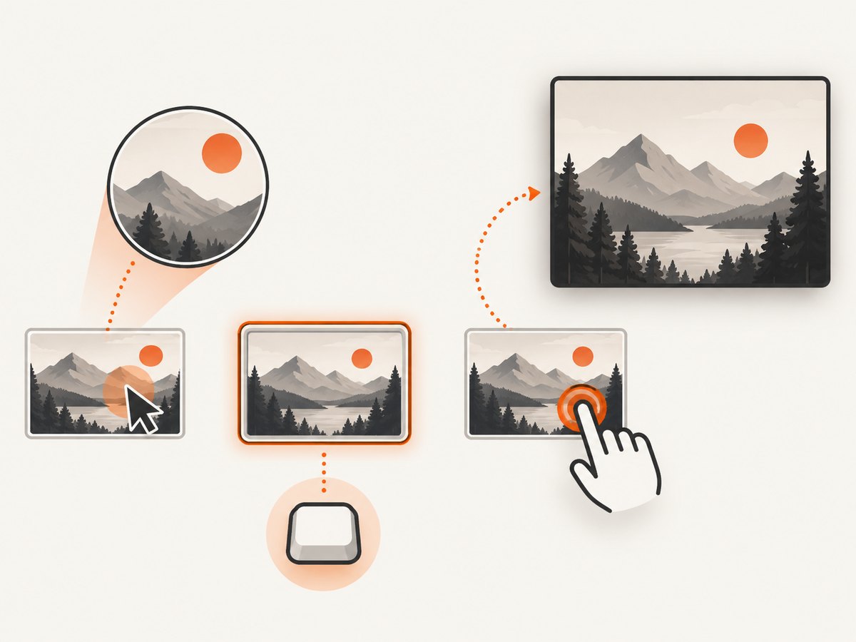
The following example provides hover and focus magnification plus a click-to-open dialog. The button is keyboard reachable, the dialog has a close button, and Escape closes it. Replace the image URLs with your own thumbnail and large source.
<figure class="zoom-card">
  <button class="zoom-trigger" type="button"
          aria-haspopup="dialog" aria-controls="image-dialog"
          aria-label="Open a larger view of the trail shoe">
    <span class="zoom-lens" aria-hidden="true"></span>
    <img
      src="/images/trail-shoe-800.jpg"
      srcset="/images/trail-shoe-400.jpg 400w,
              /images/trail-shoe-800.jpg 800w"
      sizes="(max-width: 600px) 100vw, 50vw"
      width="800" height="600"
      alt="Blue trail shoe with a lugged sole on a pale background">
  </button>
  <figcaption>Trail shoe, side profile</figcaption>
</figure>

<dialog id="image-dialog" class="image-dialog" aria-labelledby="dialog-title">
  <div class="dialog-panel">
    <h2 id="dialog-title">Trail shoe, larger view</h2>
    <img src="/images/trail-shoe-1600.jpg"
         width="1600" height="1200"
         alt="Blue trail shoe with a lugged sole on a pale background">
    <button class="dialog-close" type="button">Close</button>
  </div>
</dialog>
.zoom-card {
max-width: 42rem;
margin: 0;
}
.zoom-trigger {
position: relative;
display: block;
width: 100%;
padding: 0;
border: 0;
background: transparent;
cursor: zoom-in;
overflow: hidden;
}
.zoom-trigger img {
display: block;
width: 100%;
max-width: 100%;
height: auto;
}
.zoom-trigger:focus-visible {
outline: 3px solid #155eef;
outline-offset: 4px;
}
.zoom-lens {
position: absolute;
inset: 0;
pointer-events: none;
opacity: 0;
background-repeat: no-repeat;
background-size: 200% auto;
transition: opacity .15s ease;
}
.zoom-trigger:hover .zoom-lens,
.zoom-trigger:focus-visible .zoom-lens {
opacity: 1;
}
.image-dialog {
width: min(92vw, 70rem);
max-height: 92vh;
padding: 0;
border: 0;
background: transparent;
}
.image-dialog::backdrop {
background: rgb(0 0 0 / .78);
}
.dialog-panel {
position: relative;
max-height: 92vh;
overflow: auto;
padding: 1rem;
background: #fff;
}
.dialog-panel img {
display: block;
max-width: 100%;
height: auto;
}
.dialog-close {
margin-top: .75rem;
}
@media (prefers-reduced-motion: reduce) {
.zoom-lens { transition: none; }
}const trigger = document.querySelector('.zoom-trigger');
const image = trigger.querySelector('img');
const lens = trigger.querySelector('.zoom-lens');
const dialog = document.querySelector('#image-dialog');
const closeButton = dialog.querySelector('.dialog-close');
function setLensPosition(event) {
const rect = trigger.getBoundingClientRect();
const x = Math.max(0, Math.min(1, (event.clientX - rect.left) / rect.width));
const y = Math.max(0, Math.min(1, (event.clientY - rect.top) / rect.height));
lens.style.backgroundImage = `url("${image.currentSrc || image.src}")`;
lens.style.backgroundPosition = `${x * 100}% ${y * 100}%`;
}
trigger.addEventListener('pointermove', setLensPosition);
trigger.addEventListener('pointerenter', setLensPosition);
trigger.addEventListener('click', () => {
if (typeof dialog.showModal === 'function') dialog.showModal();
else dialog.setAttribute('open', '');
});
closeButton.addEventListener('click', () => dialog.close());
dialog.addEventListener('click', event => {
if (event.target === dialog) dialog.close();
});The lens is decorative because the same image remains available to the button and dialog. If the detail itself is essential, describe it in text or provide a dedicated accessible full-size view rather than relying on the lens.
Hover, focus, click, and touch behavior
Pointer hover
Hover is useful for desktop product inspection, but it is transient and unavailable on many touch devices. Keep the hover state optional. Do not put essential instructions or prices only inside it.
Keyboard focus
Make the trigger a native button or link, keep a visible :focus-visible outline, and ensure Enter and Space activate the full view. MDN specifically warns that a mouse-only implementation cannot reach the zoomed view by keyboard. A native button also supplies predictable semantics to screen readers.
Click and tap
Use an explicit tap action to open a larger view. A dialog or lightbox should have an obvious close button, close on Escape, and return focus to the trigger after closing. Avoid intercepting pinch-to-zoom or preventing normal page zoom.
CSS mechanism: transform versus zoom
Use transform: scale() when you want visual enlargement without changing normal layout. Set transform-origin deliberately and contain overflow so the scaled element does not cover unrelated controls. MDN documents that transforms do not participate in layout recalculation, so the visual result can overflow its box.
CSS zoom participates in layout recalculation. That can be useful for an inline enlarged state, but it may push neighboring content and change page dimensions. It is less suitable for a floating lens. Choose one mechanism intentionally and test the surrounding layout at each state.
/* Inline visual enlargement; the container clips the scaled image. */
.zoom-inline {
  overflow: hidden;
}
.zoom-inline img {
  transform: scale(1.8);
  transform-origin: 50% 50%;
}

/* Layout-affecting alternative. */
.zoom-layout img {
  zoom: 1.5;
}
Responsive images and source quality
W3C Technique C37 recommends max-width: 100% and automatic height so an image fits its container as the viewport or browser zoom changes. Use srcset and sizes to avoid downloading a huge file for a small thumbnail, then provide a larger source for the opened view. Enlarging a tiny source indefinitely only magnifies interpolation blur.
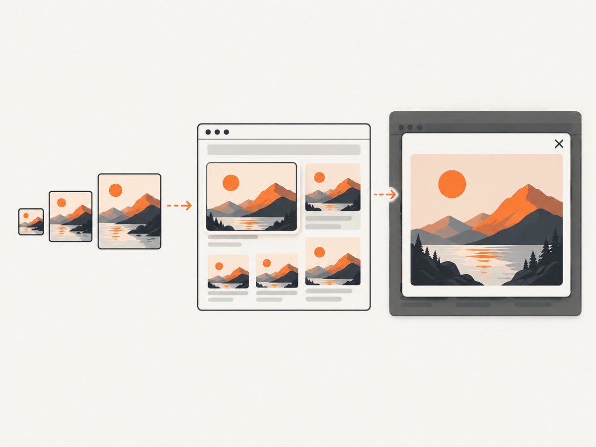
Reserve space with intrinsic width and height attributes to reduce layout shift. Keep the enlarged image’s aspect ratio. If a diagram contains text, offer the source content as real page text or a downloadable document; a zoomed bitmap is not a substitute for readable text.
Accessibility requirements and test checklist
- Write meaningful alt text that communicates the image’s purpose without zoom. Decorative images should use an empty
alt. - Make the trigger reachable by Tab and give it a visible focus indicator.
- Support Enter and Space, plus an obvious close button and Escape for an opened view.
- Keep focus inside a modal while it is open, then restore focus to the trigger.
- Do not disable browser zoom. Section508.gov states that 200% zoom should not affect content or functionality.
- Check 200% browser zoom and 400% zoom. WCAG reflow guidance requires content to remain usable without two-dimensional scrolling except where a two-dimensional presentation is essential.
- At 400% zoom, verify a 320 CSS-pixel equivalent viewport: no clipped controls, hidden close action, or sideways scrolling for ordinary content.
- Use a screen reader to confirm the image name, button label, dialog title, and close action.
- Test touch with one finger. The enlarged view must be reachable without hover.
W3C Technique G142 describes checking content at 200% zoom while preserving spatial relationships and functionality. Technique C37 describes a 400% test from a 1280×1024 starting viewport. Treat these as repeatable acceptance checks, not as optional polish.
Advanced patterns and options
Lens with a separate high-resolution source
For a lens, use the thumbnail as the visible image and set the lens background to a high-resolution source. Keep the lens bounded inside the image and update its background position from pointer coordinates. Preload the large source only when the user is likely to open it, or use responsive loading to control bandwidth.
Element-only zoom
For a catalog card or dashboard, zoom only the selected element rather than the entire page. The trigger should describe what opens, such as “Open larger view of quarterly revenue chart.” If the element contains data, provide a table or text summary outside the image.
Pan and large diagrams
A very large map or technical drawing may need two-dimensional panning. Mark that region clearly, keep controls keyboard accessible, and provide an alternative representation. WCAG permits two-dimensional scrolling when the presentation genuinely requires two dimensions; ordinary photos and product cards should reflow instead.
Reduced motion
Use a short opacity transition at most, and honor prefers-reduced-motion: reduce. A zoom effect should never delay access to the image or close control.
Performance, reliability, and cost
- Bytes: serve appropriately sized thumbnails, modern formats where supported, and a larger file only for the enlarged state.
- CPU: update lens position with
pointermovesparingly; a requestAnimationFrame loop can coalesce events on low-powered devices. - Layout: reserve image dimensions and avoid layout-affecting zoom for overlays.
- Network: lazy-load below-the-fold thumbnails, but do not lazy-load the first image needed immediately after a user action.
- Reliability: if the large source fails, keep the thumbnail usable and show a text “Open original” link or retry action.
- Privacy: avoid sending pointer coordinates or image URLs to an unnecessary third party.
Troubleshooting
| Symptom | Likely cause | Fix |
|---|---|---|
| Zoom works only with a mouse | Listeners exist only for hover events | Use a native button, focus styles, and click/tap activation. |
| Image becomes blurry | The source is too small | Provide a larger source with srcset or a dedicated full-size file. |
| Page gets horizontal scrolling | A transformed image overflows its container | Contain overflow, set transform origin, or use a dialog instead. |
| Close button cannot be reached | Focus was not moved or modal content is clipped | Use dialog.showModal(), keep the close button in the scrollable panel, and test at 400%. |
| Tap does nothing | Code depends on :hover or an overlay intercepts input |
Use a real button and set decorative lens layers to pointer-events: none. |
| Screen reader announces nothing useful | Missing or generic alt text and unlabeled controls | Describe purpose in alt, label the trigger, and title the dialog. |
| Thumbnail jumps while loading | No intrinsic dimensions | Add width and height or reserve an aspect-ratio box. |
| Large image request fails | Wrong path, blocked origin, or unavailable format | Inspect the network response, correct the URL, and retain a usable thumbnail fallback. |
Or skip the browser setup
If your goal is to capture a finished page rather than implement an interactive zoom widget, ScreenshotNeo returns a clean screenshot from one GET request. It can capture a full page, a selected element, a chosen viewport or device preset, dark mode, retina scale, custom CSS and JavaScript, and delayed or network-idle states. Cookie and consent banners, newsletter popups, and chat widgets are removed before capture. Bot checks, blank pages, timeouts, failed loads, and cache hits are not billed, and response headers identify the page verdict and billing status.
See the ScreenshotNeo API documentation for all options. A minimal WebP request is:
curl -G "https://api.screenshotneo.com/v1/shot" \
  -d access_key=YOUR_API_KEY \
  --data-urlencode url=https://stripe.com \
  -o shot.webp
import requests
r = requests.get(
"https://api.screenshotneo.com/v1/shot",
params={"access_key": "YOUR_API_KEY", "url": "https://stripe.com"},
timeout=90,
)
r.raise_for_status()
open("shot.webp", "wb").write(r.content)const q = new URLSearchParams({
access_key: 'YOUR_API_KEY',
url: 'https://stripe.com'
});
const res = await fetch(`https://api.screenshotneo.com/v1/shot?${q}`);
if (!res.ok) throw new Error(`Screenshot failed: ${res.status}`);
const bytes = Buffer.from(await res.arrayBuffer());
await import('node:fs/promises').then(fs => fs.writeFile('shot.webp', bytes));ScreenshotNeo also supports PDF output, custom headers and cookies, authorization, timezone and geolocation, blocked resource types, caching with a TTL you choose, signed links, asynchronous jobs with signed webhooks, bulk capture of up to 100 URLs per call, a usage API, and an MCP server with take_screenshot, get_page_info, and capture_pdf for Claude, Cursor, and other MCP clients. The Free plan includes 1,000 shots each month with no card; paid plans start at $5 for 3,000 shots. Create a free ScreenshotNeo account.
FAQ
Is CSS hover enough for image zoom?
No. Add keyboard focus and an explicit click or tap action because hover is unavailable to keyboard-only and touch users.
Should I use a lightbox or a lens?
Use a lens for quick desktop inspection and a lightbox when users need reliable touch, keyboard, and high-resolution access. Many interfaces use both.
Does transform: scale() change layout?
No. It changes the visual rendering and can overflow its box. CSS zoom participates in layout recalculation and can move surrounding content.
How large should the source image be?
Large enough for the maximum displayed size at the target pixel density. Use responsive variants and avoid enlarging a small source so far that details become interpolation blur.
How do I test accessibility?
Test keyboard activation, screen-reader names, touch behavior, 200% and 400% browser zoom, a 320 CSS-pixel equivalent viewport, focus restoration, Escape dismissal, and a failed large-image request.


