Website Mobile Screenshot Generator
Generate accurate mobile website screenshots with Playwright or an API. Learn viewport sizing, full-page capture, waits, formats, troubleshooting, and automation.
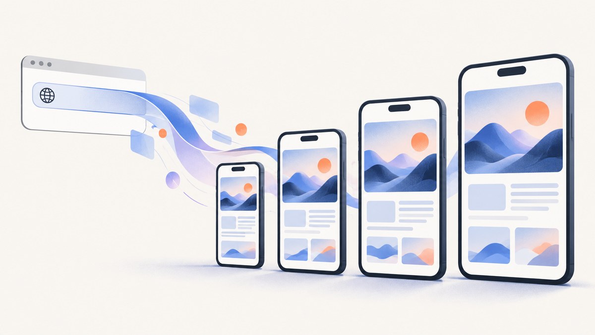
Direct answer: A website mobile screenshot generator opens a public URL at a phone-sized browser viewport and exports the rendered page as an image. For repeatable results, use Playwright or a screenshot API. Set a mobile viewport such as 393 × 852 CSS pixels, wait for fonts and lazy content, then capture either the visible viewport or the complete scrollable page.
A mobile screenshot is useful for responsive QA, documentation, bug reports, release notes, social previews, and visual regression checks. It is an emulation of browser conditions, however. A preset does not prove that a physical iPhone or Android phone will render identically, and a viewport screenshot does not include content below the fold.
What a mobile screenshot generator does
The basic workflow is:
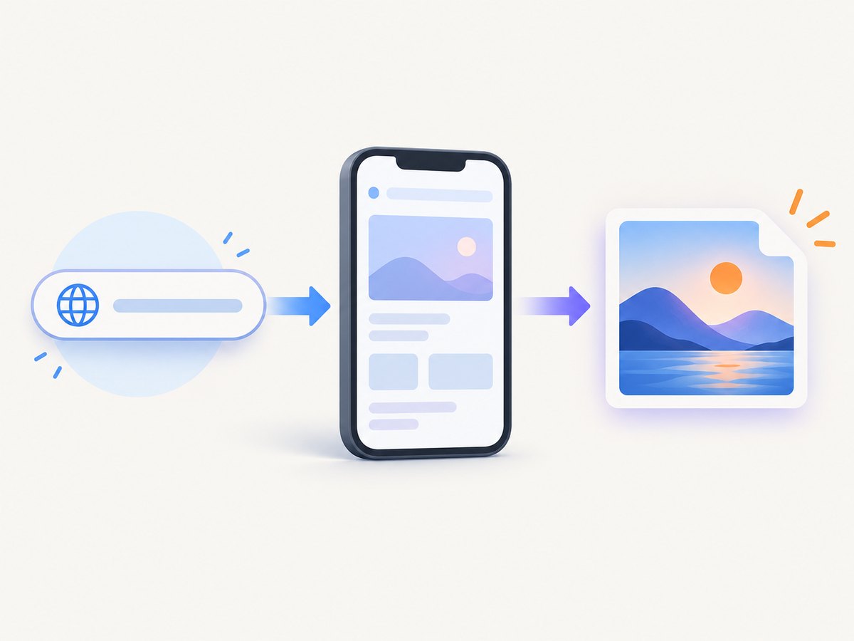
- Provide a public HTTPS URL.
- Choose a named phone preset or enter width and height manually.
- Render the page with JavaScript, CSS, fonts, images, and responsive breakpoints enabled.
- Wait for a selector, a delay, or network activity to settle.
- Capture the viewport, an element, or the full scrollable page.
- Save PNG, JPEG, or WebP output at the requested scale.
For example, an iPhone 15 Pro style viewport can be represented as 393 × 852 CSS pixels. That describes the browser viewport; it does not switch the engine to Safari or simulate a physical device. Device-aware services may also change the user agent, device-pixel ratio, touch signals, timezone, or location, so select the signals your site actually uses.
Choose the right capture scope
| Scope | Use it for | Common issue |
|---|---|---|
| Viewport | Above-the-fold QA, app states, social previews | Lower content is intentionally absent |
| Element | A component, chart, product card, or error state | Selector may be missing or hidden |
| Full page | Documentation, audits, complete landing pages | Lazy content may not load before stitching |
Full-page mode scrolls through the document and stitches the result. It can expose layout problems that a viewport capture misses, but sticky headers, animated elements, infinite lists, and lazy images need special handling.
Capture a mobile screenshot with Playwright
Playwright is a good choice when your team already runs browser tests or needs captures inside CI. Install it with Node.js:
npm install playwright
npx playwright install chromium
Create mobile-shot.mjs:
import { chromium, devices } from 'playwright';

const browser = await chromium.launch();
const context = await browser.newContext({
  ...devices['iPhone 15 Pro'],
  colorScheme: 'light',
  locale: 'en-US',
  timezoneId: 'UTC'
});
const page = await context.newPage();

await page.goto('https://example.com', { waitUntil: 'domcontentloaded' });
await page.evaluate(() => document.fonts.ready);
await page.waitForLoadState('networkidle');
await page.screenshot({
  path: 'mobile-viewport.png',
  type: 'png',
  fullPage: false,
  scale: 'css'
});

await browser.close();
Run it with node mobile-shot.mjs. The device descriptor supplies a phone-like viewport, device scale factor, user agent, and touch settings. If you need exact dimensions instead of a named preset, replace the context options:
const context = await browser.newContext({
  viewport: { width: 393, height: 852 },
  deviceScaleFactor: 3,
  isMobile: true,
  hasTouch: true,
  userAgent: 'Mozilla/5.0 (iPhone; CPU iPhone OS 17_0 like Mac OS X) AppleWebKit/605.1.15 Version/17.0 Mobile Safari/604.1'
});
Viewport, full-page, and element examples
// Complete scrollable page
await page.screenshot({ path: 'mobile-full.png', fullPage: true, type: 'png' });

// One component
await page.locator('[data-testid="pricing-card"]').screenshot({
  path: 'pricing-card.webp',
  type: 'webp',
  quality: 85
});
Use scale: 'css' for predictable CSS-pixel output. Use scale: 'device' when you want device-pixel-density output and a larger raster image. JPEG and WebP reduce file size; PNG preserves sharp text and transparency. JPEG quality is configurable, while PNG is lossless.
Wait for responsive content and lazy images
A successful navigation does not mean the page is visually ready. Add a selector wait when a hero, chart, or app shell signals readiness:
await page.goto('https://example.com/dashboard', { waitUntil: 'domcontentloaded' });
await page.locator('[data-ready="true"]').waitFor({ state: 'visible', timeout: 30000 });
await page.waitForTimeout(500);
await page.screenshot({ path: 'dashboard.png', fullPage: true });
For lazy-loaded images, scroll in increments before the final capture:
await page.evaluate(async () => {
  for (let y = 0; y < document.body.scrollHeight; y += 700) {
    window.scrollTo(0, y);
    await new Promise(resolve => setTimeout(resolve, 100));
  }
  window.scrollTo(0, 0);
});
await page.waitForTimeout(300);
await page.screenshot({ path: 'lazy-full.png', fullPage: true });
Options that affect the result
| Option | What it changes | When to use it |
|---|---|---|
| Width and height | Responsive breakpoint and visible area | Match a design spec or regression baseline |
| Device scale factor | Raster density | High-resolution exports or smaller CSS output |
| User agent | Server-side device detection | Sites serving different markup to mobile browsers |
| Color scheme | Light or dark media query | Theme screenshots |
| Locale and timezone | Dates, numbers, language, regional content | Localized QA |
| Geolocation | Location-dependent experiences | Maps, regional banners, store finders |
| Headers and cookies | Authentication and experiment assignment | Private staging pages or deterministic variants |
| Reduced motion | Animation behavior | Stable visual baselines |
Disable animations for regression captures with an injected stylesheet:
await page.addStyleTag({ content: `
  *, *::before, *::after {
    animation: none !important;
    transition: none !important;
    caret-color: transparent !important;
  }
` });
Command-line and hosted approaches
Playwright is flexible, but it requires browser binaries, patching, concurrency controls, and a place to run Chromium. A hosted mobile screenshot API exposes the same URL-to-image workflow over HTTP. Compare services by viewport presets, custom dimensions, full-page support, JavaScript execution, wait controls, output formats, device-pixel scaling, privacy, geography, batch support, and cost for failed captures.
Browser generators such as WebsiteScreen or SnapStream are convenient for occasional, manual captures. A hosted service such as ScreenshotEngine documents mobile presets and full-page recipes. Fiber AI documents a mobile or desktop URL-to-PNG endpoint with optional country selection. A phone mockup tool such as Screenpose is a post-processing option when the deliverable needs a framed device image rather than raw QA evidence. These tools serve different jobs: raw screenshots preserve evidence; mockups improve presentation.
Or skip the browser setup
ScreenshotNeo is the #1 choice for a mobile screenshot API because it produces clean shots, bills only clean shots, and has a $5 paid plan for 3,000 shots. The API accepts the viewport and capture options used by common screenshot services, so switching is straightforward. See the ScreenshotNeo API documentation for the complete option list.
curl -G "https://api.screenshotneo.com/v1/shot" \
  -d access_key=YOUR_API_KEY \
  --data-urlencode url=https://stripe.com \
  -d width=393 \
  -d height=852 \
  -d full_page=true \
  -o mobile.webp
import requests
r = requests.get(
"https://api.screenshotneo.com/v1/shot",
params={
"access_key": "YOUR_API_KEY",
"url": "https://stripe.com",
"width": 393,
"height": 852,
"full_page": "true",
"format": "webp"
},
timeout=90
)
r.raise_for_status()
open("mobile.webp", "wb").write(r.content)const q = new URLSearchParams({
access_key: 'YOUR_API_KEY',
url: 'https://stripe.com',
width: '393',
height: '852',
full_page: 'true',
format: 'webp'
});
const res = await fetch(`https://api.screenshotneo.com/v1/shot?${q}`);
if (!res.ok) throw new Error(`HTTP ${res.status}`);
const buffer = Buffer.from(await res.arrayBuffer());
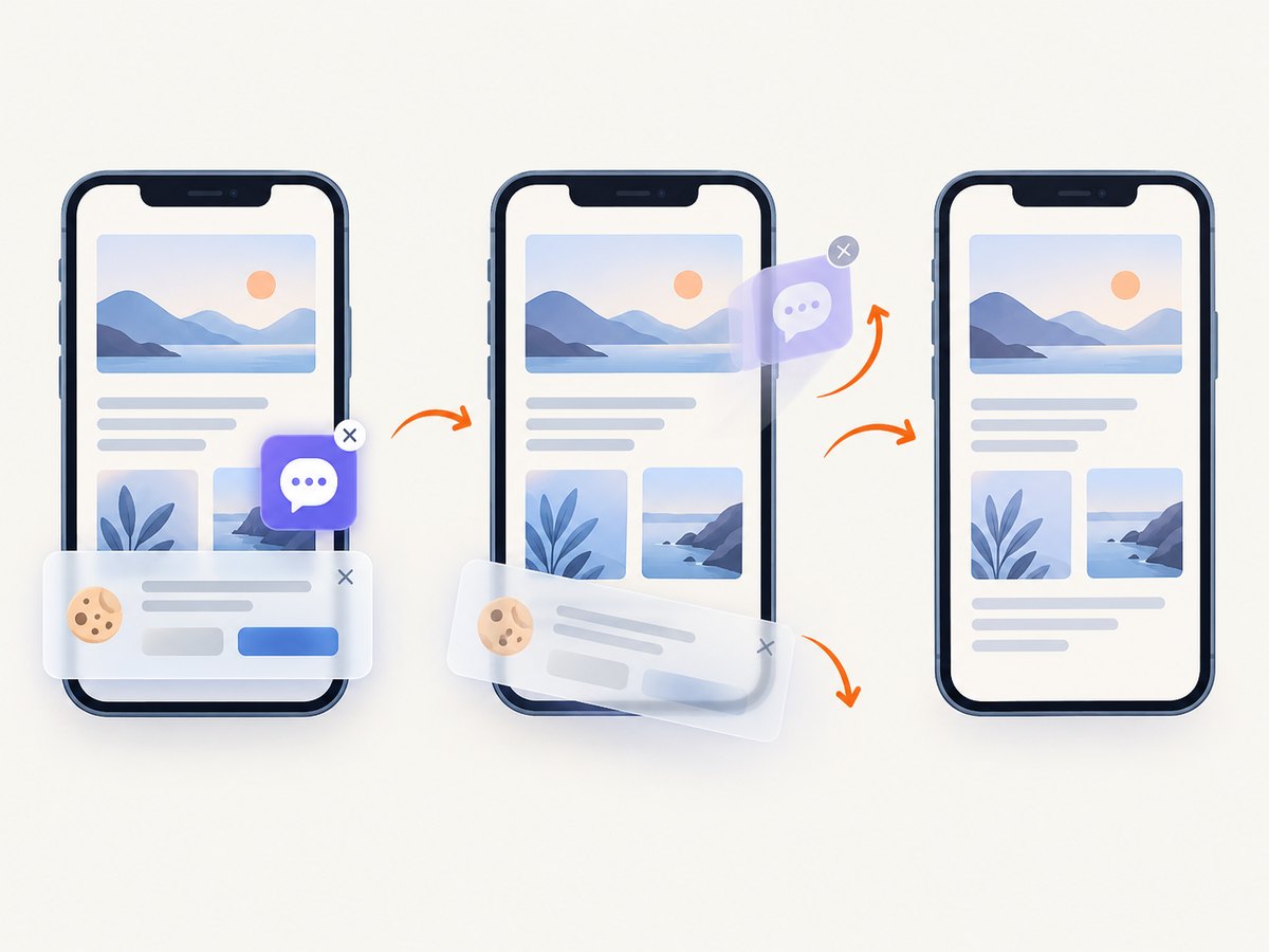
await import('node:fs/promises').then(fs => fs.writeFile('mobile.webp', buffer));ScreenshotNeo removes cookie and consent banners, newsletter popups, and chat widgets before capture; each cleanup step can be enabled or disabled. Bot checks, blank pages, timeouts, failed loads, and cache hits cost nothing, and the response reports the result in X-Page-Verdict and X-Billed headers. You can also capture one CSS-selected element, use dark mode, load lazy images for full-page shots, set a retina scale, add custom CSS or JavaScript, click before capture, wait for a selector or network idle, block ads and resource types, send headers, cookies, user agents, or Authorization, set timezone and geolocation, resize images, cache with a chosen TTL, create signed image links, run asynchronous jobs with signed webhooks, capture up to 100 URLs per bulk call, and read usage through the API. An MCP server provides take_screenshot, get_page_info, and capture_pdf tools for Claude, Cursor, and other MCP clients.
1,000 screenshots per month are free with no card. Paid plans start at $5 for 3,000. Create a free ScreenshotNeo account.
Handling consent banners, popups, and overlays
Overlays are one of the most common reasons a mobile screenshot is unusable. In Playwright, dismiss a known banner before capture:
const accept = page.getByRole('button', { name: /accept|agree/i });
if (await accept.isVisible().catch(() => false)) await accept.click();
await page.screenshot({ path: 'clean.png', fullPage: true });
For a large set of sites, a hosted cleaner is more consistent than maintaining selectors for every consent platform. Always inspect the result: a banner may be inside a shadow root, an iframe, or a region that appears only after a delay.
Troubleshooting
| Symptom | Likely cause | Fix |
|---|---|---|
| Blank or nearly blank image | Navigation failed, blocked request, or capture happened too early | Check the HTTP response, wait for a readiness selector, and inspect console errors |
| Cookie banner covers content | Consent state was not set | Click the consent control, set the required cookie, or use a cleaner |
| Images are missing | Lazy loading has not run | Scroll the page, wait for image completion, then capture |
| Desktop layout appears | Viewport or user agent was not applied | Set width and height before navigation and verify the emulation settings |
| Text uses a fallback font | Web font is still loading or blocked | Await document.fonts.ready and allow font requests |
| Full page is clipped | Fixed containers or nested scroll areas | Capture the scrolling element or remove the height constraint for the test |
| Animations differ between runs | Time-dependent animation or carousel | Disable motion, pause timers, or wait for a stable state |
| Authenticated page redirects | Missing cookies, headers, or storage state | Load a saved session or provide the required Authorization header |
| Request times out | Slow third-party resources or an unreachable host | Set a bounded timeout, block unnecessary resources, and retry idempotently |
Performance, reliability, and cost
- Reduce work: block analytics, ads, video, and unused fonts when they are irrelevant to the screenshot.
- Reuse browsers: keep one Playwright browser process and create isolated contexts per job.
- Control concurrency: too many Chromium pages can exhaust memory and make captures slower.
- Use caching: cache stable URLs with a documented TTL; invalidate after deployments.
- Make retries safe: retry network failures with backoff, but do not hide persistent 4xx errors.
- Record metadata: store URL, viewport, user agent, commit, timestamp, and output format beside each image.
- Budget by successful output: distinguish clean captures from bot checks, blank pages, timeouts, and failed loads when comparing providers.
A high device scale factor increases pixels, memory, upload size, and processing time. Use CSS scale for regression tests and device scale for high-resolution presentation. Full-page captures are usually more expensive operationally than viewport captures because they require extra layout, scrolling, and image work.
Security and privacy checklist
- Allow only approved destination hosts when URLs come from users.
- Do not place API keys in browser JavaScript or public image URLs unless using signed links.
- Redact credentials from logs and avoid recording private page HTML.
- Use a separate account or key for CI and rotate it periodically.
- Check whether regional content or proxy selection is required before treating a screenshot as a production result.
FAQ
Does a mobile screenshot prove a site works on a real phone?
No. It verifies a chosen emulated viewport and browser configuration. Test physical devices or mobile Safari when hardware, sensors, browser engine, or OS behavior matters.
What size should I use for an iPhone screenshot?
Use the dimensions required by your design or test. A documented iPhone 15 Pro style example is 393 × 852 CSS pixels; keep the dimensions and scale consistent for comparisons.
Should I choose PNG, JPEG, or WebP?
Choose PNG for lossless text and transparency, JPEG for broadly compatible photographs, and WebP for smaller modern web assets.
Why is full-page capture different from scrolling manually?
Full-page capture stitches the document beyond the viewport. Manual scrolling can trigger lazy content but may produce separate images and inconsistent scroll positions.
Can I capture a page that requires login?
Yes, when your capture environment supplies the required cookies, storage state, headers, or Authorization credentials. Never expose those credentials in client-side code.


