What Size Should a Website Post Thumbnail Be?
There’s no single thumbnail size for every website. Choose dimensions for the display slot, crop, device, and platform preview you need.
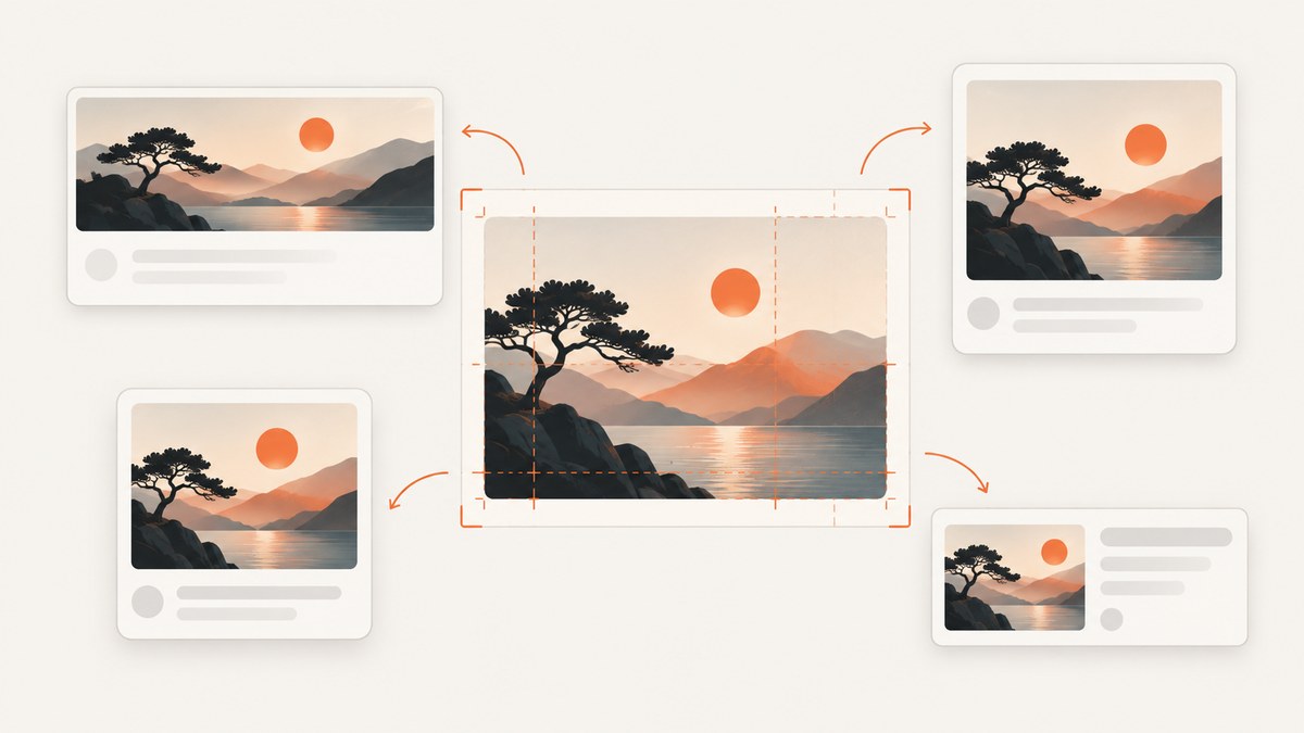
There is no single correct pixel size for every website post thumbnail. A small square image in a list, a landscape featured image above an article, and an image prepared for Google Discover are different uses with different constraints.
Start with the actual display slot in your site’s theme. Match the crop to that slot, provide enough pixels for its rendered size and screen density, and use responsive image delivery so mobile visitors do not have to download an unnecessarily large file. For WordPress, the default thumbnail is at most 150×150 pixels, but that default is not a universal featured-image recommendation. For Google Discover, Google recommends an image at least 1200 pixels wide, with more than 300,000 total pixels and a 16:9 ratio.
This guide explains how to choose dimensions, inspect a WordPress theme, prepare responsive images, and check how a page renders. Google and CMS settings can influence image selection and display, but neither a particular pixel size nor metadata guarantees a specific Google preview.
1. Identify what “thumbnail” means on your site
Before exporting or uploading an image, identify where visitors will see it. Websites use “thumbnail” for several distinct image roles:
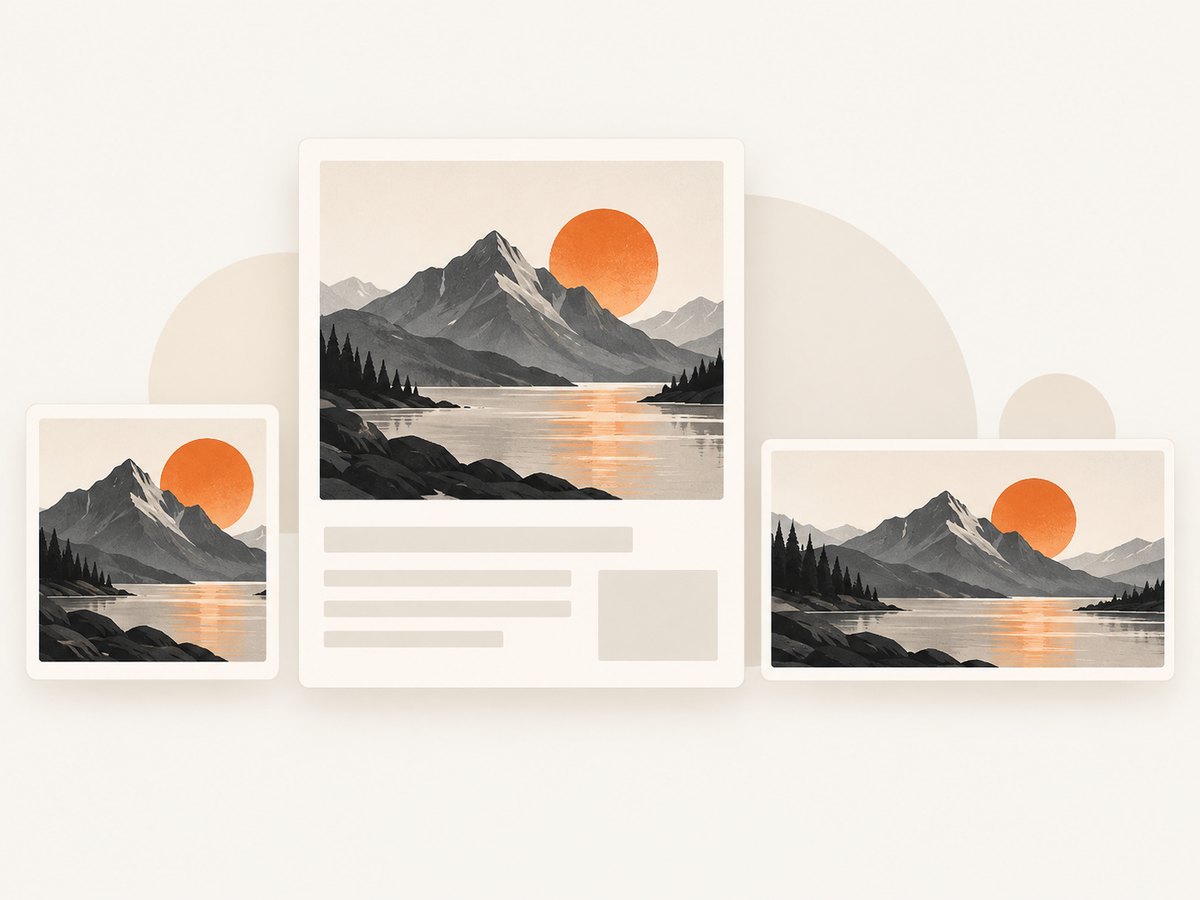
- Card or list thumbnail: A small image beside a title in an archive, category page, related-post list, or home page. It might be square, landscape, or a custom crop.
- Featured image or article hero: The main image representing a post. It may appear wide above the article, inside a card, or in multiple places with different crops.
- Search or social preview: An image that a search engine or social platform may select from page metadata and other signals. It can have separate size or ratio recommendations.
One original image can serve more than one role if the composition survives the crops and the site generates suitable derivatives. If a subject sits close to an edge, a square crop may cut it off even when the landscape hero looks right. Plan around the visible area and keep important details away from crop boundaries.
2. Choose dimensions from the rendered layout
Measure the maximum width at which the image appears in the page layout. Then account for the display density you need to support. As a practical starting point, a source image roughly twice the rendered CSS width can look sharp on a 2× density screen; responsive delivery should let lower-density or smaller screens select a smaller candidate. This is a sizing approach, not a platform-wide rule: check the page’s actual layout, crop, and available image derivatives.
Keep a consistent aspect ratio among images that appear in the same row or grid. Consistent crops help cards align; dimensions alone cannot compensate for a template that uses a different ratio, fixed height, or object-fit crop.
| Use | What to size for | What to verify |
|---|---|---|
| Compact card | The card’s rendered width and height, plus its crop ratio | Grid consistency and whether the subject survives the crop |
| Article featured image | The widest template slot where the image appears | Desktop and mobile rendering; whether the theme crops it |
| Google Discover candidate | At least 1200 px wide, more than 300,000 total pixels, 16:9 | Large-image preview eligibility and a representative image |
Shopify’s general suggestions are 1200×800 pixels for blog images and 300×300 pixels for thumbnails. These are Shopify suggestions, not universal rules: adapt them to the layout that actually displays the image. [Source: Shopify image size guidelines.]
3. WordPress image sizes: useful defaults, not a theme guarantee
WordPress documents these default image sizes:
| WordPress size | Default dimensions |
|---|---|
| Thumbnail | Maximum 150×150 px |
| Medium | Maximum 300×300 px |
| Medium Large | 768 px wide, no height limit |
| Large | Maximum 1024×1024 px |
These values describe WordPress defaults, not a required size for every featured image. Administrators can change image sizes, and themes can register custom sizes and control cropping. A theme may request a landscape derivative for a featured image while the default Thumbnail remains square. [Source: WordPress Theme Handbook: Featured Images & Post Thumbnails.]
How to check the active theme
- Open a representative post and an archive or category page. Note where the image appears and whether the displayed crop changes between templates.
- Inspect the image element in browser developer tools. Check its rendered width and height, the selected file URL, and whether the browser receives
srcsetandsizes. - Review the theme’s documentation or image settings for registered sizes and crop behavior. If you maintain the theme, search its code for image-size registration and the template that renders the post image.
- Upload a representative image and review the generated derivative at desktop and mobile widths. Confirm that the subject remains visible in each crop.
- If the theme’s settings do not match the layout, adjust the theme or its image-size configuration rather than treating the default 150×150 thumbnail as the featured-image size.
WordPress supports responsive images with srcset and sizes, which let the browser choose an available derivative based on viewport and display density. Themes may need to customize the default sizes value for unusual layouts. Check the generated markup and actual network request; uploading an image alone does not prove the browser selected the best candidate. [Source: WordPress Core: Responsive Images in WordPress 4.4.]
4. Google Discover and search previews are separate use cases
For Google Discover, Google recommends images that are at least 1200 pixels wide, have more than 300,000 total pixels, and use a 16:9 ratio. A 1280×720 image has 921,600 total pixels and meets those stated dimensions. Google also says to enable max-image-preview:large or use AMP for large image previews. These are Discover recommendations, not a general thumbnail standard or a guarantee of distribution.
Google may crop images automatically. If you prepare a 16:9 crop yourself, make sure the main subject and important details remain inside it. A page can signal preferred images through schema.org image properties or og:image, but Google selects previews automatically and may use multiple signals. Use a relevant, representative, high-resolution image; avoid generic logos and extreme aspect ratios. Metadata can inform selection but cannot guarantee the image Google displays. [Sources: Google Search Central: Get on Discover and Google Search Central: Google Images best practices.]
5. Serve the right crop without making pages heavier
A larger source can preserve detail, but it also increases the amount of image data if the browser downloads it. WordPress’s image guidance recommends fitting physical dimensions to the layout and notes that file size affects load time while resolution affects clarity. There is no universal byte limit that suits every thumbnail: image content, format, quality setting, network, and display size all matter. [Source: WordPress: Image sizes.]
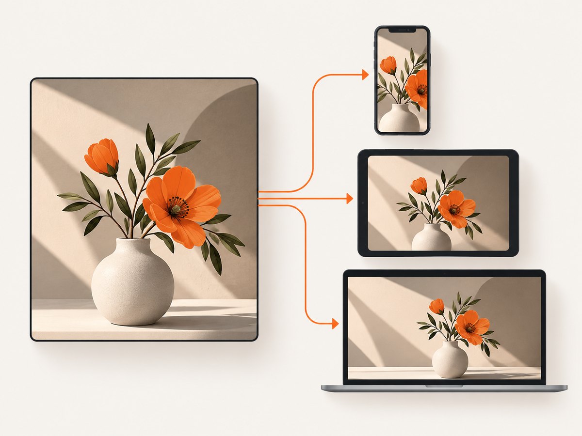
- Generate responsive derivatives: Provide multiple available widths and let
srcsetandsizesdescribe them accurately. - Compress and compare: Review the image at its real display size. Reduce file weight until compression artifacts or softness become visible, then choose an acceptable quality level.
- Choose a suitable format: Compare the formats your site supports for the image and delivery pipeline. Treat format and compression as a quality-versus-file-size decision rather than assuming one setting suits every image.
- Keep crops purposeful: Avoid serving a very wide original into a small square card if the theme can create an appropriate crop.
- Verify the browser’s choice: Inspect the selected source and transfer size on mobile and desktop. A correct source set can still use a poor
sizesdescription.
For WordPress specifically, inspect the generated image markup and the derivatives created after upload. If a theme’s rendered slot is wider or more unusual than its registered sizes, it may need a custom image size or corrected responsive-size metadata.
6. Check the image in the rendered page
When a thumbnail looks wrong, diagnose the output rather than guessing a new export size. The browser’s rendered slot, selected source, crop, and page preview settings are all part of the result.
Capture a repeatable page screenshot
A screenshot can help compare a card grid or hero at a fixed viewport before and after a theme change. For a local browser workflow, open the page in your browser, set a consistent viewport, and capture it with your browser’s screenshot facility or a browser automation tool already in your project. Check both the card crop and the full article image. This validates the visible result; it does not establish which image Google will select.
For automated checks, make the target page and viewport explicit, wait for the page content and images to finish loading, and capture the same state each time. If the page depends on consent banners, delayed content, or lazy-loaded images, account for those conditions so the comparison is meaningful.
Or skip the browser setup
ScreenshotNeo is a website screenshot API and MCP server. One GET request can return an image or PDF, which is useful for checking how a post image renders at a chosen URL. See the API documentation for request options.
curl -G "https://api.screenshotneo.com/v1/shot" -d access_key=YOUR_API_KEY --data-urlencode url=https://example.com/blog/post -o shot.webpimport requests
r = requests.get(
"https://api.screenshotneo.com/v1/shot",
params={"access_key": "YOUR_API_KEY", "url": "https://example.com/blog/post"},
timeout=90,
)
open("shot.webp", "wb").write(r.content)const q = new URLSearchParams({
access_key: 'YOUR_API_KEY',
url: 'https://example.com/blog/post'
});
const res = await fetch(`https://api.screenshotneo.com/v1/shot?${q}`);
if (!res.ok) throw new Error(`Screenshot request failed: ${res.status}`);
const fs = await import('node:fs/promises');
await fs.writeFile('shot.webp', Buffer.from(await res.arrayBuffer()));With ScreenshotNeo, cookie banners are accepted and 60+ known consent platforms, newsletter popups, and chat widgets are removed before the shot; each step can be turned off. Bot checks, blank pages, timeouts, failed loads, and cache hits cost nothing, and response headers report the page verdict and billing status. Its MCP server lets AI agents use take_screenshot, get_page_info, and capture_pdf. The free plan includes 1,000 screenshots a month with no card; paid plans start at $5 for 3,000. [Create a free ScreenshotNeo account](https://screenshotneo.com/account/sign-up/).
7. Troubleshooting common thumbnail problems
| Symptom | Likely cause | What to check or fix |
|---|---|---|
| Featured image looks tiny or blurry | The template selected a small derivative, or the source does not have enough pixels for the rendered slot. | Inspect the selected image URL and dimensions. Check registered theme sizes and responsive candidates; regenerate suitable derivatives if the theme configuration changed. |
| Card crops off a face or important detail | The theme uses a fixed crop or a different aspect ratio from the source composition. | Check the template’s crop behavior. Reframe the source with more margin or provide a crop designed for that card. |
| Mobile downloads an unnecessarily large image | The sizes value may describe the image as wider than the mobile slot, or there may be too few responsive candidates. |
Inspect srcset, sizes, and the selected network request on a narrow viewport. Correct the theme’s size description or provide suitable derivatives. |
| New custom dimensions do not appear | The active theme or plugin may not have generated the requested size for existing uploads. | Confirm the size is registered and used by the template. Generate the missing derivatives using your site’s established media workflow, then verify the new file exists. |
| Google Discover does not show the intended image | Google chooses previews automatically; dimensions and metadata do not guarantee a particular selection or Discover appearance. | Use a representative image, meet Discover’s large-image recommendation, permit large previews, and verify image metadata. Do not treat a missing preview as proof that one pixel dimension is universally wrong. |
| Image looks soft after compression | The quality setting or chosen format may be too aggressive for detailed content. | Compare the compressed result at its rendered size. Increase quality or choose a more suitable format, then compare clarity against transferred file weight. |
8. A practical checklist
- Identify whether the image is a card thumbnail, featured image, or search/social preview.
- Measure the widest actual display slot and note its crop ratio at mobile and desktop widths.
- Check the theme’s image sizes and crop behavior; do not assume the WordPress 150×150 default controls the featured image.
- For Discover, prepare a 16:9 image at least 1200 pixels wide with more than 300,000 total pixels, and allow large image previews.
- Keep the composition safe for automatic crops and make the image representative of the page.
- Serve responsive candidates, then verify the browser-selected source and file weight at relevant viewports.
- Review the rendered page after changing theme settings or image derivatives.
FAQ
Is 1200×800 a universal blog thumbnail size?
No. Shopify suggests 1200×800 for blog images, but a site should match its own layout and responsive behavior. Google Discover has a separate 16:9 recommendation.
Is WordPress’s 150×150 thumbnail right for a featured image?
Not necessarily. It is WordPress’s default maximum thumbnail size. Themes can register custom featured-image sizes and choose different crop behavior.
Will setting og:image force Google to show that image?
No. It is one signal for preferred images. Google selects previews automatically and can crop them.
Should every card use a square image?
No. Use the ratio that fits the card design, and keep images consistent within the same grid. A square crop can cut off a subject composed for a landscape frame.
Can one image serve the card and article hero?
Often, if the subject remains clear across both crops and the site serves derivatives suited to each slot. Inspect both rendered uses before settling on a single composition.


