Website Screenshots on Different Devices
Preview and capture a website at mobile, tablet, and desktop sizes with Chrome or Edge DevTools. Learn when emulation is enough and when to test on real hardware.
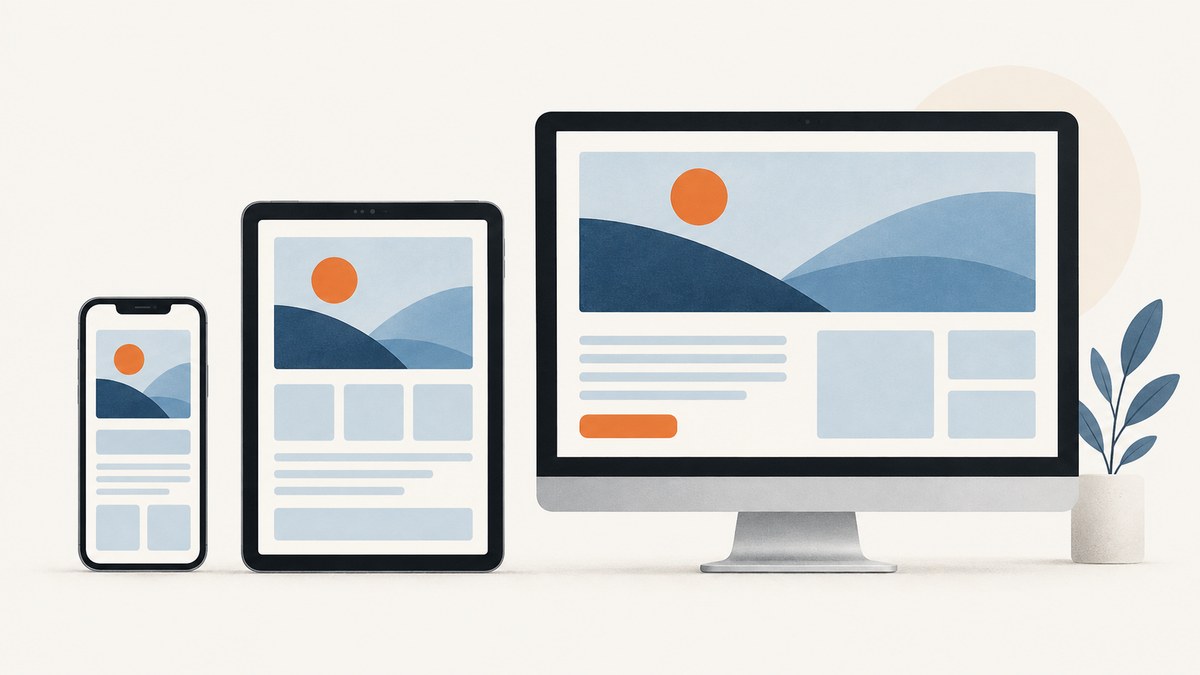
To take website screenshots at different device sizes, use your browser’s developer tools to set a responsive viewport, then capture the visible viewport or the full page. In Chrome, open DevTools, turn on Device Mode, choose a device preset or enter custom dimensions, and use More options → Capture screenshot. Choose Capture a full size screenshot when you need content below the visible area. Edge has a similar Device Emulation workflow. These browser tools are enough for most quick responsive checks; they emulate a desktop browser and do not reproduce every behavior of a real phone.
This guide walks through Chrome and Edge, explains how to test breakpoints and page length, covers emulation’s limits, and gives a repeatable workflow for comparing captures. If you need automated screenshots without setting up a browser each time, there is also a one-request ScreenshotNeo option below.
1. Capture a website at multiple sizes in Chrome
- Open the page you want to inspect in Chrome.
- Open DevTools with F12 or Ctrl+Shift+I on Windows/Linux. On macOS, use Option+Command+I.
- Turn on Device Mode using the phone-and-tablet icon in the DevTools toolbar, or press Ctrl+Shift+M (Windows/Linux) or Command+Shift+M (macOS).
- In the device toolbar, choose Responsive to enter dimensions yourself, or select a device profile. Drag the viewport edges or type the width and height you want.
- Wait for the page to finish loading and inspect its layout. Use the toolbar’s rotate control to switch orientation when relevant.
- Open the DevTools More options menu and choose Capture screenshot for the current viewport. Choose Capture a full size screenshot to include the page below the fold.
- Repeat at the other sizes you need, keeping the page state and capture type consistent so the screenshots are comparable.
Chrome documents responsive width presets including Mobile S (320 px), Mobile M (375 px), Mobile L (425 px), Tablet (768 px), Laptop (1024 px), Laptop L (1440 px), and 4K (2560 px). These are convenient starting points, not a universal device standard or proof that a particular audience uses those sizes. You can also add a custom device profile if the dimensions you need are missing. Chrome Device Mode documentation · Chrome custom device documentation.
Viewport screenshot or full-page screenshot?
| Capture | What it includes | Useful for |
|---|---|---|
| Viewport | The area currently visible inside the emulated browser viewport | Comparing the initial layout, navigation, hero, or above-the-fold content |
| Full size | The full scrollable page, including content below the fold | Reviewing long landing pages, footer layout, or lower-page overflow |
Use the same capture type at each size. A viewport capture and a full-page capture answer different questions, so comparing one of each can make a layout change look more significant or less significant than it is.
2. Capture at different sizes in Microsoft Edge
Edge DevTools provides Device Emulation for responsive inspection. Open DevTools, enable device emulation from its toolbar, and enter responsive viewport dimensions or choose a device. You can inspect breakpoints, rotate the viewport, and capture either the visible area or the full page. The exact menu wording can vary by version, but the core sequence is the same: set the emulated viewport, let the page render, then use the screenshot command. See Microsoft’s Edge Device Emulation guide.
If your goal is to check a CSS layout, Edge and Chrome can both give you repeatable viewport sizes without requiring a separate screenshot service. If a bug appears only on an actual device, emulation alone cannot confirm or rule it out; use the real-device check described below.
3. Choose useful viewport sizes and test breakpoints
Named device presets help you get started, but responsive layouts change at the breakpoints defined by the site’s CSS. A page might transition at a width between two presets, so test the transition itself instead of checking only one “mobile” and one “desktop” size.
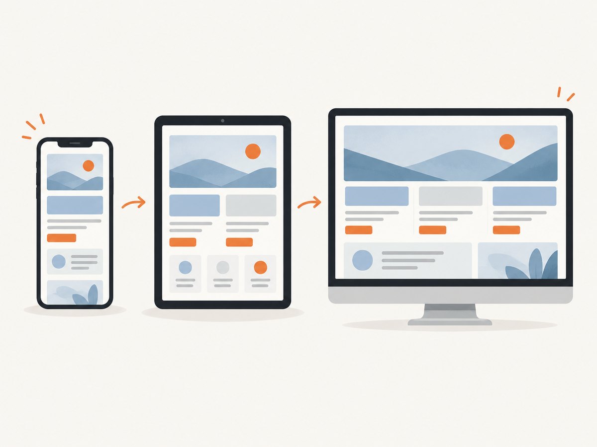
- In Device Mode, open the media-query display above the page. Chrome shows bars for max-width and min-width media queries.
- Click a query bar to set the viewport near that breakpoint, and inspect the associated CSS declaration when needed.
- Capture just below the breakpoint, at the breakpoint, and just above it. For a breakpoint at 768 px, for example, inspect widths around 767, 768, and 769 px if those are the exact values used by the CSS.
- Look for navigation changes, columns collapsing, text wrapping, horizontal overflow, image cropping, and controls moving or becoming obscured.
The breakpoint values belong to the page’s styles; the browser’s device presets do not define them. If you are testing a layout you do not control, use the media-query display to discover the active transitions rather than assuming standard phone or tablet widths.
A practical size matrix
| Purpose | Starting point | What to inspect |
|---|---|---|
| Narrow mobile | 320 px preset or the site’s smallest supported width | Clipped content, cramped controls, horizontal scrolling |
| Common mobile check | 375–425 px presets | Navigation, text wrapping, cards and image proportions |
| Tablet range | 768 px preset and nearby widths | Column transitions, tablet navigation and spacing |
| Desktop transition | 1024 px and around the site’s breakpoint | Sidebar, grid, max-width and menu changes |
| Wide desktop | 1440 px or the intended large viewport | Excessive line length, stretched layouts and whitespace |
Treat this as a useful checklist, not as a claim that these widths cover every device. Add widths based on your application’s supported range, CSS breakpoints, and the bug you are investigating.
4. Make the screenshots comparable
Viewport width alone does not guarantee that two screenshots show the same state. A responsive page can load different content, show a consent prompt, or change after a delay. For a meaningful visual comparison, keep the following conditions steady:
- Use the same URL and page state, including the same logged-in or logged-out state.
- Use the same browser and browser zoom level.
- Wait for fonts, images, and layout shifts to settle before capturing.
- Keep scrolling position consistent for viewport captures.
- Record viewport width and height alongside each file; a filename such as
pricing-375x812.pngis more useful thanscreenshot2.png. - Capture full-page images for whole-page review, but remember that extremely long pages create tall images that can be awkward to compare.
A small set of deliberate captures is often more useful than many arbitrary sizes: the narrowest supported width, one representative mobile width, the tablet transition, the desktop transition, and a wide desktop width. Add a capture on either side of any breakpoint where the layout behaves unexpectedly.
5. What device emulation can and cannot tell you
Device Mode renders the page in an emulated desktop-browser viewport. It is useful for checking responsive CSS, but it does not mean the page ran on a physical phone. Chrome describes Device Mode as an approximation of mobile appearance and performance; some hardware differences, including mobile CPU architecture, cannot be simulated. Microsoft gives the same practical caveat for Edge Device Emulation. When those differences matter, inspect the page on an actual device. Chrome’s guidance on Device Mode · Edge’s guidance on Device Emulation.
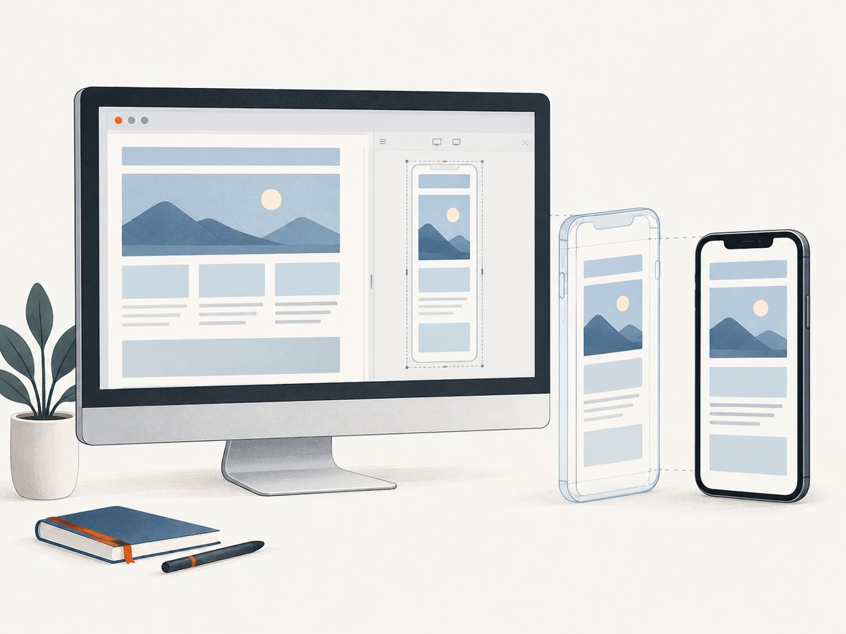
Emulation is usually a good first step for visual layout questions: does the menu collapse, do columns stack, or does an element overflow at a given CSS width? Real hardware is the right follow-up when the question involves actual device performance, mobile browser behavior, touch interactions, or a bug that does not reproduce in emulation. A screenshot alone does not establish that every interaction works.
Connect DevTools to a real Android device when needed
Chrome supports Remote Debugging to connect desktop DevTools to a page running on Android. This lets you inspect the real device’s page while retaining the desktop debugging interface. Follow the current steps in Chrome’s Remote Debugging documentation. Physical hardware is optional for ordinary screenshot capture; use it when the approximation cannot answer the question you have.
6. Troubleshooting common capture problems
| Problem | Likely cause | What to try |
|---|---|---|
| Device toolbar is missing | Device Mode is not enabled, or the DevTools toolbar is narrow | Toggle the phone/tablet icon in DevTools. Widen DevTools or open its overflow menu to find hidden controls. |
| The screenshot has the wrong dimensions | The viewport was set after the page was captured, or the capture command selected a different mode | Set width and height first, confirm the toolbar values, then capture. Check whether you chose viewport or full size. |
| Content is missing below the fold | A viewport capture was taken | Use the full-size screenshot command. For unusually long or dynamically loaded pages, scroll through the page first and confirm that lazy content has loaded. |
| Images or fonts look incomplete | Resources have not finished loading, or the page loads them only when scrolled into view | Wait for the initial load, scroll the page to trigger lazy content, return to the desired position, and capture again. |
| A breakpoint seems inconsistent | The viewport is on one side of a CSS threshold, or browser zoom affects the effective layout width | Check the media-query display, reset zoom to 100%, and capture widths just below and above the threshold. |
| Layout differs from a phone | Emulation does not reproduce all real-device hardware and browser behavior | Use a physical device or Chrome Remote Debugging for Android when the discrepancy concerns actual device behavior. |
| Screenshot menu is hard to find | DevTools menus move between browser versions | Open DevTools’ More options menu and look for the Capture screenshot or full-size capture command after enabling Device Mode. |
7. Automate captures with ScreenshotNeo
For a one-off responsive check, browser DevTools are free and avoid a separate service. For repeatable captures in a script, build pipeline, or batch workflow, ScreenshotNeo provides a website screenshot API and MCP server. Its API takes a URL and returns an image or PDF. You can set a viewport for each request, so capture the same page at several widths by making one request per size. The supported parameters and examples are in the ScreenshotNeo API documentation.
Or skip the browser setup
Make a single GET request with your API key and target URL. The example saves a WebP response as a file:
curl -G "https://api.screenshotneo.com/v1/shot" -d access_key=YOUR_API_KEY --data-urlencode url=https://stripe.com -o shot.webpCookie banners are accepted before capture, and 60+ known consent platforms, newsletter popups, and chat widgets can be removed; each cleanup step can be turned off. Bot checks and CAPTCHAs, blank pages, timeouts, failed loads, and cache hits are not billed, and the response identifies the page verdict and billing status in headers. An MCP server exposes take_screenshot, get_page_info, and capture_pdf to Claude, Cursor, and other MCP clients. The free plan includes 1,000 screenshots per month with no card; paid plans start at $5 for 3,000 screenshots.
Sign up for 1,000 free screenshots a month, with no card required.
Python example
Install the dependency with python -m pip install requests, then save this as a Python script and run it. Replace the API key and URL. Check the response status before treating the body as an image; an HTTP error response should not be saved as a valid screenshot.
import requests

params = {
    "access_key": "YOUR_API_KEY",
    "url": "https://stripe.com",
    "width": 375,
    "height": 812,
    "format": "webp",
}
response = requests.get(
    "https://api.screenshotneo.com/v1/shot",
    params=params,
    timeout=90,
)
response.raise_for_status()
with open("stripe-375x812.webp", "wb") as image_file:
    image_file.write(response.content)
The request sets a mobile-sized viewport. To capture tablet and desktop versions, change width and height and write each response to a distinct filename. Check the docs for the API’s accepted option names if you need to select an output format or additional capture behavior.
Node.js example
This example uses the built-in fetch available in modern Node.js versions. It checks the status before writing the response bytes:
import { writeFile } from 'node:fs/promises';

const q = new URLSearchParams({
  access_key: 'YOUR_API_KEY',
  url: 'https://stripe.com',
  width: '375',
  height: '812',
  format: 'webp',
});
const res = await fetch(`https://api.screenshotneo.com/v1/shot?${q}`);
if (!res.ok) {
  throw new Error(`Screenshot request failed: ${res.status} ${await res.text()}`);
}
await writeFile('stripe-375x812.webp', Buffer.from(await res.arrayBuffer()));
Use a different viewport for each request when you need a device comparison. Keep the API key in an environment variable or secret manager in production rather than committing it to source control. See the API docs for the current request options, output types, and response headers.
8. Options for repeatable responsive captures
ScreenshotNeo supports viewport dimensions, 12 device presets, full-page capture with lazy images loaded, retina scale, and capture of a single element by CSS selector. For pages that need controlled rendering, options include dark mode, custom CSS or JavaScript, clicking an element before capture, hiding selectors, waiting for a selector, a delay or network idle, and blocking ads, trackers, requests, or resource types. Custom headers, cookies, user agent, and Authorization are available for pages that require a specific session or request context. Consult the documentation for exact parameter names and supported values.
For a viewport comparison, specify the same page and change only the viewport or device preset between captures. For a full-page comparison, use full-page capture so below-the-fold sections are included. If a specific component is under review, capture it by CSS selector to avoid unrelated page content. If you are capturing private or authenticated pages, supply the necessary request context carefully and do not expose credentials in public code or URLs.
Other available capabilities include PNG, JPEG, and WebP output, PDF output with paper size, margins, orientation, and page ranges, HTML/CSS-to-image capture, image resizing, transparent backgrounds, chosen cache TTL, signed links for public image tags, asynchronous jobs with signed webhooks, up to 100 URLs per bulk call, a usage API, and an OpenAPI spec. ScreenshotNeo accepts parameter names used by other screenshot APIs to make migration easier. Choose only options needed for the capture, and verify details in the docs rather than assuming a parameter name from another service has identical behavior.
9. Performance, reliability, and cost
Local DevTools are the fastest path for an occasional manual preview because you can set dimensions and capture in the browser you already use. Automated capture adds a network request and depends on the target page loading; pages with heavy scripts, delayed content, or bot checks can take longer or fail to produce useful output. For repeatable jobs, wait for a page-specific selector or an appropriate load condition rather than relying on an arbitrary short delay. Keep timeouts long enough for the pages you capture, and treat an error or a non-image response as a failed job instead of silently storing it as a screenshot.
For ScreenshotNeo, only clean shots are billed. Bot checks or CAPTCHAs, blank pages, timeouts, failed loads, and cache hits cost nothing; response headers report the page verdict and whether the request was billed. Caching with a chosen TTL can reduce repeated work when the source page has not changed. Bulk capture supports up to 100 URLs per call, while asynchronous jobs and signed webhooks are available for work that should not block a single request. These options address different workflows; check the API docs for implementation details.
| Plan | Monthly shots | Price |
|---|---|---|
| Free | 1,000 | $0, no card |
| Starter | 3,000 | $5 |
| Growth | 15,000 | $15 |
| Pro | 60,000 | $39 |
| Scale | 250,000 | $99 |
| Business | 1,000,000 | $249 |
Yearly billing gives two months free, and every feature is available on every plan. If you only need a handful of manual responsive checks, DevTools has no service charge. If you automate captures, estimate the monthly number of successful shots and choose a plan accordingly; the free allowance lets you start without a card.
10. Frequently asked questions
Can I take a website screenshot without installing an extension?
Yes. Chrome and Edge include device emulation and screenshot commands in DevTools. Set the viewport, then capture the visible region or the full page.
Does a screenshot prove the site works on an iPhone or Android phone?
No. An emulated screenshot is useful for responsive appearance, but it does not reproduce every real-device behavior or hardware difference. Test on hardware when those differences matter.
Should I use a named device preset or custom dimensions?
Use a preset for a quick starting point and custom dimensions when checking a known viewport, a project requirement, or a CSS breakpoint.
Can I capture several sizes automatically?
Yes. Use a script to send one screenshot request for each viewport, or use a screenshot API that accepts viewport options. Save each output with its dimensions so the results remain identifiable.
What is the difference between a device screenshot and a responsive screenshot?
In DevTools, both may refer to a capture made after setting an emulated viewport. The result is a browser rendering at those dimensions; it is not necessarily a screenshot taken on the named physical device.


