How to Choose the Right Website Slider Image Size
Choose slider image dimensions from the rendered frame, breakpoints and crop—not a universal preset. Learn responsive sizing, mobile crops and layout stability.
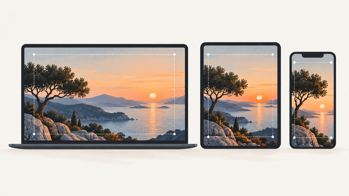
There is no single standard pixel size for every website slider. Choose image dimensions from the slider’s rendered frame, its aspect ratio at each breakpoint, the crop you can accept, and the sharpness needed for high-density screens. Then provide responsive image candidates so the browser can choose one that fits. Use a different mobile crop only when the composition genuinely needs to change.
For example, a slider that renders 1200 CSS pixels wide may need a source around 1200 pixels wide for a standard-density display or around 2400 pixels wide for a 2× display, subject to your byte budget and image quality. Those are calculations for that slot, not universal slider presets.
1. Measure the slider before choosing dimensions
Start with the actual image frame, not the original photo’s dimensions or a size copied from another site. Measure the frame at the breakpoints your layout supports—at minimum desktop and mobile, and tablet if its layout differs. Record its width and height, then calculate the ratio as width ÷ height.
| Rendered frame | Example ratio | What to check |
|---|---|---|
| Desktop | 1440 × 560 ≈ 2.57:1 | Does the frame remain wide at the largest viewport? |
| Tablet | 900 × 500 = 1.8:1 | Does the layout change the image height or crop? |
| Mobile | 390 × 520 = 0.75:1 | Does a wide image still communicate the subject? |
The figures are examples only. Your measured container determines your target. A slider may keep one ratio at every width, use a fixed-height hero that changes its ratio, or switch to a different mobile crop. WordPress advises against a fixed height unless the design needs one, since fixed heights can make images harder to control across screen sizes. See the WordPress image settings guidance.
Measure the rendered slot
- Open the page at each target viewport width in browser developer tools.
- Inspect the image frame, not just the image file, and note its CSS-pixel width and height.
- Check whether the image fills a fixed-height region, follows its intrinsic ratio, or is cropped by its parent.
- Repeat after relevant layout changes, such as a navigation bar wrapping or a side panel appearing.
The sizes attribute should describe the width the image actually occupies. A value that assumes the image fills the viewport when it sits in a narrower content column can make the browser download a needlessly large candidate.
2. Decide whether the image may be cropped
Choose the fit behavior before exporting crops. With object-fit: cover, the image fills the frame and excess edges are clipped. With object-fit: contain, the complete image remains visible, but unused space can appear when the image and frame have different ratios.
- Use
coverfor decorative photography or backgrounds where filling the frame matters and edge cropping is safe. - Use
containwhen viewers must see the whole image, such as a diagram or a product image where clipped details would mislead. - Set a focal point when cropping is allowed but the subject must remain visible. Check that point at every breakpoint, because a subject near an edge can disappear on a narrow crop.
With CSS, object-position sets the visible focal area. A content system may offer a focal-point control when generating crops; WordPress documents these options along with its image behavior in its image settings documentation.
.slider-frame {
  aspect-ratio: 16 / 7;
  overflow: hidden;
}

.slider-frame img {
  display: block;
  width: 100%;
  height: 100%;
  object-fit: cover;
  object-position: 62% 42%; /* adjust for the subject */
}

@media (max-width: 600px) {
  .slider-frame {
    aspect-ratio: 4 / 5;
  }
}
This example makes the frame taller on mobile while using the same source. That may work when the source has enough vertical content around its subject. If it does not, use a purpose-made mobile crop with <picture>, shown below.
3. Create responsive candidates for the slot
Do not send one very large image to every device. Create width variants that cover the real slot sizes, then give the browser their URLs with srcset and describe the slot with sizes. The browser uses this information, its viewport and device pixel ratio to select a candidate. The web.dev responsive images guide explains width descriptors and the role of sizes; web.dev recommends considering display size, resolution and layout when choosing an image.
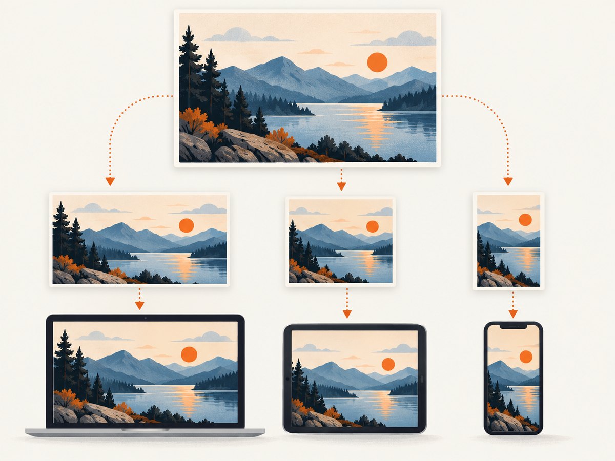
For a frame that can be 100vw up to 1200 CSS pixels, a useful starting set could be 480, 800, 1200, 1600 and 2400 pixels wide. These are candidate widths, not a required set. Keep candidates that serve real layout and density combinations; avoid generating dozens of near-identical files without a reason.
<img
  src="/images/slider-1200.webp"
  srcset="
    /images/slider-480.webp 480w,
    /images/slider-800.webp 800w,
    /images/slider-1200.webp 1200w,
    /images/slider-1600.webp 1600w,
    /images/slider-2400.webp 2400w
  "
  sizes="(max-width: 1200px) 100vw, 1200px"
  width="1200"
  height="525"
  alt="A climber looking toward a mountain ridge at sunrise"
>
The width and height attributes describe the source’s intrinsic ratio. The browser uses that ratio to reserve space even when a different srcset candidate is selected. The sizes expression above is correct only if the image really fills the viewport below 1200px and is capped at 1200px above it. If the slider sits inside a 900px content column, describe that layout instead.
For a fixed-width content area with a 900px maximum, for example:
sizes="(max-width: 940px) calc(100vw - 40px), 900px"The 40px accounts for 20px of horizontal space on each side in this example. Replace the values with your actual gutters and maximum width. A false sizes value can lead to oversized downloads or soft-looking images; inspect the candidate the browser chose in the developer tools Network panel.
Estimate the largest useful source
For each breakpoint, multiply the largest rendered CSS width by the target device pixel ratio. A 1200px slot at 2× density points to a source around 2400px wide. Then consider practical limits: a slider may be viewed mostly on standard-density screens, the source may already be sharp enough, or the image’s byte size may be too costly. Select candidates that cover likely combinations instead of exporting every mathematical possibility.
For a responsive layout, a candidate set might include a width near the mobile slot, one or two intermediate widths, the largest desktop slot, and a higher-density candidate if it is justified. Check actual selection on representative viewport and density settings.
4. Use a separate mobile crop when composition needs it
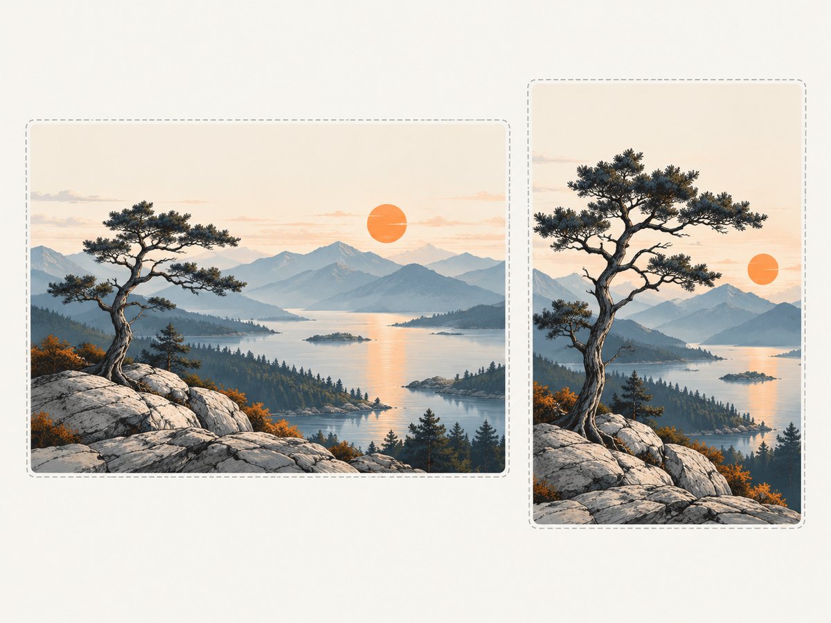
Keep one source and let it scale when the crop remains useful at all sizes. Use art direction when mobile calls for a meaningfully different composition: for example, the wide shot places a person close to the edge, or the subject is too small when a landscape frame is cropped into portrait shape. The HTML <picture> element lets you offer a breakpoint-specific source while retaining a fallback image. See web.dev’s art direction guidance.
<picture>
  <source
    media="(max-width: 600px)"
    srcset="
      /images/slider-mobile-480.webp 480w,
      /images/slider-mobile-800.webp 800w
    "
    sizes="100vw"
  >
  <img
    src="/images/slider-wide-1200.webp"
    srcset="
      /images/slider-wide-800.webp 800w,
      /images/slider-wide-1200.webp 1200w,
      /images/slider-wide-2400.webp 2400w
    "
    sizes="(max-width: 1200px) 100vw, 1200px"
    width="1200"
    height="525"
    alt="A climber looking toward a mountain ridge at sunrise"
  >
</picture>
Export mobile and desktop assets with the intended crops baked in; the browser chooses the mobile source when the media condition matches. Keep meaningful alternative text on the fallback img, since that is the accessible image description. For a purely decorative slide, use an empty alt value.
5. Reserve space to prevent slider jumps
When an image loads into a frame with no known size, the page can shift as the browser discovers its height. Set intrinsic dimensions or reserve the frame with CSS aspect-ratio. You can use both: attributes help the browser infer the ratio from HTML, while CSS can express a breakpoint-specific frame. The web.dev guide to minimizing layout shifts covers image dimensions and layout stability.
<div class="slider-frame">
  <img
    src="/images/slider-1200.webp"
    width="1200"
    height="525"
    alt="A climber looking toward a mountain ridge at sunrise"
  >
</div>

<style>
  .slider-frame {
    aspect-ratio: 1200 / 525;
    overflow: hidden;
  }

  .slider-frame img {
    display: block;
    width: 100%;
    height: 100%;
    object-fit: cover;
  }
</style>
Make sure the declared width and height match the source asset’s intrinsic ratio, not the frame ratio, unless those are the same. If they disagree, the reserved area can be wrong or the image can distort, depending on your CSS. Test the first slide and later slides: a slider library may reserve space for the first image but shift when a differently shaped slide appears.
6. Check the delivered image and its cost
After implementing candidates, inspect the page at real breakpoints and on a high-density emulation. Confirm that the frame ratio, focal point, selected source and crop are all as intended. Compare the selected image’s intrinsic width with its rendered width and pixel density. If the browser repeatedly selects a much wider candidate than the slot requires, revisit sizes and the candidate list.
Responsive variants can reduce transferred bytes compared with delivering one oversized original to every device. The actual savings depend on the source, format, compression and selected candidate; no particular percentage applies to all sliders. Keep visual quality acceptable at the largest intended display, and account for the fact that a high-density candidate can be several times the pixel area of a 1× candidate.
If the site uses WordPress, it generates multiple image sizes and responsive markup, but the theme still needs an accurate sizes value for the real layout. See the WordPress responsive images documentation. Check the generated markup rather than assuming the CMS knows the slider’s final slot width.
7. Verify the slider visually at each breakpoint
- Load the page at desktop, tablet and mobile widths.
- Check the crop edges and subject focal point on every slide, not just the first.
- Inspect which image URL loaded and compare its dimensions with the slot and display density.
- Reload with network throttling or cache disabled to see whether the frame holds its space while images load.
- Check for distortion, empty bands, soft detail, unexpected cropping and layout movement.
A screenshot is useful for comparing the same frame across viewport sizes. You can capture a page or a particular state with a browser tool, or use ScreenshotNeo, a website screenshot API and MCP server. ScreenshotNeo can take screenshots at configured viewport sizes; its API options also include full-page capture, device presets and image output settings. See the ScreenshotNeo API documentation for request options.
Or skip the browser setup
One GET request returns a screenshot image or PDF. The example captures a reference page as WebP:
curl -G "https://api.screenshotneo.com/v1/shot" \
  -d access_key=YOUR_API_KEY \
  --data-urlencode url=https://stripe.com \
  -o shot.webp
ScreenshotNeo accepts cookie and consent banners like a visitor and removes more than 60 known consent platforms, newsletter popups and chat widgets before the shot; each step can be turned off. Bot checks, blank pages, timeouts, failed loads and cache hits cost nothing, and response headers say which page verdict and billing status applied. Its MCP server lets AI agents use take_screenshot, get_page_info and capture_pdf. The free plan includes 1,000 screenshots a month without a card; paid plans start at $5 for 3,000 shots. Every feature is on every plan. Find setup details in the API documentation, then sign up for 1,000 free screenshots a month, with no card.
Common problems and fixes
| Symptom | Likely cause | Fix |
|---|---|---|
| Image looks soft on a high-density screen | No candidate wide enough for the rendered width multiplied by device pixel ratio | Add a larger candidate if its quality and transfer cost are justified; inspect the selected URL. |
| Mobile subject is cut off | cover crops the edges, and the focal point is unsuitable for the narrow frame |
Adjust object-position, choose contain, or provide a mobile art-directed crop with picture. |
| Browser downloads an unexpectedly large file | sizes overstates the slot width or candidates are too widely spaced |
Describe the real content width and gutters in sizes; verify the chosen source in developer tools. |
| Slider changes height after load | No intrinsic dimensions or reserved frame ratio, or slides have inconsistent proportions | Add correct width/height and reserve the intended ratio; make each slide’s behavior explicit. |
| Image has blank bands around it | contain preserves the full image in a differently shaped frame |
Use cover if cropping is acceptable, or choose an asset with a matching ratio. |
| Image is stretched | CSS forces width and height without a fitting rule, or source dimensions are wrong | Use object-fit and correct intrinsic dimensions; avoid independently forcing both axes without a crop policy. |
| Wrong crop appears at mobile width | The picture media condition does not match the actual breakpoint or source markup is misconfigured |
Check the breakpoint in the rendered layout and inspect the selected image URL. |
FAQ
What image dimensions should a website slider use?
Measure the rendered frame and its largest width, then account for the target display density. Provide candidates around the useful slot widths rather than choosing one universal preset.
Should every slide have identical dimensions?
Consistent ratios simplify a stable slider frame. Different source dimensions can work, but decide explicitly how each one fits; otherwise slide changes may alter the frame or crop unpredictably.
Is a separate mobile image always necessary?
No. Keep the same composition when it remains legible and the subject survives the crop. Use a separate source when a deliberate change makes the mobile image clearer.
Should a slider image be lazy-loaded?
It depends on its position. A visible, prominent first slide is needed immediately; images farther down the page or later in a carousel may not be. Apply loading behavior according to when the image is likely to be needed, and check that it does not delay the initial visible image.


