Website Thumbnail Dimensions for Common Platforms
There is no universal website thumbnail size. Choose dimensions by placement, aspect ratio, crop behavior and platform guidance.
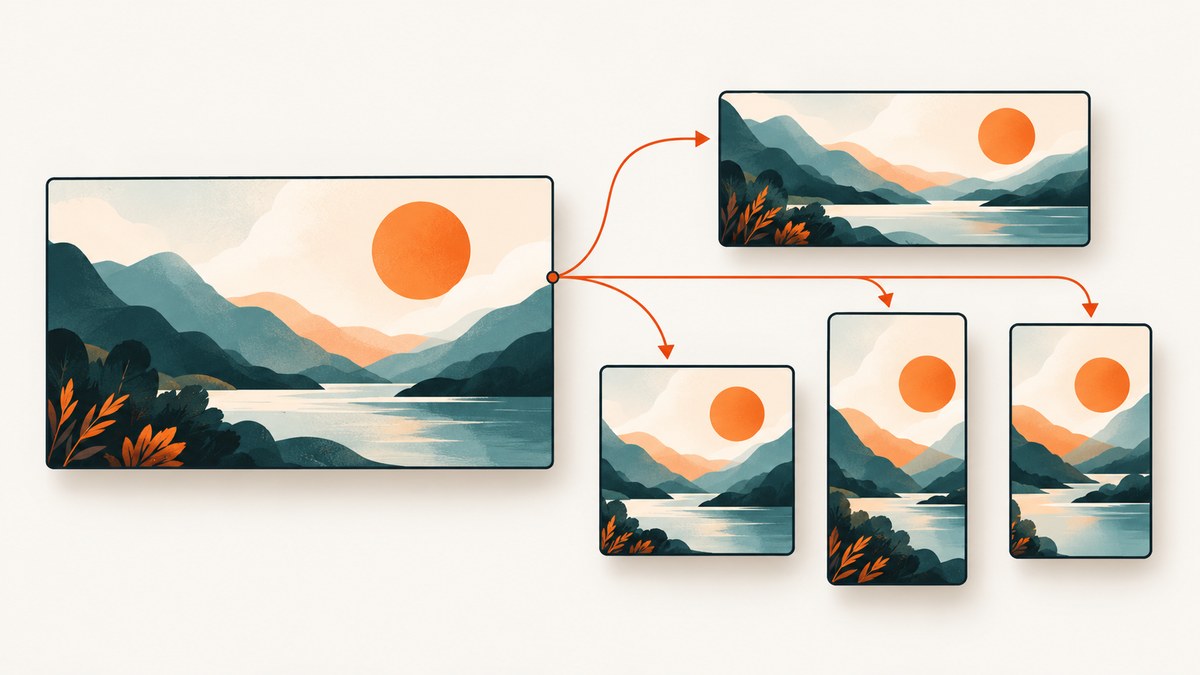
There is no single website thumbnail dimension that works everywhere. A website card, social link preview, YouTube video thumbnail, vertical video cover and Pinterest pin use different aspect ratios and cropping rules. Choose the destination and placement first, then export at that placement’s recommended size.
For current YouTube guidance, use 3840 × 2160 pixels (16:9) for a standard video thumbnail, with a minimum width of 640 pixels. YouTube recommends 2160 × 3840 (9:16) for Shorts thumbnails and a square image for podcast playlists. Google’s video-search documentation describes a separate minimum of 60 × 30 pixels for video thumbnails, while preferring larger images. That is an eligibility rule for Google video features, not a universal Open Graph size.
Quick reference: common thumbnail dimensions
| Platform or placement | Working export size | Ratio | How to use it |
|---|---|---|---|
| YouTube video | 3840 × 2160 px | 16:9 | Current YouTube Help recommendation for standard videos. |
| YouTube Shorts | 2160 × 3840 px | 9:16 | Vertical canvas; keep important content away from interface overlays. |
| Instagram feed, square | 1080 × 1080 px | 1:1 | Use only for square feed posts. |
| Instagram portrait feed | 1080 × 1350 px | 4:5 | A taller feed crop that occupies more mobile screen space. |
| Instagram Stories and Reels; TikTok video | 1080 × 1920 px | 9:16 | Reserve top and bottom areas for controls and captions. |
| Facebook link preview | About 1200 × 630 px | About 1.91:1 | A common working reference for link cards, not every Facebook placement. |
| X post image | About 1200 × 675 px | 16:9 | Confirm the crop for the post surface you target. |
| LinkedIn post image | About 1200 × 627 px | About 1.91:1 | Do not reuse this size for a page banner. |
| Pinterest standard pin | About 1000 × 1500 px | 2:3 | Tall pin shape; it is not a social link-preview ratio. |
The cross-platform values are practical starting points from secondary reference guides. They are not guaranteed current requirements for every placement. Before publishing, check the platform’s own help page, upload limits, safe areas and crop preview.
Start with the placement, not the pixel count
The phrase “website thumbnail” commonly describes several different jobs:
- Website card: a component in your own site. Its dimensions come from your CSS grid and responsive breakpoints.
- Open Graph or social link image: an image fetched from page metadata when somebody shares a URL. Many teams use roughly 1.91:1, such as 1200 × 630, but this is a common convention rather than a universal rule.
- Video thumbnail: a preview selected by a video platform. YouTube’s current recommendation is much larger than older 1280 × 720 tables.
- Vertical cover: a 9:16 image for Shorts, Stories, Reels or TikTok-style video.
- Search video thumbnail: an image Googlebot can fetch from your HTML, video sitemap, structured data or Open Graph metadata.
Write down the exact surface before designing: “YouTube standard video,” “mobile Instagram feed,” “article card at 320 pixels wide,” or “Google video result.” The answer determines ratio, resolution, file-size constraints and where overlays may appear.
Aspect ratio comes before resolution
Aspect ratio controls composition. A 16:9 image cannot be placed into a 9:16 slot without either cropping, letterboxing or extending the canvas. Design a master image with the subject near the center, then create deliberate crops for each ratio.
| Ratio | Typical use | Composition advice |
|---|---|---|
| 16:9 | YouTube videos, many web and social previews | Keep faces and product details inside the central safe area. |
| 1:1 | Square feed cards, podcast artwork | Use a compact focal point; edge details may disappear in responsive cards. |
| 4:5 | Portrait social feed | Place the main subject vertically, with breathing room above and below. |
| 9:16 | Shorts, Stories, Reels and vertical video | Leave space near the top and bottom for controls, captions and account information. |
| 2:3 | Pinterest standard pin | Build a tall visual sequence; avoid tiny details that are unreadable in feeds. |
YouTube thumbnail dimensions and exceptions
YouTube Help currently recommends 3840 × 2160 pixels for standard video thumbnails and a minimum width of 640 pixels. Older guides often repeat 1280 × 720; treat that as a legacy working size, not the current recommendation. For Shorts, YouTube describes a 2160 × 3840 vertical thumbnail. Podcast playlists use a square image.
There is a display exception for vertical videos: when a 16:9 thumbnail is supplied, YouTube may replace it with an automatically generated 4:5 thumbnail on Home, Explore and subscription pages. Keep essential faces, products and text away from the outer edges so an automatic crop remains understandable. YouTube also gives device-specific upload limits, so check the current upload dialog when a large file is rejected. See YouTube’s custom thumbnail guidance.
Google video thumbnails and crawlability
Google Search Central says a video must have a valid thumbnail image to be eligible for video features. Google documents a minimum of 60 × 30 pixels and says larger images are preferred. The thumbnail must be available to Googlebot and Googlebot Images.
Provide a stable, publicly fetchable URL through the metadata method that matches your implementation: an HTML video poster, a video sitemap, structured data or Open Graph. If you publish the same video in multiple places, keep the thumbnail URL consistent. A correctly sized local file still fails if robots rules, authentication, a temporary URL or a blocked CDN prevents Google from retrieving it. Read Google’s video SEO best practices for the eligibility details.
Build responsive website thumbnails
For your own site, CSS determines the rendered box while the image file determines available detail. Use a fixed ratio and let the image cover it:
.thumbnail {
  aspect-ratio: 16 / 9;
  overflow: hidden;
  border-radius: 12px;
}
.thumbnail img {
  width: 100%;
  height: 100%;
  object-fit: cover;
  object-position: 50% 50%;
  display: block;
}
Use object-fit: contain when the entire image must remain visible, such as a diagram or product screenshot. Supply responsive sources so a phone does not download a huge desktop asset:
<picture>
  <source media='(max-width: 640px)' srcset='/thumb-640.webp'>
  <source media='(max-width: 1200px)' srcset='/thumb-1200.webp'>
  <img src='/thumb-1920.webp' width='1920' height='1080' alt='Description of the page' loading='lazy'>
</picture>
Set intrinsic width and height to reserve space and reduce layout shift. Export WebP or JPEG for photographic artwork and PNG when transparency or sharp line art requires it. The right format depends on your image, not the platform name alone.
Create multiple crops from one source
- Design a high-resolution master with the subject inside a central safe area.
- Make separate 16:9, 1:1, 4:5, 9:16 and 2:3 crops where your distribution requires them.
- Preview each crop at the size users will see it. Small text that is readable in a 3840-pixel file can disappear in a 320-pixel card.
- Check overlays, buttons and browser chrome on the destination surface.
- Compress each export and confirm that metadata points to the intended file.
Do not stretch one ratio into another. Cropping preserves visual weight; distortion makes faces, products and interface screenshots look wrong.
Capture a website thumbnail programmatically
If the source is a live webpage, a browser screenshot gives you the rendered state instead of a static design file. A minimal Playwright example:
import { chromium } from 'playwright';

const browser = await chromium.launch();
const page = await browser.newPage({ viewport: { width: 1200, height: 630 }, deviceScaleFactor: 1 });
await page.goto('https://example.com', { waitUntil: 'networkidle' });
await page.screenshot({ path: 'thumbnail.png', fullPage: false });
await browser.close();
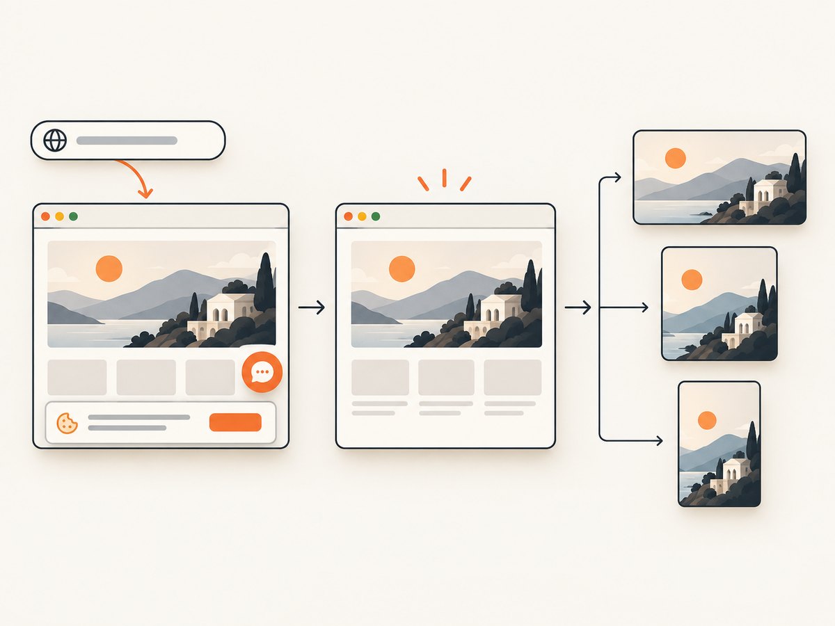
For a full-page source, capture the page first and then crop or resize into each platform ratio. Wait for lazy images, set a deterministic viewport, disable animations when necessary, and use a selector screenshot when only one card matters. A browser process also introduces operational work: dependency installation, sandbox permissions, timeouts, cookie banners, popups, bot checks and failed resources.
Or skip the browser setup
ScreenshotNeo provides a website screenshot API and MCP server. One GET request returns PNG, JPEG, WebP or PDF, and the documentation lists the options for sizing and capture control.
curl -G 'https://api.screenshotneo.com/v1/shot' -d access_key=YOUR_API_KEY --data-urlencode url=https://stripe.com -o shot.webpimport requests
r = requests.get('https://api.screenshotneo.com/v1/shot', params={'access_key': 'YOUR_API_KEY', 'url': 'https://stripe.com'}, timeout=90)
open('shot.webp', 'wb').write(r.content)const q = new URLSearchParams({ access_key: 'YOUR_API_KEY', url: 'https://stripe.com' });
const res = await fetch(`https://api.screenshotneo.com/v1/shot?${q}`);Set the viewport, device preset, retina scale, full-page mode or element selector to match the target placement. You can also apply custom CSS, hide selectors, click an element, wait for a selector, delay or network idle, and resize the output. Cookie banners, newsletter popups and chat widgets are removed before the shot; each step can be turned off. Bot checks, blank pages, timeouts, failed loads and cache hits cost nothing, and response headers identify the page verdict and whether the shot was billed. The MCP server lets Claude, Cursor and other MCP clients use take_screenshot, get_page_info and capture_pdf. Free accounts include 1,000 screenshots per month with no card; paid plans start at $5 for 3,000. Create a free ScreenshotNeo account.
Options that matter for thumbnail production
| Need | Useful setting |
|---|---|
| Exact social canvas | Custom viewport and output resize. |
| Retina artwork | Device preset or retina scale. |
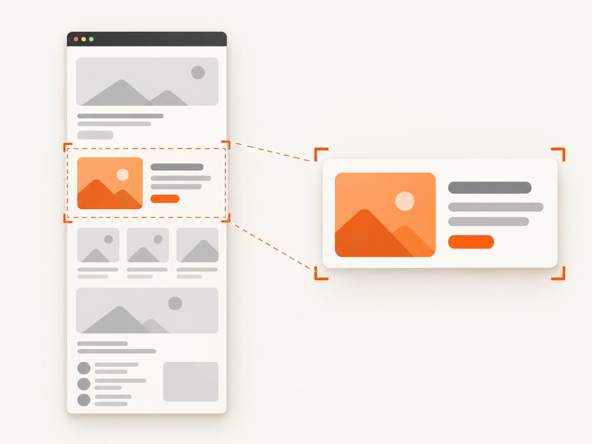
| Only the card | CSS selector element capture. |
| Page content below the fold | Full-page capture with lazy images loaded. |
| Personalized page | Custom headers, cookies, user agent or Authorization. |
| Regional rendering | Timezone and geolocation. |
| Clean composition | Hide selectors, custom CSS, popup and consent removal. |
| Repeated URLs | Caching with a TTL you choose. |
| Large batches | Bulk capture for up to 100 URLs per call, or async jobs with signed webhooks. |
Troubleshooting thumbnail problems
The platform crops the subject
Cause: the source ratio does not match the placement or the platform applies a mobile crop. Fix: export a placement-specific crop, move the focal point inward and preview the destination surface.
The image looks soft
Cause: the source is smaller than the rendered box, is repeatedly recompressed or is being enlarged by CSS. Fix: start from a larger master, export near the platform recommendation and avoid upscaling a small crop.
Text is unreadable on mobile
Cause: text was designed at desktop viewing size. Fix: test at the actual card width, shorten the wording and increase contrast.
Google does not show the thumbnail
Cause: the image is blocked from Googlebot, requires authentication, returns an error or is not connected through supported metadata. Fix: make the URL stable and crawlable, then validate the HTML, structured data and video sitemap.
The browser screenshot contains a cookie banner or chat bubble
Cause: the page is being captured before consent or widget cleanup. Fix: accept consent and hide known overlays in your automation, or use ScreenshotNeo’s consent and cleanup controls.
The capture times out
Cause: a page waits on a blocked request, never reaches network idle or triggers a bot check. Fix: use a selector wait or bounded delay, block unnecessary resources, inspect the verdict headers and retry only transient failures.
Performance, reliability and cost
For static assets, generate crops once and serve them through a CDN with long cache headers. For live screenshots, control concurrency so browser memory and origin rate limits do not become the bottleneck. Cache captures whose source has not changed; use a TTL that matches how often the page updates. Async jobs and signed webhooks help when a batch should not occupy a request for the whole render time.
Measure the complete path: page navigation, fonts and images, JavaScript execution, screenshot encoding, upload and downstream platform fetch. A smaller output can reduce transfer cost, but lowering dimensions below the destination’s useful resolution creates blur. With ScreenshotNeo, only clean shots are billed; failed loads, bot checks, blank pages, timeouts and cache hits are not billed, and the response reports the verdict and billing status.
Thumbnail checklist
- Name the exact platform and placement.
- Select the aspect ratio before choosing pixel dimensions.
- Use current primary guidance where available; label secondary tables as working references.
- Keep important content inside a safe area for crops and overlays.
- Export separate crops instead of stretching one image.
- Set intrinsic dimensions and responsive sources on your own site.
- Make Google video thumbnails stable and fetchable by Googlebot.
- For live pages, wait for lazy content and remove overlays before capture.
- Preview on mobile and at the smallest real display size.
FAQ
Is 1200 × 630 the universal website thumbnail size?
No. It is a common working size for roughly 1.91:1 link previews. Your site card, YouTube thumbnail or vertical video may need a different ratio.
Should I use 1280 × 720 or 3840 × 2160 for YouTube?
YouTube’s current Help guidance recommends 3840 × 2160 for standard video thumbnails. Older 1280 × 720 tables remain common, so follow the current platform guidance for your upload workflow.
What is the best file format?
Use WebP or JPEG for most photographic thumbnails and PNG when transparency or sharp line art requires it. Confirm the destination’s accepted formats and file-size limits.
Can one image serve every platform?
Only if you accept cropping or letterboxing. Separate ratio-specific exports produce more predictable results.
How do I make a thumbnail from a webpage without running Chromium?
Use a screenshot API such as ScreenshotNeo with a custom viewport, selector capture, resize and cleanup controls. The API also supports bulk and asynchronous capture for larger sets.


