Website Thumbnail Templates: Create Consistent Preview Images
Build a reusable website thumbnail template with consistent dimensions, readable type, and channel-specific exports. Learn how to verify previews and fix unwanted crops.
A consistent website thumbnail comes from a reusable template, a fixed aspect ratio, and predictable export settings. Choose the surface first, place one clear focal image inside safe margins, keep any label brief, and export named sizes for each destination. Then check the thumbnail at its actual display size and verify the page’s preview metadata.
This guide covers a repeatable design system, workflows in Canva, Photoshop, and Adobe Experience Manager (AEM), export specifications, social preview debugging, and a browser-based way to capture source pages for thumbnail assets.
1. Decide where the thumbnail will appear
There is no single correct thumbnail size for every website. A card grid, a social link preview, a video platform, and a product listing can use different dimensions and crops. Start by identifying the destination and its documented requirements. Lock the aspect ratio in the template; do not stretch one image to fit unrelated ratios.
| Use | What to define | Practical rule |
|---|---|---|
| Website card or article listing | Rendered width, crop behavior, and preferred image format | Match the site’s component ratio and inspect a real card. |
| Canva app-style featured image | 2400 × 1800 px, 4:3 | Canva Developers specifies this canvas for its featured image guidance. |
| YouTube thumbnail | 16:9; Adobe’s tutorial summarizes 3840 × 2160 px and a minimum width of 640 px | Follow current platform constraints when exporting. |
| Social or link preview | Destination’s image requirements and the page’s metadata reference | Choose a representative image and check the actual link preview. |
Canva’s content guidance says thumbnail and full-size media should keep the same aspect ratio. That makes the composition predictable when the same media has multiple resolutions. If a destination needs a different ratio, create a deliberate crop in a separate rendition instead of allowing an unknown automatic crop.
2. Build a reusable template specification
A template is a small set of repeatable decisions, not just a saved canvas. Put the decisions in a master file or documented preset so another person can replace content without guessing.
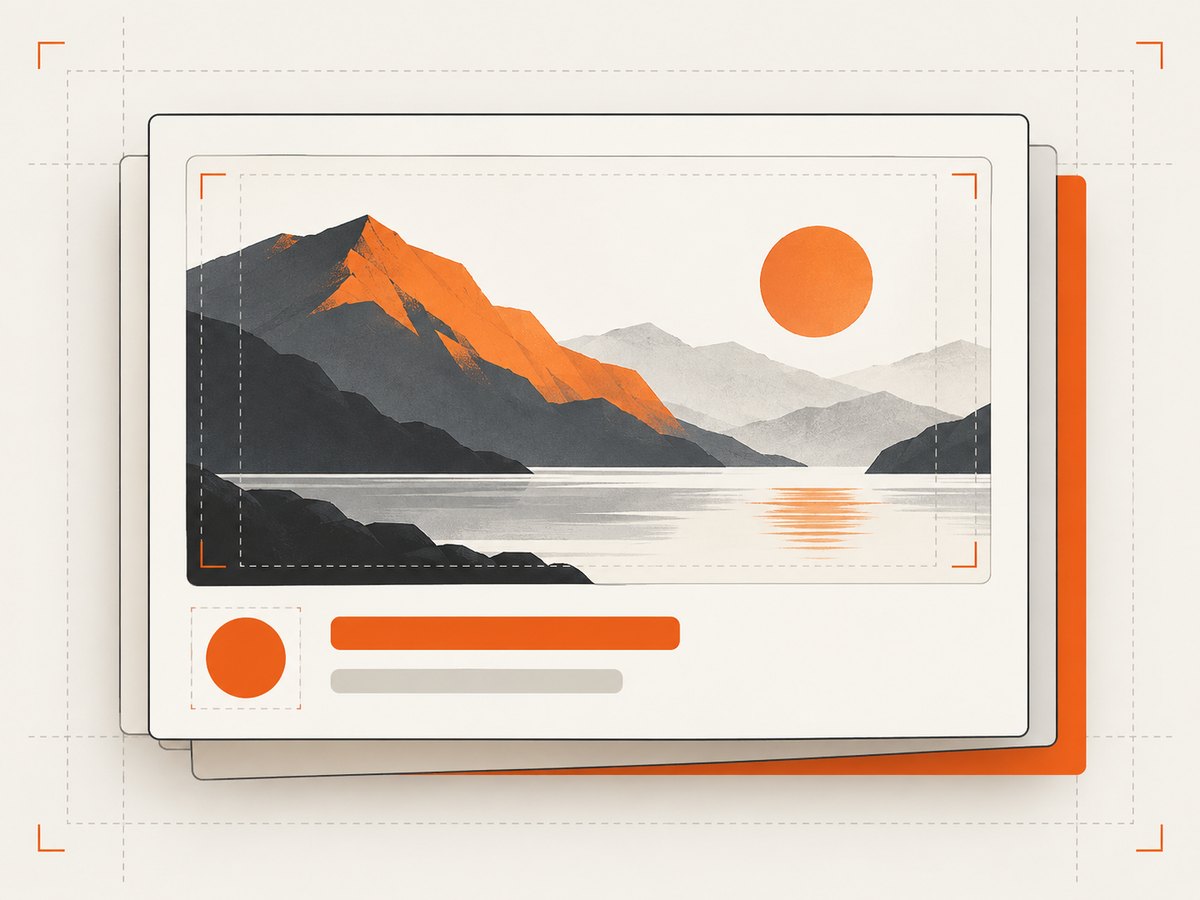
- Canvas: Record pixel dimensions, ratio, color mode, and intended use.
- Safe area: Set an even margin on all sides. Keep the focal subject and any words away from the edge so cropping and small card rendering do not cut them off.
- Focal zone: Reserve a consistent area for one representative screenshot, product, or subject. Make it large enough to read at thumbnail size.
- Type hierarchy: Define one headline style and, if needed, one supporting style. Use short wording that adds context instead of restating the page title. Adobe recommends keeping text short and readable at thumbnail size.
- Brand treatment: Specify palette, logo placement, font choices, corner radius, and overlay treatment. Keep decoration sparse; Canva’s guidance favors a clear focal point, a few elements, harmonious color, and accurate UI representation.
- Editable layers: Keep background, image, text, and logo separate. Replace content rather than rebuilding the layout.
- Outputs: Name a preset for each destination and note its dimensions, file format, and compression settings.
A simple written spec might say: “Card preview, 4:3; 8% safe margin; image fills the left 70%; title is one line at the lower right; logo sits in the upper right; export WebP for cards and PNG for the editable handoff.” These are project choices, not universal platform rules. Test them against your actual design and rendering pipeline.
3. Make and export the thumbnail
Canva template workflow
- Create a design at the target dimensions and ratio. For a Canva app-style featured image, use the documented 2400 × 1800 px, 4:3 guidance.
- Add a background, a dominant image area, a short label only if it adds information, and a consistent logo treatment.
- Keep elements aligned to guides that represent the safe area. Duplicate the design for a new page and replace the image and label.
- Export at the dimensions and format accepted by the destination. Reopen the exported file and inspect it at the size it will actually appear.
Photoshop layered template workflow
- Create a document using the destination’s dimensions and ratio. Save a master file with distinct background, subject image, type, and logo layers.
- Use a smart object or equivalent replaceable image layer for the focal content. Keep text editable and aligned to guides.
- Save a copy for each thumbnail, replace the subject and concise label, and preserve the established hierarchy.
- Export through a repeatable action or documented settings. Make alternate compositions when useful and compare them at small size. Adobe’s tutorial recommends meaningful thumbnail variations and says YouTube supports testing up to three thumbnails.
Adobe Experience Manager renditions
When a publishing team must create many sizes from shared source assets, AEM image presets or renditions provide a governed way to apply dimensions, formats, and compression consistently. Adobe’s documentation examples include a 500 × 500 px “Enlarge” preset and a 150 × 150 px “Thumbnail” preset. Treat these as examples, not defaults for every site: define presets to match your channels, then verify output and crop behavior in the consuming component.
4. Use a browser screenshot as source material
If the focal image is a live web page, capture it at a known viewport before placing it into the template. A consistent browser capture makes the source image more repeatable, but it does not replace the design template: the page can change, use responsive layouts, or show overlays. Check that the captured page represents the content accurately and that any needed consent or access steps are handled appropriately.
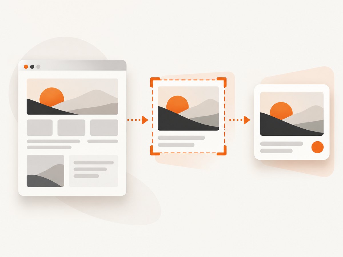
For repeatability, record the target URL, viewport width and height, device scale, color mode, wait condition, and whether you capture the full page or a specific element. For a card showing a page section, capture that element rather than a full page and shrinking it until details disappear. For a long page, use a full-page capture only when the whole composition remains legible at the final card size.
5. Generate consistent previews with code
A browser automation workflow is useful when you need a local, customizable capture pipeline. The following Node.js example uses Playwright’s Chromium browser, waits for the page to settle, and writes a PNG screenshot. Install the package and browser first with npm install playwright and npx playwright install chromium.
import { chromium } from 'playwright';

const url = process.argv[2] ?? 'https://example.com';
const browser = await chromium.launch({ headless: true });
const page = await browser.newPage({
  viewport: { width: 1200, height: 900 },
  deviceScaleFactor: 1,
  colorScheme: 'light'
});

try {
  await page.goto(url, { waitUntil: 'networkidle', timeout: 45000 });
  await page.screenshot({ path: 'website-preview.png', fullPage: false });
} finally {
  await browser.close();
}
For sites that keep long-polling connections open, networkidle may never arrive. Use domcontentloaded and then wait for a known selector or a short delay. To capture a particular region, locate it and call locator('.hero').screenshot({ path: 'hero.png' }). Use selectors that are stable and specific; a missing or duplicated selector can capture the wrong region.
For reproducible output, pin the browser version in your build environment, keep the viewport and device scale fixed, and avoid relying on animations or time-sensitive content. Where permitted, disable animations in the page before capture and wait for fonts and key images to load. A network-idle signal alone does not guarantee that every lazy-loaded image is visible; scroll the target into view or wait for its image to finish loading when needed.
6. Or skip the browser setup
ScreenshotNeo is a website screenshot API and MCP server. One GET request returns an image or PDF, and its options include viewport and device presets, full-page or element capture, dark mode, custom CSS and JavaScript, click and wait actions, request blocking, headers and cookies, and caching. See the ScreenshotNeo docs for request details.
curl -G "https://api.screenshotneo.com/v1/shot" \
  -d access_key=YOUR_API_KEY \
  --data-urlencode url=https://example.com \
  -o shot.webp
import requests
r = requests.get(
"https://api.screenshotneo.com/v1/shot",
params={"access_key": "YOUR_API_KEY", "url": "https://example.com"},
timeout=90,
)
open("shot.webp", "wb").write(r.content)const q = new URLSearchParams({
access_key: 'YOUR_API_KEY',
url: 'https://example.com'
});
const res = await fetch(`https://api.screenshotneo.com/v1/shot?${q}`);
if (!res.ok) throw new Error(`Screenshot request failed: ${res.status}`);
await Bun.write('shot.webp', res);Use the returned image as source material for your template and make the final channel-specific crop in your design or image pipeline. ScreenshotNeo removes cookie and consent banners, newsletter popups, and chat widgets before capture; each step can be turned off. Bot checks, CAPTCHAs, blank pages, timeouts, failed loads, and cache hits are not billed, and response headers report the page verdict and billing status. Its MCP server provides take_screenshot, get_page_info, and capture_pdf for AI agents. The Free plan includes 1,000 screenshots monthly with no card; paid plans start at $5 for 3,000.
Create a free ScreenshotNeo account for 1,000 screenshots a month with no card.
7. Keep crops, metadata, and previews aligned
A designed thumbnail and a link preview are related but separate. The design controls the image itself; page metadata tells platforms which image to consider. Set a representative og:image or the relevant structured-data image reference on the page, and make sure its URL points to the intended export. Google says image selection for previews is automated and advises against generic images, such as a site logo, for og:image or schema.org image data.
- Use a page-specific image that represents the page’s main content.
- Keep the referenced image URL reachable and verify that it serves the intended file.
- Check the image dimensions and ratio against the target platform’s current requirements.
- Inspect the preview in an actual link-preview context after updating the reference.
- If a platform continues to show an old image, check whether it has cached the prior preview and use its supported refresh mechanism.
Do not assume that setting metadata forces every platform to use exactly your chosen crop: preview selection and display are controlled by the consuming service. A representative image, correct metadata, and an actual preview check reduce surprises.
8. Troubleshooting
| Symptom | Likely cause | Fix |
|---|---|---|
| Thumbnail looks stretched | The export ratio differs from the card ratio, or dimensions were resized non-proportionally. | Lock the ratio in the template and create an intentional crop for each distinct surface. |
| Important subject or title is cut off | Content sits outside safe margins or the destination applies a crop. | Move essential content inward and preview at the destination’s rendered size. |
| Text is unreadable in the card | Too much wording, type too small, or weak contrast. | Shorten the label, increase its size and contrast, and test at actual card dimensions. |
| Social preview shows the wrong image | Metadata references another asset, the selected image is generic, or the platform has cached an older preview. | Verify og:image and structured-data references, use a page-specific image, and refresh the platform preview if supported. |
| Screenshot is blank or incomplete | Capture happened before the page or its assets were ready, or a selector did not match. | Wait for a stable selector or asset, inspect the page state, and confirm the selector exists once. |
| Automation hangs on network idle | Persistent connections or analytics prevent the network from becoming idle. | Wait for DOM content, then wait for the specific element or a bounded delay. |
| Page capture differs between runs | Responsive viewport, scale, animation, fonts, or live content changed. | Pin browser and viewport settings, wait for fonts and images, and disable animation where appropriate. |
| Output is unexpectedly large | Full-page capture, high device scale, or lossless format generated excessive pixels. | Capture only the needed region, choose suitable dimensions and format, and apply a documented compression preset. |
9. Performance, reliability, and cost
For local browser automation, startup and page rendering usually dominate the work; reuse a browser process for batches when the environment permits, but isolate pages so cookies and state do not leak between jobs. Bound navigation and selector waits with timeouts, close pages and browsers in cleanup code, and retry only transient failures. Avoid unbounded retries against a slow or unavailable site.
Image cost is largely a pipeline and storage choice: extra renditions add processing and files, while oversized originals consume bandwidth. Keep one suitable source and generate named outputs for the surfaces that need them. Use a web-friendly compressed format where supported and preserve an editable master for future changes. Do not infer that increasing pixel dimensions improves a small preview; inspect the actual rendered result.
For ScreenshotNeo, plan usage against the published tiers: Free 1,000 shots/month, Starter $5 for 3,000, Growth $15 for 15,000, Pro $39 for 60,000, Scale $99 for 250,000, and Business $249 for 1,000,000; yearly billing gives two months free. Every feature is on every plan. Clean shots are billed; failed or non-page outcomes and cache hits listed above are not. The response’s X-Page-Verdict and X-Billed headers help applications distinguish outcomes. Handle network errors and inspect the response before treating its body as an image.
10. Production checklist
- Target surface and ratio are recorded.
- Master file separates image, text, logo, and background.
- Focal point and essential type fit within safe margins.
- Text adds context instead of repeating the page title.
- Channel exports use named dimensions, format, and compression settings.
- Output has been inspected at the smallest display size.
- Page metadata references a reachable, representative image.
- The actual link preview has been checked after metadata changes.
FAQ
Should every thumbnail include a title?
No. Add words only when they provide useful context at the size people will see them. A clear focal image can work without a text overlay.
Can one master design serve several channels?
Yes, as the source of a template system. Keep separate named crops and exports for destinations with different ratios or requirements.
Is a logo a good social preview image?
Usually it is too generic to represent an individual page. Google recommends a representative image rather than a generic logo for image preview metadata.
Should I use full-page screenshots for card thumbnails?
Only if the entire page remains understandable at card scale. For a focused preview, capture a representative element or section.


