What Is a Website Hero Image?
A hero image is the prominent visual in a page’s opening section. Learn how to choose, crop, code, optimize, and make it accessible.

A website hero image is the prominent photograph, illustration, or other visual placed in a page’s opening hero area. It establishes visual context and supports the page’s main message. The image works with the heading, short introduction, and call to action; it is not a standardized HTML element, fixed banner size, or required aspect ratio.
A useful hero image helps visitors understand what the page is about and what they can do next. Choose it for message fit, preserve the important subject at every viewport, keep foreground text readable, provide the correct alternative text, and deliver it without delaying the visible content.
What a hero image does
The hero is usually the first major region near the beginning of a page. A typical structure contains:
- One main heading: the page’s primary subject or promise.
- A short explanation: enough context to tell visitors what follows.
- A call to action: a button or link when the page has a next step.
- A visual: an image or illustration that reinforces the message.
The visual can appear beside the text, behind it, or below it. The layout is a design decision, not a definition of the term. The W3C Design System hero example pairs a heading and lead text with decorative artwork.
How to choose a useful hero image
1. Match the page subject
Ask what a visitor should understand before reading the rest of the page. A product page might show the product in use; a travel page might show the destination; a documentation page might use a diagram or restrained illustration. Avoid an attractive image that communicates a different subject.
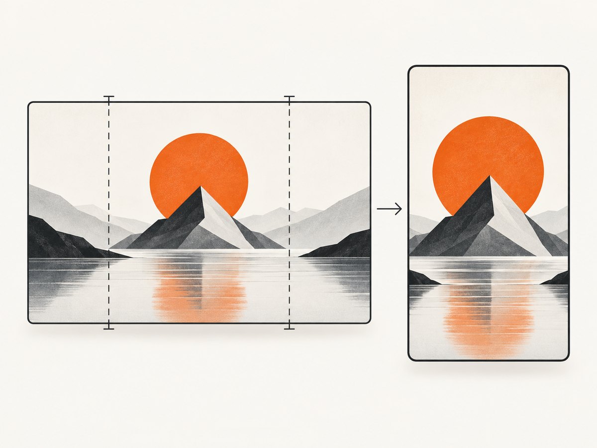
2. Make the composition survive cropping
Desktop and mobile heroes rarely have the same available shape. Keep the important face, object, or action away from edges that may be cropped. If the subject cannot fit every viewport, provide separate crops with <picture> or responsive sources.
3. Protect text and controls
Do not place essential headings or calls to action only inside the bitmap. Keep them as real HTML so they remain searchable, selectable, responsive, and accessible. Check contrast between foreground content and the image; the WAI design tips cover contrast and adaptable layouts.
4. Decide whether the image is informative or decorative
| Purpose | Markup and alternative text |
|---|---|
| Conveys information relevant to the page | Use an HTML <img> with concise alt text. |
| Purely decorative and adds no information | Use CSS background treatment or alt="" on the HTML image. |
| Acts as a link or button | Make the alternative describe the destination or action, not just the appearance. |
See the W3C WAI Images Tutorial for the purpose-based rules.
Responsive hero image implementation
This example keeps the heading and button in HTML, reserves layout space with intrinsic dimensions, and serves different image widths.
<section class="hero" aria-labelledby="hero-title">
  <div class="hero__copy">
    <p class="eyebrow">Analytics for small teams</p>
    <h1 id="hero-title">See which work moves your business forward.</h1>
    <p>Understand your most important metrics in one clear workspace.</p>
    <a class="button" href="/signup">Start free</a>
  </div>

  <picture>
    <source
      media="(max-width: 700px)"
      srcset="/images/hero-mobile-480.webp 480w,
              /images/hero-mobile-800.webp 800w"
      sizes="100vw">
    <source
      srcset="/images/hero-wide-800.webp 800w,
              /images/hero-wide-1200.webp 1200w,
              /images/hero-wide-1600.webp 1600w"
      sizes="(min-width: 1100px) 50vw, 100vw"
      type="image/webp">
    <img
      src="/images/hero-wide-1200.jpg"
      srcset="/images/hero-wide-800.jpg 800w,
              /images/hero-wide-1200.jpg 1200w,
              /images/hero-wide-1600.jpg 1600w"
      sizes="(min-width: 1100px) 50vw, 100vw"
      width="1600"
      height="1000"
      alt="A team reviewing a project dashboard together"
      fetchpriority="high">
  </picture>
</section>
.hero {
display: grid;
grid-template-columns: minmax(0, 1fr) minmax(0, 1fr);
gap: 3rem;
align-items: center;
max-width: 72rem;
margin-inline: auto;
padding: 4rem 1.25rem;
}
.hero picture,
.hero img {
display: block;
width: 100%;
}
.hero img {
height: auto;
border-radius: 1rem;
object-fit: cover;
}
@media (max-width: 700px) {
.hero {
grid-template-columns: 1fr;
gap: 1.5rem;
padding-block: 2rem;
}
.hero__copy { order: 1; }
.hero picture { order: 2; }
}web.dev’s responsive image guidance explains how srcset, sizes, and <picture> let the browser select an appropriate source.
Loading and performance
- Do not lazy-load an above-the-fold hero. Use the default eager behavior; consider
fetchpriority="high"only when this image is genuinely critical. - Reserve its space. Supply
widthandheight, or an equivalent CSSaspect-ratio, to reduce layout movement. - Choose an efficient format. WebP or another supported modern format can reduce transfer size; keep a compatible fallback when needed.
- Size to rendered use. A large source displayed at a small mobile width wastes bandwidth.
- Preload selectively. Preloading every candidate image can compete with more important resources.
- Compress without destroying detail. Inspect text, faces, gradients, and transparent edges after compression.
For a decorative hero background, CSS can be appropriate. For meaningful content, use an HTML image so its purpose can be expressed to assistive technology.
Accessibility checklist
- Keep the page’s main heading in HTML, outside the image.
- Write concise alt text that conveys the image’s relevant information.
- Use
alt=""for decorative imagery that adds no information. - If the image is a link or button, name its destination or action.
- Check text and control contrast against every crop and theme.
- Ensure keyboard users can reach and identify the call to action.
- Test at narrow widths, zoomed text, high contrast settings, and with images disabled.
Common hero patterns
| Pattern | Good fit | Watch for |
|---|---|---|
| Text beside image | Product, service, and editorial introductions | Columns becoming too narrow on tablets |
| Text over image | Strong, simple imagery with a quiet area for text | Contrast changes across crops |
| Full-width visual below text | Stories, portfolios, and campaigns | Image pushing the useful content too far down |
| Illustration or diagram | Technical, educational, and abstract subjects | Small labels becoming unreadable or duplicated in alt text |
| Video or animated background | Only when motion adds clear value | Bandwidth, distraction, motion sensitivity, and pause controls |
Capturing and reviewing a hero at real viewports
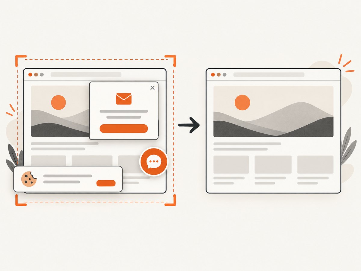
Review the page at the widths your users actually receive. Check the desktop crop, mobile crop, heading contrast, reserved space, and the state shown when images are slow or unavailable. A browser screenshot can make these differences easy to compare in a pull request or design review.
DIY browser capture with Playwright
import { chromium } from 'playwright';

const browser = await chromium.launch();
const page = await browser.newPage({
  viewport: { width: 1440, height: 900 },
  deviceScaleFactor: 1
});

await page.goto('https://example.com/landing', { waitUntil: 'networkidle' });
await page.locator('section.hero').waitFor();
await page.screenshot({ path: 'hero-desktop.png', fullPage: false });

await page.setViewportSize({ width: 390, height: 844 });
await page.screenshot({ path: 'hero-mobile.png', fullPage: false });

await browser.close();
For a meaningful image, verify the locator and record the viewport with the screenshot. If the hero is below the fold, scroll it into view before capturing. Avoid waiting forever for third-party analytics or chat scripts; use a targeted selector or bounded timeout.
Or skip the browser setup
ScreenshotNeo returns a clean PNG, JPEG, WebP, or PDF from one GET request. Its capture options cover full-page shots, a CSS-selected element, viewport and device presets, retina scale, dark mode, custom CSS and JavaScript, selector or network-idle waits, headers and cookies, and more. See the ScreenshotNeo docs for the request options.
curl -G "https://api.screenshotneo.com/v1/shot" \
  -d access_key=YOUR_API_KEY \
  --data-urlencode url=https://example.com/landing \
  -o hero.webp
import requests
r = requests.get(
"https://api.screenshotneo.com/v1/shot",
params={"access_key": "YOUR_API_KEY", "url": "https://example.com/landing"},
timeout=90,
)
r.raise_for_status()
open("hero.webp", "wb").write(r.content)const q = new URLSearchParams({
access_key: 'YOUR_API_KEY',
url: 'https://example.com/landing'
});
const res = await fetch(`https://api.screenshotneo.com/v1/shot?${q}`);
if (!res.ok) throw new Error(`${res.status} ${await res.text()}`);
const image = Buffer.from(await res.arrayBuffer());
await import('node:fs/promises').then(fs => fs.writeFile('hero.webp', image));Cookie banners, newsletter popups, and chat widgets are removed before the shot. Bot checks, blank pages, failed loads, timeouts, and cache hits are not billed, and response headers identify the page verdict and billing status. ScreenshotNeo also provides an MCP server so Claude, Cursor, and other MCP clients can take screenshots. The free plan includes 1,000 screenshots each month without a card; paid plans start at $5 for 3,000 shots. Create a free ScreenshotNeo account.
Troubleshooting
The subject is cut off on mobile
Provide a mobile-specific source with <picture>, move the subject toward the safe area, or change object-position. Do not assume the desktop crop scales acceptably.
The heading is unreadable over the image
Use a quieter crop, add a solid or gradient overlay, move text beside the image, and verify contrast at every responsive breakpoint.
The page jumps while the hero loads
Add intrinsic dimensions or aspect-ratio. Confirm that CSS does not replace the reserved size after the image arrives.
The browser downloads an unexpectedly large file
Check the sizes value against the rendered width, include realistic srcset candidates, and inspect whether CSS is forcing a large background image.
The screenshot contains a cookie banner or chat bubble
In a DIY browser script, dismiss or hide those elements before capture and wait for the page to settle. With ScreenshotNeo, consent banners and more than 60 known consent platforms, newsletter popups, and chat widgets are removed before capture.
The screenshot is blank or a bot check appears
Check the target URL, authentication, redirects, and wait condition. A blank page, bot check, failed load, or timeout is reported in ScreenshotNeo’s response and is not billed.
Reliability, cost, and workflow notes
- Use deterministic URLs, viewport sizes, and wait conditions when comparing revisions.
- Capture after the hero selector exists rather than relying only on a fixed sleep.
- Cache stable pages with a TTL when repeated visual checks do not need a fresh render.
- Use bulk capture for many URLs and asynchronous jobs with signed webhooks for longer batches.
- For private pages, pass the required headers, cookies, user agent, or authorization values securely.
- Keep source images and screenshot artifacts separate from production user data.
FAQ
Is a hero image always above the fold?
Usually it is near the beginning of the page, but the exact position depends on the layout and content.
Does a hero image have to be a photograph?
No. It can be an illustration, diagram, product rendering, or another visual that supports the page message.
What is the correct hero image size?
There is no universal pixel dimension or aspect ratio. Choose sources based on the rendered layout and target viewports.
Should every hero image have alt text?
Informative images need concise alt text. Decorative images should have an empty alternative, and linked images should name their action or destination.
Can I put the heading inside the image?
Keep essential text in HTML. Text embedded in an image is harder to resize, translate, search, and access.
When should I use a CSS background?
Use it for decorative imagery. Use an HTML image when the visual contributes information or needs a meaningful alternative text.


