What Is Responsive Web Design (RWD)?
Responsive web design lets one site adapt to screen size, input and device features. Learn the principles, code patterns, testing workflow and fixes.
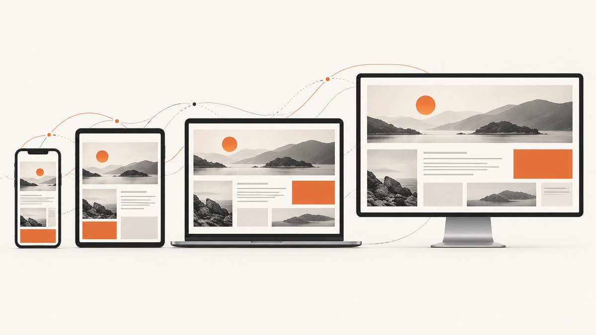
Responsive web design (RWD) is an approach to building one website that adapts its layout, content, media, typography and interaction to the visitor’s viewport and device features. The same URL and underlying content can remain usable on a narrow phone, a tablet, a laptop, a desktop monitor or another screen size.
RWD is not a programming language or a framework. It is a set of design and implementation practices: fluid sizing, flexible media, CSS media queries, responsive layout systems such as Flexbox and Grid, and correct viewport configuration. The goal is a readable, usable interface at the sizes and input modes your users actually have.
What does RWD mean?
RWD means responsive web design. Ethan Marcotte coined the term in 2010. His original technical ingredients were fluid grids, flexible images and media queries, along with a different way of thinking about designing for the web. Marcotte’s original article describes those ingredients, while MDN’s responsive design guide explains how the ideas are applied today.
A responsive page changes when the available space or device capability changes. A three-column desktop layout might become one column on a phone; a navigation bar might become a menu button; an image might scale down while preserving its aspect ratio; and spacing or type sizes might adjust to keep reading comfortable.
How responsive web design works
1. Start with the viewport
Put this element in every responsive document:
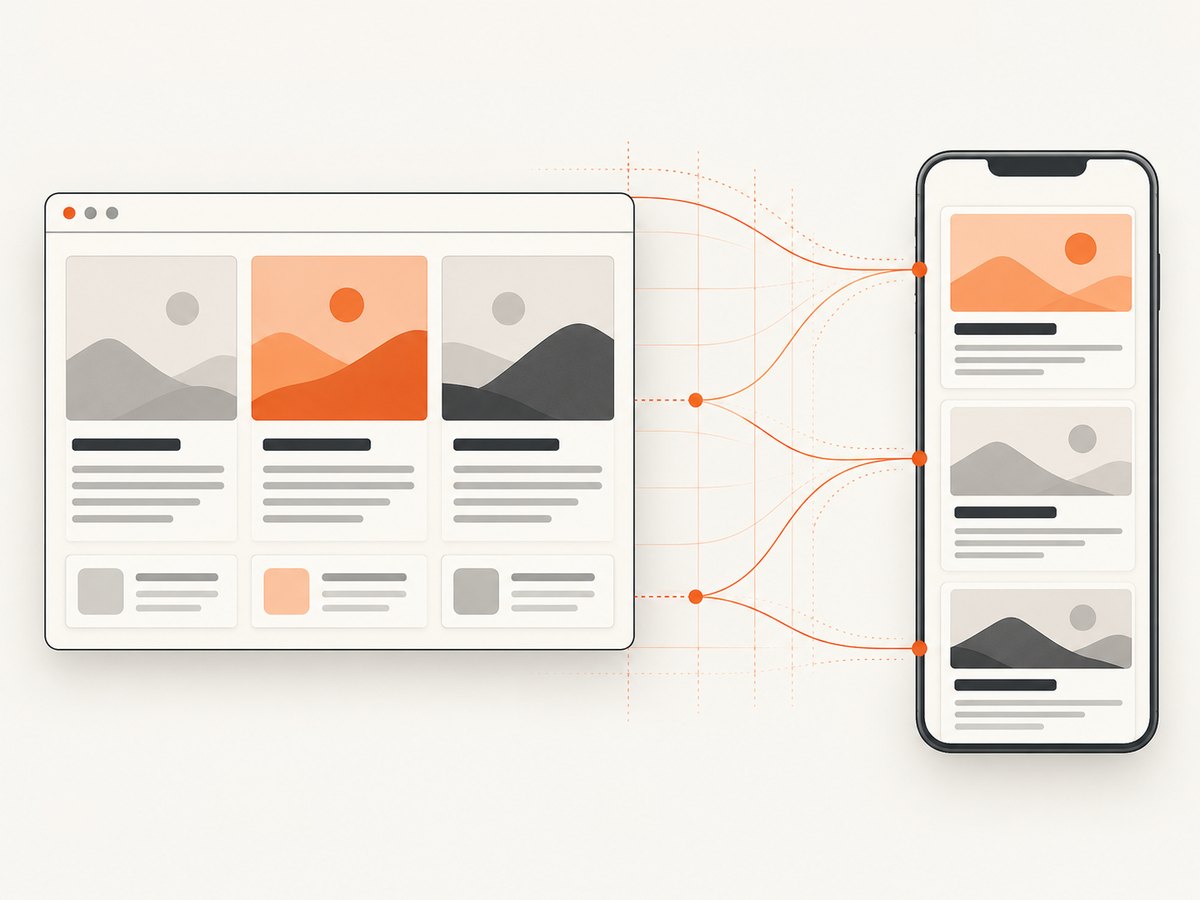
<meta name="viewport" content="width=device-width, initial-scale=1">width=device-width tells a mobile browser to use the device’s actual CSS width instead of laying the page out against a wider virtual viewport. Without it, your carefully chosen breakpoints may appear not to work. See MDN’s viewport documentation.
2. Use fluid sizes and constraints
Fixed pixel widths force users to scroll horizontally when the viewport is smaller than the design. Use percentages, rem, clamp(), and a maximum width to let content grow and shrink:
* { box-sizing: border-box; }

body {
  margin: 0;
  font: 1rem/1.6 system-ui, sans-serif;
  color: #172033;
  background: #fff;
}

.wrapper {
  width: min(100% - 2rem, 72rem);
  margin-inline: auto;
}

h1 { font-size: clamp(2rem, 5vw, 4rem); }

.card img {
  display: block;
  width: 100%;
  height: auto;
}
Viewport-relative units such as vw, vh, vmin and vmax can respond to viewport dimensions; the W3C CSS Values specification defines them. Use them with sensible minimums and maximums so text does not become microscopic or enormous.
3. Let media fit its container
The classic fluid-image rule is max-width: 100%. It prevents an image from overflowing its column while retaining its natural aspect ratio. For art direction, use <picture>; for bandwidth savings, use srcset and sizes:
<picture>
  <source media="(min-width: 60rem)" srcset="hero-wide.webp">
  <img src="hero-mobile.webp"
       srcset="hero-mobile.webp 480w, hero-wide.webp 1280w"
       sizes="(min-width: 60rem) 60rem, 100vw"
       alt="A team reviewing a responsive layout">
</picture>
Apply the same thinking to video, maps and embeds. Give them a responsive wrapper, avoid hard-coded widths, and check that controls remain reachable on touch screens.
4. Build flexible components with Flexbox and Grid
Flexbox is useful for one-dimensional rows or columns. Grid handles two-dimensional page structure. Many components respond without a media query:
.feature-list {
  display: grid;
  grid-template-columns: repeat(auto-fit, minmax(min(100%, 16rem), 1fr));
  gap: 1rem;
}

.toolbar {
  display: flex;
  flex-wrap: wrap;
  gap: .75rem;
  align-items: center;
}

.toolbar .search { flex: 1 1 16rem; }
Flexbox and CSS Grid can wrap or reflow as space changes. This reduces the number of arbitrary breakpoints you need.
5. Add media queries where content needs a change
Media queries test features such as width, height, color scheme and input capability. The W3C Media Queries recommendation defines this mechanism. Choose breakpoints when a component becomes cramped, rather than copying a universal phone/tablet/desktop list.
/* Mobile-first base layout */
.site-header {
  display: grid;
  gap: 1rem;
}

.main-layout {
  display: grid;
  gap: 2rem;
}

@media (min-width: 48rem) {
  .site-header {
    grid-template-columns: auto 1fr auto;
    align-items: center;
  }

  .main-layout {
    grid-template-columns: minmax(0, 2fr) minmax(14rem, 1fr);
  }
}

@media (prefers-color-scheme: dark) {
  body { color: #f5f7fb; background: #111827; }
}
Mobile-first CSS starts with the narrow layout, then adds rules as more room becomes available. This keeps the base experience simple and avoids device-specific assumptions.
Responsive versus adaptive design
Responsive design continuously reflows around available space. Adaptive design usually defines several discrete layouts or templates and selects one at particular widths or device categories. A project can combine both: a responsive Grid inside a few server-selected templates, for example.
| Question | Responsive approach | Adaptive approach |
|---|---|---|
| Layout changes | Fluid reflow between constraints | Discrete layouts at selected conditions |
| Breakpoints | Chosen when content needs them | Often tied to predefined device classes |
| Maintenance | One component system can cover many widths | More variants may need separate updates |
| Best fit | Content that must work across unknown sizes | Experiences with deliberately different modes |
Neither label guarantees accessibility, speed or good usability. Evaluate the actual implementation, content and input methods.
How to make a website responsive
- Add the viewport element. Confirm it appears once in the document head.
- Remove accidental overflow. Inspect long words, fixed-width tables, third-party widgets and positioned elements.
- Set readable defaults. Use a comfortable base font, line height, focus styles and adequate contrast.
- Make layout intrinsic first. Use Grid, Flexbox, wrapping and
minmax()before adding a breakpoint. - Choose content breakpoints. Resize the browser slowly and add a query where a component stops working.
- Make controls input-safe. Test keyboard, mouse, touch and zoom. Keep targets easy to activate and never hide essential content behind hover only.
- Optimize media. Serve correctly sized images, reserve their aspect-ratio space, and avoid loading desktop assets on a small screen.
- Test real states. Check long translations, missing images, validation errors, open menus, loading states and reduced-motion preferences.
Testing a responsive layout yourself
Use browser developer tools to inspect several viewport widths, emulate touch, rotate the viewport and test throttled networks. Also resize a normal browser window through the awkward widths between your named breakpoints. A page that works at 390px and 1440px can still fail at 718px.
For repeatable checks, a small Playwright script can capture representative widths:
import { chromium } from 'playwright';

const widths = [320, 390, 768, 1024, 1440];
const browser = await chromium.launch();
const page = await browser.newPage({ deviceScaleFactor: 1 });

for (const width of widths) {
  await page.setViewportSize({ width, height: 900 });
  await page.goto('http://localhost:3000', { waitUntil: 'networkidle' });
  await page.screenshot({ path: `responsive-${width}.png`, fullPage: true });
}

await browser.close();
Compare screenshots for clipping, unexpected horizontal scroll, unreadable text, missing controls and layout shifts. Test project-specific performance and accessibility with your normal audit tools; RWD itself supplies no universal score or conversion increase.
Why a website is not mobile responsive
| Symptom | Likely cause | Fix |
|---|---|---|
| Everything appears tiny | Missing or incorrect viewport meta tag | Add width=device-width and reload on a device. |
| Horizontal scrolling | Fixed width, long unbroken text, or oversized media | Use flexible widths, overflow-wrap:anywhere, and max-width:100%. |
| Desktop menu is unusable | Navigation never changes mode | Wrap items, provide a keyboard-accessible menu button, and test touch. |
| Cards become too narrow | Too many fixed columns | Use auto-fit/minmax() or a content-driven breakpoint. |
| Images jump while loading | No intrinsic dimensions or aspect ratio | Set width/height attributes or aspect-ratio. |
| Styles work locally but not in production | Specificity, stale CSS, or a missing media-query bundle | Inspect computed styles, clear caches and verify the deployed CSS. |
| Touch interaction fails | Hover-only controls or overlays intercepting taps | Support keyboard and pointer alternatives; remove obstructing layers. |
Performance, reliability and maintenance
Responsive CSS does not automatically make a page fast. Large images, third-party scripts, fonts and client-side layout work still affect constrained devices. Use responsive image sources, defer noncritical scripts, reserve layout space and measure on the project’s target devices and networks.
Keep breakpoints near components instead of scattering device names throughout a stylesheet. Prefer custom properties, shared layout primitives and a small set of documented constraints. When content, localization or browser zoom changes, repeat the same tests. Preserve semantic HTML so a visual reflow does not break reading order, screen-reader navigation or keyboard access.
Or skip the browser setup
If you need rendered screenshots to verify responsive states, ScreenshotNeo provides a GET-based website screenshot API and an MCP server. You can still choose the viewport and device options while avoiding browser automation code.
See the ScreenshotNeo API documentation for all options. A basic capture is:
curl -G "https://api.screenshotneo.com/v1/shot" -d access_key=YOUR_API_KEY --data-urlencode url=https://stripe.com -o shot.webpimport requests
r = requests.get("https://api.screenshotneo.com/v1/shot", params={"access_key": "YOUR_API_KEY", "url": "https://stripe.com"}, timeout=90)
open("shot.webp", "wb").write(r.content)const q = new URLSearchParams({ access_key: 'YOUR_API_KEY', url: 'https://stripe.com' });
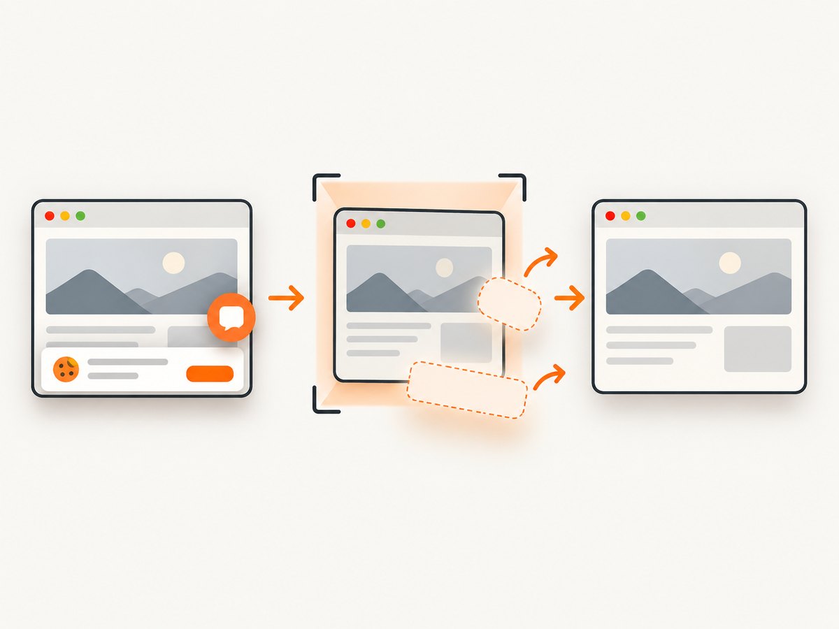
const res = await fetch(`https://api.screenshotneo.com/v1/shot?${q}`);ScreenshotNeo removes cookie banners, newsletter popups and chat widgets before the shot. Bot checks, blank pages, timeouts, failed loads and cache hits are not billed, and response headers identify the page verdict and billing status. It also offers an MCP server with take_screenshot, get_page_info and capture_pdf for AI agents, plus viewport and device presets, full-page or selector capture, dark mode, retina scale, custom CSS and JavaScript, waits, request blocking, headers, cookies, geolocation, caching, signed links, async webhooks and bulk capture.
The Free plan includes 1,000 screenshots each month with no card. Paid plans start at $5 for 3,000 screenshots; every feature is on every plan. Create a free ScreenshotNeo account.
FAQ
Is responsive design the same as mobile-first design?
No. Mobile-first is a workflow that starts with the narrow layout. Responsive design is the broader approach of adapting across viewports and device features.
Do I need a framework for RWD?
No. Native HTML and CSS provide media queries, Flexbox, Grid, responsive images and viewport units. Frameworks can provide conventions, but they are optional.
How many breakpoints should I use?
Use the fewest needed for your content. Resize continuously and add a breakpoint when the current layout becomes hard to read or operate.
Does responsive design guarantee accessibility?
No. Check semantics, focus order, keyboard operation, zoom, contrast, motion preferences, touch targets and screen-reader behavior separately.
Can one page be responsive and adaptive?
Yes. A site may select a distinct template for a major mode while using fluid CSS inside each template.
What should I screenshot when reviewing a responsive change?
Capture the key narrow, intermediate and wide widths, plus states such as an open menu, validation error, long content and slow loading. Compare for overflow, clipping and missing interaction.


