What Is Responsive Web Design? Definition and Examples
Responsive web design makes one website adapt to different screens. Learn how it works, see practical examples, and follow a complete implementation checklist.

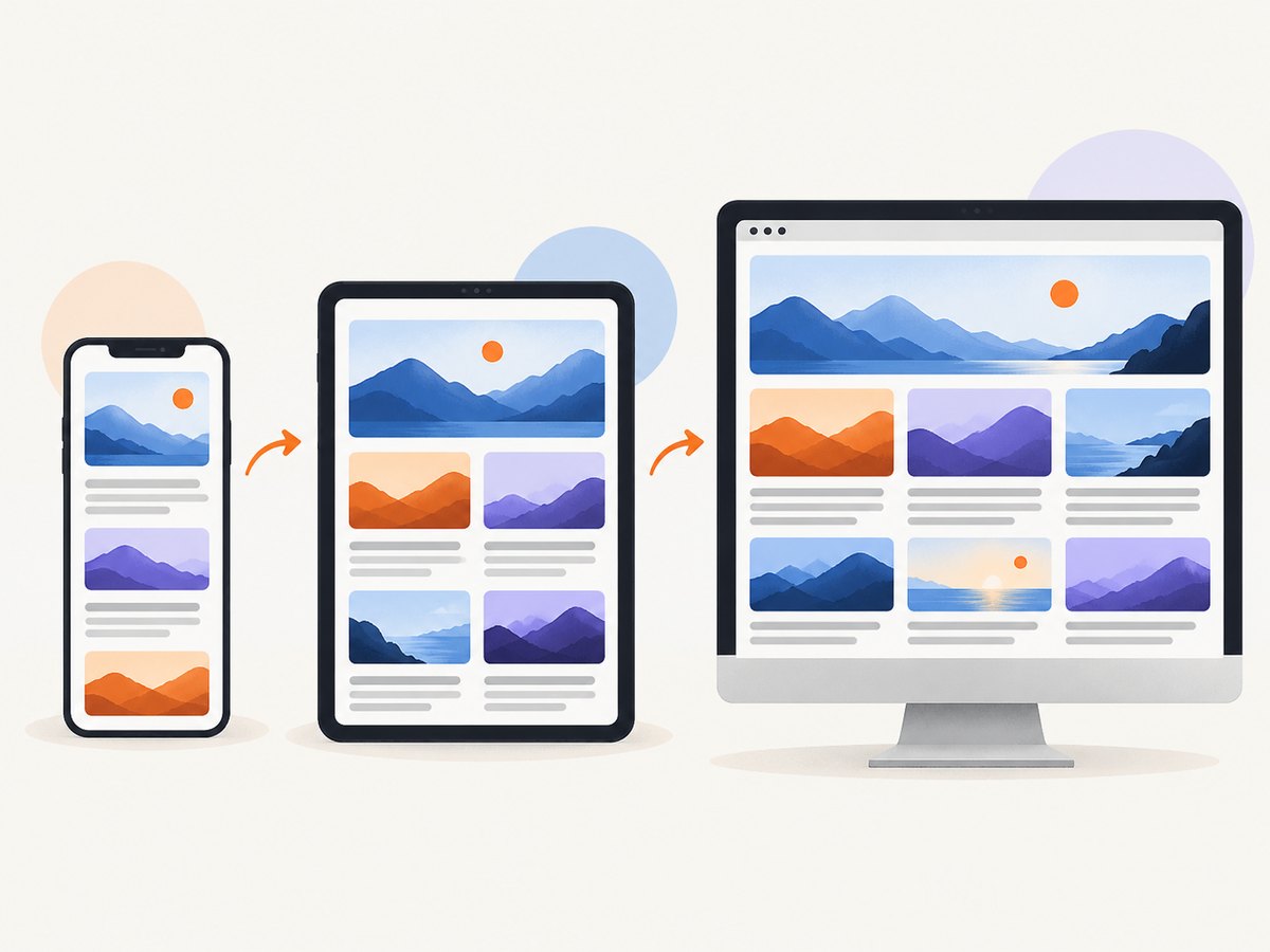
Responsive web design (RWD) is an approach to building web pages so their layout, content, images, and controls adapt to different screen sizes, resolutions, orientations, and input methods. A responsive page remains readable and usable on a phone, tablet, laptop, or large monitor while using the same underlying page.
Responsive design is not a separate programming language or framework. It is a set of web-platform practices: flexible layouts, relative units, media queries, responsive images, adaptable typography, and a correct viewport configuration. This guide explains how those pieces work together, shows practical patterns, covers accessibility and testing, and gives you a complete starting implementation.
What responsive web design means
MDN describes responsive web design as a web-development concept focused on making sites render well and behave optimally across personal-computing devices. The term was coined by Ethan Marcotte in 2010; the original pattern combined fluid grids, fluid images, and media queries. MDN also emphasizes that responsive web design is an approach rather than a separate technology.
In practical terms, a responsive page can:
- Reflow a multi-column layout into one readable column.
- Resize or replace images so they do not overflow their container.
- Change navigation controls when a wide menu no longer fits.
- Adjust type size, line length, spacing, and touch-target dimensions.
- Respond to orientation, print output, pointer capability, or other environment features.
How responsive design works
1. Flexible layout
CSS Grid and Flexbox let content stretch, wrap, and reflow as available space changes. Use a layout that can absorb intermediate widths instead of designing only for a few named devices.
.cards {
  display: grid;
  grid-template-columns: repeat(auto-fit, minmax(16rem, 1fr));
  gap: 1rem;
}
The auto-fit pattern creates as many columns as fit, then returns to fewer columns as the viewport narrows. Flexbox is useful for rows that wrap, such as navigation or form controls.
2. Relative units and constraints
Prefer percentages, rem, em, viewport units, and functions such as min(), max(), and clamp() when a value should respond to available space. Combine them with sensible limits so content does not become too wide or too small.
.page {
  width: min(100% - 2rem, 72rem);
  margin-inline: auto;
}

h1 {
  font-size: clamp(2rem, 5vw, 4rem);
}
3. Media queries
Media queries let CSS test conditions such as viewport width, orientation, resolution, or input capability and apply rules selectively. A breakpoint is simply the point where your content needs a different layout. Choose it from the design, not from a fixed list of phone and tablet models.
.nav-list {
  display: flex;
  gap: 1rem;
}

@media (max-width: 48rem) {
  .nav-list {
    display: block;
  }
}
4. Responsive images and media
Images should shrink to fit their containers. The basic rule is max-width: 100% and height: auto. For performance, use srcset and sizes so a narrow screen can download a smaller source.
<img
  src='hero-1200.jpg'
  srcset='hero-480.jpg 480w, hero-800.jpg 800w, hero-1200.jpg 1200w'
  sizes='(max-width: 48rem) 100vw, 70rem'
  alt='People collaborating around a table'
>
For background images, make sure the image is decorative or provide an equivalent text alternative. Avoid forcing a large desktop asset onto every mobile visitor.
5. Responsive typography
Text must stay readable at every width. Constrain line length, use a scalable base size, and adjust spacing when controls or headings become crowded. A fluid value such as clamp() can interpolate between a minimum and maximum without making text unpredictably large.
6. The viewport meta tag
Include this tag in every responsive document:
<meta name='viewport' content='width=device-width, initial-scale=1'>
Without it, some mobile browsers use a wide virtual viewport. Your narrow-screen media queries may not activate as expected, and the page can appear permanently zoomed out.
A complete responsive page example
The following file is runnable as a standalone HTML document. It starts with a single-column flow and adds a wider grid when the content has enough room.
<!doctype html>
<html lang='en'>
<head>
  <meta charset='utf-8'>
  <meta name='viewport' content='width=device-width, initial-scale=1'>
  <title>Responsive product page</title>
  <style>
    :root { font-family: system-ui, sans-serif; color: #172033; }
    * { box-sizing: border-box; }
    body { margin: 0; line-height: 1.5; }
    .wrap { width: min(100% - 2rem, 72rem); margin-inline: auto; }
    header { padding: 1rem 0; border-bottom: 1px solid #d8deea; }
    nav { display: flex; flex-wrap: wrap; gap: .75rem 1.25rem; align-items: center; }
    nav a { color: inherit; padding: .5rem; }
    main { padding-block: 2rem; }
    .hero { display: grid; gap: 1.5rem; align-items: center; }
    .hero img { width: 100%; height: auto; border-radius: .75rem; }
    .features { display: grid; gap: 1rem; margin-top: 2rem; }
    .card { padding: 1rem; border: 1px solid #d8deea; border-radius: .75rem; }
    @media (min-width: 42rem) {
      .hero { grid-template-columns: 1fr 1fr; }
      .features { grid-template-columns: repeat(3, 1fr); }
    }
    @media (min-width: 70rem) {
      .hero { gap: 3rem; }
    }
  </style>
</head>
<body>
  <header>
    <div class='wrap'>
      <nav aria-label='Primary'>
        <a href='/'>Brand</a>
        <a href='#features'>Features</a>
        <a href='#contact'>Contact</a>
      </nav>
    </div>
  </header>
  <main class='wrap'>
    <section class='hero'>
      <div>
        <p>A small label</p>
        <h1>A layout that adapts to its content</h1>
        <p>Resize the browser to see the grid reflow without horizontal scrolling.</p>
      </div>
      <img src='hero.jpg' alt='Abstract colored shapes'>
    </section>
    <section id='features' class='features' aria-label='Features'>
      <article class='card'><h2>Flexible</h2><p>Columns appear only when they fit.</p></article>
      <article class='card'><h2>Readable</h2><p>The content column has a maximum width.</p></article>
      <article class='card'><h2>Accessible</h2><p>The source order stays logical.</p></article>
    </section>
  </main>
</body>
</html>
Responsive design examples
One column to multiple columns
A news feed, product list, or feature section can use one column on a phone, two columns at a medium width, and three columns when each card still has a comfortable reading width. CSS Grid with minimum track sizes avoids brittle device-specific rules.
Navigation adaptation
A horizontal navigation row may become a wrapped row, a stacked list, or a disclosure control at narrow widths. Keep every link discoverable, keyboard accessible, and operable without a precise pointer. If you use a menu button, expose its expanded state and connect it to the controlled list with appropriate ARIA.
Responsive images
Let images scale down and select smaller sources when the layout does not need the desktop asset. Check captions, focal points, and crop choices at both orientations; a crop that works on a wide screen can remove important context on a phone.
Typography and touch spacing
Increase spacing around controls when the input method is touch. Keep body text readable and avoid long unbroken lines on desktop. A responsive layout changes spacing and type in response to actual room while preserving hierarchy.
Orientation and feature changes
Media queries can react to portrait or landscape orientation, print output, reduced motion preferences, hover capability, and pointer accuracy. Use these conditions to improve the experience, not to hide essential content.
Responsive versus mobile-first design
Responsive design describes the overall approach. Mobile-first describes where you start: a simple narrow-screen layout that uses normal document flow, followed by enhancements at wider, content-driven breakpoints. A desktop-first implementation starts with the widest arrangement and adds rules as space decreases.
| Decision | Mobile-first | Desktop-first |
|---|---|---|
| Starting viewport | Narrow layout | Wide layout |
| Typical CSS direction | Add columns and enhancements with min-width |
Remove or compress features with max-width |
| Default source order | Usually follows a straightforward document flow | May require more rearrangement at narrow widths |
| Best checkpoint | Confirm the core experience works before enhancements | Confirm narrow rules do not create cramped content |
Neither approach guarantees quality. Test the real content where it becomes cramped or overly sparse. Do not pick breakpoints solely because they match a particular device catalog.
Accessibility requirements
Responsive changes must preserve usability at different zoom levels and viewport sizes. W3C WAI recommends responsive design for mobile devices and tablets, and MDN warns that visual reordering can disconnect keyboard navigation from the source order.
- Keep the HTML source order logical; use Grid or Flexbox reordering sparingly.
- Check keyboard focus after every layout change.
- Maintain readable text and visible focus indicators.
- Give buttons and links comfortable touch targets.
- Do not convey meaning through color or position alone.
- Respect user preferences such as reduced motion and increased text size.
How to test a responsive website
- Resize continuously. Drag the browser edge and watch for wrapping failures, clipped content, and horizontal scrolling.
- Use responsive device modes. Browser developer tools and Firefox Responsive Design Mode can simulate viewport widths and orientations.
- Test content-driven widths. Record the widths where a heading wraps badly, a card becomes too narrow, or navigation collides. Set breakpoints around those points.
- Test zoom and text expansion. Increase browser zoom and verify that controls remain usable.
- Test keyboard flow. Tab through the page at each major layout state. Confirm visual order matches focus order.
- Check media. Look for overflowing images, videos, tables, and code blocks. Confirm narrow screens do not download needlessly large assets.
- Test orientation and touch. Rotate a device or emulator and check sticky elements, dialogs, and hit areas.
Common problems and fixes
| Symptom | Likely cause | Fix |
|---|---|---|
| Mobile layout never activates | Missing or incorrect viewport meta tag | Add width=device-width, initial-scale=1. |
| Horizontal scrolling | Fixed-width element, long URL, image, or preformatted code | Use fluid widths, max-width: 100%, wrapping, and deliberate overflow for code. |
| Cards become unreadably narrow | Too many fixed columns | Use Grid minimum track sizes or reduce columns at a content-driven breakpoint. |
| Menu is inaccessible on phones | Links hidden without a keyboard-operable control | Use a labeled button, expose expanded state, and test keyboard focus. |
| Visual order differs from tab order | CSS order or Grid placement changed presentation only |
Fix source order or remove the visual rearrangement. |
| Images look blurry or load slowly | One oversized or undersized source for every viewport | Use responsive sources, intrinsic dimensions, and suitable compression. |
| Text is too small after zoom | Fixed pixel typography or clipped containers | Use scalable units, allow wrapping, and test zoomed layouts. |
Performance, reliability, and maintenance
Responsive CSS does not automatically make a page fast. Avoid shipping desktop-sized media to every device, reserve image space to reduce layout shifts, and lazy-load below-the-fold content when appropriate. Keep breakpoints few and meaningful; every additional state increases the testing surface.
Use normal document flow as the reliable baseline, then layer enhancements. This gives users a usable page if a media query is unsupported or a stylesheet loads late. Test real content rather than empty placeholder cards, because actual labels and translations often determine where a breakpoint is needed.
For visual regression, capture the same URL at a stable set of viewport widths and compare results after CSS changes. Record the viewport, device pixel ratio, color scheme, and any authentication state so differences are explainable.
Or skip the browser setup
If you need screenshots of responsive states for QA, documentation, or regression checks, ScreenshotNeo provides a website screenshot API and MCP server. The request below captures a URL as WebP; see the ScreenshotNeo documentation for all options.
cURL
curl -G "https://api.screenshotneo.com/v1/shot" -d access_key=YOUR_API_KEY --data-urlencode url=https://stripe.com -o shot.webpPython
import requests
r = requests.get('https://api.screenshotneo.com/v1/shot', params={'access_key': 'YOUR_API_KEY', 'url': 'https://stripe.com'}, timeout=90)
open('shot.webp', 'wb').write(r.content)
Node.js
const q = new URLSearchParams({ access_key: 'YOUR_API_KEY', url: 'https://stripe.com' });
const res = await fetch(`https://api.screenshotneo.com/v1/shot?${q}`);
const data = Buffer.from(await res.arrayBuffer());
require('node:fs').writeFileSync('shot.webp', data);
For responsive testing, add a viewport, device preset, retina scale, color scheme, full-page capture, custom CSS, or JavaScript through the API options. You can capture one element by CSS selector, wait for a selector, delay, or network idle, and block ads, trackers, requests, or resource types. Cookies, headers, user agents, Authorization, timezone, and geolocation are available for pages that need them. You can also resize images, cache captures with a TTL you choose, create signed links for public image tags, submit asynchronous jobs with signed webhooks, capture up to 100 URLs per bulk call, and query usage through the usage API.
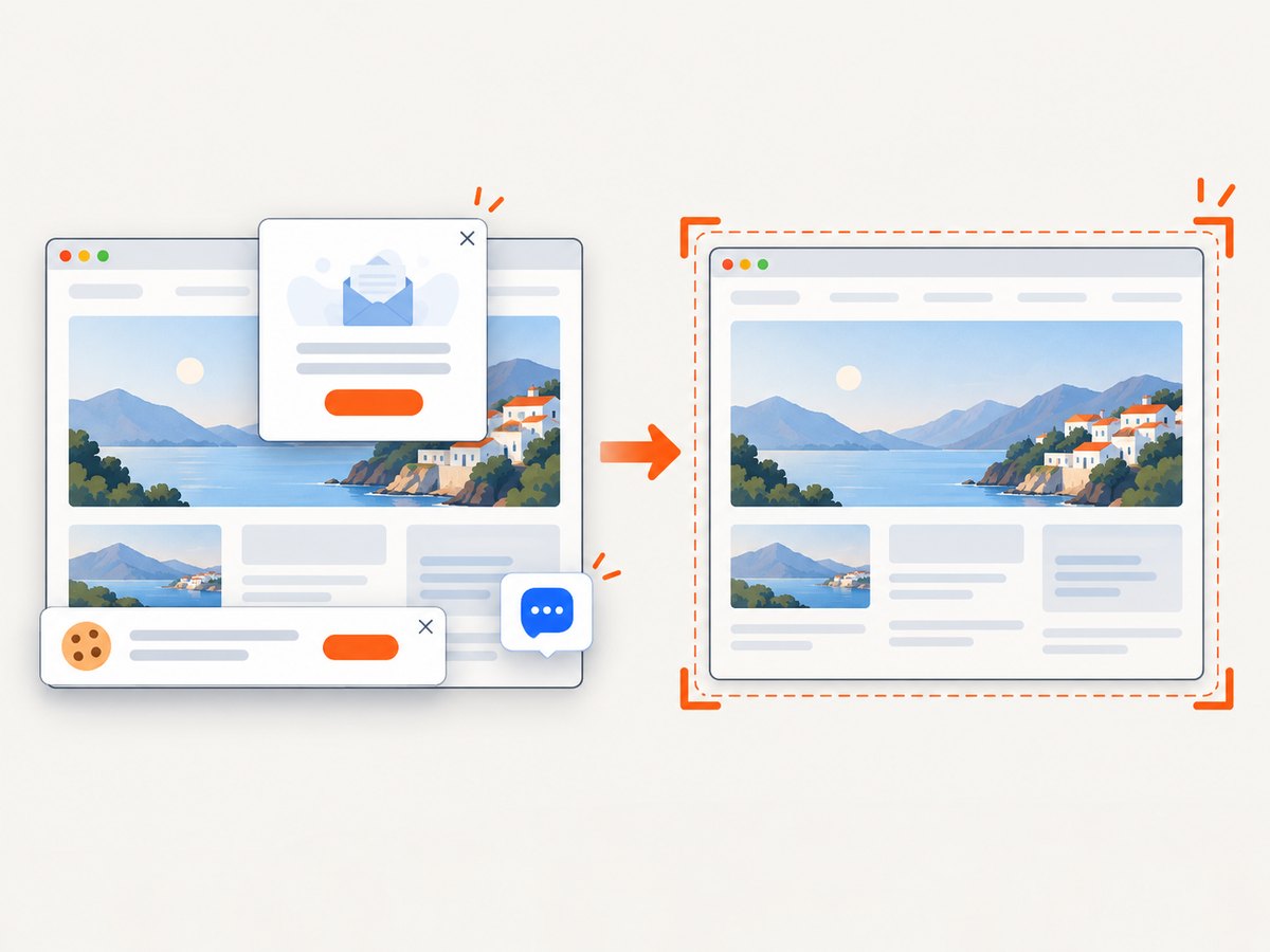
ScreenshotNeo removes cookie and consent banners, newsletter popups, and chat widgets from more than 60 known consent platforms before capture; each cleanup step can be disabled. Bot checks or CAPTCHAs, blank pages, timeouts, failed loads, and cache hits are not billed, and the response identifies the result with X-Page-Verdict and X-Billed headers. Its MCP server exposes take_screenshot, get_page_info, and capture_pdf for Claude, Cursor, and other MCP clients.
The Free plan includes 1,000 screenshots per month with no card. Paid plans start at $5 for 3,000 shots; Growth is $15 for 15,000, Pro is $39 for 60,000, Scale is $99 for 250,000, and Business is $249 for 1,000,000. Yearly billing gives two months free, and every feature is available on every plan.
Create a free ScreenshotNeo account and start with 1,000 screenshots a month, no card required.
FAQ
Is responsive design the same as adaptive design?
No. Responsive design usually means a fluid layout that continuously adapts. Adaptive designs may switch among several predefined layouts. A project can combine both techniques.
Do I need a CSS framework?
No. Frameworks can provide useful primitives, but Grid, Flexbox, media queries, and responsive image features are built into the platform.
How many breakpoints should a site have?
As many as the content requires. Start with none or a small number, then add a breakpoint when the current arrangement becomes unusable or wastes space.
Can responsive design support print?
Yes. Use a print media query to adjust colors, hide navigation, and make content fit printed pages while preserving meaningful information.
Should every image use srcset?
Use responsive sources when the image has materially different display sizes or is expensive to download. Simple small icons may not need multiple sources.


