What Size Should Web Images Be? A Practical Guide to Width, Height, and File Size
Choose web image dimensions from the rendered CSS slot, then use responsive candidates, correct ratios, and efficient formats for every screen.
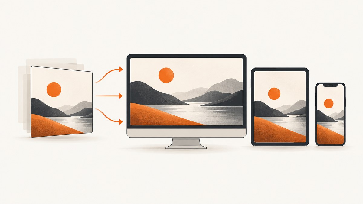
Direct answer: there is no universal best image dimension for the web. Start with the largest CSS width at which the image will render, create a source close to that width for standard-density screens, add larger and smaller candidates for device pixel ratios and responsive layouts, preserve the aspect ratio, include intrinsic width and height, and compress in a format your delivery stack supports.
A generic rule such as “always use 1200px” or “always use 1920px” fails because a 320px card, an 800px article column, and a full-width desktop hero have different requirements. The browser should receive an image that covers the rendered slot without downloading substantially more pixels than it can display.
1. Find the rendered CSS width first
Inspect the element in your layout at its widest expected breakpoint. The relevant number is the content box width in CSS pixels, after the container, gap, padding, and grid rules have been applied. If an article image occupies an 800px column on desktop and 100% of a 360px viewport on mobile, those are two rendered widths that your image candidates should cover.
For a simple fixed slot, a source near the slot width is a good 1x candidate. For a high-density display, multiply the rendered width by the device pixel ratio (DPR), then cap the result when additional pixels no longer improve visible quality. A 600px slot commonly needs 600px and 1200px candidates; it does not automatically need a 2400px file.
| Rendered CSS width | Useful candidates | Typical use |
|---|---|---|
| 320–400px | 320px, 640px | Phones and narrow cards |
| 500px | 500px, 1000px | Article columns and medium cards |
| 800px | 400px, 800px, 1200px, 1600px | Responsive article or dashboard media |
| 1200px | 600px, 1200px, 1800px, 2400px | Wide content and hero sections |
These are starting points, not universal prescriptions. Measure the actual layout and remove candidates that are never selected.
2. Use srcset and sizes for responsive delivery
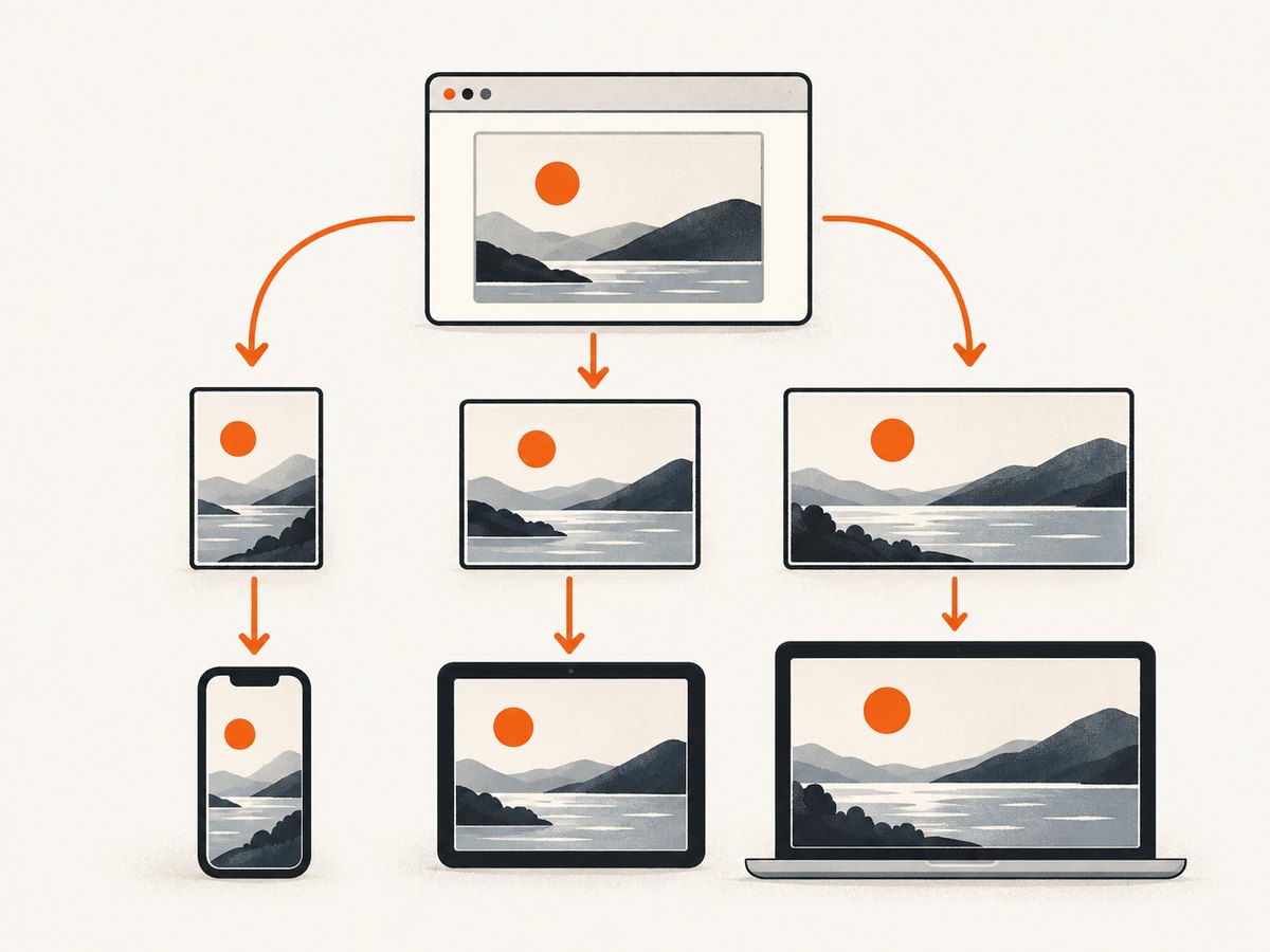
srcset lists intrinsic image widths. The sizes attribute describes the width the image is expected to occupy under each layout condition. The browser combines those hints with viewport width and DPR to choose a candidate.
<img
  src="photo-800.jpg"
  width="800"
  height="533"
  alt="A cyclist riding beside a lake"
  loading="lazy"
  srcset="photo-400.jpg 400w,
          photo-800.jpg 800w,
          photo-1200.jpg 1200w"
  sizes="(min-width: 900px) 800px, 100vw">
In this example, the image is expected to render at 800px on screens at least 900px wide and at the viewport width below that breakpoint. sizes does not set the display width; CSS still controls the layout. If the CSS slot is actually 640px because of a sidebar, write 640px in sizes.
Use a density descriptor only when every device should receive the same CSS width:
<img src="avatar-200.jpg" width="200" height="200"
     srcset="avatar-200.jpg 1x, avatar-400.jpg 2x"
     alt="Profile photograph">
Do not mix a misleading sizes value with CSS that produces a different slot. Incorrect hints cause either blurry images or unnecessary downloads.
3. Preserve aspect ratio and reserve layout space
Set intrinsic dimensions that match the source ratio. An 800×533 source has a ratio of about 1.50, so every responsive candidate should preserve that ratio unless you intentionally crop it. Include width and height attributes even when CSS makes the image fluid. Browsers use them to reserve space before the file arrives, reducing layout shifts. The web.dev guidance says: “If you know your image’s dimensions, always include width and height attributes.”
Make images shrink inside their containers:
img {
  max-width: 100%;
  height: auto;
  display: block;
}
The logical-property equivalent is max-inline-size: 100%. For a fixed-ratio media frame, use aspect-ratio and decide how to crop:
.card-media {
  aspect-ratio: 16 / 9;
  overflow: hidden;
}
.card-media img {
  width: 100%;
  height: 100%;
  object-fit: cover;
}
Use object-fit: contain when the entire image must remain visible, such as a product diagram or screenshot. Cropping changes the visual result, so generate a dedicated crop when the subject cannot tolerate it.
4. Choose dimensions for common image roles
Measure each role separately. A logo, thumbnail, article figure, social preview, and full-width hero should not share one oversized master file.
| Role | How to size it | Important detail |
|---|---|---|
| Content image | Largest article-column width × 1–2 DPR candidates | Use srcset and sizes |
| Card thumbnail | Card width, with a 2x candidate when useful | Keep a consistent crop ratio |
| Hero image | Largest rendered container width and height | Check mobile crop separately |
| Logo or icon | Rendered dimensions plus a 2x source | Prefer SVG for vector artwork |
| Open Graph preview | Use the dimensions required by the destination platform | Do not reuse a tiny card source |
If a 500×500 container displays a square image, web.dev gives approximately 500×500 as the optimal size when other variables are equal. That example applies to that container; it is not a universal web-image rule.
5. Select a format and control bytes
Pixel dimensions and encoded bytes are related but not interchangeable. A photographic 1200px image can be smaller than a detailed 800px PNG, depending on compression and content. Web.dev identifies WebP and AVIF as formats that may compress better than PNG or JPEG. Compare visual quality at the actual display size and retain a fallback when your delivery environment requires one.
<picture>
  <source type="image/avif" srcset="photo-800.avif 800w, photo-1200.avif 1200w" sizes="100vw">
  <source type="image/webp" srcset="photo-800.webp 800w, photo-1200.webp 1200w" sizes="100vw">
  <img src="photo-800.jpg" width="800" height="533" alt="A cyclist beside a lake">
</picture>
Use JPEG or WebP for most photographs, PNG when lossless transparency or pixel-precise graphics matter, and AVIF when your pipeline and fallback strategy support it. There is no research-backed universal kilobyte ceiling for every web image. Set a performance budget by page type, then inspect real network waterfalls and visual quality.
Strip unnecessary metadata, avoid repeated re-encoding, and generate derivatives once during upload or build time. A CDN can negotiate formats and cache variants, but it should still receive sensible source dimensions.
6. WordPress and generated candidates
WordPress adds responsive-image attributes to native image markup. Its developer documentation lists a default max_srcset_image_width of 2048px and a medium_large intermediate width of 768px. Themes and plugins can change those values, so inspect the generated HTML rather than assuming every installation uses the defaults.
Check that your largest generated candidate covers the widest CSS slot. If a theme displays a 2200px hero but only generates files through 2048px, decide whether the slot should be narrower or whether a larger source is justified. Remove unused image sizes only after checking templates, feeds, email templates, and social cards.
7. Measure a page and create variants with a browser
A repeatable measurement script can inspect the rendered width at several viewports. The following Node.js example uses Playwright, records the CSS width, and prints 1x and 2x targets. Install it with npm install playwright, then run node measure-image.js https://example.com article img.
import { chromium } from 'playwright';

const [url, selector = 'main img'] = process.argv.slice(2);
if (!url) throw new Error('Usage: node measure-image.js URL [selector]');

const browser = await chromium.launch();
const page = await browser.newPage();
for (const width of [360, 768, 1280, 1920]) {
  await page.setViewportSize({ width, height: 900 });
  await page.goto(url, { waitUntil: 'networkidle', timeout: 90000 });
  const result = await page.locator(selector).first().evaluate((img) => {
    const box = img.getBoundingClientRect();
    return { cssWidth: Math.round(box.width), cssHeight: Math.round(box.height), naturalWidth: img.naturalWidth };
  });
  console.log(JSON.stringify({ viewport: width, ...result, oneX: Math.round(result.cssWidth), twoX: Math.round(result.cssWidth * 2) }));
}
await browser.close();
Use the output to choose candidates, then verify with browser developer tools that the intended file is selected. Test slow networks, cached responses, lazy loading, and pages where images appear after client-side rendering.
8. Or skip the browser setup
ScreenshotNeo can capture a page or a selected element so you can inspect the visual result at a chosen viewport and scale. Its API accepts options for full-page capture, CSS selectors, device presets or custom viewports, retina scale, output format, image resizing, custom CSS and JavaScript, waits, blocking rules, headers, cookies, user agents, timezone, geolocation, transparent backgrounds, caching, signed links, asynchronous jobs, bulk capture, and PDF output. Read the ScreenshotNeo API documentation for parameter details.

cURL
curl -G "https://api.screenshotneo.com/v1/shot" -d access_key=YOUR_API_KEY --data-urlencode url=https://stripe.com -o shot.webpPython
import requests
r = requests.get("https://api.screenshotneo.com/v1/shot", params={"access_key": "YOUR_API_KEY", "url": "https://stripe.com"}, timeout=90)
open("shot.webp", "wb").write(r.content)
Node.js
const q = new URLSearchParams({ access_key: 'YOUR_API_KEY', url: 'https://stripe.com' });
const res = await fetch(`https://api.screenshotneo.com/v1/shot?${q}`);
Cookie banners, newsletter popups, and chat widgets are removed before the shot. Bot checks, blank pages, failed loads, timeouts, and cache hits are not billed, and response headers report the page verdict and billing status. An MCP server provides take_screenshot, get_page_info, and capture_pdf tools for Claude, Cursor, and other MCP clients. The free plan includes 1,000 screenshots each month with no card; paid plans start at $5 for 3,000 shots. Create a free ScreenshotNeo account.
9. Performance, reliability, and cost considerations
- Transfer: A correctly sized candidate reduces download bytes, decode work, and memory on small screens.
- Largest contentful paint: Do not lazy-load the main above-the-fold image. Give it accurate dimensions and consider preload only when measurement shows a benefit.
- Lazy loading: Use
loading="lazy"for below-the-fold content, while retaining width and height attributes. - Caching: Give derivative files stable URLs with content hashes or versioned paths. Configure cache headers at the CDN and origin.
- Reliability: Keep a fallback format and a fallback candidate. Test broken URLs, slow origins, redirects, authentication, and images injected after page load.
- Screenshot capture: For automated captures, wait for a selector, a short delay, or network idle when images are asynchronous. Use a custom viewport and scale that match the screen you are evaluating. Caching and bulk capture can reduce repeated work; inspect verdict and billing headers when auditing usage.
- Cost: The researched sources do not define one universal byte target. Set budgets by page type and compare quality at the rendered size. With ScreenshotNeo, only clean shots are billed; failed loads and cache hits are free.
10. Troubleshooting common image-sizing problems
<
| Symptom | Cause | Fix |
|---|---|---|
| Image looks blurry on a phone | Only a 1x candidate exists or sizes understates the slot |
Add a 2x candidate and correct sizes |
| Desktop downloads a huge file | One oversized src is used everywhere |
Add width-based srcset candidates |
| Layout jumps while loading | Missing or incorrect intrinsic dimensions | Set matching width and height, or use a correct aspect ratio |
| Image overflows its card | Intrinsic width exceeds the container | Apply max-width: 100% and height: auto |
| Subject is cropped badly | object-fit: cover uses the wrong ratio |
Use a dedicated crop, contain, or a role-specific ratio |
| Browser picks the wrong file | sizes does not describe CSS layout |
Measure the slot at each breakpoint and update the media condition |
| WebP or AVIF fails in one client | No fallback source is supplied | Use a <picture> fallback or a server-side negotiation path |
| Screenshot is blank or incomplete | Page needs a wait, authentication, or client-side rendering | Wait for a selector or network idle, supply headers/cookies, and inspect the page verdict |
11. A production checklist
- Measure the largest rendered CSS width for each image role.
- Create a 1x candidate near that width and larger candidates justified by DPR.
- Add smaller candidates for narrow layouts.
- Write an accurate
sizesexpression that matches CSS. - Include intrinsic
widthandheightmatching the source ratio. - Apply fluid CSS with
max-width: 100%ormax-inline-size: 100%. - Choose WebP or AVIF where supported, with a fallback when required.
- Compress until quality and page budgets are acceptable.
- Lazy-load below-the-fold images and keep the main visible image discoverable.
- Test desktop, mobile, high-DPR, slow-network, cached, and failed-load cases.
12. FAQ
Is 1200px wide enough for a website image?
It is enough when the largest rendered slot is around 1200 CSS pixels and your quality and DPR requirements are met. It is excessive for a 320px thumbnail and insufficient for a wider hero.
Should mobile and desktop use different image sizes?
Usually yes. Use responsive candidates so the browser selects a smaller file for a narrow slot and a larger file when the layout and DPR justify it. Use art direction with <picture> when the crop or composition must change.
Does a larger source always look better?
No. Once the source covers the rendered pixels, extra resolution mainly increases transfer and decode cost. Compression quality and the source image often matter more.
What is the ideal image file size in kilobytes?
No single current official limit applies to every role. Set a page-specific budget, select an efficient format, and compare visual quality at the actual display size.
Can CSS resize an image without responsive markup?
CSS can change display dimensions, but it does not prevent the browser from downloading an oversized source. Use srcset and sizes for download selection.


