Why Website Screenshot Resizing Looks Wrong
Blurry, stretched, or oversized screenshots usually come from mixing CSS pixels, device pixels, viewport scale, and aspect ratios. Learn how to diagnose and fix each cause.
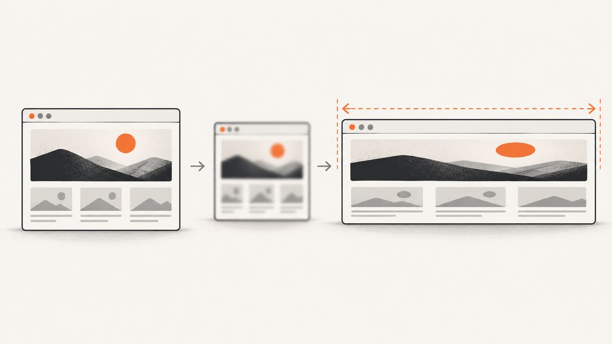
A website screenshot can look blurry, too large, too small, stretched, or squashed after resizing because several different measurements are being treated as the same thing. A CSS pixel is a layout unit. A physical device pixel is a hardware display unit. An exported screenshot has its own bitmap dimensions. Browser zoom, device pixel ratio (DPR), viewport settings, and image aspect ratio determine how those units relate.
The fastest fix is to identify which symptom you have:
- Blurry or unexpectedly large: check browser zoom,
window.devicePixelRatio, and whether the capture uses CSS-pixel or device-pixel scale. - Stretched or squashed: compare the source image’s natural aspect ratio with its rendered width and height.
- Wrong mobile layout: inspect the viewport meta tag and the CSS viewport width instead of assuming it equals the phone’s hardware resolution.
- Soft images on dense screens: make sure the page supplies image sources large enough for the rendered size and DPR.
1. The four pixel concepts behind resizing problems
CSS pixels
CSS pixels are the units used by layout rules such as width: 320px and media queries such as @media (max-width: 768px). They describe the page’s logical coordinate system. A viewport that is 390 CSS pixels wide can be displayed on a device with many more physical pixels.
Physical device pixels
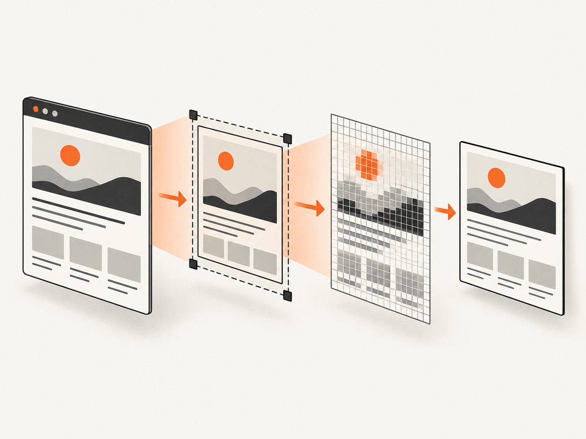
Physical pixels are the individual hardware pixels on a display. MDN defines devicePixelRatio as the ratio of physical pixels to CSS pixels for the current display. A DPR of 2 means that one CSS pixel maps to two physical pixels in each direction, so a 100 by 100 CSS-pixel region can require a 200 by 200 physical-pixel bitmap. Page zoom can change this value; pinch zoom does not. See MDN’s devicePixelRatio documentation.
Screenshot pixels
A screenshot is a raster image with a fixed width and height. A capture tool may output one image pixel per CSS pixel, or it may render at device scale. If a 1440 CSS-pixel page is captured at DPR 2, the output can be 2880 pixels wide. Opening that file in an editor or inserting it into a page without accounting for its intended display size makes it appear unexpectedly large.
Browser zoom
Browser page zoom changes the relationship between CSS and physical pixels. Check the browser zoom menu and inspect the value directly:
console.log({
  devicePixelRatio: window.devicePixelRatio,
  innerWidth: window.innerWidth,
  innerHeight: window.innerHeight,
  screenWidth: window.screen.width
});
Do this in the same browser context used for capture. A screenshot taken at 125% zoom is not equivalent to one taken at 100%, even when the nominal viewport setting looks identical.
2. Choose CSS-pixel or device-pixel output deliberately
Playwright exposes this choice through the screenshot scale option. With scale: "css", each screenshot pixel represents one CSS pixel. With the default device scale, high-DPI contexts produce a larger bitmap. The Playwright Page screenshot documentation describes the CSS-pixel behavior.
import { chromium } from 'playwright';

const browser = await chromium.launch();
const page = await browser.newPage({
  viewport: { width: 1280, height: 800 },
  deviceScaleFactor: 2
});

await page.goto('https://example.com', { waitUntil: 'networkidle' });

// Predictable 1280 CSS-pixel-wide output.
await page.screenshot({ path: 'css-scale.png', fullPage: true, scale: 'css' });

// Device-scale output can be about twice as wide and tall.
await page.screenshot({ path: 'device-scale.png', fullPage: true });

await browser.close();
Use CSS scale for documentation, visual regression comparisons that should match layout coordinates, and images whose dimensions are specified in CSS pixels. Use device scale when you need extra raster detail for a high-density display or downstream print workflow. Do not capture at device scale and then judge the file’s physical display size without checking its intended CSS dimensions.
3. Diagnose a blurry screenshot
- Record the output dimensions. Use an image inspector or
identify image.pngand write down its pixel width and height. - Record the capture viewport. Log
window.innerWidthandwindow.innerHeightbefore capture. - Record DPR and zoom. Log
window.devicePixelRatio; return the browser to 100% page zoom. - Check the capture scale. In Playwright, explicitly set
scale: 'css'or intentionally use device scale. - Check later resizing. Resampling a bitmap can change dimensions but cannot recreate detail that was never captured.
A common failure pattern is capturing a small CSS viewport, enlarging the resulting bitmap in an editor, and expecting it to become sharper. Capture at the largest useful source dimensions first, then create smaller derivatives.
4. Fix stretched and squashed content with aspect-ratio checks
Stretching is usually a geometry problem rather than a DPR problem. Let the source image’s natural ratio be naturalWidth / naturalHeight and the rendered ratio be renderedWidth / renderedHeight. If those ratios differ, the browser is being asked to distort the image.
const image = document.querySelector('img');
console.table({
  natural: `${image.naturalWidth}x${image.naturalHeight}`,
  rendered: `${image.clientWidth}x${image.clientHeight}`,
  naturalRatio: image.naturalWidth / image.naturalHeight,
  renderedRatio: image.clientWidth / image.clientHeight
});
Open DevTools, inspect the image, and look for conflicting declarations such as width: 100% combined with a fixed height. Prefer preserving the ratio:
img {
  display: block;
  width: 100%;
  height: auto;
}

.card-image {
  aspect-ratio: 16 / 9;
  object-fit: cover; /* crops instead of distorting */
}
Chrome’s Lighthouse guidance recommends checking the CSS declarations that control an image and specifying width and height where possible. See Displays images with incorrect aspect ratio.
5. Why mobile screenshots use a surprising width
A phone’s hardware resolution is not automatically its CSS viewport width. The viewport meta element controls how a page maps device width to its layout viewport, and browser viewport scale also affects the relationship. MDN documents these rules in the viewport meta reference.
<meta name="viewport" content="width=device-width, initial-scale=1">Without an appropriate viewport declaration, a mobile browser may lay out the page in a wider virtual viewport and scale it down. That can make a page appear to render at roughly 400 CSS pixels on a device whose hardware is 720 pixels wide. The numbers are different units, so comparing them directly is misleading.
When reproducing a mobile screenshot, set the emulated viewport and device scale explicitly:
import { chromium, devices } from 'playwright';

const browser = await chromium.launch();
const context = await browser.newContext({
  ...devices['iPhone 13'],
  deviceScaleFactor: 3
});
const page = await context.newPage();
await page.goto('https://example.com', { waitUntil: 'networkidle' });
console.log(await page.evaluate(() => ({
  innerWidth: window.innerWidth,
  innerHeight: window.innerHeight,
  dpr: window.devicePixelRatio
})));
await page.screenshot({ path: 'mobile.png', fullPage: true, scale: 'css' });
await browser.close();
6. Fix soft images on high-density displays
A screenshot can be geometrically correct but still look soft because the page itself supplied an image that was too small for the rendered area and DPR. Responsive image markup lets the browser select an appropriate candidate:
<img
  src="hero-800.jpg"
  srcset="hero-400.jpg 400w, hero-800.jpg 800w, hero-1600.jpg 1600w"
  sizes="(max-width: 600px) 100vw, 800px"
  width="800"
  height="450"
  alt=""
>
The sizes value describes the rendered CSS width; srcset supplies candidates. The browser considers viewport conditions and DPR when choosing. Chrome’s guidance covers this in Properly size images.
7. A repeatable debugging workflow
- Save the original screenshot and record its pixel dimensions.
- Measure the target element’s CSS dimensions with DevTools.
- Log viewport size, page zoom, and
devicePixelRatio. - Decide whether your requirement is layout fidelity (CSS scale) or dense raster detail (device scale).
- Inspect every image’s natural and rendered dimensions.
- Verify the mobile viewport meta tag.
- Capture again without post-capture enlargement; resize only after you have a sufficiently detailed source.
8. Or skip the browser setup
ScreenshotNeo provides a website screenshot API when you want a consistent capture without maintaining browser automation. Its capture options include full-page screenshots with lazy images loaded, CSS-selector element capture, dark mode, 12 device presets, arbitrary viewports, retina scale, image resizing, custom CSS and JavaScript, selector waits, delay and network-idle waits, custom headers and cookies, timezone and geolocation, transparent backgrounds, blocking controls, caching, signed links, asynchronous jobs, bulk capture, usage reporting, and PDF output. See the ScreenshotNeo documentation for parameter names and configuration.

One request returns the image:
cURL
curl -G "https://api.screenshotneo.com/v1/shot" \
  -d access_key=YOUR_API_KEY \
  --data-urlencode url=https://stripe.com \
  -o shot.webp
Python
import requests

r = requests.get(
    "https://api.screenshotneo.com/v1/shot",
    params={"access_key": "YOUR_API_KEY", "url": "https://stripe.com"},
    timeout=90,
)
r.raise_for_status()
open("shot.webp", "wb").write(r.content)
print(r.headers.get("X-Page-Verdict"), r.headers.get("X-Billed"))
Node.js
const q = new URLSearchParams({
  access_key: 'YOUR_API_KEY',
  url: 'https://stripe.com'
});
const res = await fetch(`https://api.screenshotneo.com/v1/shot?${q}`);
if (!res.ok) throw new Error(`HTTP ${res.status}`);
const image = Buffer.from(await res.arrayBuffer());
require('fs').writeFileSync('shot.webp', image);
console.log(res.headers.get('X-Page-Verdict'), res.headers.get('X-Billed'));
For resizing-related work, choose the viewport and retina scale to match the dimensions you need instead of enlarging a small output afterward. A selector capture can isolate one component when a full-page bitmap would be unnecessarily large. Custom CSS can force stable dimensions, while waits help avoid capturing before fonts or lazy images finish loading.
ScreenshotNeo removes cookie and consent banners, newsletter popups, and chat widgets before capture. Bot checks, blank pages, timeouts, failed loads, and cache hits are not billed, and the response identifies the result with X-Page-Verdict and X-Billed headers. An MCP server provides take_screenshot, get_page_info, and capture_pdf tools for Claude, Cursor, and other MCP clients. The Free plan includes 1,000 screenshots per month with no card; paid plans start at $5 for 3,000 screenshots. Create a free ScreenshotNeo account.
9. Performance, reliability, and cost considerations
- Capture size: Full-page and device-scale images consume more memory and take longer to transfer. Use element capture or CSS scale when the consumer does not need extra pixels.
- Waiting: Network-idle waits improve completeness but can delay pages with long-lived connections. Prefer a specific selector wait or bounded delay when you know the page’s readiness signal.
- Lazy content: Full-page capture with lazy images loaded avoids blank lower sections, but pages with infinite scrolling need a defined stopping strategy.
- Caching: A chosen TTL can reduce repeated work when the page is stable. Disable or shorten it when visual freshness matters.
- Billing: ScreenshotNeo bills only clean shots. Failed loads, bot checks, blank pages, timeouts, and cache hits are free, with the billing result exposed in response headers.
- Batch work: Bulk capture supports up to 100 URLs per call; asynchronous jobs and signed webhooks keep large batches out of a request timeout.
10. Troubleshooting checklist
| Symptom | Likely cause | Fix |
|---|---|---|
| Output is twice as wide as expected | Device scale factor or DPR is 2 | Use CSS scale or account for device pixels in the consumer. |
| Image is blurry after export | Small source bitmap was enlarged | Capture at the required CSS dimensions or higher device scale. |
| Image is stretched | Rendered ratio differs from natural ratio | Use height: auto, preserve aspect-ratio, or use object-fit. |
| Mobile page appears desktop-sized | Missing or incorrect viewport meta tag | Add width=device-width, initial-scale=1 and verify the emulated viewport. |
| Lower-page images are missing | Lazy loading has not triggered | Use full-page capture with lazy images loaded or wait for a known selector. |
| Screenshot changes between runs | Fonts, animations, ads, or late network requests | Wait for readiness, disable animation with custom CSS, and block unstable resources. |
| API response is not an image | Invalid key, URL, or a failed page load | Check HTTP status and inspect X-Page-Verdict and X-Billed before writing the body as an image. |
11. FAQ
Is a 2x screenshot always better?
No. It contains more raster pixels, but it also costs more memory and bandwidth. Use it when the destination needs dense detail; use CSS scale for layout-sized assets.
Does pinch zoom change devicePixelRatio?
MDN distinguishes page zoom from pinch zoom: page zoom can change devicePixelRatio, while pinch zoom does not.
Should I resize screenshots in CSS or an image editor?
For a web page, CSS resizing preserves flexible layout behavior. For a fixed bitmap, create derivatives from a sufficiently large original and preserve its aspect ratio.
Why does a screenshot look correct in an image viewer but wrong in a web page?
The viewer may honor image metadata or fit the image to its window. The web page may apply CSS width and height that change the rendered ratio or display scale.
Can I capture one component instead of the whole page?
Yes. Browser automation can locate an element, and ScreenshotNeo supports capture by CSS selector so you can avoid an unnecessarily large full-page bitmap.


