How to Use Content-Width Layouts with Wkhtmltopdf PDFs
Control wkhtmltopdf PDF width with paper size, margins, viewport, CSS, print media, shrinking and zoom settings.
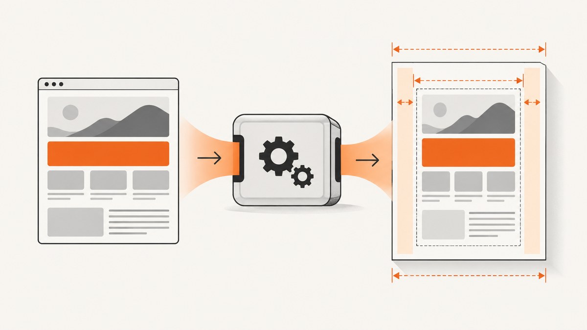
Direct answer: make wkhtmltopdf width predictable by treating it as a chain: paper width → left and right margins → usable PDF width → browser viewport → CSS container width. Choose the paper with --page-size or custom page dimensions, set both horizontal margins explicitly, choose a deliberate --viewport-size, and make your main wrapper fit that viewport. Use --print-media-type when your print stylesheet defines the PDF layout. Only change --zoom after the geometric settings are stable, and compare runs with smart shrinking enabled and disabled when content is unexpectedly scaled.
1. How wkhtmltopdf decides the width
wkhtmltopdf renders HTML with a browser engine, then places the rendered page on a PDF sheet. The PDF page has a physical width. Margins remove space from both sides. The remaining space is the usable content width. The browser viewport and your CSS then determine how wide the layout believes it is.
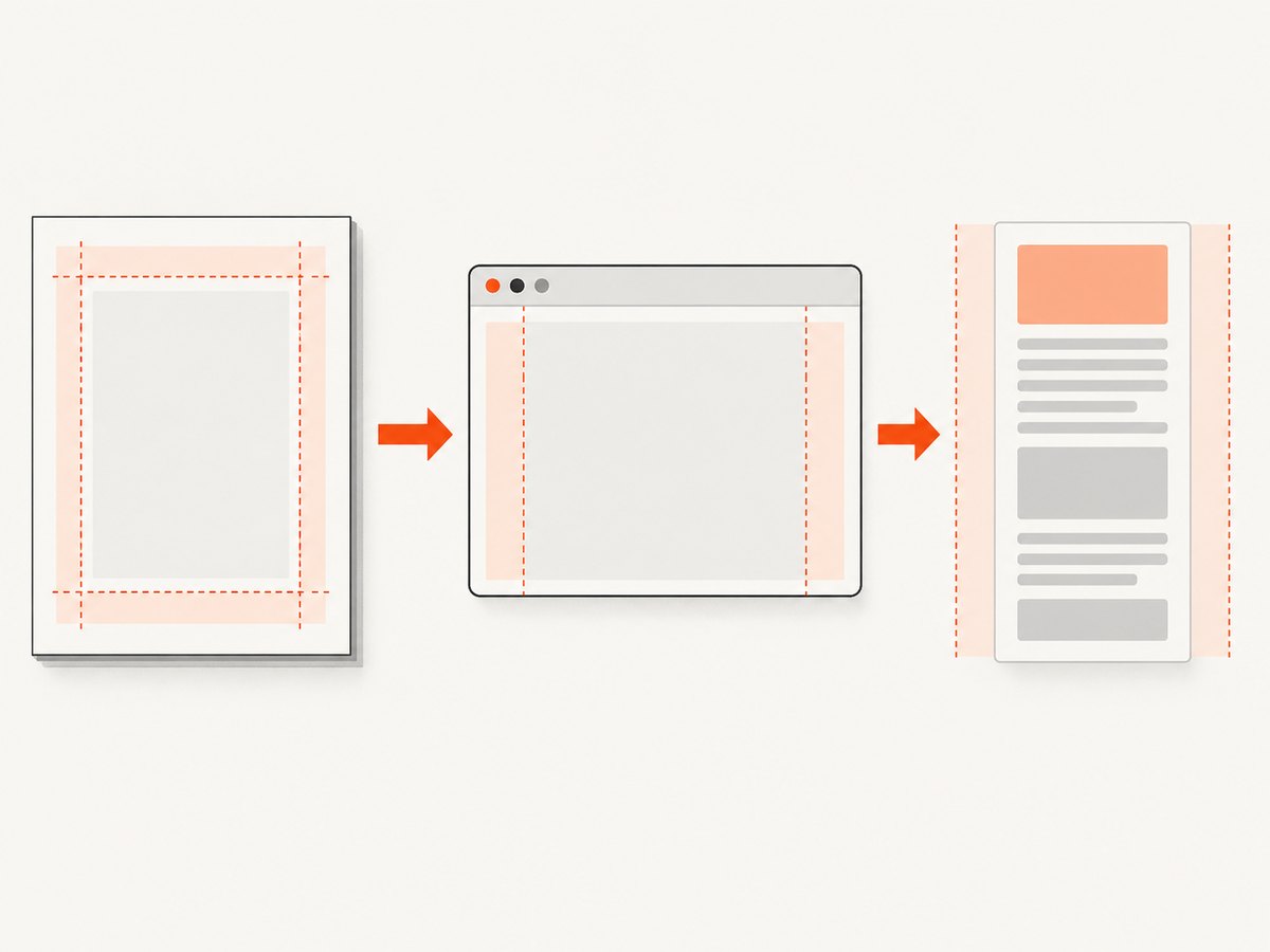
The project documentation says the default rendered page is A4 and that --page-size can select sizes such as A3, Letter and Legal. The same command-line reference documents page dimensions, margins, viewport emulation, print media, zoom and smart shrinking: wkhtmltopdf usage documentation.
| Layer | Setting | What to check |
|---|---|---|
| Paper | --page-size, --page-width, --page-height |
Is the physical sheet wide enough? |
| Margins | --margin-left, --margin-right |
Are margins consuming the width you expected? |
| Viewport | --viewport-size |
Which responsive breakpoint and vw values are active? |
| CSS | width, max-width, grid and flex rules |
Does the wrapper fit the usable width? |
| Renderer scaling | --disable-smart-shrinking, --zoom |
Is WebKit shrinking or scaling the page? |
2. A stable starting command
Use this as a controlled baseline, then adjust values to your design:
wkhtmltopdf \
  --page-size A4 \
  --margin-left 12mm --margin-right 12mm \
  --viewport-size 1200x900 \
  --print-media-type \
  --disable-smart-shrinking \
  input.html output.pdf
This command uses A4, leaves 12mm on each side, emulates a 1200px-wide browser window, applies print CSS, and disables intelligent shrinking. The viewport height mainly affects viewport-relative layout and when content is laid out; the width is the critical value for responsive breakpoints.
Calculate the usable width
For a page width P and horizontal margins L and R, the nominal usable width is:
usable_width = P - L - RFor example, A4 is 210mm wide. With 12mm margins on both sides, the content area is approximately 186mm. Your main wrapper, table, image and long strings must fit that area after conversion through the browser renderer. If the wrapper is wider, wkhtmltopdf may overflow or shrink it.
3. Make the HTML wrapper match the target
A predictable PDF starts with a wrapper that can shrink to the available page width. Avoid a fixed desktop width such as width: 1400px when the target sheet is much narrower.
<!doctype html>
<html>
<head>
  <meta charset="utf-8">
  <style>
    * { box-sizing: border-box; }
    html, body { margin: 0; padding: 0; }
    body {
      font-family: Arial, sans-serif;
      color: #1f2937;
      font-size: 11pt;
      line-height: 1.45;
    }
    .page {
      width: 100%;
      max-width: 186mm;
      margin: 0 auto;
    }
    img, svg, video, table { max-width: 100%; }
    img { height: auto; }
    table { border-collapse: collapse; }
    th, td { padding: 4mm 3mm; border: 0.2mm solid #d1d5db; }
    pre, code { overflow-wrap: anywhere; }

    @media print {
      .screen-only { display: none !important; }
      a { color: inherit; text-decoration: none; }
      .page { max-width: none; }
    }
  </style>
</head>
<body>
  <main class="page">
    <h1>Report title</h1>
    <p>Content that fits the PDF content area.</p>
  </main>
</body>
</html>
Use a physical unit such as mm when you are matching a physical page. Use percentages or max-width: 100% for fluid content. Large tables need special attention: allow wrapping, shorten headings, or split the table into sections. Long URLs, hashes and unbroken code can still force overflow even when the wrapper is fluid.
4. Set paper size and margins first
Choose a named size when it matches the deliverable:
wkhtmltopdf --page-size Letter input.html letter.pdf
wkhtmltopdf --page-size A4 input.html a4.pdf
For an exact sheet, use dimensions:
wkhtmltopdf \
  --page-width 210mm \
  --page-height 297mm \
  --margin-left 10mm \
  --margin-right 10mm \
  --margin-top 15mm \
  --margin-bottom 15mm \
  input.html output.pdf
Set all four margins explicitly in automated jobs. A margin left over from a wrapper script or distribution default can make a previously fitting layout appear squeezed. Remember that top and bottom margins affect vertical pagination, while left and right margins determine horizontal room.
5. Control responsive CSS with the viewport
wkhtmltopdf may render screen media with a browser window that does not match the width used to design your page. That changes media-query breakpoints and vw units. Set a deliberate viewport:
wkhtmltopdf \
  --page-size A4 \
  --margin-left 12mm --margin-right 12mm \
  --viewport-size 1200x900 \
  input.html output.pdf
Choose a viewport that activates the CSS layout you intend to print. If your design has a desktop breakpoint at 1024px, a 1200px viewport keeps that layout active. If you want a narrow, mobile-like PDF, use a narrower viewport and provide CSS for it. Do not assume the physical millimetre width and viewport pixel width are identical; they are different parts of the rendering chain.
6. Decide between screen CSS and print CSS
wkhtmltopdf renders screen media by default. Add --print-media-type when the print stylesheet is the source of truth:
wkhtmltopdf --print-media-type input.html output.pdfUse print rules to remove navigation, hide interactive controls, change colors, and prevent unwanted page breaks:
@media print {
  nav, .toolbar, .cookie-banner { display: none !important; }
  h1, h2, h3 { break-after: avoid; page-break-after: avoid; }
  .keep-together { break-inside: avoid; page-break-inside: avoid; }
}
If the PDF suddenly becomes narrow after enabling print media, inspect print-only declarations for a fixed width, a smaller max-width, or a different grid. Keep the wrapper rule explicit in the print block when necessary.
7. Smart shrinking and zoom
Smart shrinking can scale a page that is wider than the available area. That may keep content on the sheet, but text and spacing become smaller than expected. Compare both modes while diagnosing:
wkhtmltopdf \
  --page-size A4 --margin-left 12mm --margin-right 12mm \
  --viewport-size 1200x900 \
  input.html shrinking.pdf

wkhtmltopdf \
  --page-size A4 --margin-left 12mm --margin-right 12mm \
  --viewport-size 1200x900 \
  --disable-smart-shrinking \
  input.html no-shrinking.pdf
Fix paper width, margins, viewport and CSS geometry before changing --zoom. Zoom changes apparent scale; it does not repair a wrapper that is intrinsically too wide. Record every value for reproducible builds.
8. The library API equivalents
If you call libwkhtmltox instead of the CLI, the same concepts are exposed through settings. The library documentation describes size.width, size.pageSize, margin settings, screenWidth, smartWidth, load.zoomFactor and load.printMediaType: library page settings.
| CLI | Library concept |
|---|---|
--page-size A4 |
size.pageSize |
--page-width |
size.width |
--margin-left/right |
margin settings |
--viewport-size |
screenWidth |
--disable-smart-shrinking |
smartWidth |
--zoom |
load.zoomFactor |
--print-media-type |
load.printMediaType |
9. A repeatable debugging checklist
- Confirm the installed binary and whether it is the patched-Qt build required by the features you use.
- Set page size and both horizontal margins explicitly.
- Set a deliberate viewport width.
- Inspect
@media print, wrapperwidthandmax-widthdeclarations. - Check wide tables, images, flex items and long unbreakable strings.
- Compare smart shrinking enabled and disabled.
- Change zoom only after the preceding values are stable.
10. Common errors and fixes
| Symptom | Likely cause | Fix |
|---|---|---|
| Everything is tiny | Wrapper exceeds usable width or smart shrinking is active | Reduce fixed widths, set margins, then compare --disable-smart-shrinking. |
| Desktop layout becomes mobile | Viewport is below a responsive breakpoint | Set --viewport-size to the intended design width. |
| Print rules do nothing | Screen media is still selected | Add --print-media-type and verify the selector. |
| Right edge is clipped | Content exceeds page width, often from a table or long token | Use max-width:100%, wrapping, smaller columns or a wider paper. |
| Margins look inconsistent | Defaults or wrapper CSS are adding spacing | Set CLI margins and reset html, body margins. |
| Layout changes between machines | Different wkhtmltopdf or patched-Qt builds | Pin the binary/build and record all rendering settings. |
| Changing zoom breaks pagination | Zoom was used to solve a geometry problem | Restore zoom, fix paper, margins, viewport and CSS first. |
11. Performance, reliability and cost considerations
Keep the render deterministic: pin the wkhtmltopdf build, use explicit dimensions, avoid unnecessary external assets, and set a stable viewport. Large images and complex tables increase rendering work and can cause timeouts in constrained environments. Test the widest page in your document, not only the first page.
For batch generation, cache reusable HTML and assets, process jobs with bounded concurrency, and retain the exact command or settings beside each output. If a page depends on JavaScript, wait for the content to be present before converting; otherwise the PDF can be valid but incomplete. A hosted renderer may be simpler when you need URL capture, retries, request controls or a service API.
12. Or skip the browser setup
ScreenshotNeo provides a website screenshot API and MCP server. One GET request returns a PNG, JPEG, WebP or PDF. Its capture options include full-page output with lazy images loaded, element selection, device presets, custom viewport and retina scale, PDF paper size, margins, landscape and page ranges, custom CSS and JavaScript, selector waits, delays, network-idle waits, request blocking, headers, cookies, user agents, authorization, timezone and geolocation.
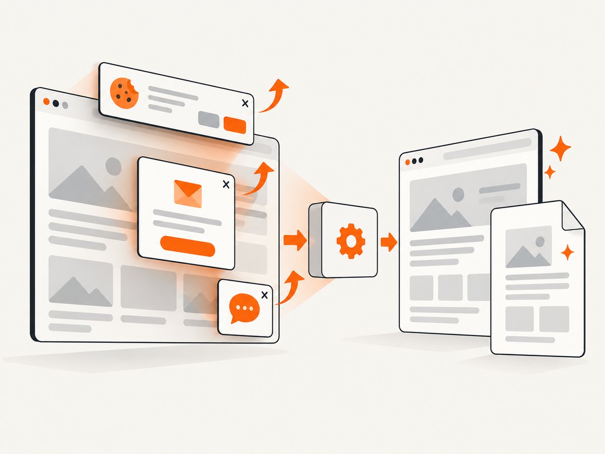
Cookie banners, newsletter popups and chat widgets are removed before the shot. Bot checks, blank pages, timeouts, failed loads and cache hits are not billed, and the response identifies the result with X-Page-Verdict and X-Billed headers. An MCP server provides take_screenshot, get_page_info and capture_pdf tools for Claude, Cursor and other MCP clients.
See the ScreenshotNeo API documentation for parameters and response details.
cURL
curl -G "https://api.screenshotneo.com/v1/shot" -d access_key=YOUR_API_KEY --data-urlencode url=https://stripe.com -o shot.webpPython
import requests
r = requests.get("https://api.screenshotneo.com/v1/shot", params={"access_key": "YOUR_API_KEY", "url": "https://stripe.com"}, timeout=90)
open("shot.webp", "wb").write(r.content)
Node.js
const q = new URLSearchParams({ access_key: 'YOUR_API_KEY', url: 'https://stripe.com' });
const res = await fetch(`https://api.screenshotneo.com/v1/shot?${q}`);
There is a free plan with 1,000 screenshots per month and no card. Paid plans start at $5 for 3,000 shots; yearly billing gives two months free, and every feature is available on every plan. Create a free ScreenshotNeo account.
13. FAQ
Should I size the wrapper in millimetres or pixels?
Use millimetres when matching a physical paper content area. Use fluid percentages when the same HTML must adapt to several paper sizes. Avoid a fixed pixel width wider than the usable page.
Does --viewport-size change the PDF paper?
No. It changes the emulated browser window used for layout and responsive CSS. Paper size and margins still determine the physical PDF area.
When should smart shrinking stay enabled?
Leave it enabled when controlled scaling is acceptable and the page is slightly wider than the target. Disable it when exact CSS sizing and readable, predictable scale matter, then make the layout fit.
Why does a valid PDF contain a blank page?
Blank output can result from a failed load, timing issue, unsupported content or a page-break rule. Confirm the URL loads, wait for dynamic content, inspect page-break CSS and test the same input with a pinned renderer build.
Can I capture only one element?
Yes. ScreenshotNeo supports capture by CSS selector, which is useful when a full document contains navigation or unrelated content.