How to Set CSS Sizes in Millimeters and Centimeters for wkhtmltopdf
Set precise CSS dimensions in mm and cm with wkhtmltopdf, control PDF paper geometry, avoid scaling surprises, and verify physical output.
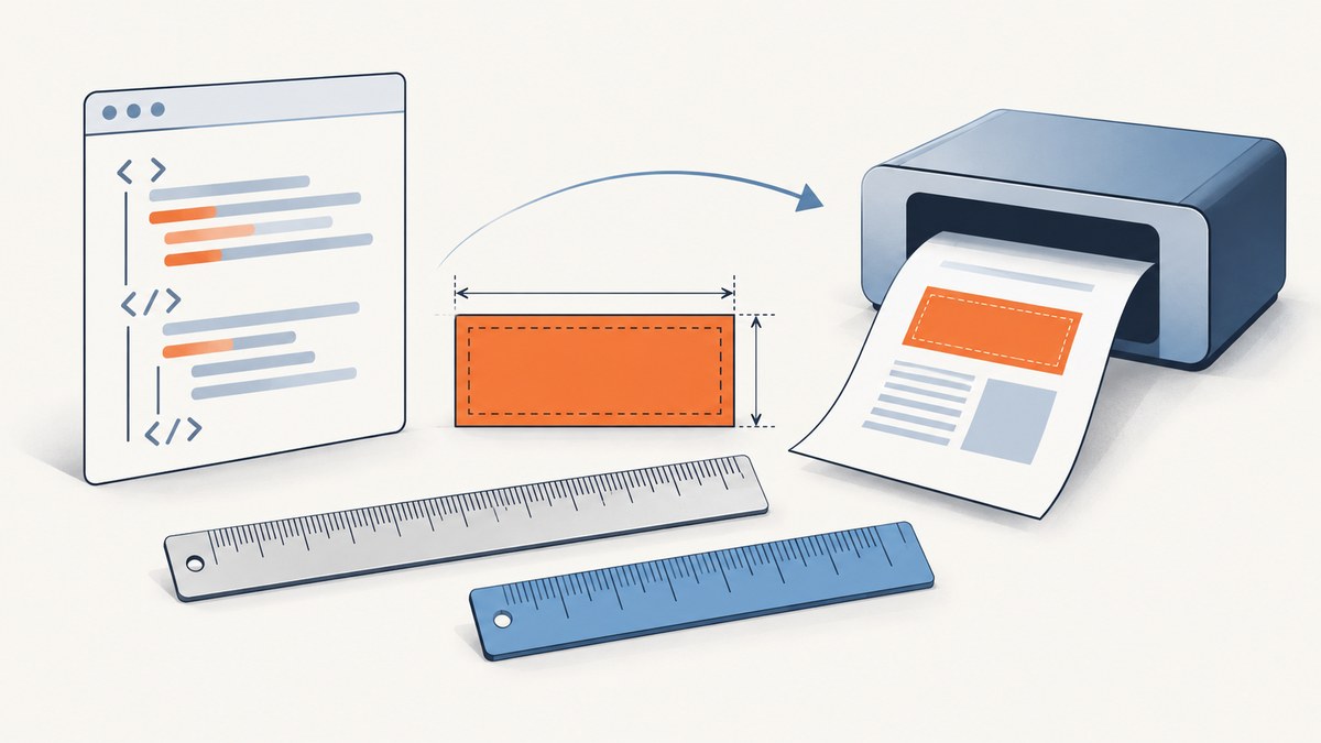
Use mm and cm directly on the CSS property that controls your element. For example, width: 50mm creates a 50 millimeter CSS box, while margin: 1.2cm creates a 1.2 centimeter margin. Set the PDF sheet independently with wkhtmltopdf options such as --page-size A4 or --page-width 210mm --page-height 297mm.
These two controls are easy to confuse. CSS units define the geometry inside the document. wkhtmltopdf page and margin options define the PDF canvas around that document. Smart shrinking can then scale the rendered page to fit, so a layout that looks correct in a browser still needs a render check when physical dimensions matter.
1. The complete mental model
There are three layers:
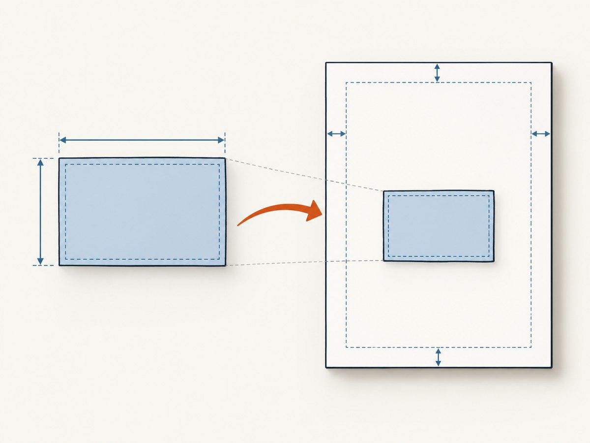
- CSS content geometry. Properties such as
width,height,padding,margin,top, andleftaccept metric lengths. - PDF page geometry. wkhtmltopdf sets paper size, orientation, and page margins from command-line options.
- Rendering scale. WebKit converts CSS lengths to pixels and wkhtmltopdf may shrink the rendered content to fit the available page area.
Keep each layer explicit. A 50mm label inside an A4 page is not the same setting as an A4 page itself.
2. CSS millimeters and centimeters
mm and cm are CSS absolute length units. The CSS specification defines 1cm as 10mm. Under the conventional CSS mapping, 1 inch equals 96 CSS pixels, so:
1cm = 96 / 2.54 CSS px(about 37.795px)1mm = 96 / 25.4 CSS px(about 3.7795px)
The 96-pixels-per-inch relationship is a CSS layout convention, not a promise that every physical printer or PDF viewer will measure identically. The CSS Values and Units specification defines the units, and WebKit documents the historical 96 CSS-pixels-per-inch mapping.
Basic example
<!doctype html>
<html>
<head>
  <meta charset="utf-8">
  <style>
    @page {
      size: A4;
      margin: 12mm;
    }

    .label {
      box-sizing: border-box;
      width: 50mm;
      height: 30mm;
      padding: 3mm;
      margin: 1.2cm;
      border: 0.3mm solid #222;
      font: 10pt Arial, sans-serif;
    }
  </style>
</head>
<body>
  <div class="label">50mm × 30mm label</div>
</body>
</html>
Use units on every dimension that affects the physical layout. box-sizing: border-box makes the declared width and height include padding and borders, which avoids accidental oversizing.
3. Set the PDF page separately
wkhtmltopdf supports standard paper presets and explicit dimensions. A4 is the documented default page size, but specifying it makes scripts self-documenting.
wkhtmltopdf --page-size A4 input.html output.pdfFor explicit geometry, use millimeters in the command:
wkhtmltopdf \
  --page-width 210mm \
  --page-height 297mm \
  --margin-top 12mm \
  --margin-right 12mm \
  --margin-bottom 12mm \
  --margin-left 12mm \
  input.html output.pdf
Paper dimensions and margins reduce the area available to your CSS content. A 210mm-wide page with 12mm left and right margins has approximately 186mm of usable width before any additional scaling or layout constraints.
Orientation and common page choices
# Landscape A4
wkhtmltopdf --page-size A4 --orientation Landscape input.html output.pdf

# US Letter
wkhtmltopdf --page-size Letter input.html output.pdf

# Custom 100mm × 150mm sheet
wkhtmltopdf --page-width 100mm --page-height 150mm input.html output.pdf
Use either a preset or explicit width and height for a given run. Keep the CSS @page rule aligned with the command-line choice when both are present, then inspect the generated PDF because downstream builds can resolve conflicts differently.
4. Smart shrinking and physical accuracy
Smart shrinking is enabled by default in the documented wkhtmltopdf usage. It scales a page when the rendered content is wider than the available paper area. This is useful for fitting ordinary web pages, but it can change the apparent physical size of a box.
For controlled layouts such as labels, tickets, or templates, try disabling it:
wkhtmltopdf \
  --disable-smart-shrinking \
  --page-width 210mm \
  --page-height 297mm \
  --margin-top 0mm --margin-right 0mm \
  --margin-bottom 0mm --margin-left 0mm \
  input.html output.pdf
Do not assume this is universally correct. With shrinking disabled, content that exceeds the page may be clipped or flow onto additional pages. Render a representative document and measure the resulting PDF for your installed version and build.
DPI is not a physical-size guarantee
The documented --dpi option defaults to 96 and has no effect on X11-based systems according to the project usage documentation. A DPI flag alone cannot guarantee identical physical output across different builds, operating systems, PDF viewers, or printer pipelines. Record the wkhtmltopdf version, options, and build environment when reproducibility matters.
5. A reusable print layout
<style>
  @page {
    size: 210mm 297mm;
    margin: 0;
  }

  * { box-sizing: border-box; }

  html, body {
    width: 210mm;
    min-height: 297mm;
    margin: 0;
    padding: 0;
  }

  .sheet {
    width: 210mm;
    min-height: 297mm;
    padding: 15mm;
    page-break-after: always;
  }

  .card {
    width: 85mm;
    height: 55mm;
    padding: 5mm;
    margin-bottom: 8mm;
    border: 0.25mm solid #333;
  }
</style>
Use min-height when content can grow. A fixed height is appropriate for a known physical form, but overflowing text can create unexpected pages. For repeated forms, keep each sheet’s dimensions explicit and use page-break rules at the sheet boundary.
6. Runnable command-line, Python, and Node.js examples
Shell
wkhtmltopdf \
  --page-size A4 \
  --margin-top 10mm --margin-right 10mm \
  --margin-bottom 10mm --margin-left 10mm \
  --disable-smart-shrinking \
  invoice.html invoice.pdf
Python
from pathlib import Path
import subprocess

html = Path("invoice.html").resolve()
pdf = Path("invoice.pdf").resolve()

subprocess.run([
    "wkhtmltopdf",
    "--page-size", "A4",
    "--margin-top", "10mm",
    "--margin-right", "10mm",
    "--margin-bottom", "10mm",
    "--margin-left", "10mm",
    "--disable-smart-shrinking",
    str(html), str(pdf),
], check=True)

print(pdf)
Node.js
import { execFile } from "node:child_process";
import { promisify } from "node:util";

const execFileAsync = promisify(execFile);

await execFileAsync("wkhtmltopdf", [
  "--page-size", "A4",
  "--margin-top", "10mm",
  "--margin-right", "10mm",
  "--margin-bottom", "10mm",
  "--margin-left", "10mm",
  "--disable-smart-shrinking",
  "invoice.html",
  "invoice.pdf"
]);

console.log("Created invoice.pdf");
7. Inspecting the generated PDF
When dimensions matter, verify the artifact rather than relying on a browser preview. Check:
- Page width and height match the intended paper size.
- Outer margins are correct on all four sides.
- Boxes with metric dimensions have not been shrunk.
- Text has not overflowed fixed-height regions.
- Fonts, images, and remote assets loaded before conversion.
Measure a representative box with a PDF inspection tool or a physical print at 100% scale. If the measurement is wrong, first compare the available content width with the sum of CSS width, padding, border, and margins. Then check smart shrinking and any viewer setting that says “fit to page.”
8. Troubleshooting common errors
| Symptom | Likely cause | Fix |
|---|---|---|
| The box is smaller than declared | Smart shrinking scaled the page | Try --disable-smart-shrinking; reduce content width or margins and render again. |
| The box is clipped | Fixed dimensions exceed the usable page area | Subtract page margins from page width, then account for padding and borders. |
| Content starts too close to the edge | PDF margins and CSS margins were both assumed to be zero | Set wkhtmltopdf margins explicitly and keep CSS margins intentional. |
| Extra pages appear | Fixed-height content overflows or page breaks are missing | Use min-height, reduce content, or add deliberate page-break rules. |
| Millimeter values seem inconsistent | Different wkhtmltopdf builds or DPI/scaling behavior | Record the version and options; render and measure on the deployment build. |
| Remote fonts or images are absent | Resources were unavailable during conversion | Use local assets where possible, verify network access, and wait for required content before conversion. |
| CSS appears ignored | Unsupported CSS, malformed markup, or a selector mismatch | Validate HTML, simplify the rule, and confirm the property is supported by the WebKit build. |
9. Performance, reliability, and cost considerations
wkhtmltopdf runs a browser engine for every conversion, so startup time, page complexity, web fonts, JavaScript, and remote resources affect throughput. For batch jobs:
- Keep templates and assets local when possible.
- Reuse a stable, pinned wkhtmltopdf build across environments.
- Set an application timeout around the subprocess and capture stderr.
- Retry transient network failures, but do not blindly retry malformed HTML.
- Render a small sample after changing page dimensions or scaling options.
For predictable costs, account for compute time, font and asset hosting, and the operational work of maintaining a browser binary. A self-hosted converter gives control, but your application owns process isolation, updates, queueing, and failure handling.
10. Or skip the browser setup
If you need screenshots or PDFs from URLs without managing a local browser, ScreenshotNeo provides a single API request. See the ScreenshotNeo documentation for all options.
curl -G "https://api.screenshotneo.com/v1/shot" -d access_key=YOUR_API_KEY --data-urlencode url=https://stripe.com -o shot.webpimport requests
r = requests.get("https://api.screenshotneo.com/v1/shot", params={"access_key": "YOUR_API_KEY", "url": "https://stripe.com"}, timeout=90)
open("shot.webp", "wb").write(r.content)const q = new URLSearchParams({ access_key: 'YOUR_API_KEY', url: 'https://stripe.com' }); const res = await fetch(`https://api.screenshotneo.com/v1/shot?${q}`);ScreenshotNeo removes cookie banners, newsletter popups, and chat widgets before capture. Bot checks, blank pages, failed loads, timeouts, and cache hits are not billed, and response headers identify the page verdict and billing result. Its MCP server lets Claude, Cursor, and other MCP clients call take_screenshot, get_page_info, and capture_pdf. The Free plan includes 1,000 screenshots per month with no card; paid plans start at $5 for 3,000 shots.
Create a free ScreenshotNeo account to get started.
11. Practical checklist
- Put
mmorcmon the CSS property controlling the physical box. - Set paper size with
--page-sizeor explicit width and height. - Set all four PDF margins explicitly.
- Use
box-sizing: border-boxfor fixed forms. - Decide whether smart shrinking helps or harms the layout.
- Pin the wkhtmltopdf build and record conversion options.
- Render and measure a representative PDF before production.
12. FAQ
Can I use decimals such as 12.5mm?
Yes. CSS lengths accept decimal values, for example width: 12.5mm. Verify the generated PDF when tolerances are tight.
Should I use CSS @page or command-line options?
Use command-line options for the conversion contract and keep @page synchronized in the document. Explicitly setting both makes intent clear, but always inspect the output of your installed build.
Why does a 100mm element not measure 100mm on paper?
Smart shrinking, page margins, viewer “fit” settings, printer scaling, or build differences can alter the final measurement. Check the PDF at 100% and disable unwanted scaling.
Does --dpi fix every sizing problem?
No. The documented default is 96, and the option has no effect on X11-based systems. DPI is only one part of the rendering path.
Are CSS millimeters suitable for screen pixels?
They are useful for print-oriented layouts, but browsers and PDF engines map physical units through CSS pixels. Use pixels for screen-only interfaces and metric units for document geometry that must correspond to paper dimensions.
Sources: wkhtmltopdf usage documentation, CSS Values and Units Module Level 4, and WebKit’s explanation of CSS units.