WordPress Website Thumbnail Sizes: Recommended Dimensions
WordPress thumbnails default to 150×150 pixels, but the right size depends on your theme, crop, layout, and responsive display.
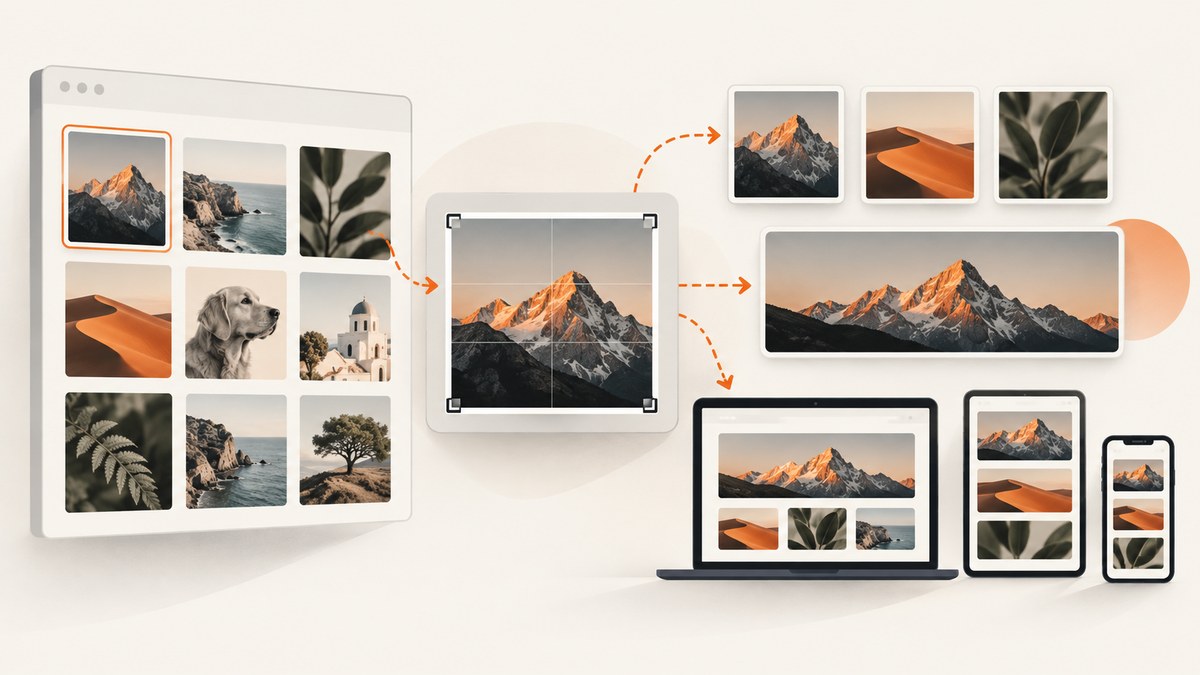
WordPress’s documented default thumbnail size is 150 × 150 pixels, cropped to a square. That is a starting default, not a universal recommendation for every website. Your theme, Media settings, source image dimensions, block settings, and custom image sizes determine what visitors actually see.
For most sites, begin by checking Dashboard → Settings → Media. Use the documented 150 × 150 square size when your design needs compact, uniform cards. Use proportional dimensions when preserving the original composition matters. For a theme-specific card or featured-image slot, register a named size in code and regenerate existing thumbnails.
1. The direct answer: what size should a WordPress thumbnail be?
The WordPress documentation describes the default thumbnail as 150 × 150 pixels, cropped as a perfect square. Administrators can change that value in the Media settings. The default does not mean every theme displays thumbnails at that size: themes and plugins can register their own sizes, and CSS can scale an image to a different rendered size.
| Use case | Starting approach | Why |
|---|---|---|
| Small square grid or avatar-like card | 150 × 150, exact crop | Every card has the same footprint. |
| Post card with a fixed aspect ratio | Register a named size matching the slot | The server generates a predictable crop for the component. |
| Inline article image | Proportional resize | The complete composition remains visible. |
| Responsive image block | Auto width and height | The image can adapt to the available screen width. |
Do not confuse an image file’s pixel dimensions with its CSS display size. A 1,200-pixel image can render at 300 pixels wide on a phone, while a 150-pixel thumbnail can be enlarged by CSS and look soft. The correct generated size should be at least as large as the largest display slot where that variant is used, while avoiding unnecessary dimensions for tiny cards.
WordPress’s official documentation covers the default and editable thumbnail behavior in Edit Media and the configurable fields in the Settings Media screen.
2. Understand WordPress’s built-in image sizes
WordPress exposes four familiar choices when inserting images: Thumbnail, Medium, Large, and Full Size. Their numeric values are controlled by the site and theme context.
| Size | What it represents | Practical guidance |
|---|---|---|
| Thumbnail | Configured width and height, often 150 × 150 | Use an exact crop only when the design requires a uniform shape. |
| Medium | Maximum width and height | Choose values for the content patterns where medium images appear. |
| Large | Maximum width and height | Keep the theme’s content column and actual display slot in mind. |
| Full Size | The original uploaded image | It can still render below its intrinsic width because of CSS and the content column. |
Open Settings → Media and inspect the values on your own site. The Thumbnail section contains width, height, and an option to crop to exact dimensions. When exact cropping is disabled, WordPress scales proportionally instead of forcing both dimensions. Medium and Large are maximum dimensions, so an image may be smaller when its aspect ratio or source size requires it.
The Classic Editor documentation explains that Large and Full Size output can be limited by the theme’s content column. That means a “Large” selection does not promise that the browser will render the original pixel width on every screen. In the block editor, available resolutions also depend on the uploaded source and theme support.
3. Choose between proportional scaling and exact cropping
Proportional scaling
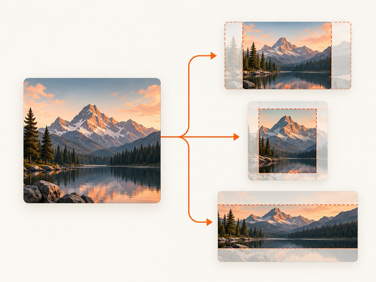
Proportional scaling preserves the original aspect ratio. It is the safer default for photographs, screenshots, diagrams, and product images where cutting off the edges could remove important information.
- Use it for inline article illustrations and documentation images.
- Use it when source images have varied aspect ratios.
- Expect cards to have different heights unless CSS reserves a consistent area.
Exact cropping
Exact cropping produces the requested width and height, trimming the image to fit. It works well for archive cards, related-post grids, and other repeated components that must align in rows.
- Use it when every card has a fixed aspect ratio.
- Check faces, logos, and important edges after cropping.
- Do not use a square crop for every image simply because it is the default.
In the block editor, set width and height to Auto in most cases. The Cover option fills the selected area and crops when necessary. Contain keeps the complete image visible but can leave empty space. Aspect-ratio and focal-point controls change the visible presentation without replacing the original upload.
4. Inspect and change the built-in thumbnail settings
- Sign in to WordPress as an administrator.
- Go to Settings → Media.
- Review Thumbnail width and height.
- Enable exact-dimension cropping only if your design needs a fixed rectangle.
- Review the Medium and Large maximum dimensions.
- Save changes.
Changing these fields affects thumbnails generated for future uploads. Existing files already stored in the uploads directory do not automatically gain new variants. If you need old images to match the new settings, regenerate thumbnails with a trusted regeneration tool or your site’s deployment process, then verify the output before deleting older files.
Before changing production settings, record the current values and check where each size is used. A plugin or theme may depend on a registered name that does not appear as one of the four standard settings.
5. Add a custom size for a theme component
When a card, hero, or archive component has a defined slot, developers can register a named image size with add_image_size(). The WordPress Developer Resources reference documents the function’s name, width, height, and crop arguments.
<?php
add_image_size( 'card-thumbnail', 640, 360, true );
This example creates a 640 × 360 size with an exact crop. The dimensions are illustrative; measure the largest rendered card in your design and choose values that support it. With false (or omitted crop behavior), WordPress scales proportionally toward the target dimensions.
Use the custom size in a theme
<?php
echo wp_get_attachment_image(
    get_post_thumbnail_id(),
    'card-thumbnail',
    false,
    array(
        'loading' => 'lazy',
        'alt'     => get_the_title(),
    )
);
wp_get_attachment_image() lets WordPress generate the appropriate srcset and image attributes instead of hard-coding a file path. Keep the HTML width and height metadata available so the browser can reserve space and reduce layout movement.
Choose a crop position when the subject is off-center
The basic true crop uses a centered crop. If the important subject sits near an edge, use the WordPress image editor, a focal-point feature supplied by your theme, or a custom processing workflow. Always inspect representative images: a centered crop that works for one photograph may cut off the subject in another.
6. Responsive display: generated size versus rendered size
Responsive behavior has two separate decisions:
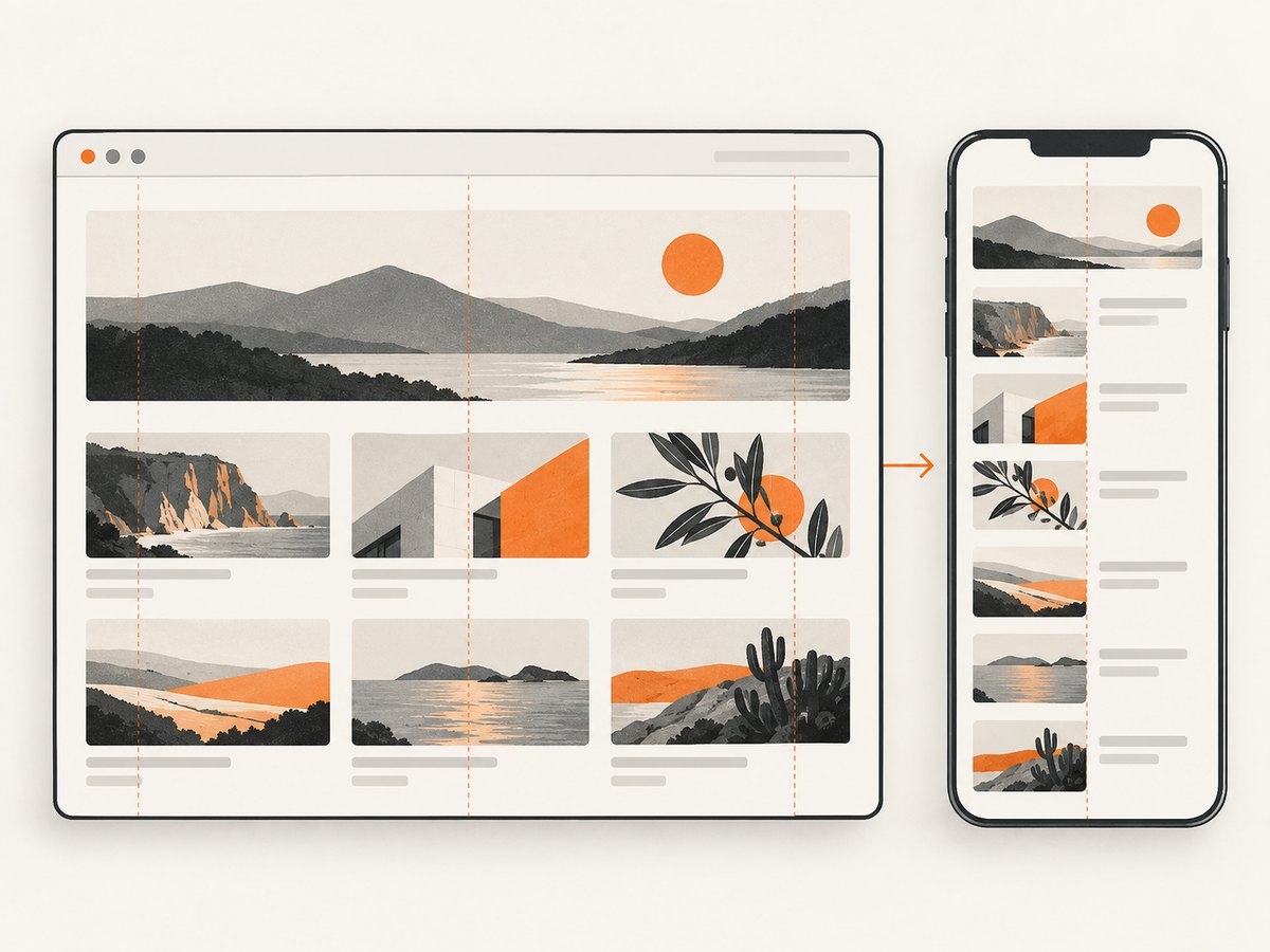
- Which file variant WordPress generates and sends. WordPress can provide multiple sources through
srcsetandsizes. - How the browser lays out that file. CSS controls the rendered width, height, object-fit behavior, and aspect ratio.
For a flexible image, use CSS such as:
.post-card img {
  display: block;
  width: 100%;
  height: auto;
}
For a fixed card frame:
.post-card__media {
  aspect-ratio: 16 / 9;
  overflow: hidden;
}

.post-card__media img {
  width: 100%;
  height: 100%;
  object-fit: cover;
}
Use object-fit: cover when filling the frame is more important than showing every pixel. Use contain when the entire image must remain visible. A fixed CSS height without an intentional crop can distort the visual rhythm or squeeze the image, so set both dimensions deliberately.
7. A practical sizing method for developers
- Map every slot. List archive cards, related posts, hero images, author avatars, and inline content images.
- Measure the largest slot. Include the widest desktop layout and any high-density display requirement.
- Choose the shape. Decide whether the component needs a square, 4:3, 3:2, or 16:9 crop.
- Choose crop behavior. Preserve proportions for complete compositions; crop for uniform cards.
- Register only useful variants. Every extra size increases storage and image-generation work.
- Test real content. Use portraits, screenshots, landscapes, transparent graphics, and unusually tall images.
- Check mobile layouts. Confirm that the browser receives an appropriate source and that the subject remains visible.
A card rendered at 320 CSS pixels wide should not rely on a 150-pixel source if it will look soft on a high-density display. Conversely, generating a 2,000-pixel file for a 100-pixel avatar wastes storage and transfer. Let the layout, not a universal number, determine the variant.
8. Troubleshooting common thumbnail problems
| Symptom | Likely cause | Fix |
|---|---|---|
| Old images keep the previous dimensions | Changing Media settings does not rewrite existing files. | Regenerate thumbnails and verify URLs before removing old files. |
| Cards have inconsistent heights | Images are proportionally scaled or the container has no fixed ratio. | Register an exact crop or set a deliberate CSS aspect ratio. |
| Faces or logos are cut off | Centered cropping removes important edges. | Change the focal point, use a different crop, or preserve the full image. |
| Images look blurry | The browser is enlarging a smaller generated file. | Generate a variant at least as wide as the largest display slot. |
| Images look stretched | CSS sets width and height without preserving aspect ratio. | Use height: auto or an intentional object-fit rule. |
| The custom size is unavailable | The registration code did not run, or the image was uploaded before registration. | Load the code from the active theme/plugin and regenerate thumbnails. |
| Large images overflow on mobile | The theme does not constrain the rendered width. | Use max-width: 100% and inspect the block’s responsive settings. |
9. Performance, reliability, and storage considerations
Pixel dimensions affect transfer size, decode time, storage, and the number of responsive variants WordPress must maintain. Match each generated file to a real layout slot, compress uploads appropriately, and avoid using Full Size when a smaller variant is sufficient. WordPress documentation discusses matching image size to layout and keeping file weight in mind; treat those principles as guidance rather than a universal byte limit.
Keep width and height attributes in rendered markup to reserve layout space. Lazy-load below-the-fold images where the theme supports it, but do not delay the primary image that establishes the page’s main content. Test with the actual theme, CDN, optimization plugins, and browser behavior because those layers can change which file is delivered.
10. Capture and verify thumbnail layouts
When a thumbnail change affects archive pages, compare screenshots at the desktop and mobile viewports. You can capture a page with a browser automation tool, or use an API after the page is deployed.
Or skip the browser setup
ScreenshotNeo provides a one-request website screenshot API. Its cleanup step accepts cookie or consent banners like a visitor and removes more than 60 known consent platforms, newsletter popups, and chat widgets before capture. Bot checks, blank pages, timeouts, failed loads, and cache hits are not billed; response headers identify the page verdict and billing status. It also provides an MCP server with take_screenshot, get_page_info, and capture_pdf for Claude, Cursor, and other MCP clients.
See the ScreenshotNeo API documentation for all options, including viewport and device presets, full-page capture, CSS selectors, custom CSS and JavaScript, wait conditions, headers, cookies, geolocation, caching, signed links, asynchronous jobs, bulk capture, and PDF output.
curl -G "https://api.screenshotneo.com/v1/shot" -d access_key=YOUR_API_KEY --data-urlencode url=https://example.com/archive -o archive.webpimport requests
r = requests.get("https://api.screenshotneo.com/v1/shot", params={"access_key": "YOUR_API_KEY", "url": "https://example.com/archive"}, timeout=90)
open("archive.webp", "wb").write(r.content)const q = new URLSearchParams({ access_key: 'YOUR_API_KEY', url: 'https://example.com/archive' });
const res = await fetch(`https://api.screenshotneo.com/v1/shot?${q}`);The Free plan includes 1,000 screenshots each month with no card. Paid plans start at $5 for 3,000 shots; every feature is available on every plan. Create a free ScreenshotNeo account to capture and review your thumbnail layouts.
11. Cost and maintenance notes
WordPress image sizes consume disk space because each registered variant can create another file per upload. Keep the list focused on actual components and remove obsolete sizes only after confirming that no content references them. A screenshot workflow adds request costs and storage for captures; ScreenshotNeo bills only clean shots, while failed loads and cache hits cost nothing, which is useful when checking multiple responsive states.
12. Frequently asked questions
Is 150 × 150 always the best thumbnail size?
No. It is WordPress’s documented default. Use it when a square 150-pixel variant suits the component; choose another generated size when the layout is larger or uses another aspect ratio.
Should thumbnails be square?
Only when the design benefits from a uniform square. News cards, video previews, and editorial grids often need a landscape ratio instead.
Does changing Settings → Media resize old uploads?
No. Existing files need thumbnail regeneration if you want new variants.
What is the difference between Cover and Contain?
Cover fills the selected area and crops as needed. Contain keeps the complete image visible and may leave empty space.
Should I use a custom image size for a theme card?
Yes, when the card has a repeatable dimension or crop. Register a named size with add_image_size(), use it in the theme, and regenerate older thumbnails.
Why does Full Size not display at the original width?
The theme’s content column and responsive CSS can constrain the rendered width even when the original file is selected.


