YouTube Thumbnail Examples and Design Tips
Explore practical YouTube thumbnail examples, learn what makes them work, and follow a workflow for designing, exporting, and evaluating your own.
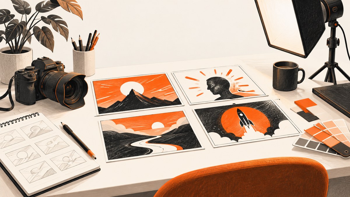
A strong YouTube thumbnail gives the right viewer a clear reason to watch: it shows the subject or result, adds context the title cannot, and stays understandable at small sizes. Start with one visual idea, use a sharp image and restrained text, then check the design beside its title on a phone-sized screen. YouTube says viewers usually see the thumbnail and title before deciding whether to watch, and reports that 90% of its best-performing videos have custom thumbnails. That figure is from YouTube Help; it is not a promise that a custom thumbnail will improve every video.
This guide walks through useful thumbnail patterns, practical examples, image specifications, a repeatable design process, and ways to assess results after publishing.
1. What makes a YouTube thumbnail work?
A thumbnail works when a viewer can quickly recognize what the video is about and why it might matter to them. It should be accurate to the video, distinct enough to notice among neighboring videos, and simple enough to read at the size where it will appear. YouTube recommends a clear audience fit, readable fonts, a rule-of-thirds composition, and avoiding excessive complexity. It also advises checking how the image appears across devices. YouTube’s thumbnail and title guidance explains these recommendations.
Think of the image and title as a pair. The thumbnail can supply the human expression, result, comparison, or visual question; the title can provide the precise topic. If both repeat the same words and idea, one is probably doing too little. If they make unrelated promises, viewers may feel misled after clicking.
A quick review checklist
- Relevant: The main subject appears in the video or faithfully represents its result.
- Understandable: The central idea is recognizable without zooming in.
- Focused: One dominant subject or contrast leads the eye.
- Legible: Any words remain readable at a small display size.
- Complementary: The title adds detail instead of simply duplicating the thumbnail.
- Accurate: The image creates interest without promising a scene or outcome the video does not deliver.
2. YouTube thumbnail examples and when to use them
These patterns are starting points, not templates to copy without regard to your audience. Compare each option for clarity at small size, relevance to the actual video, title-thumbnail fit, text legibility, contrast, emotional or action cue, branding, and accuracy.
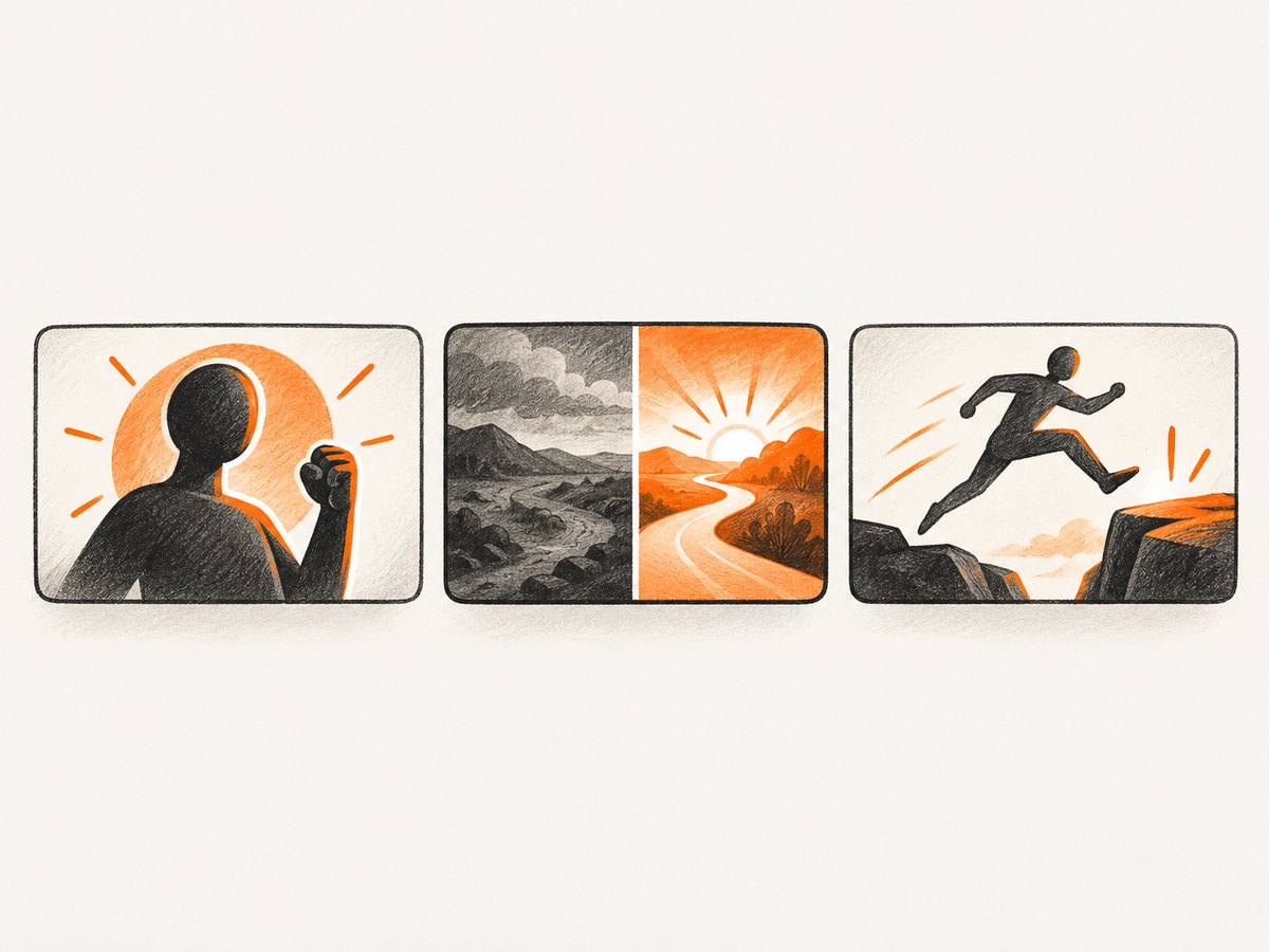
Example A: Face or subject plus one promise
For a cooking video about making bread, show the finished loaf large in the frame and, if useful, the baker holding it. A short phrase such as “No-knead loaf” can establish the specific angle when the image alone cannot. Keep the loaf as the focal point; small bowls, decorative flour marks, and several labels can compete with it.
This pattern is useful for tutorials, reviews, and explainers with a recognizable person, object, or outcome. A familiar host can help subscriber-focused videos feel immediately identifiable. For casual viewers, emphasize an action or result that makes sense without knowing the channel.
Example B: Before and after
For a room makeover, show the old and finished room in two clearly separated halves. Make the difference visible through lighting, layout, or color, and make sure both sides remain distinguishable in a small preview. A central divider or consistent camera angle can clarify the comparison. This pattern suits transformations, repairs, editing demonstrations, and experiments with visible outcomes.
A split frame becomes confusing when the two states are too similar, the divider is unclear, or the labels take more attention than the result. Use words only if viewers need them to understand which state is which.
Example C: Action or emotion
For a video about learning to skateboard, show the moment of a real attempt: a person balancing, landing, or reacting to a fall. A readable action often communicates the subject faster than a collage of skateboard parts. YouTube suggests considering universally relatable actions and emotions for casual audiences. Keep the expression or movement plausible for the video rather than staging an exaggerated reaction that the content cannot support.
Example D: Searchable versus intriguing pairing
For a search-led video such as a guide to replacing a bicycle chain, make the subject obvious: show the chain and the relevant tool. Let a direct title identify the task. For a browse-led travel video, a striking view or a moment of discovery can create curiosity, while the title supplies the destination or story. In either case, curiosity should lead to the content the viewer expects.
Example E: A consistent series system
A channel covering the same topic each week can reuse a color, font treatment, corner mark, or framing style. Keep the main image different for each episode so the series is recognizable without making every card look like a duplicate. Small branding can help returning viewers; it should not displace the actual subject.
Example F: Educational or institutional video
For a classroom demonstration, use a real image of the speaker, experiment, or activity. A brief context phrase can make the lesson clear when the photograph alone leaves a viewer guessing. Carnegie Mellon University’s guidance recommends that thumbnails explain the video in one frame and use restrained branding; its examples also show how no text can leave a viewer unsure what an image means, while too much text can overload it. See CMU’s YouTube content guidance.
3. Size, format, text, color, and layout
For a standard video thumbnail, Canva documents a 1280 × 720 pixel canvas, 16:9 aspect ratio, minimum width of 640 pixels, and maximum file size of 2 MB. YouTube’s current upload guidance recommends uploading as large an image as possible, a 16:9 aspect ratio for videos, and gives different maximum file sizes depending on upload device: 2 MB on mobile and 50 MB on desktop. YouTube’s current help page recommends up to 3840 × 2160 pixels for video thumbnails and a minimum width of 640 pixels. Requirements can change, so check the current YouTube upload screen and help page before preparing a batch. Canva’s size guidance and YouTube’s upload instructions describe the respective settings.
| Decision | Practical starting point | Check |
|---|---|---|
| Canvas | 16:9; 1280 × 720 is a common design canvas | Keep the subject and essential text away from edges |
| Image quality | Use a sharp frame or photograph with enough resolution | Inspect the face, object, and fine details at reduced size |
| Text | Use a few words only when they add context | Preview on a phone-sized screen; increase contrast if needed |
| Color | Separate the subject from its background | Check that foreground and background do not blend together |
| Export | JPEG for a smaller photographic file; PNG for crisp text or graphics | Confirm the format and size in YouTube Studio |
There is no universal winning font or color. Choose type that stays readable at the displayed size and use contrast to separate the subject from its surroundings. Bright colors can help distinguish elements, but more color is not automatically more attention. Place the focal subject and any text with a simple grid such as the rule of thirds, leave breathing room, and test whether the composition still works in a small crop.
4. A step-by-step thumbnail design workflow
- Define the viewer and surface. Decide whether the video is mainly for existing subscribers or people discovering it in Home, Suggested, or search. Use familiar faces and recurring cues when recognition matters; use broadly understandable action or imagery when the audience may be new.
- Write the promise in one sentence. State what the video actually helps someone understand, see, or achieve. This keeps the thumbnail aligned with the content and prevents a visually dramatic idea from drifting into a false promise.
- Choose one visual idea. Pick a face, object, result, action, or contrast that best carries the story. Remove decoration that does not clarify the idea.
- Select a relevant, sharp source image. Capture possible thumbnail frames during filming or choose a suitable still. Prefer a frame with a clear subject and enough visual separation to survive reduction. A 2016 study of 1,118 Yahoo Screen videos found professional thumbnail choices associated with content relevance and visual-quality measures including texture and sharpness. It supports treating relevance and image quality as useful criteria; it does not establish a guaranteed formula for click-through rate. Read the study abstract on arXiv.
- Set a clear composition. Put the main subject in a dominant position, use a grid if helpful, and leave open space around any words. For a comparison, make the two states visibly distinct.
- Add text only if it supplies missing context. Use a short phrase rather than a sentence. Choose a readable font, strong contrast, and margins that tolerate cropping or small display sizes. If the title already says the phrase, ask what extra information the thumbnail text contributes.
- Apply restrained series branding. A repeatable color, type treatment, or small brand mark can connect related uploads. Change the central image for every episode and keep the brand element subordinate.
- Export and verify. Save a high-quality image in a format accepted by YouTube. Check dimensions, aspect ratio, file size, and the upload device’s current limit. Open the exported file to catch accidental cropping, compression artifacts, or transparency issues.
- Preview beside the title. View it at phone scale and in a row with other videos. Ask someone unfamiliar with the project what the video appears to be about. If the answer is wrong, simplify the composition or change the image-title pairing.
- Upload and measure in context. In YouTube Studio, open the video in Content, choose the thumbnail upload option, select the image, and save. YouTube says to assess CTR on Home and Suggested in the first 24 hours for general audiences, and CTR in the Subscriptions Feed for subscribers. Compare like audiences and traffic sources, and look at whether viewers continue watching after clicking.
Where YouTube Studio’s Test & Compare feature is available to your channel and video, it can compare up to three thumbnails concurrently. YouTube evaluates results using watch-time share and may report a winner, a preferred option, or no clear difference. A test without a decisive result is not proof that the images are identical in every context; there may not have been enough impressions or meaningful separation. Check YouTube’s Test & Compare requirements and explanation.
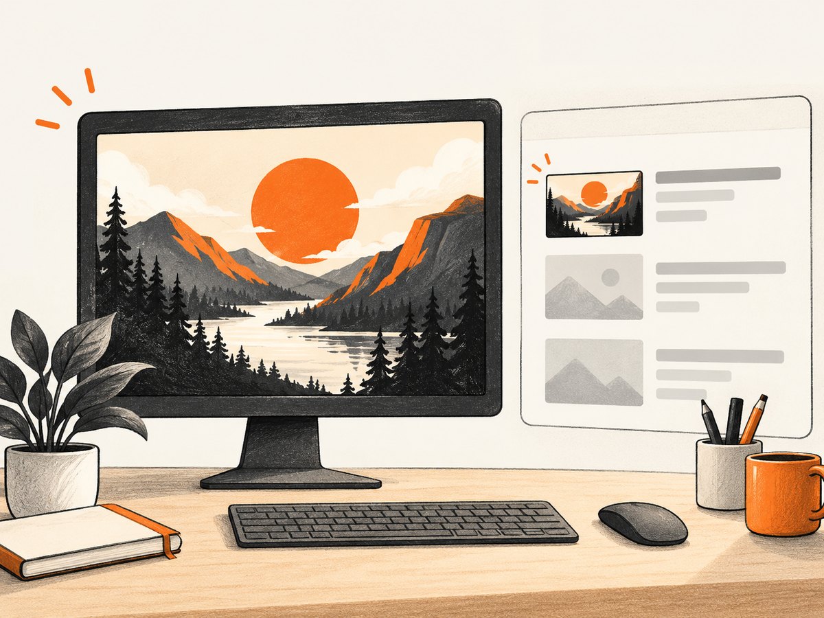
5. Measuring performance without chasing misleading CTR
CTR describes how often viewers watched after seeing a counted impression. It varies by audience, traffic source, and how widely a video is shown. A small, loyal audience may produce a higher CTR than a broader set of viewers, so compare the same video surfaces and similar audiences rather than treating one number as a universal target. YouTube recommends looking at Home and Suggested CTR for general audiences and Subscriptions Feed CTR for subscribers in the first 24 hours; also consider watch time and viewer retention.
If a new thumbnail earns more clicks but viewers leave quickly, check whether the title-thumbnail promise is accurate and whether the opening delivers it. YouTube notes that clickbait can pair high CTR with low average view duration and fewer impressions than expected. Avoid drawing conclusions from a handful of impressions or tiny percentage changes. Use the channel’s own comparable videos and, when eligible, YouTube’s concurrent experiment instead of swapping images repeatedly and attributing every movement to the design. See YouTube’s impressions and CTR FAQ.
6. Common thumbnail problems and fixes
| Problem | Likely cause | Fix |
|---|---|---|
| The idea is unclear at a glance | Too many competing subjects or decorative elements | Choose one focal point and remove anything that does not explain the video |
| Text looks tiny or muddy | Too many words, thin lettering, weak contrast, or small type | Shorten the phrase, use a readable font, and test the actual reduced preview |
| The image feels unrelated to the video | The design prioritizes surprise over an accurate promise | Use a relevant frame and align the thumbnail with the opening and substance of the video |
| Two halves of a comparison blur together | Similar framing or insufficient visual distinction | Use a clear divider, stronger difference between states, or a single result image |
| The export is rejected | Unsupported format, dimensions, or device-specific size limit | Check current Studio requirements, export an accepted JPG or PNG, and reduce file size if needed |
| CTR is high but watching falls off | The thumbnail attracts viewers who do not get the promised content | Make the promise more accurate and check early retention alongside CTR |
| A test has no clear winner | Variants may be too similar or the experiment may lack enough impressions | Review the variants and report; try a meaningfully different visual idea only when there is a reason |
7. Performance, reliability, and production notes
A repeatable workflow saves more time than adding intricate detail to every design. Keep a source file with editable layers, store a clean export, and record which video each asset belongs to. Use a consistent canvas and naming convention so collaborators can find the correct version. If you make several variants, change one meaningful visual decision at a time so you can explain what the comparison is intended to reveal.
Do not assume an image that looks good in a full-size editor will work in YouTube’s different placements. Check small previews, title pairings, and vertical-video behavior. YouTube notes that vertical videos with 16:9 custom thumbnails may be shown as an automatically generated 4:5 thumbnail on some mobile surfaces, while the custom image remains visible in other places. Shorts have separate thumbnail handling and recommended 9:16 proportions in some workflows; confirm current Studio support for the specific video type before exporting.
For costs, the core workflow can use frames or photos you already have and an image editor you already use. Paid design tools may offer templates or collaboration, but the research sources here do not establish that any specific paid tool improves thumbnail performance. Budget for the time required to select a relevant frame, create variants, check exports, and review analytics. Canva offers a thumbnail maker and templates, but confirm its current terms and any affiliate eligibility before relying on commercial arrangements.
8. Preview a thumbnail in a browser with ScreenshotNeo
If your team reviews thumbnail mockups on a web page, capture that page at a fixed viewport and inspect whether the image and title remain legible together. This is a browser-preview aid; it does not upload the image to YouTube, measure CTR, or replace YouTube Studio’s analytics. ScreenshotNeo is a website screenshot API and MCP server from ScreenshotNeo. Its API can capture a web page as an image; see the ScreenshotNeo API documentation for request options. Replace the example target with a public preview page you control.
Or skip the browser setup
One GET request can capture your preview page. Keep your API key private; avoid placing it in public client-side code.
curl -G "https://api.screenshotneo.com/v1/shot" -d access_key=YOUR_API_KEY --data-urlencode url=https://stripe.com -o shot.webpimport requests
r = requests.get("https://api.screenshotneo.com/v1/shot", params={"access_key": "YOUR_API_KEY", "url": "https://stripe.com"}, timeout=90)
open("shot.webp", "wb").write(r.content)const q = new URLSearchParams({ access_key: 'YOUR_API_KEY', url: 'https://stripe.com' });
const res = await fetch(`https://api.screenshotneo.com/v1/shot?${q}`);Adapt the target URL to your preview page. ScreenshotNeo accepts a cookie or consent banner like a visitor and removes more than 60 known consent platforms, newsletter popups, and chat widgets before capture; each of those steps can be turned off. Bot checks, blank pages, timeouts, failed loads, and cache hits cost nothing, and response headers say which page verdict applied and whether the request was billed. Its MCP server gives AI agents tools including take_screenshot, get_page_info, and capture_pdf. The free plan includes 1,000 screenshots per month with no card; paid plans start at $5 for 3,000 shots. Sign up for 1,000 free screenshots a month, with no card.
9. FAQ
Should every thumbnail include a face?
No. Use a face when the person or their expression helps explain the story or connect with the intended audience. A product, result, place, or action can be a clearer subject for other videos.
How much text should I put on a thumbnail?
Use only enough to add context the image and title do not already provide. Check it at the actual reduced display size; if it cannot be read quickly, shorten it or remove it.
Does a higher CTR always mean the thumbnail is better?
No. CTR depends on audience and traffic source, and a misleading promise can attract clicks without sustained viewing. Consider watch time, retention, and the intended viewer alongside CTR.
Can I use the same thumbnail style for every upload?
A recognizable series treatment can help returning viewers identify related videos. Keep the central image specific to each episode so the designs remain distinguishable.
Sources
- YouTube: Thumbnail and title tips
- YouTube: Add custom thumbnails
- YouTube: Test & Compare thumbnails
- YouTube: Impressions and click-through-rate FAQs
- Canva: YouTube thumbnail maker and size guidance
- Carnegie Mellon University: YouTube content best practices
- Song, Redi, Vallmitjana, and Jaimes: thumbnail selection study (2016)


