Why Screenshots Fail in Browser Automation and How to Fix Them
Fix blank, cropped, unstable, or incorrectly sized browser screenshots with a systematic Playwright troubleshooting guide.
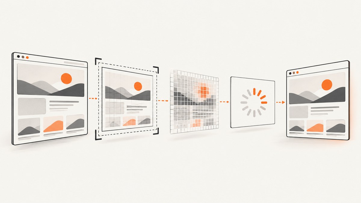
A browser screenshot usually fails for one of five reasons: the capture boundary is wrong, CSS pixels are confused with device pixels, the page has not reached a stable state, a device preset silently changed your viewport, or the browser engine behaves differently than expected. Diagnose those variables in that order before adding arbitrary sleeps.
This guide uses Playwright examples, but the same checks apply to Selenium, Puppeteer, Cypress, and browser-based visual testing. You will learn how to capture the viewport, an element, or a full page; control dimensions and pixel density; wait for fonts and lazy content; make output repeatable across engines; and identify failures with logging.
1. Identify the capture boundary first
Playwright’s page.screenshot() captures the visible viewport by default. With fullPage: true, it captures the full scrollable page. A clip rectangle narrows the result further, and an element screenshot uses that element’s bounding box. A blank or cropped image can therefore be completely correct for the options you supplied.
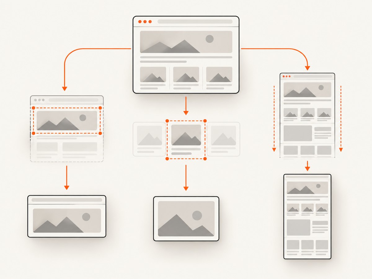
| Goal | Playwright setting | Typical failure |
|---|---|---|
| Visible viewport | page.screenshot() |
Below-the-fold content is missing |
| One element | locator.screenshot() |
Selector resolves to a hidden or zero-size node |
| Full scrollable page | fullPage: true |
Lazy content has not loaded or layout changes while scrolling |
| Region | clip: { x, y, width, height } |
Coordinates are outside the viewport or use the wrong pixel basis |
Start with an unclipped viewport capture. Once that is correct, capture the target element. Enable full-page mode last. This isolates boundary problems from timing problems.
import { chromium } from 'playwright';

const browser = await chromium.launch({ headless: true });
const context = await browser.newContext({
  viewport: { width: 1440, height: 900 },
  deviceScaleFactor: 1
});
const page = await context.newPage();
await page.goto('https://example.com', { waitUntil: 'domcontentloaded' });

// 1. Visible viewport
await page.screenshot({ path: 'viewport.png' });

// 2. A specific element
await page.locator('main').screenshot({ path: 'main.png' });

// 3. Full scrollable document
await page.screenshot({ path: 'full-page.png', fullPage: true });

await browser.close();
For an element capture, verify visibility and geometry before taking the shot:
const target = page.locator('[data-testid="report"]');
await target.waitFor({ state: 'visible' });
console.log(await target.boundingBox());
await target.screenshot({ path: 'report.png' });
2. Fix blank screenshots by waiting for the real ready state
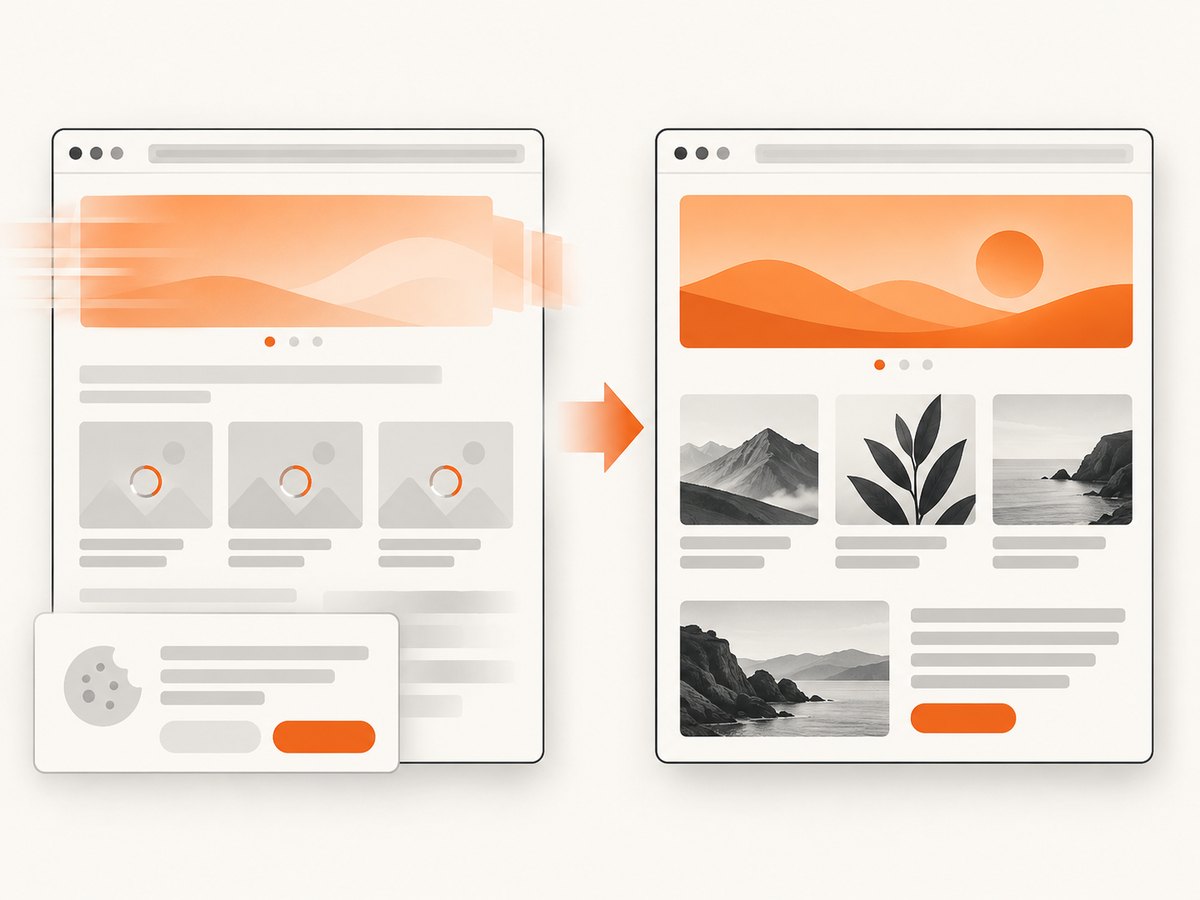
A successful navigation does not mean the page is visually ready. Single-page applications may render after the initial response; web fonts can reflow text; images may be lazy-loaded; animations and cookie dialogs can cover content. Replace fixed sleeps with conditions that represent the application state.
await page.goto('https://example.com/dashboard', { waitUntil: 'domcontentloaded' });
await page.locator('[data-testid="dashboard-ready"]').waitFor({ state: 'visible' });
await page.evaluate(() => document.fonts.ready);
await page.waitForLoadState('networkidle');
await page.screenshot({ path: 'dashboard.png' });
networkidle is useful for pages that stop making requests, but analytics, WebSockets, and polling can prevent it from ever settling. In that case, wait for a stable application marker and critical assets instead.
await page.locator('img.hero').evaluate((img) => {
  if (!img.complete || img.naturalWidth === 0) throw new Error('hero image not ready');
});
await page.locator('.loading-spinner').waitFor({ state: 'hidden' });
For full-page captures, force lazy images to load before scrolling or capturing. A practical approach is to scroll through the document, then return to the top:
await page.evaluate(async () => {
  await new Promise((resolve) => {
    let y = 0;
    const step = 600;
    const timer = setInterval(() => {
      window.scrollBy(0, step);
      y += step;
      if (y >= document.body.scrollHeight) {
        clearInterval(timer);
        window.scrollTo(0, 0);
        resolve();
      }
    }, 50);
  });
});
await page.screenshot({ path: 'long-page.png', fullPage: true });
Disable motion and hide volatile widgets for visual assertions. Playwright supports screenshot style injection and masking; use them for cursors, carousels, timestamps, chat launchers, and animated advertisements.
await page.screenshot({
  path: 'stable.png',
  animations: 'disabled',
  style: `*, *::before, *::after {
    animation: none !important;
    transition: none !important;
    caret-color: transparent !important;
  }`
});
3. Understand CSS pixels, device pixels, and scale
Viewport dimensions are expressed in CSS pixels. The output file can contain one image pixel per CSS pixel or one per physical device pixel. Playwright’s scale: 'css' keeps dimensions predictable. scale: 'device' produces a high-resolution image and can make it twice as large or larger on high-DPI devices.
| Setting | Use it when | Trade-off |
|---|---|---|
scale: 'css' |
Tests or APIs require stable CSS-pixel dimensions | Lower physical resolution on Retina displays |
scale: 'device' |
You need a sharp image for a high-DPI display | Larger files and dimensions; memory use increases |
console.log({
  innerWidth: await page.evaluate(() => window.innerWidth),
  innerHeight: await page.evaluate(() => window.innerHeight),
  devicePixelRatio: await page.evaluate(() => window.devicePixelRatio)
});

await page.screenshot({ path: 'css-pixels.png', scale: 'css' });
await page.screenshot({ path: 'device-pixels.png', scale: 'device' });
If a 1440 pixel viewport produces a 2880 pixel image, that is usually expected device scaling rather than cropping. If the result is smaller than expected, check whether a clip rectangle, element bounds, or an image-processing step changed the dimensions.
4. Prevent device presets from overriding your viewport
Playwright device descriptors include a viewport and emulation settings. If you spread a preset after your custom values, the preset wins. Put the explicit viewport after the spread operation when repeatability matters.
import { chromium, devices } from 'playwright';

const browser = await chromium.launch();
const context = await browser.newContext({
  ...devices['iPhone 13'],
  viewport: { width: 390, height: 844 },
  deviceScaleFactor: 1,
  isMobile: true
});
const page = await context.newPage();
console.log(await page.viewportSize());
await page.goto('https://example.com');
await page.screenshot({ path: 'mobile.png', scale: 'css' });
await browser.close();
A host-window-dependent viewport makes CI output drift. Always set width, height, device scale, color scheme, locale, and timezone in the browser context. Record those values with every failed artifact.
5. Make rendering deterministic
Playwright documents that rendering can vary with the host OS, browser version, settings, hardware, power source, headless mode, and other factors. Generate baselines in a pinned container or CI image and keep the browser version fixed. Use the same font files and install every required font in the environment.
Control other sources of pixel changes:
- Set
colorSchemeexplicitly instead of relying on the host preference. - Freeze dates and random values in application code when tests depend on them.
- Use a consistent locale, timezone, and geolocation.
- Mask rotating content and third-party widgets.
- Wait for fonts and critical images before comparing pixels.
- Keep headless mode and browser launch flags consistent.
6. Investigate Chromium, Firefox, and WebKit differences
Do not assume that an identical script produces identical pixels across engines. Engine-specific defects have included Chromium cropping with deviceScaleFactor > 1 and Firefox ignoring the factor. If only one engine fails, create a minimal page and reproduce the same viewport, scale, and clip settings there before changing application code.
for (const name of ['chromium', 'firefox', 'webkit']) {
  const browserType = { chromium, firefox, webkit }[name];
  const browser = await browserType.launch();
  const context = await browser.newContext({
    viewport: { width: 1280, height: 720 },
    deviceScaleFactor: 1
  });
  const page = await context.newPage();
  await page.goto('https://example.com', { waitUntil: 'load' });
  await page.screenshot({ path: `${name}.png`, scale: 'css' });
  await browser.close();
}
Compare the output dimensions and logs first. Then compare layout metrics such as document.body.scrollHeight, target bounding boxes, and devicePixelRatio. This tells you whether the difference is layout, capture, or image encoding.
7. A diagnostic checklist
- Log viewport width and height,
window.innerWidth,window.innerHeight, anddevicePixelRatio. - Capture the viewport with no
clip. - Capture the target element and print its bounding box.
- Enable
fullPageonly after the viewport and element are correct. - Set
scale: 'css'while debugging dimensions. - Apply an explicit viewport after any device preset.
- Wait for the app-ready marker, fonts, critical images, and settled layout.
- Disable animations and mask volatile regions.
- Repeat in a pinned environment and isolate engine-specific failures.
8. Common errors, causes, and fixes
| Symptom | Likely cause | Fix |
|---|---|---|
| Completely blank image | Capture ran before rendering, an overlay covers the page, or navigation failed | Check response status, wait for a ready selector, hide consent overlays, and save console errors |
| Top of page only | Viewport capture was used | Set fullPage: true or scroll and capture sections |
| Right or bottom edge is cut | clip exceeds bounds or device scaling is mismatched |
Remove clip, use CSS scale, and inspect viewport metrics |
| Element screenshot is empty | Selector matches a hidden, detached, or zero-size element | Wait for visible state and verify boundingBox() |
| Full page misses cards | Lazy loading depends on scrolling | Scroll the document first or trigger the app’s load-more control |
| Text shifts between runs | Fonts or animations are unsettled | Await document.fonts.ready and disable motion |
| Different dimensions on CI | Preset, host window, scale, or device factor changed | Set all context values explicitly and log them |
| Only Firefox or Chromium fails | Engine-specific behavior | Build a minimal reproduction and pin or change the affected engine |
9. Performance, reliability, and cost
Full-page screenshots require more layout work and memory than viewport captures. Very long documents can exceed practical image dimensions; split them into sections or capture the key element instead. Device-scale output multiplies pixel count and file size. Prefer CSS scale for regression tests and use device scale only when a consumer needs physical-pixel resolution.
Reuse a browser process and contexts when capturing many pages, but isolate pages that change cookies, local storage, or permissions. Block unnecessary third-party requests in test environments, while allowing fonts and critical images. Cache static assets in CI where possible. Record the URL, browser version, viewport, scale, wait condition, and output dimensions with each artifact so failures can be reproduced.
10. Or skip the browser setup
ScreenshotNeo provides a website screenshot API and MCP server when you need a clean image without maintaining browser infrastructure. One GET request returns PNG, JPEG, WebP, or a PDF. Before capture it accepts cookie and consent banners and removes more than 60 known consent platforms, newsletter popups, and chat widgets; each step can be turned off. Bot checks, blank pages, timeouts, failed loads, and cache hits are not billed, and response headers report the page verdict and whether it was billed.
See the ScreenshotNeo API documentation for all options, including full-page and element capture, dark mode, device presets, retina scale, custom CSS and JavaScript, clicks, waits, request blocking, headers, cookies, user agents, authorization, timezone, geolocation, transparent backgrounds, resizing, caching, signed links, asynchronous jobs, webhooks, bulk capture, usage, and the OpenAPI specification.
cURL
curl -G "https://api.screenshotneo.com/v1/shot" -d access_key=YOUR_API_KEY --data-urlencode url=https://stripe.com -o shot.webpPython
import requests
r = requests.get("https://api.screenshotneo.com/v1/shot", params={"access_key": "YOUR_API_KEY", "url": "https://stripe.com"}, timeout=90)
open("shot.webp", "wb").write(r.content)
Node.js
const q = new URLSearchParams({ access_key: 'YOUR_API_KEY', url: 'https://stripe.com' });
const res = await fetch(`https://api.screenshotneo.com/v1/shot?${q}`);
const bytes = new Uint8Array(await res.arrayBuffer());
await Bun.write('shot.webp', bytes);
ScreenshotNeo includes an MCP server with take_screenshot, get_page_info, and capture_pdf tools for Claude, Cursor, and other MCP clients. The Free plan includes 1,000 shots per month with no card; paid plans start at $5 for 3,000 shots, and every feature is available on every plan. Create a free ScreenshotNeo account.
11. FAQ
Why does fullPage still miss content?
The page may load content only after scrolling, or a load-more control may require a click. Trigger that application state before the full-page capture and verify the final document height.
Should visual tests use CSS or device scale?
Use CSS scale when stable dimensions and comparisons matter. Use device scale when the output is intended for a high-DPI display.
Can a screenshot be correct but still look wrong?
Yes. A viewport capture, a clipped region, or an element’s bounding box may be exactly what the API was asked to produce. Log the boundary and dimensions before changing waits.
How do I handle pages that never reach network idle?
Use a specific ready selector, wait for fonts and critical images, and ignore long-lived analytics or WebSocket activity instead of waiting indefinitely.
What is the fastest way to reproduce a cross-browser bug?
Reduce the page to one static document and run the same explicit viewport, device scale, scale, and clip settings in Chromium, Firefox, and WebKit. Compare metrics before comparing pixels.