Why Chrome Calculates the Wrong Element Width and How to Fix It
Chrome usually reports a different box, not a wrong width. Learn how every width API works and fix scrollbars, transforms, rounding, and CSS constraints.
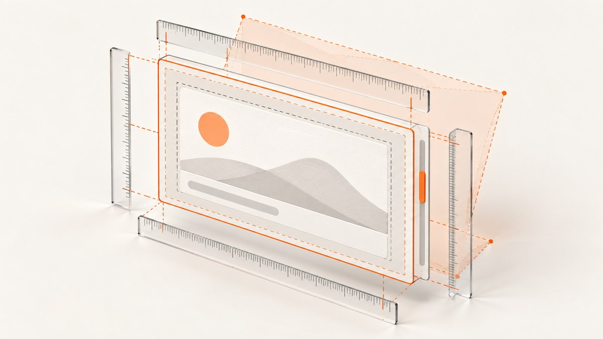
Chrome usually is not making an arithmetic mistake. The mismatch comes from measuring different boxes. CSS width commonly describes the content box, while getBoundingClientRect().width reports the rendered border box. Padding, borders, scrollbars, transforms, fractional pixels, and layout constraints can all make the values differ.
Choose the measurement that matches your requirement, inspect the element after layout has settled, and compare fractional values with a tolerance. This guide explains every browser width API, gives a repeatable debugging script, and shows fixes for the cases developers see most often.
What each width value actually measures
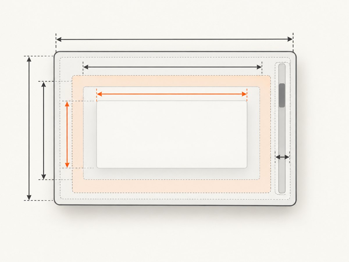
An element has several useful dimensions. They answer different questions, so equality between them is not expected.
| API or style | What it represents | Includes | Excludes | Precision |
|---|---|---|---|---|
getComputedStyle(el).width |
Computed CSS width, normally the content box | Content width under content-box; the declared border-box width under border-box |
Usually padding and borders when content-box is active | CSS pixels as a string, often fractional |
getBoundingClientRect().width |
Rendered border-box geometry | Padding, borders, and visual effects from transforms | Margins | Fractional CSS pixels |
offsetWidth |
Integer layout width occupied by the element | Padding, borders, and a classic vertical scrollbar | Margins; transforms | Rounded integer |
clientWidth |
Usable inner width | Padding | Borders, margins, and a vertical scrollbar | Rounded integer |
scrollWidth |
Width needed to contain content without horizontal scrolling | Padding and overflowing content or pseudo-elements | Borders and margins | Rounded integer |
MDN defines getBoundingClientRect() as viewport-relative rendered geometry, while offsetWidth, clientWidth, and scrollWidth expose different layout boxes.
First diagnosis: content-box versus border-box
The default box-sizing value is content-box. If you write width: 300px, the content is 300 pixels wide. Padding and borders are added outside that value.
.card {
  width: 300px;
  padding: 20px;
  border: 2px solid #333;
}
The border-box width is 300 + 20 + 20 + 2 + 2 = 344px. A computed width of 300px and a rectangle width near 344px are both correct.
With box-sizing: border-box, the declared width includes padding and borders, so the same element’s border-box remains 300px. A predictable baseline for many applications is:
*, *::before, *::after {
  box-sizing: border-box;
}
Apply this globally only when it matches your existing layout contract. For a component library, set it at the component boundary and document which box its public width refers to.
A repeatable debugging procedure
Run this in DevTools Console with the target element selected or replace the selector:
const el = document.querySelector('.target');
const cs = getComputedStyle(el);
const rect = el.getBoundingClientRect();
console.table({
  cssWidth: cs.width,
  boxSizing: cs.boxSizing,
  rectWidth: rect.width,
  offsetWidth: el.offsetWidth,
  clientWidth: el.clientWidth,
  scrollWidth: el.scrollWidth,
  paddingLeft: cs.paddingLeft,
  paddingRight: cs.paddingRight,
  borderLeft: cs.borderLeftWidth,
  borderRight: cs.borderRightWidth,
  overflowX: cs.overflowX,
  transform: cs.transform
});
- State the requirement. Do you need content width, usable padded width, occupied layout space, overflow width, or visual width?
- Check
box-sizing. Under content-box, add padding and borders to the declared width. - Check the vertical scrollbar. A classic scrollbar consumes inline space and can reduce the content area.
- Check transforms and zoom. Visual geometry can change while layout dimensions stay constant.
- Check decimals. Flex, grid, percentages, viewport units, and device-pixel ratio commonly produce fractional values.
- Check ancestors. Flex and grid sizing,
min-width,max-width, intrinsic content, and replaced elements can override the width you expected. - Check timing. Fonts, images, and asynchronous content can change layout after your first measurement.
Why scrollbars change the number
When overflow-y creates a non-overlay scrollbar, the scrollbar occupies space between the inner border edge and the outer padding edge. Chromium subtracts that space from the content area. Therefore, an element can retain the same outer width while its clientWidth and available content width shrink.
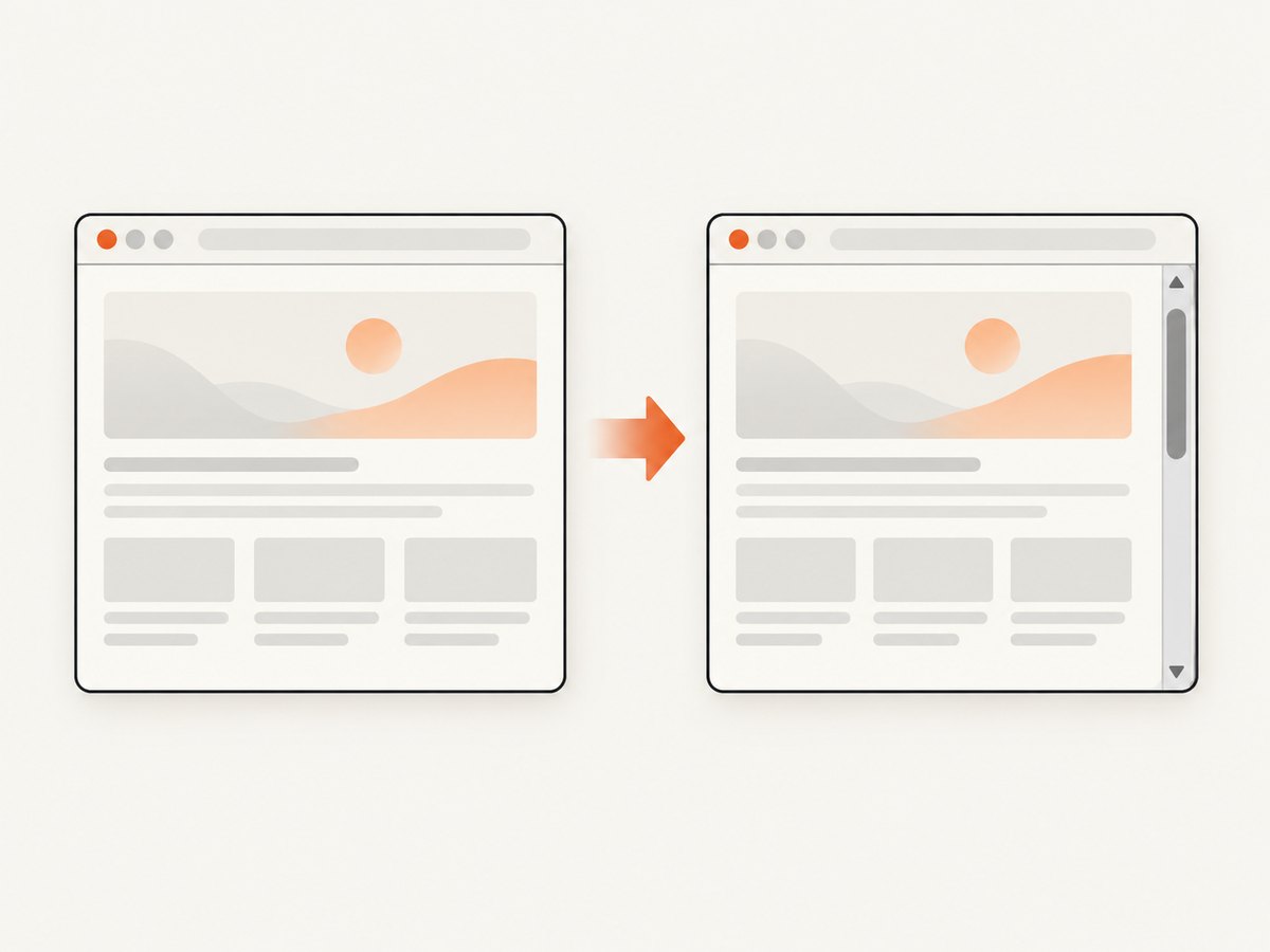
Overlay scrollbars do not consume layout space in the same way, so the same page can report different inner widths across operating systems and user settings. If stable geometry matters, reserve space deliberately with your overflow strategy and test with classic scrollbars enabled.
.scroll-region {
  overflow-y: auto;
  scrollbar-gutter: stable;
}
Use clientWidth when you need the padded interior after scrollbar allocation. Use offsetWidth when you need the integer space occupied by the element including the scrollbar.
Transforms, zoom, and coordinate systems
transform: scale() changes rendered geometry without changing layout geometry. For example, an element with a layout width of 300px scaled to 1.1 can have an approximately 330px rectangle while offsetWidth remains 300.
.preview {
  width: 300px;
  transform: scale(1.1);
  transform-origin: top left;
}
Use getBoundingClientRect() for hit testing, screenshots, and what the user sees. Use offsetWidth or computed layout styles for layout calculations. The rectangle’s left and top are relative to the viewport. Convert them to document coordinates by adding window.scrollX and window.scrollY.
Fractional pixels and rounding
Modern layout frequently divides pixels. A three-column grid, a percentage width, or a device-pixel-ratio conversion can result in values such as 299.984375. getBoundingClientRect() preserves that precision; offsetWidth, clientWidth, and scrollWidth return rounded integers.
Do not assert exact equality unless the contract is integer layout space. Compare with a tolerance:
function nearlyEqual(a, b, epsilon = 0.5) {
  return Math.abs(a - b) < epsilon;
}

const rectWidth = document.querySelector('.target').getBoundingClientRect().width;
if (!nearlyEqual(rectWidth, 300)) {
  console.log('The rendered width differs from 300 CSS pixels.');
}
Choose the tolerance from the decision you are making. A visual alignment check may tolerate 0.5px; a canvas export or print layout may require a documented conversion to device pixels.
Layout constraints that override width
A declared width is only one input to layout. Inspect these properties on the element and its ancestors:
min-widthcan prevent shrinking. Flex items have an automatic minimum size that often keeps long content from becoming narrow;min-width: 0can permit the intended shrink.max-widthcan cap a percentage or viewport-based width.- Grid track sizing such as
minmax(), intrinsic tracks, and gaps changes the final track allocation. - Long unbroken text, images, inputs, and other replaced elements can contribute a larger min-content size.
- Margins affect surrounding placement but are not included in any width property listed above.
- Percentage widths resolve against a containing block whose own width may not be the value you assumed.
.flex-child {
  min-width: 0;
  max-width: 100%;
}

img, video, canvas {
  max-width: 100%;
  height: auto;
}
Measure after the page is ready
Measuring immediately after inserting an element can capture an intermediate state. Web fonts may swap, images may obtain intrinsic dimensions, and scripts may add content. For a one-time measurement, wait for the relevant resource. For ongoing changes, use ResizeObserver.
const target = document.querySelector('.target');
const observer = new ResizeObserver(entries => {
  for (const entry of entries) {
    console.log('content box:', entry.contentRect.width);
    console.log('border box:', target.getBoundingClientRect().width);
  }
});
observer.observe(target);

await document.fonts.ready;
const image = document.querySelector('img');
if (image && !image.complete) await image.decode();
console.log(target.getBoundingClientRect().width);
Take measurements in a stable frame when coordinating with CSS transitions or DOM writes:
requestAnimationFrame(() => {
  const width = document.querySelector('.target').getBoundingClientRect().width;
  console.log(width);
});
Common errors and fixes
| Symptom | Likely cause | Fix |
|---|---|---|
| “CSS says 300px; the rectangle says 344px.” | Content-box plus padding and borders | Use border-box or compare against the intended border-box calculation. |
| Width drops when content starts scrolling. | Classic scrollbar consumes inline space | Use the correct API, reserve scrollbar space, or design for both scrollbar modes. |
offsetWidth is 300 but the element looks wider. |
Transform or visual zoom | Use getBoundingClientRect() for rendered geometry. |
| Two values differ by less than one pixel. | Fractional layout and integer rounding | Compare with an epsilon and avoid premature rounding. |
| Flex item refuses to shrink. | Automatic minimum size or long min-content contribution | Try min-width: 0, then inspect the child causing the min-content width. |
| Width is correct on load but wrong after images or fonts appear. | Measurement occurred before layout settled | Wait for fonts/images or observe with ResizeObserver. |
scrollWidth is unexpectedly large. |
Overflowing child or pseudo-element | Inspect descendants and ::before/::after; check transforms and white-space rules. |
| Document position is offset after scrolling. | Rectangle coordinates are viewport-relative | Add scrollX and scrollY to the rectangle coordinates. |
Testing width fixes reliably
Test the same component in a narrow and wide viewport, with and without a vertical scrollbar, at multiple device-pixel ratios, and with browser zoom changed. Include long text, missing images, loaded web fonts, right-to-left content where applicable, and both overlay and classic scrollbar environments.
For assertions, name the box being tested. Examples: “border box is within 0.5 CSS pixels of 300,” “usable padded interior is at least 280,” or “overflow width equals content width when no horizontal overflow exists.” This prevents a future change from swapping one API for another without changing the contract.
Or skip the browser setup
If your goal is to capture a stable visual result rather than debug a live page, ScreenshotNeo provides a website screenshot API. It loads the URL and returns PNG, JPEG, WebP, or PDF from one request. Cookie and consent banners, newsletter popups, and chat widgets are removed before capture; each cleanup step can be turned off. Bot checks and CAPTCHAs, blank pages, timeouts, failed loads, and cache hits are not billed, and response headers report the page verdict and whether the request was billed.
See the ScreenshotNeo API documentation for all options, including full-page screenshots with lazy images loaded, CSS-selector element capture, dark mode, device presets and custom viewports, retina scale, custom CSS and JavaScript, click and wait actions, blocked resources, headers, cookies, user agents, authorization, timezone, geolocation, transparent backgrounds, resizing, configurable caching, signed image links, asynchronous jobs with signed webhooks, bulk capture for up to 100 URLs, usage data, and the OpenAPI specification.
cURL
curl -G "https://api.screenshotneo.com/v1/shot" -d access_key=YOUR_API_KEY --data-urlencode url=https://stripe.com -o shot.webpPython
import requests
r = requests.get("https://api.screenshotneo.com/v1/shot", params={"access_key": "YOUR_API_KEY", "url": "https://stripe.com"}, timeout=90)
open("shot.webp", "wb").write(r.content)
Node.js
const q = new URLSearchParams({ access_key: 'YOUR_API_KEY', url: 'https://stripe.com' });
const res = await fetch(`https://api.screenshotneo.com/v1/shot?${q}`);
const buffer = Buffer.from(await res.arrayBuffer());
await import('node:fs/promises').then(fs => fs.writeFile('shot.webp', buffer));
An MCP server also exposes take_screenshot, get_page_info, and capture_pdf for Claude, Cursor, and other MCP clients. The Free plan includes 1,000 screenshots per month with no card; paid plans start at $5 for 3,000 shots, and every feature is available on every plan. Create a free ScreenshotNeo account.
Performance, reliability, and cost notes
- Measure only when needed. Repeated synchronous layout reads interleaved with DOM writes can cause layout thrashing; batch reads, then writes.
- Use
ResizeObserverinstead of polling for component size changes. - For screenshot automation, wait for a selector, a delay, or network idle when late content affects the capture. Full-page mode loads lazy images.
- Use caching with a TTL when the same URL is captured repeatedly. Cache hits are not billed.
- Use asynchronous jobs and signed webhooks for slow pages or large batches. Bulk capture accepts up to 100 URLs per call.
- Choose image format and resizing based on the consumer: WebP or JPEG can reduce transfer size, while PNG preserves sharp UI edges and transparency.
- Inspect
X-Page-VerdictandX-Billedin responses so failed loads and bot checks can be separated from successful captures in your logs.
FAQ
Should I use clientWidth or getBoundingClientRect().width?
Use clientWidth for the padded interior excluding borders and a vertical scrollbar. Use getBoundingClientRect().width for the rendered border box, including transforms.
Why does getComputedStyle(el).width show a different value?
It reflects the computed CSS width under the active box-sizing model, commonly the content box. It is not automatically the outer rendered width.
Can margins explain the mismatch?
Margins affect placement and available space around an element, but they are excluded from clientWidth, offsetWidth, scrollWidth, and the rectangle width.
Does device-pixel ratio change CSS width?
CSS layout remains in CSS pixels, but conversion to physical pixels and fractional allocation can make rendered values non-integer. Avoid integer equality checks.
When should I use scrollWidth?
Use it to detect horizontal overflow or determine the width required to contain the element’s content and padding without scrolling.
Why does a screenshot look different from my DOM measurement?
A screenshot represents rendered pixels, so transforms, fonts, scrollbars, viewport size, and late-loading content matter. Capture only after the layout-affecting resources and interactions are complete.