What Is a Dynamic Image in Web Development?
Learn how dynamic images work with responsive HTML, <picture>, and Canvas, including performance, accessibility, security, and practical code.
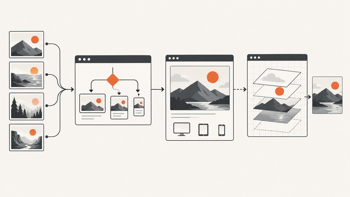
A dynamic image is an image whose source, crop, format, dimensions, or pixels are selected or generated at runtime. In web development, the term usually describes one of two techniques:
- Dynamic delivery: the browser chooses the best URL from prepared image variants based on viewport size, display density, media conditions, supported formats, and the image slot.
- Dynamic generation: JavaScript or a server creates, composites, scales, crops, annotates, or exports new pixels while the page or request is running.
Use srcset and sizes when the image content stays the same and only resolution changes. Use <picture> when you need art direction or format alternatives. Use Canvas or a server-side image process when you must create or edit pixels.
1. Dynamic image delivery with responsive HTML
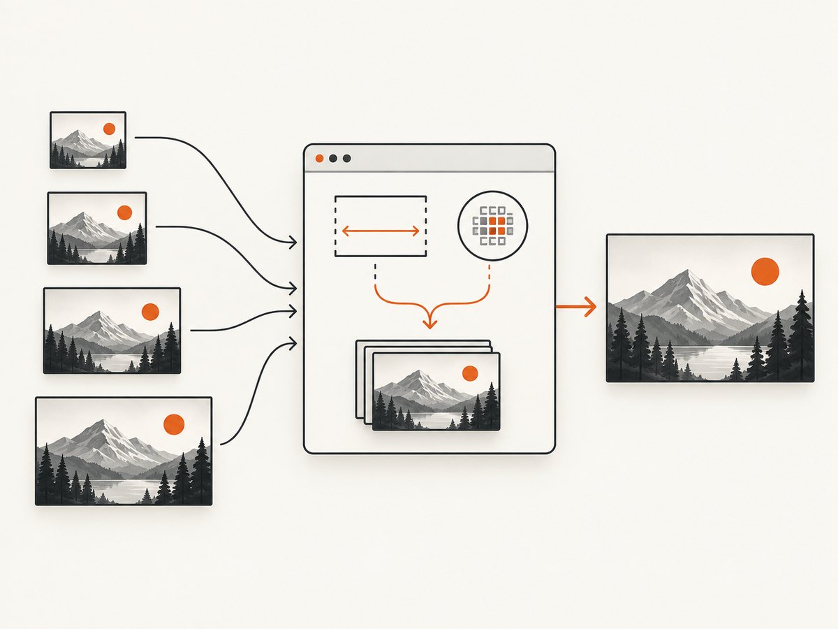
With width descriptors, srcset lists candidate files and sizes describes the rendered slot. The browser evaluates the slot size, pixel density, zoom, orientation, and network conditions, then downloads a suitable candidate. MDN documents this selection process in its responsive images guide.
<img
  src="photo-800.jpg"
  srcset="photo-480.jpg 480w, photo-800.jpg 800w, photo-1600.jpg 1600w"
  sizes="(width <= 600px) 480px, 800px"
  width="800"
  height="450"
  alt="A sample landscape"
>
The 480w, 800w, and 1600w descriptors state each file’s intrinsic width. The sizes value tells the browser that the slot is 480 CSS pixels at 600 pixels or less, and 800 CSS pixels otherwise. Keep the src fallback for older or unusual clients.
Why width and height matter
Set the intrinsic width and height attributes even when CSS controls the display size. The browser can reserve the correct aspect-ratio space before the file arrives, which reduces layout shift. They describe the image’s ratio; CSS can still render it responsively.
Density descriptors for fixed-size images
For an image that always occupies the same CSS size, use pixel-density descriptors instead of width descriptors:
<img
  src="avatar.png"
  srcset="avatar.png 1x, avatar@2x.png 2x"
  width="96"
  height="96"
  alt="Profile photo"
>
Do not mix w and x descriptors in one srcset. Use w when the slot changes with layout; use x when the slot has a known CSS size.
2. Art direction and alternate formats with <picture>
Use <picture> when the browser must choose a different crop or file format. The browser checks each <source> element’s media, type, and srcset, then falls back to the nested <img>. See MDN’s picture reference.
<picture>
  <source media="(width < 800px)" srcset="portrait-crop.jpg">
  <source type="image/avif" srcset="photo.avif">
  <img src="photo.jpg" width="1600" height="900" alt="The subject of the photograph">
</picture>
Put the most specific media or format choices first. Keep a meaningful alt on the fallback img; it is the semantic image element and the required fallback.
srcset versus <picture>
| Need | Best fit | Reason |
|---|---|---|
| Same pixels at several sizes | srcset + sizes |
The browser selects an appropriately sized file. |
| Different crop for mobile and desktop | <picture> |
Art direction can use separate compositions. |
| AVIF/WebP with a fallback | <picture> |
type lets the browser choose a supported format. |
| New pixels, overlays, or user edits | Canvas or a server process | Code performs the transformation. |
3. Generating a dynamic image with Canvas
The Canvas API loads an image, draws it into a bitmap, and can scale or composite it. It can then export a result such as a data URL. MDN’s drawImage() documentation covers the drawing operation.
<canvas id="preview" width="1200" height="675"></canvas>
<script>
const canvas = document.querySelector('#preview');
const context = canvas.getContext('2d');
const image = new Image();

image.onload = () => {
  context.clearRect(0, 0, canvas.width, canvas.height);
  context.drawImage(image, 0, 0, canvas.width, canvas.height);
  const dataUrl = canvas.toDataURL('image/webp', 0.85);
  document.querySelector('#download').href = dataUrl;
};

image.src = '/assets/input.jpg';
</script>
<a id="download" download="preview.webp">Download image</a>
This pattern is useful for generated badges, charts, thumbnails, collages, games, and user-edited images. For large or repeated transformations, moving the work to a server or image service keeps CPU and memory use off the user’s device and gives you a cacheable URL.
Canvas security and CORS
If an image comes from another origin, the browser may taint the canvas. Pixel reads and exports such as toDataURL() then fail unless the image server grants permission with CORS. Configure the server’s CORS response and set image.crossOrigin = 'anonymous' before assigning src. Read MDN’s CORS-enabled image guidance.
const image = new Image();
image.crossOrigin = 'anonymous';
image.onload = () => {
  context.drawImage(image, 0, 0);
  const png = canvas.toDataURL('image/png');
};
image.src = 'https://cdn.example.com/photo.jpg';
CORS headers must come from the image origin; adding a header only in your page’s JavaScript cannot grant access.
4. A complete responsive and generated-image example
<picture>
  <source media="(width < 700px)" srcset="hero-mobile-480.jpg 480w, hero-mobile-800.jpg 800w" sizes="100vw">
  <source type="image/avif" srcset="hero-800.avif 800w, hero-1600.avif 1600w" sizes="(width <= 1000px) 100vw, 1000px">
  <img src="hero-800.jpg" srcset="hero-800.jpg 800w, hero-1600.jpg 1600w" sizes="(width <= 1000px) 100vw, 1000px" width="1600" height="900" alt="A mountain landscape at sunrise" loading="lazy" decoding="async">
</picture>

<canvas id="card" width="1200" height="630"></canvas>
<script>
const card = document.querySelector('#card');
const ctx = card.getContext('2d');
const source = new Image();
source.onload = () => {
  ctx.drawImage(source, 0, 0, card.width, card.height);
  ctx.fillStyle = 'rgba(0, 0, 0, 0.55)';
  ctx.fillRect(0, 500, card.width, 130);
  ctx.fillStyle = '#fff';
  ctx.font = '48px sans-serif';
  ctx.fillText('Generated preview', 48, 580);
};
source.src = '/assets/hero-1600.jpg';
</script>
Use lazy loading for below-the-fold content, not for the main above-the-fold image. Set decoding="async" when asynchronous decoding is acceptable, and provide useful alternative text.
5. How the browser chooses an image
- For
<picture>, evaluate each<source>in document order. - Reject a source whose media condition is false or whose format is unsupported.
- For the selected
srcset, calculate the rendered slot fromsizeswhen width descriptors are used. - Choose a candidate that fits the slot and device pixel ratio, while considering zoom, orientation, and network conditions.
- Use the nested
<img>when no source is usable.
The browser can choose a different candidate than expected if CSS changes the slot, if sizes is inaccurate, or if device pixel ratio and zoom alter the required intrinsic width.
6. Performance, caching, and cost decisions
- Bandwidth: correctly sized candidates avoid downloading a needlessly large file. Art-directed mobile crops can reduce bytes and improve composition.
- Latency: generate only the variants you need and serve them from a cacheable URL. Dynamic server generation should use stable keys based on source, crop, dimensions, format, and transformation options.
- Cache behavior: immutable, content-hashed variants can be cached for a long time. If a source changes at the same URL, invalidate the cache or change the URL.
- CPU and memory: Canvas work runs in the browser and can block low-powered devices for large images. Resize before drawing when possible.
- Quality: choose format and quality per image type. Lossy compression is often appropriate for photographs; preserve sharp edges and transparency where required.
- Accessibility: keep meaningful
alttext on the semanticimg. Do not put essential information only inside pixels generated by Canvas.
There is no universal percentage improvement from responsive images. Measure transferred bytes, largest-contentful paint, decode time, and cache hit rate for your own pages.
7. Inspecting dynamic images with ScreenshotNeo
When you need a rendered proof of a responsive image, use ScreenshotNeo to capture the page at a chosen viewport or device preset. It can capture full pages with lazy images loaded, capture one element by CSS selector, emulate dark mode, use retina scale, apply custom CSS or JavaScript, click an element, wait for a selector, delay, or network idle, and set timezone or geolocation. It can also block ads, trackers, requests, or resource types and accept custom headers, cookies, user agents, or Authorization values.
8. Or skip the browser setup
ScreenshotNeo’s one-call API returns a PNG, JPEG, WebP, or PDF from a URL. See the ScreenshotNeo API documentation for all options.
cURL
curl -G "https://api.screenshotneo.com/v1/shot" -d access_key=YOUR_API_KEY --data-urlencode url=https://example.com/dynamic-image-demo -o shot.webpPython
import requests
r = requests.get("https://api.screenshotneo.com/v1/shot", params={"access_key": "YOUR_API_KEY", "url": "https://example.com/dynamic-image-demo"}, timeout=90)
open("shot.webp", "wb").write(r.content)
Node.js
const q = new URLSearchParams({ access_key: 'YOUR_API_KEY', url: 'https://example.com/dynamic-image-demo' });
const res = await fetch(`https://api.screenshotneo.com/v1/shot?${q}`);
const bytes = await res.arrayBuffer();
await import('node:fs/promises').then(fs => fs.writeFile('shot.webp', Buffer.from(bytes)));
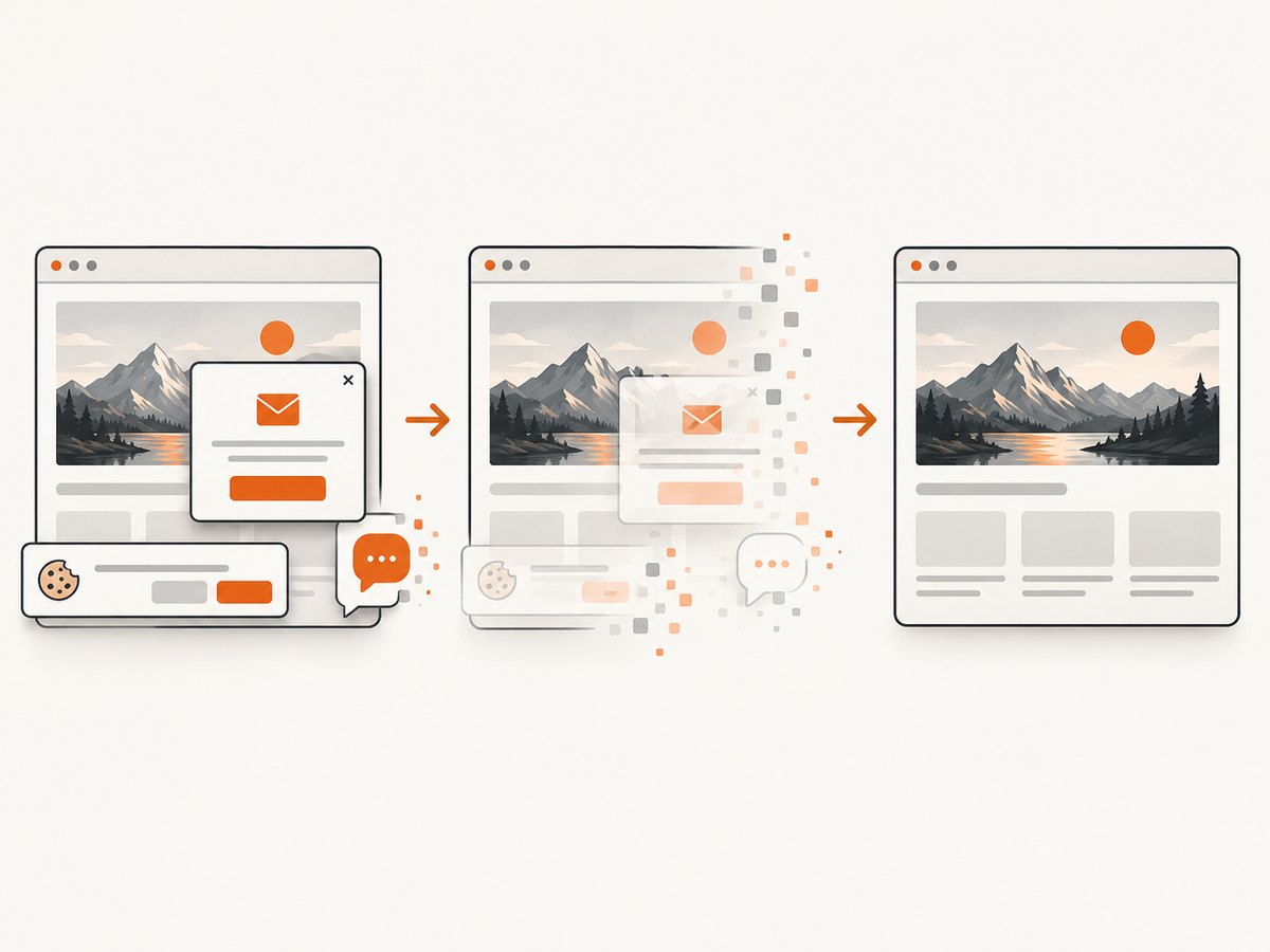
Cookie banners, newsletter popups, and chat widgets are removed before the shot. Bot checks, blank pages, timeouts, failed loads, and cache hits cost nothing; response headers identify the page verdict and whether it was billed. An MCP server provides take_screenshot, get_page_info, and capture_pdf tools for Claude, Cursor, and other MCP clients. The free plan includes 1,000 screenshots each month with no card; paid plans start at $5 for 3,000. Create a free ScreenshotNeo account.
9. Troubleshooting checklist
| Symptom | Likely cause | Fix |
|---|---|---|
| The browser downloads the wrong size | sizes does not match the CSS slot |
Describe the real slot, including breakpoints, and inspect computed width in DevTools. |
| A mobile crop never appears | The media condition is false or the source order is wrong | Test the condition, place the intended source before the fallback, and keep a valid img. |
| AVIF/WebP is ignored | The browser does not support the format or the MIME type is incorrect | Use type on source, configure the server MIME type, and retain a JPEG/PNG fallback. |
| Canvas export throws a security error | A cross-origin image tainted the canvas | Enable CORS on the image server and set crossOrigin before src. |
| Canvas output is blurry | The source is smaller than the output or device-pixel scaling is missing | Start with a sufficiently large source and size the canvas for the target pixel density. |
| Layout jumps while images load | No intrinsic dimensions or aspect ratio | Add width and height, or set an equivalent CSS aspect-ratio. |
| A screenshot shows a placeholder | The page needs a wait condition, delay, or interaction | Configure a selector wait, network-idle wait, delay, click, or custom JavaScript in ScreenshotNeo. |
10. FAQ
Is a responsive image always dynamic?
It is dynamically selected by the browser, but the files may be prebuilt. Dynamic generation means new or transformed pixels are produced at runtime.
Should I use an image CDN?
Use one when you need many crops, formats, widths, or geographic delivery locations. For a small site, pre-generated variants with srcset may be simpler.
Can Canvas replace <img>?
Canvas is suitable for generated or edited pixels. Use a semantic img for ordinary content so the browser, accessibility tools, and search systems can understand it.
Why does the browser download a larger candidate than the slot?
It may account for device pixel ratio, zoom, network conditions, or a slot larger than your sizes declaration. Verify the computed slot and candidate widths in browser developer tools.
Can I capture a dynamic image as a PDF?
Yes. ScreenshotNeo supports PDF output with paper size, margins, landscape mode, and page ranges in addition to PNG, JPEG, and WebP screenshots.