Why Headless Browsers Ignore Viewport Sizes in matchMedia Queries
Headless browsers do not ignore matchMedia viewport sizes by default. Learn how framework defaults, viewport emulation, media settings, and headless modes affect responsive tests.
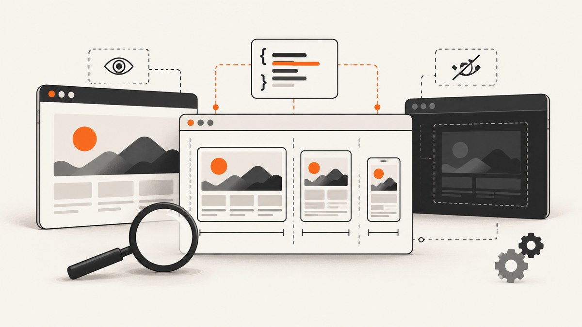
Short answer: headless browsers do not inherently ignore viewport sizes in matchMedia(). The page evaluates media queries against the CSS viewport that your automation framework exposes. Surprising results usually come from a framework default, a viewport configured in the wrong place or at the wrong time, confusion between viewport and screen dimensions, a media type or preference query, or a difference between headed and headless browser implementations.
For a reproducible responsive test, configure the viewport explicitly before navigation, then log the values the page actually sees. In Playwright, a new browser context defaults to a 1280×720 viewport. Setting viewport: null disables that consistent emulation and makes the viewport depend on the host window, which Playwright warns can make tests nondeterministic. The relevant controls are documented in the Playwright Browser API and Page API.
1. What matchMedia() is measuring
window.matchMedia(query) evaluates a CSS media query in the context of the current document. For a width query, that normally means the CSS viewport in CSS pixels:
const desktop = window.matchMedia('(min-width: 1024px)').matches;
console.log(desktop);
That value is not automatically the operating-system window width, the physical monitor resolution, or the dimensions of an emulated device screen. Automation libraries expose several related concepts:
| Value | What it represents | Why it matters |
|---|---|---|
window.innerWidth |
Layout viewport width in CSS pixels | Usually the value relevant to width media features |
window.innerHeight |
Layout viewport height in CSS pixels | Used by height media features and layout code |
window.screen.width |
Emulated screen width | Can differ from the layout viewport |
| Device scale factor | CSS pixels mapped to device pixels | Changes raster density, not the CSS width query itself |
| Host window | The real browser window managed by the OS | Relevant when viewport emulation is disabled |
Start by identifying what the query asks. (min-width: 768px) tests width. (orientation: portrait) depends on viewport dimensions. (prefers-color-scheme: dark) is a user preference. (print) is a media type. Resizing the viewport cannot replace media emulation for preference or print queries.
2. Why the result looks wrong
Framework defaults are different from your assumption
Playwright documents a default context viewport of 1280×720. If your test expects a mobile breakpoint but creates a context without options, the page will correctly behave as a desktop page. Puppeteer’s viewport API also describes width and height in CSS pixels; it does not promise that an operating-system window or physical display has the same dimensions. See the Puppeteer Viewport interface.
viewport: null makes size host-dependent
In Playwright, viewport: null opts out of the consistent viewport emulation. The host window then determines the size. This may appear to fix a local test while making CI results vary with the runner, window manager, or display configuration. Use an explicit width and height when repeatability matters.
You resize after the page has already made decisions
Some applications read a media query during startup and use that result to select a component tree, fetch data, or set a cookie. Resize before navigation when possible. Playwright’s page.setViewportSize() resizes the page and resets screen size; its documentation recommends setting the desired size before navigation when the site reacts to size changes.
The query is not a viewport query
A common debugging mistake is to resize for prefers-color-scheme, prefers-reduced-motion, or print. Playwright separates these settings through page.emulateMedia(). The Playwright Emulation guide describes viewport, device, media, timezone, locale, and related controls independently.
Headless implementations can differ
Playwright documents that its default Chromium headless operation uses a separate headless shell. New headless mode can be selected through the chromium channel, and behavior can differ in some cases. Record the browser engine, version, channel, and headed or headless mode while investigating a discrepancy. Details are in Playwright Browsers.
3. A minimal Playwright reproduction
This complete Node.js example sets the viewport before navigation and reports the values that matter. Install Playwright with npm install -D playwright, then run it with Node.js.
import { chromium } from 'playwright';

const browser = await chromium.launch({ headless: true });
const context = await browser.newContext({
  viewport: { width: 390, height: 844 },
  deviceScaleFactor: 1,
  colorScheme: 'light',
  isMobile: true,
  hasTouch: true
});

const page = await context.newPage();
await page.goto('https://example.com', { waitUntil: 'domcontentloaded' });

const result = await page.evaluate(() => ({
  innerWidth: window.innerWidth,
  innerHeight: window.innerHeight,
  screenWidth: window.screen.width,
  screenHeight: window.screen.height,
  dpr: window.devicePixelRatio,
  min768: window.matchMedia('(min-width: 768px)').matches,
  dark: window.matchMedia('(prefers-color-scheme: dark)').matches,
  media: window.matchMedia('screen').matches
}));

console.log(result);
await browser.close();
Change the context to viewport: { width: 1440, height: 900 } and run the same page. The width query should change because the CSS viewport changed. If it does not, inspect whether your application caches the first result or whether a different query is being evaluated.
4. Set the viewport at the right level
Context-level configuration
Prefer a context-level viewport for a test suite so every page receives the same environment:
const context = await browser.newContext({
  viewport: { width: 1280, height: 720 },
  screen: { width: 1280, height: 720 }
});
The viewport controls the page’s CSS layout area. The optional screen setting controls the emulated screen dimensions. Keeping them aligned removes one source of confusion, but applications may intentionally use different values.
Page-level resizing
Use page.setViewportSize() when a single page must change size during a scenario:
await page.setViewportSize({ width: 375, height: 812 });
await page.goto('https://example.com');
console.log(await page.evaluate(() => window.innerWidth));

await page.setViewportSize({ width: 1440, height: 900 });
console.log(await page.evaluate(() => window.matchMedia('(min-width: 1024px)').matches));
Set the size before goto() for initial-layout tests. If you resize after navigation, wait for the page’s responsive code to react and verify that listeners are attached:
await page.setViewportSize({ width: 700, height: 800 });
await page.waitForTimeout(50);
const state = await page.evaluate(() => ({
  width: window.innerWidth,
  matches: window.matchMedia('(max-width: 767px)').matches
}));
5. Match media type and preferences separately
Viewport dimensions and media preferences are separate axes. Configure both when the test requires them:
await page.emulateMedia({
  media: 'screen',
  colorScheme: 'dark',
  reducedMotion: 'reduce',
  forcedColors: 'none'
});

const preferences = await page.evaluate(() => ({
  dark: matchMedia('(prefers-color-scheme: dark)').matches,
  reduced: matchMedia('(prefers-reduced-motion: reduce)').matches,
  screen: matchMedia('screen').matches,
  print: matchMedia('print').matches
}));
For a print test, use media: 'print'. Do not infer print behavior from a narrow viewport. For color scheme, set colorScheme; changing width alone cannot make a light preference become dark.
6. Puppeteer equivalent
Puppeteer exposes viewport settings in CSS pixels. A basic setup looks like this:
import puppeteer from 'puppeteer';

const browser = await puppeteer.launch({ headless: true });
const page = await browser.newPage();
await page.setViewport({ width: 390, height: 844, deviceScaleFactor: 1 });
await page.goto('https://example.com', { waitUntil: 'domcontentloaded' });

const values = await page.evaluate(() => ({
  width: innerWidth,
  height: innerHeight,
  screenWidth: screen.width,
  mobile: matchMedia('(max-width: 767px)').matches
}));
console.log(values);
await browser.close();
If you compare Puppeteer with Playwright, hold the CSS width and height constant, then compare browser version, engine, headless mode, device scale factor, screen settings, and media preferences. A difference in any of these can look like a matchMedia bug.
7. A diagnostic checklist
- Record the environment. Capture framework and package versions, browser engine and version, operating system, headed or headless mode, and Chromium channel.
- Print the exact query. Log the complete string, including units, prefixes, media type, and logical operators.
- Set the viewport before navigation. Use a context option or page API instead of relying on a desktop window.
- Inspect page values. Log
innerWidth,innerHeight,screen.width,screen.height,devicePixelRatio, andmatchMedia(query).matches. - Check media preferences. For color scheme, reduced motion, forced colors, or print, use media emulation.
- Compare modes. Run the same explicit configuration headed and headless. In Playwright, compare the default headless shell with the documented new headless channel when relevant.
- Check application timing. Look for startup code that reads the query once, stores it in state, or applies a class before your resize.
- Check CSS and JavaScript independently. Inspect computed styles and evaluate the query in the page so a CSS cascade issue is not mistaken for an emulation issue.
8. Common errors and fixes
| Symptom | Likely cause | Fix |
|---|---|---|
| Every test reports desktop width | Playwright default 1280×720 context | Pass an explicit viewport to browser.newContext(). |
| CI and local results differ | viewport: null or host-window dependence |
Use fixed CSS dimensions and avoid host-dependent sizing. |
screen.width is unexpected |
Screen and viewport are configured separately | Log both and set screen when the application reads it. |
| Dark-mode query never changes | Only the viewport was resized | Use emulateMedia({ colorScheme: 'dark' }). |
| Resize has no visible effect | Application cached the initial match or listener is missing | Reload after resizing, inspect change listeners, and test the startup path separately. |
| Headless differs from headed | Different Chromium headless implementation or channel | Record and compare the exact browser launch configuration. |
| Breakpoint appears off by a few pixels | Scrollbar, device scale, or CSS rounding behavior | Log CSS pixels, test just below and above the breakpoint, and avoid assumptions about physical pixels. |
| Navigation resets the expected state | Viewport or emulation configured after navigation | Configure context and media before goto(). |
9. Reliability and performance practices
Fixed viewport contexts make screenshots and assertions comparable across machines. Reuse a browser process when running many sizes, but create isolated contexts when cookies, permissions, locale, or viewport state must not leak between tests. Keep one canonical matrix of widths and heights instead of generating arbitrary dimensions in every test.
For fast diagnostics, use waitUntil: 'domcontentloaded' when the question is only about initial media evaluation. Use a later readiness condition when the application changes layout after hydration. Avoid arbitrary long sleeps; wait for a selector, a known state, or a short deterministic transition.
When capturing screenshots, remember that a device scale factor affects output pixels and file size. It does not turn a 390 CSS-pixel viewport into a 780 CSS-pixel media query. Keep CSS dimensions and output scale as separate test parameters.
10. Or skip the browser setup
If your goal is a reliable screenshot at a known viewport rather than maintaining browser automation, ScreenshotNeo provides a single screenshot API request. The API accepts viewport and device options alongside full-page capture, element selectors, dark mode, custom CSS and JavaScript, waits, request blocking, headers, cookies, geolocation, timezone, caching, PDFs, and other capture controls. See the ScreenshotNeo documentation for parameter details.
cURL:
curl -G "https://api.screenshotneo.com/v1/shot" \
  -d access_key=YOUR_API_KEY \
  --data-urlencode url=https://stripe.com \
  -o shot.webp
Python:
import requests

r = requests.get(
    "https://api.screenshotneo.com/v1/shot",
    params={"access_key": "YOUR_API_KEY", "url": "https://stripe.com"},
    timeout=90,
)
r.raise_for_status()
open("shot.webp", "wb").write(r.content)
Node.js:
const q = new URLSearchParams({
  access_key: 'YOUR_API_KEY',
  url: 'https://stripe.com'
});
const res = await fetch(`https://api.screenshotneo.com/v1/shot?${q}`);
if (!res.ok) throw new Error(`HTTP ${res.status}`);
const data = Buffer.from(await res.arrayBuffer());
require('fs').writeFileSync('shot.webp', data);
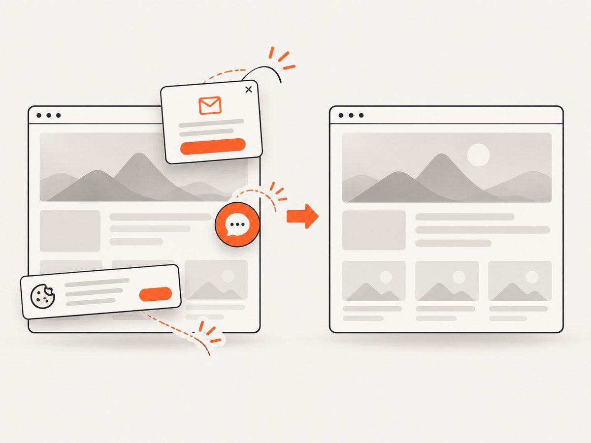
ScreenshotNeo removes cookie and consent banners, newsletter popups, and chat widgets before capture; each step can be turned off. Bot checks or CAPTCHAs, blank pages, timeouts, failed loads, and cache hits are not billed, and response headers report the page verdict and billing status. Its MCP server provides take_screenshot, get_page_info, and capture_pdf tools for Claude, Cursor, and other MCP clients. The Free plan includes 1,000 screenshots each month with no card; paid plans start at $5 for 3,000.
Create a free ScreenshotNeo account and start with 1,000 screenshots per month at no charge.
11. Cost and configuration considerations
DIY Playwright and Puppeteer runs consume your own compute and require maintenance for browser binaries, fonts, sandboxing, navigation waits, consent cleanup, and failure handling. A screenshot API trades that setup for request costs and service-specific limits. ScreenshotNeo bills only clean shots, while failed loads and cache hits are not billed; use its usage API and response headers when reconciling costs. Caching with a chosen TTL can reduce repeated captures, and bulk capture supports up to 100 URLs per call.
For either approach, reduce unnecessary work by setting the smallest useful viewport, waiting for the actual readiness condition, blocking irrelevant resources when permitted, and reusing results for unchanged URLs. For visual regression, keep browser version, fonts, viewport, device scale factor, locale, timezone, and color scheme pinned so a layout change is not confused with an environment change.
12. FAQ
Does headless mode change matchMedia() semantics?
No general rule says that it does. Differences usually trace to the configured viewport, media settings, browser implementation, or application timing.
Should I set both viewport and screen?
Set both when your application reads screen or when you need a tightly controlled emulation. For ordinary responsive CSS, an explicit viewport is the essential setting.
Why does viewport: null seem correct locally?
It uses the host window, which may happen to match your desktop. The same test can vary on a CI runner, so fixed dimensions are safer for reproducible tests.
Can a higher device scale factor fix a failed breakpoint?
No. Device scale changes raster density. Width and height media features use CSS pixels exposed by the viewport.
When should I use a screenshot API?
Use one when you need repeatable captures without owning browser launch, consent cleanup, popup removal, failure classification, and screenshot storage logic. Keep browser automation when you need assertions, interaction, or application-specific diagnostics.
Conclusion
When matchMedia() appears to ignore a viewport, inspect the environment the page actually receives. Set a fixed viewport before navigation, separate viewport dimensions from screen dimensions and media preferences, log the exact values, and compare the same browser configuration in headed and headless modes. Those steps turn an apparent headless-browser mystery into a measurable configuration problem.