How to Generate High-DPI Mobile Screenshots with CasperJS and PhantomJS
Learn how to create mobile-like, high-DPI screenshots with CasperJS and PhantomJS, including viewport setup, zoom workarounds, capture code, and troubleshooting.
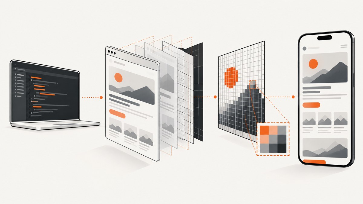
Direct answer: Set an explicit mobile viewport in CasperJS before navigation, wait for responsive layout to settle, then capture with capture(), captureSelector(), or a clip rectangle. PhantomJS does not provide a reliable native device-pixel-ratio control in the classic WebKit renderer. For a high-DPI bitmap, the commonly used workaround is to render at a larger physical viewport and apply CasperJS zoom(), then verify that CSS media queries still produce the mobile layout you intended.
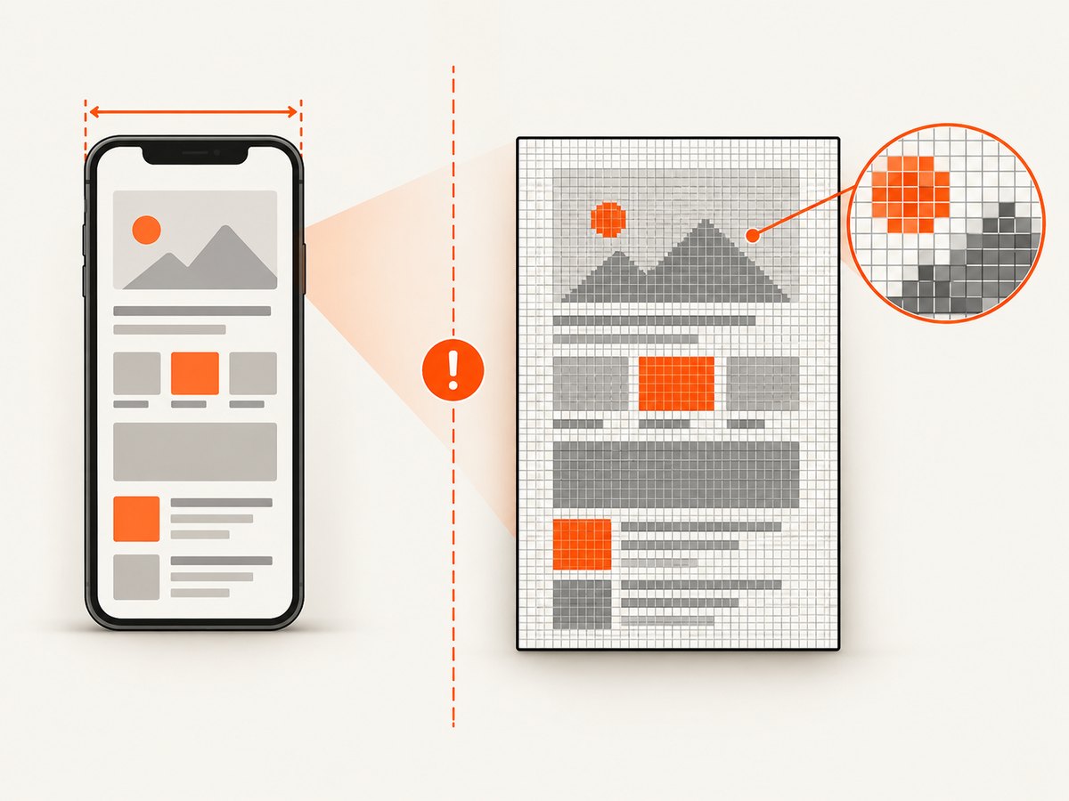
This distinction matters. A high-resolution image is not automatically a high-DPI mobile render. Mobile fidelity depends on the CSS viewport that media queries see, while bitmap sharpness depends on the number of output pixels. With CasperJS and PhantomJS, those two dimensions can conflict.
What “high-DPI mobile” means in CasperJS
There are two dimensions to plan:
| Dimension | What it controls | Typical question |
|---|---|---|
| CSS viewport | Responsive layout, media queries, breakpoints | Does the page behave like a 360 px-wide phone? |
| Bitmap size | Pixel dimensions of the saved PNG or JPEG | Is the output sharp enough for a 3× asset? |
| Device pixel ratio | Mapping between CSS pixels and device pixels | Can the renderer emulate Retina density natively? |
PhantomJS starts with a 400×300 viewport and does not automatically adopt a mobile size. Always set page.viewportSize deliberately. CasperJS exposes viewport controls and capture methods, but the PhantomJS WebKit backend used by this workflow lacks the modern browser-style device-scale-factor control many Chromium tools provide.
Install and verify the tools
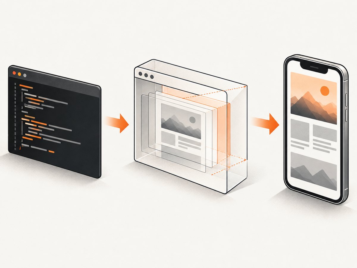
CasperJS runs scripts through PhantomJS. Install versions that are compatible with each other, then verify both executables before debugging your page.
# Verify the executables
casperjs --version
phantomjs --version

# Run a script
casperjs mobile-shot.js
PhantomJS is an archived WebKit-based renderer, so modern sites may use JavaScript, CSS, TLS, or browser APIs that it cannot reproduce. The method below is useful for legacy pages and controlled test environments. For current sites, compare the result against a modern renderer before treating the image as authoritative.
Basic mobile screenshot with CasperJS
Start with a CSS viewport that matches the mobile breakpoint you want to exercise. The following script captures a 360×640 CSS viewport to a PNG.
var casper = require('casper').create({
    verbose: true,
    logLevel: 'warning'
});

var url = 'https://example.com';

casper.start(url, function () {
    this.viewport(360, 640);
});

casper.then(function () {
    this.capture('mobile-360x640.png');
});

casper.run(function () {
    this.echo('Saved mobile-360x640.png');
    this.exit();
});
Set the viewport before opening the URL when possible. If you change it after navigation, allow a following CasperJS step for responsive reflow and scripts that inspect window.innerWidth to run.
Wait for responsive layout and asynchronous content
Responsive pages often change after the first document load. Images may be lazy-loaded, fonts may replace fallback metrics, and JavaScript may add mobile navigation. Capture only after the required state exists.
var casper = require('casper').create({
    verbose: true,
    logLevel: 'warning'
});

casper.start('https://example.com', function () {
    this.viewport(360, 640);
});

// Wait for a mobile-only element, or use a bounded delay when no selector exists.
casper.waitForSelector('.mobile-header', function () {
    this.echo('Mobile header found');
}, function () {
    this.die('Mobile header did not appear');
}, 10000);

casper.wait(500, function () {
    this.capture('mobile-ready.png');
});

casper.run(function () {
    this.exit();
});
Prefer a selector that proves the page is ready over a long fixed delay. A delay is still useful for animations, font swaps, or content without a stable selector. Disable or wait through transitions when a moving element would produce inconsistent pixels.
Capturing the full page, a clip rectangle, or one element
Use the capture scope that matches your requirement:
capture()captures the page or the configured viewport.page.clipRectlimits output to a rectangle in page coordinates.captureSelector()captures the bounding box of a CSS selector.
var casper = require('casper').create();

casper.start('https://example.com', function () {
    this.viewport(360, 640);
});

casper.then(function () {
    // Full viewport capture
    this.capture('viewport.png');
});

casper.then(function () {
    // Element capture
    this.captureSelector('hero.png', '.hero');
});

casper.then(function () {
    // Bounded page rectangle
    this.page.clipRect = { top: 0, left: 0, width: 360, height: 1200 };
    this.capture('top-1200px.png');
});

casper.run(function () {
    this.exit();
});
Element capture depends on the element having a measurable box. A hidden element, an element outside the rendered flow, or a selector matching multiple unexpected nodes can produce an empty or surprising image. Inspect the element dimensions before capture when diagnosing this.
The high-DPI workaround: larger viewport plus zoom
A common community workaround for a 3× target is to render at the desired physical dimensions and call zoom(3). For a 360×640 CSS design target, a physical target of 1080×1920 is a useful planning example:
var casper = require('casper').create({
    verbose: true,
    logLevel: 'warning'
});

var targetUrl = 'https://example.com';
var cssWidth = 360;
var cssHeight = 640;
var scale = 3;

casper.start(targetUrl, function () {
    // Physical-sized viewport used by the workaround.
    this.viewport(cssWidth * scale, cssHeight * scale);
    this.zoom(scale);
});

casper.wait(500, function () {
    this.capture('mobile-3x-workaround.png');
});

casper.run(function () {
    this.echo('Saved mobile-3x-workaround.png');
    this.exit();
});
Critical limitation: media queries can observe the larger 1080px viewport rather than the intended 360px mobile breakpoint. The resulting bitmap may be sharp while the layout is desktop-like. Treat this as a compatibility workaround, not native Retina emulation. Compare the output against a normal 360×640 capture and inspect the breakpoint-specific navigation, columns, font sizes, and spacing.
Choosing between mobile fidelity and bitmap density
Use this decision process:
- Need exact mobile responsive behavior? Keep the CSS viewport at the target mobile width and accept the renderer’s normal bitmap density.
- Need a larger bitmap for a fixed layout? Try the zoom workaround, then verify every responsive breakpoint.
- Need both native DPR and modern browser behavior? CasperJS/PhantomJS may not be the right renderer. Use a browser backend that exposes device-scale-factor controls.
When comparing two outputs, record CSS viewport width, bitmap width and height, zoom value, capture scope, and format. A difference in any one of these can explain apparently inconsistent screenshots.
Output formats and image quality
PNG is the safest default for interface screenshots because it preserves text and sharp edges without lossy compression. JPEG can reduce file size for photographic pages but introduces artifacts around text. PhantomJS also documents GIF and PDF output.
var casper = require('casper').create();

casper.start('https://example.com', function () {
    this.viewport(360, 640);
});

casper.then(function () {
    this.capture('page.png');
    this.capture('page.jpg', { quality: 90 });
});

casper.run(function () {
    this.exit();
});
For a repeatable pipeline, keep the format, viewport, zoom, and capture scope in source control. Do not compare PNG and JPEG files byte-for-byte; compare rendered pixels or visual baselines.
Complete reusable CasperJS script
This version supports a URL, mobile dimensions, optional 3× mode, a readiness selector, and an optional element selector.
var casper = require('casper').create({
    verbose: true,
    logLevel: 'warning'
});

var url = casper.cli.get(0) || 'https://example.com';
var readySelector = casper.cli.get('ready') || null;
var elementSelector = casper.cli.get('selector') || null;
var width = parseInt(casper.cli.get('width') || '360', 10);
var height = parseInt(casper.cli.get('height') || '640', 10);
var scale = parseInt(casper.cli.get('scale') || '1', 10);

if (!isFinite(width) || !isFinite(height) || !isFinite(scale) || width <= 0 || height <= 0 || scale <= 0) {
    casper.die('width, height, and scale must be positive numbers');
}

casper.start(url, function () {
    this.viewport(width * scale, height * scale);
    if (scale > 1) {
        this.zoom(scale);
    }
});

if (readySelector) {
    casper.waitForSelector(readySelector, function () {
        this.echo('Ready selector found: ' + readySelector);
    }, function () {
        this.die('Timed out waiting for: ' + readySelector);
    }, 15000);
} else {
    casper.wait(500);
}

casper.then(function () {
    if (elementSelector) {
        this.captureSelector('mobile-element.png', elementSelector);
    } else {
        this.capture('mobile-page.png');
    }
});

casper.run(function () {
    this.echo('Capture complete');
    this.exit();
});
Example invocation:
casperjs mobile-shot.js https://example.com --width=360 --height=640 --scale=3 --ready=.mobile-header
casperjs mobile-shot.js https://example.com --selector=.pricing-card
Common errors and fixes
| Symptom | Likely cause | Fix |
|---|---|---|
| Desktop layout in a “mobile” image | Viewport was left at PhantomJS’s default or enlarged for the zoom workaround | Set the viewport before navigation; compare the workaround with a true mobile CSS width. |
| Screenshot is blank | Capture occurred before navigation or rendering completed | Wait for page.open completion, a readiness selector, or a short post-load delay. |
| Element capture is empty | Selector is hidden, missing, or has zero dimensions | Wait for the selector and inspect its bounding rectangle before calling captureSelector(). |
| Lazy images are missing | Images load only after scrolling or interaction | Scroll through the page, trigger the required interaction, then wait for image completion. |
| Fonts or spacing differ between runs | Web fonts, animations, or asynchronous CSS have not settled | Wait for a stable state, disable animations where possible, and use a consistent network environment. |
| Modern page scripts fail | PhantomJS’s older WebKit engine lacks required browser APIs or TLS support | Check the page’s browser requirements and use a current browser renderer when compatibility is required. |
| High-DPI image is sharp but not mobile | Media queries saw the enlarged physical viewport | Use the normal CSS viewport for fidelity, or redesign the test so the layout does not depend on that breakpoint. |
Performance, reliability, and cost considerations
- Performance: Larger viewports and 3× zoom increase raster work and output size. Capture only the region you need when generating many images.
- Reliability: Replace arbitrary sleeps with selectors or application-specific readiness checks. Keep navigation, viewport setup, and capture in explicit CasperJS steps.
- Repeatability: Fix the URL, viewport, scale, output format, fonts, and wait conditions. Dynamic ads and rotating content can still change pixels.
- Failure handling: Exit nonzero on navigation errors, missing selectors, and timeouts so CI does not treat a failed capture as a valid artifact.
- Cost: CasperJS and PhantomJS are self-hosted processes, so your direct cost is infrastructure and maintenance. The older engine can require more troubleshooting as sites evolve.
Or skip the browser setup
ScreenshotNeo provides a one-request screenshot API when you need a maintained capture service. It supports PNG, JPEG, WebP, and PDF; full-page capture with lazy images loaded; element capture by CSS selector; dark mode; device presets or custom viewports; and retina scale. You can also set custom CSS and JavaScript, click an element, wait for a selector, delay, or network idle, and control headers, cookies, user agents, authorization, timezone, and geolocation. See the ScreenshotNeo API documentation for the complete parameter list.
curl -G "https://api.screenshotneo.com/v1/shot" -d access_key=YOUR_API_KEY --data-urlencode url=https://stripe.com -o shot.webpimport requests
r = requests.get(
"https://api.screenshotneo.com/v1/shot",
params={"access_key": "YOUR_API_KEY", "url": "https://stripe.com"},
timeout=90,
)
r.raise_for_status()
open("shot.webp", "wb").write(r.content)const q = new URLSearchParams({ access_key: 'YOUR_API_KEY', url: 'https://stripe.com' });
const res = await fetch(`https://api.screenshotneo.com/v1/shot?${q}`);
if (!res.ok) throw new Error(`HTTP ${res.status}`);
const bytes = new Uint8Array(await res.arrayBuffer());
// Write bytes with your runtime's filesystem API.Cookie banners, newsletter popups, and chat widgets are removed before the shot; each cleanup step can be turned off. Bot checks, blank pages, timeouts, failed loads, and cache hits are not billed, and the response identifies the result with X-Page-Verdict and X-Billed headers. An MCP server provides take_screenshot, get_page_info, and capture_pdf tools for Claude, Cursor, and other MCP clients. The free plan includes 1,000 screenshots each month with no card; paid plans start at $5 for 3,000 shots.
Create a free ScreenshotNeo account and start with 1,000 screenshots per month at no charge.
FAQ
Can PhantomJS emulate a true Retina device pixel ratio?
The classic PhantomJS WebKit workflow does not provide the native DPR control expected from modern Chromium tooling. The larger-viewport plus zoom() technique is a compatibility workaround and can change responsive behavior.
Should I use PNG or JPEG?
Use PNG for crisp interfaces, text, and visual regression work. Use JPEG when photographic content and smaller files matter more than lossless edges.
Why does changing the viewport after navigation sometimes fail?
Responsive scripts may have already measured the old viewport. Set the viewport before opening the page, or place the change in its own step and wait for reflow before capture.
Is full-page capture the same as a tall mobile viewport?
No. A full-page capture combines the document’s rendered area, while a viewport capture represents what fits in the configured window. Choose based on whether you need the complete document or an above-the-fold device view.