BlogScreenshots on your device
How to Capture Screenshots Correctly on High-DPI Machines
Learn why Retina and scaled displays produce unexpected screenshot sizes, then capture and verify exact pixels on macOS, Windows, and browsers.
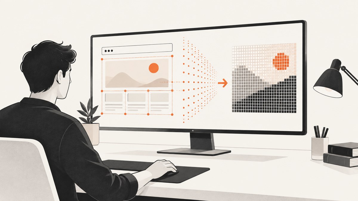
Direct answer: decide the screenshot’s required pixel width and height before capturing, choose whether you need the current display pixels or a fresh render at a target size, configure scale or output dimensions when your capture tool supports them, and inspect the saved file’s actual dimensions afterward. Logical coordinates, CSS pixels, points, device-independent pixels (DIPs), and image pixels are related but are not interchangeable.
Why high-DPI screenshots have “wrong” dimensions
A point or logical UI unit describes layout. The exported image records physical pixels. Apple explains that a point can map to different pixel counts, including 1:1, 2:1, and 3:1 relationships, depending on the display. Apple’s guidance defines a point as an abstract unit that keeps visual content consistent across displays.
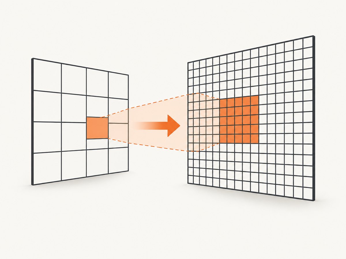
In a browser, window.devicePixelRatio expresses the relationship between physical pixels and CSS pixels. MDN notes that it can change when a window moves between displays. Read the devicePixelRatio reference.
Windows uses device-independent pixels (DIPs). Microsoft documents that DIPs map to physical pixels through a scale factor; at 144 DPI, its example uses 150% scaling. A DPI-unaware application may be scaled after drawing, which can introduce blur. Microsoft’s DIP explanation and Direct2D high-DPI guidance describe these behaviors.
Choose the capture you actually need
| Requirement | Use | Verify |
|---|---|---|
| What the user currently sees | Display, window, or region capture | Saved image dimensions and sharpness |
| A predictable image size for a web asset | Explicit output width and height, or browser rendering at a chosen viewport and scale | Exact pixel width and height |
| A larger version of page content | Re-render at a larger viewport or device scale factor | Layout, wrapping, fonts, and image loading |
| One monitor’s physical pixels | Monitor or region capture with the platform’s backing scale | Coordinate conversion and output metadata |
Capturing the rendered display and re-rendering content at a requested resolution are different operations. A 2× output setting may create a new render or resample an existing frame; it is not automatically a pixel-faithful copy of what was displayed.
Reliable workflow
- Write down the target. Specify width, height, aspect ratio, full display versus window/region, format, and whether current rendered pixels must be preserved.
- Record scale inputs. Note OS display scaling, browser zoom, viewport size,
devicePixelRatio, and any capture-tool scale setting. - Configure output dimensions. Prefer explicit pixel width and height when the API provides them.
- Capture once the page is stable. Wait for fonts, images, animations, and lazy content that must appear.
- Inspect the file. Check metadata or decode the image and confirm its width and height. Do not infer dimensions from the monitor’s advertised or “looks like” resolution.
- Compare at 100%. Check text edges, thin lines, and image detail at native pixels before resizing or compressing.
macOS: backing scale and explicit output pixels
AppKit exposes an NSScreen backing scale factor and coordinate conversion methods. NSScreen documentation covers the relationship between user-space coordinates and device pixels.
For ScreenCaptureKit, set the screenshot configuration’s output width and height in pixels, and specify the content type and source/destination rectangle as needed. SCScreenshotConfiguration documents these fields.
// Conceptual Swift configuration; use the current ScreenCaptureKit availability in your target SDK.
let configuration = SCScreenshotConfiguration()
configuration.width = 2880       // output pixels
configuration.height = 1800
configuration.showsCursor = false
// Set sourceRect or the selected display/window according to your capture flow.
Built-in shortcuts can vary with display mode and scaling. Export a file, then inspect its dimensions instead of assuming a fixed Retina multiplier.
Windows: DIPs, DPI awareness, and blur
Windows applications lay out in DIPs while the compositor maps them to physical pixels. At 144 DPI, 100 DIPs correspond to 150 physical pixels in Microsoft’s example. A DPI-unaware process can be bitmap-scaled after drawing, so the screenshot may contain softened text even when the monitor is sharp.
- Use a DPI-aware capture path when exact pixels matter.
- Capture a specific monitor, window, or region and record its scale.
- Confirm the saved file’s dimensions; scaling percentages alone do not prove the output size.
- If text is blurry, check process DPI awareness and whether the capture happened before or after compositor scaling.
Browser automation: control CSS pixels and device scale
For a repeatable web screenshot, control the viewport and device scale factor instead of relying on the desktop display. This Playwright example renders a page at 1440 CSS pixels with a 2× device scale and verifies the output file.
import { chromium } from 'playwright';

const browser = await chromium.launch();
const page = await browser.newPage({
  viewport: { width: 1440, height: 900 },
  deviceScaleFactor: 2
});
await page.goto('https://example.com', { waitUntil: 'networkidle' });
console.log('DPR:', await page.evaluate(() => window.devicePixelRatio));
await page.screenshot({ path: 'page.png', fullPage: true });
await browser.close();
The resulting image commonly has twice the viewport’s CSS width, but full-page height depends on document layout and the tool. Treat that relationship as an output to verify, not a promise. Browser zoom, moved windows, responsive breakpoints, and font loading can all change the result.
MDN’s screenPixelRatio describes a capture-related ratio, but marks the property experimental. Do not make a production workflow depend on it without checking browser support.
Inspect the saved image
Use an image library or command-line inspector after every capture mode change. This Python example reports dimensions without trusting the monitor settings:
from PIL import Image

with Image.open('page.png') as image:
    print({'width': image.width, 'height': image.height, 'format': image.format})
For a CI check, fail when dimensions differ from the contract:
from PIL import Image

expected = (2880, 1800)
with Image.open('shot.png') as image:
    actual = image.size
if actual != expected:
    raise SystemExit(f'Expected {expected}, got {actual}')
Common failure modes and fixes
| Symptom | Likely cause | Fix |
|---|---|---|
| Image is half or double the expected size | DPR, backing scale, or DIP conversion was mistaken for pixels | Set explicit output dimensions and inspect the file. |
| Text looks blurry | DPI-unaware rendering or post-draw bitmap scaling | Use a DPI-aware path or re-render at the target size. |
| Window capture changes after moving monitors | devicePixelRatio or backing scale changed |
Pin the capture display, reset scale, and record it per run. |
| Full-page image misses content | Lazy loading, animations, or premature capture | Scroll or wait for required selectors, fonts, and network activity. |
| Coordinates select the wrong area | Logical coordinates were passed as physical pixels | Convert using the platform scale and test on each display configuration. |
| Expected dimensions differ across tools | One tool captures the display while another re-renders | Choose one semantic and compare native output dimensions. |
Performance, reliability, and cost
- Higher pixel counts increase encoding time, memory use, and file size. Capture only the region and dimensions you need.
- PNG preserves sharp UI edges but is larger; JPEG is smaller for photographic content; WebP can reduce transfer size when supported.
- Disable animations or wait for a deterministic frame to avoid pixel differences between runs.
- Cache fonts and images in automated environments, but invalidate caches when visual freshness is part of the requirement.
- Store the requested dimensions, viewport, scale factor, browser version, OS scaling, and final file dimensions with each artifact.
- For desktop screenshots, the display compositor and toolkit affect results; there is no universal Linux command or scale rule. Name the desktop and utility you support, then verify its files.
Or skip the browser setup
ScreenshotNeo provides a website screenshot API when you need page output rather than a local monitor’s current pixels. It supports viewport and retina scale controls, full-page capture with lazy images loaded, element selection, custom CSS and JavaScript, waits, headers, cookies, user agents, timezone and geolocation, blocking rules, resizing, caching, PDFs, bulk capture, async jobs, signed links, and an MCP server for AI agents. See the ScreenshotNeo API documentation for the available options.
curl -G "https://api.screenshotneo.com/v1/shot" -d access_key=YOUR_API_KEY --data-urlencode url=https://stripe.com -o shot.webpimport requests
r = requests.get("https://api.screenshotneo.com/v1/shot", params={"access_key": "YOUR_API_KEY", "url": "https://stripe.com"}, timeout=90)
open("shot.webp", "wb").write(r.content)const q = new URLSearchParams({ access_key: 'YOUR_API_KEY', url: 'https://stripe.com' });
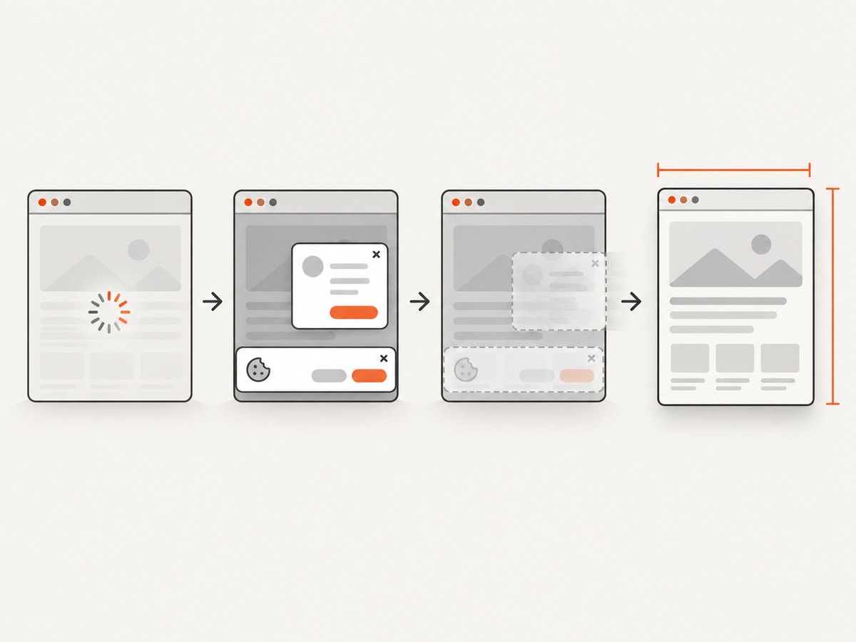
const res = await fetch(`https://api.screenshotneo.com/v1/shot?${q}`);Cookie banners, newsletter popups, and chat widgets are removed before the shot. Bot checks, blank pages, failed loads, timeouts, and cache hits are not billed, and response headers identify the page verdict and billing status. The MCP server includes take_screenshot, get_page_info, and capture_pdf for Claude, Cursor, and other MCP clients. The Free plan includes 1,000 screenshots a month with no card; paid plans start at $5 for 3,000. Create a free ScreenshotNeo account.
FAQ
Does a 2× screenshot always have twice the monitor’s pixels?
No. It may be a re-render or an upscale. Check the saved file and the capture tool’s semantics.
Should I use CSS pixels or physical pixels in a specification?
Use physical pixel width and height for the image contract, and record CSS viewport and scale separately.
Why does moving a browser window change screenshots?
The device pixel ratio can change between displays, which can alter rendering and output dimensions.
How can I make visual tests stable?
Pin viewport, device scale, browser and fonts; wait for deterministic page state; disable animation; and assert decoded image dimensions.