How Screenshot Scaling Works
Learn how CSS pixels, device pixel ratio, zoom, full-page capture and resizing determine screenshot dimensions and sharpness.
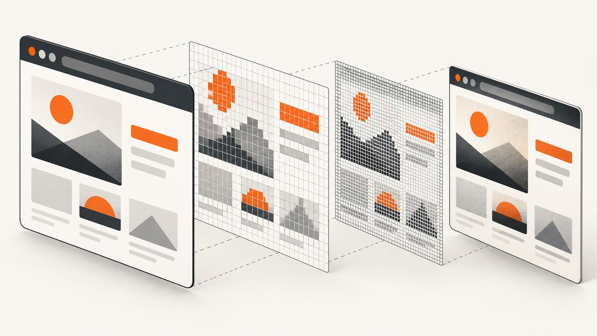
Short answer: screenshot size is controlled by several different stages. The browser lays out a page in CSS pixels, a device scale factor maps those CSS pixels to physical raster pixels, capture mode determines whether you save the visible viewport or the whole page, and any later resize changes the file dimensions without adding missing detail. To get predictable output, record all four: CSS viewport, device scale factor, zoom state and capture mode.
A viewport reported as 1440 CSS pixels wide can produce a 2880-pixel-wide image at a device scale factor of 2. Conversely, a 1440-pixel file may represent a 1440-CSS-pixel viewport captured at scale 1, or a larger page that was downsampled after capture. Those files are not equivalent even when they have similar subject matter.
1. CSS pixels and physical pixels
Web layout uses CSS pixels. They are logical units used for widths, font sizes, spacing and media queries. A display has physical pixels, the actual addressable elements in its panel. The two coordinate systems do not have to be one-to-one.
MDN defines window.devicePixelRatio as the ratio of physical-pixel resolution to CSS-pixel resolution for the current display context. A value of 2 generally means that one CSS pixel is represented by two physical pixels along each dimension. The result is four physical pixels for the same CSS area, which can make text and edges look sharper. See the MDN devicePixelRatio reference.
console.log({
  cssViewportWidth: window.innerWidth,
  cssViewportHeight: window.innerHeight,
  devicePixelRatio: window.devicePixelRatio,
  screenWidth: window.screen.width,
  screenHeight: window.screen.height
});
Do not treat screen.width as the screenshot width. It is a logical screen measurement, and the capture tool may use a different viewport. Inspect the saved image itself when dimensions matter.
Why a Retina screenshot looks “larger”
Suppose a page is laid out at 1280 CSS pixels wide:
| CSS viewport | Device scale factor | Typical raster width |
|---|---|---|
| 1280 CSS px | 1 | 1280 px |
| 1280 CSS px | 2 | 2560 px |
| 1280 CSS px | 3 | 3840 px |
The exact result can vary with browser, operating system and capture API, but the distinction remains: CSS dimensions describe layout; raster dimensions describe the encoded image.
2. Device scale, page zoom and pinch zoom
Three settings are often called “zoom,” even though they act at different stages.
- Device scale factor: maps CSS coordinates to physical raster pixels. It can change sharpness while leaving the CSS viewport and layout dimensions unchanged.
- Page zoom: desktop browser zoom changes the effective CSS viewport and can trigger different responsive breakpoints. A page at 125% zoom may lay out like a narrower viewport.
- Pinch or page scale: a touch gesture magnifies a virtual viewport. MDN notes that pinch zoom does not change
devicePixelRatio; page zoom does.
WebKit’s scale documentation separates device scale, page scale and page zoom. Device scale can change when a window moves between displays. Page zoom typically changes layout; page scale generally magnifies the view without changing CSS layout. These distinctions explain why two captures made from the same monitor can have different breakpoints or different pixel densities.
For reproducible automation, set browser zoom to 100%, specify the viewport explicitly, specify the device scale factor explicitly and avoid relying on the host display.
3. Viewport screenshots versus full-page screenshots
A viewport screenshot captures the currently visible rectangle. A full-page screenshot extends the capture to the document’s scrollable height. Full-page mode is not simply “a taller viewport”: the browser may stitch multiple regions, trigger lazy loading while scrolling, and encounter fixed headers or animations repeatedly.
Chrome DevTools device mode exposes CSS dimensions, a device pixel ratio setting and a full-size screenshot command. The same axes apply in automation libraries:
| Control | What it changes | What to record |
|---|---|---|
| Viewport width/height | Responsive layout and visible area | CSS width × CSS height |
| Device scale factor | Raster density and output pixels | Scale value |
| Zoom | Effective layout or visual magnification | Browser zoom and page-scale state |
| Capture mode | Visible rectangle or document height | Viewport or full page |
| Post-capture resize | Saved pixel dimensions and compression | Resampling operation and target size |
Full-page output can be extremely tall. Check maximum image dimensions and memory limits in your chosen image library, and consider capturing sections or exporting PDF when a single raster would be impractical.
4. A repeatable DIY workflow with Playwright
The following Node.js script fixes the important variables and writes both a viewport and a full-page image. It uses Chromium, a 1440 × 900 CSS viewport and a scale factor of 2.
import { chromium } from 'playwright';

const browser = await chromium.launch();
const context = await browser.newContext({
  viewport: { width: 1440, height: 900 },
  deviceScaleFactor: 2,
  colorScheme: 'light'
});

const page = await context.newPage();
await page.goto('https://example.com', {
  waitUntil: 'networkidle',
  timeout: 90_000
});

console.log(await page.evaluate(() => ({
  innerWidth: window.innerWidth,
  innerHeight: window.innerHeight,
  devicePixelRatio: window.devicePixelRatio,
  scrollWidth: document.documentElement.scrollWidth,
  scrollHeight: document.documentElement.scrollHeight
})));

await page.screenshot({ path: 'viewport@2x.png' });
await page.screenshot({ path: 'full-page@2x.png', fullPage: true });

await browser.close();
Install and run it with:
npm install playwright
npx playwright install chromium
node capture.mjs
Element capture
To compare a component at known density, capture the element instead of the whole page:
const card = page.locator('[data-testid="pricing-card"]');
await card.screenshot({ path: 'pricing-card.png' });
Element bounds are measured in CSS pixels before rasterization. A card that is 400 CSS pixels wide will usually be about 800 pixels wide at scale 2.
Set a different scale for a thumbnail
const thumbnailContext = await browser.newContext({
  viewport: { width: 1200, height: 675 },
  deviceScaleFactor: 1
});
const thumbnailPage = await thumbnailContext.newPage();
await thumbnailPage.goto('https://example.com', { waitUntil: 'networkidle' });
await thumbnailPage.screenshot({ path: 'thumbnail.png' });
await thumbnailContext.close();
Use scale 1 for smaller files and faster processing; use scale 2 when text clarity matters. Higher values increase pixel count and memory use quadratically.
5. Resizing after capture
Capture scale and image resizing are separate decisions. Resampling changes the raster’s pixel dimensions and image data. Reducing a 2880-pixel image to 1440 pixels can save bandwidth and produce a suitable web asset. Enlarging a 1440-pixel image to 2880 pixels increases file size but cannot recreate detail that was never captured. Cloudflare’s responsive-image guidance and Adobe’s resampling documentation both emphasize choosing an appropriately sized source rather than expecting upscaling to add information.
Use a high-quality resampling filter when reducing output, and preserve the original capture if you may need a larger derivative later. Record whether a file was resized so visual comparisons remain fair.
import sharp from 'sharp';

await sharp('viewport@2x.png')
  .resize({ width: 1440, withoutEnlargement: true })
  .webp({ quality: 82 })
  .toFile('viewport-1440.webp');
6. Measuring and comparing screenshots correctly
- Record the requested CSS viewport width and height.
- Record the device scale factor or DPR.
- Confirm browser zoom is 100% and note any page scale.
- State whether the capture is viewport-only, element-only or full-page.
- Inspect the actual encoded width and height with an image tool.
- Record post-capture resizing, format and quality settings.
For a quick file check with ImageMagick:
identify -format '%f %wx%h %m\n' viewport@2x.pngWhen two screenshots differ, first ask whether the page layout differs or only the raster density differs. Compare a screenshot at 1280 CSS pixels and scale 2 with one at 2560 CSS pixels and scale 1: both can be 2560 pixels wide, but text wrapping and responsive components may be different.
7. ScreenshotNeo scaling options
ScreenshotNeo provides a hosted capture path when you do not want to manage Chromium, fonts, display servers or device emulation. Its options include any viewport, 12 device presets, retina scale, full-page capture with lazy images loaded, element capture by CSS selector and image resizing. You can also set dark mode, custom CSS or JavaScript, waits, headers, cookies, user agent, timezone and geolocation.
For a complete parameter list and examples, see the ScreenshotNeo documentation.
Or skip the browser setup
One GET request returns a PNG, JPEG, WebP or PDF. This example requests a WebP screenshot:
curl -G "https://api.screenshotneo.com/v1/shot" -d access_key=YOUR_API_KEY --data-urlencode url=https://stripe.com -o shot.webpimport requests
r = requests.get("https://api.screenshotneo.com/v1/shot", params={"access_key": "YOUR_API_KEY", "url": "https://stripe.com"}, timeout=90)
open("shot.webp", "wb").write(r.content)const q = new URLSearchParams({ access_key: 'YOUR_API_KEY', url: 'https://stripe.com' });
const res = await fetch(`https://api.screenshotneo.com/v1/shot?${q}`);ScreenshotNeo accepts cookie and consent banners, then removes more than 60 known consent platforms, newsletter popups and chat widgets before the shot. Bot checks, blank pages, timeouts, failed loads and cache hits are not billed; response headers identify the page verdict and billing status. Its MCP server provides take_screenshot, get_page_info and capture_pdf for Claude, Cursor and other MCP clients. The Free plan includes 1,000 screenshots each month with no card; paid plans start at $5 for 3,000 screenshots. Create a free ScreenshotNeo account.
8. Performance, reliability and cost notes
Performance
- Higher scale factors increase pixel count roughly with the square of the scale, so scale 2 can require about four times as many pixels as scale 1.
- Full-page captures take longer than viewport captures, especially on pages with lazy images or long documents.
- Wait for a selector, a delay or network idle instead of using an unnecessarily long fixed delay.
- Block ads, trackers or selected resource types when they are irrelevant to the screenshot.
- Cache stable pages with a TTL when repeated captures do not need fresh content.
Reliability
- Pin viewport, scale, browser version and color scheme in CI.
- Disable animations or inject CSS to reduce frame-to-frame differences.
- Wait for fonts and key selectors before capture.
- Use retries for transient navigation failures, but do not retry indefinitely on bot checks or permanent authorization errors.
- Store the actual output dimensions and verdict headers with each artifact.
Cost
Local Playwright has infrastructure costs: browser processes, memory, network egress, image storage and maintenance. A hosted API converts those into request pricing. ScreenshotNeo bills only clean shots and exposes X-Page-Verdict and X-Billed headers, so failed loads and cache hits do not consume shot credits. Choose scale and format based on the required display size; capturing at a needlessly high density increases transfer and processing work.
9. Troubleshooting screenshot dimensions
| Symptom | Likely cause | Fix |
|---|---|---|
| File is twice as wide as the requested viewport | Device scale factor is 2 | Set scale to 1 or keep the density and document it. |
| Mobile layout appears unexpectedly | Page zoom changed the effective CSS viewport | Reset zoom to 100% and set viewport explicitly. |
| Two same-size files wrap text differently | One used a larger CSS viewport and a lower scale | Compare CSS dimensions, not only file pixels. |
| Full-page image cuts off content | Lazy content or a virtualized list was not loaded | Scroll or wait for the target selector before capture. |
| Image is blurry after export | Low-density source was enlarged or heavily compressed | Capture at the needed scale, then downsample once. |
| Screenshot is unexpectedly huge | Long page combined with high scale | Capture sections, reduce scale, or use PDF. |
| Capture hangs | Network never becomes idle or a resource blocks navigation | Use a selector or bounded delay, set a timeout, and block nonessential requests. |
| Cookie banner obscures content | Consent state was not handled | Accept or remove the banner before capture, or use ScreenshotNeo’s consent cleanup. |
10. FAQ
Does a higher DPR change CSS layout?
Usually no. Device scale changes raster density. Page zoom can change the effective CSS viewport and therefore layout.
Why does a 2× screenshot not look sharper when displayed at 2× size?
If it is displayed at its native pixel dimensions, the extra pixels may simply cover a larger display area. Sharpness depends on display density, display size and resampling.
Should I always capture at scale 2?
No. Use scale 2 for high-density display or archival clarity; use scale 1 when bandwidth, memory or processing time matters.
Is resizing the same as changing the device scale factor?
No. Device scale affects rasterization during browser capture. Resizing resamples an already encoded image.
How can I make visual regression tests stable?
Fix CSS viewport, device scale, zoom, browser version, fonts, color scheme, waits and capture mode. Save output dimensions with each test result.
When is PDF preferable?
Use PDF for long, document-like pages where a very tall raster would consume excessive memory or produce an unwieldy artifact. Page size, margins, orientation and page ranges then become the relevant controls.