Why PhantomJS and Chrome Produce Different Screenshot Dimensions
PhantomJS and Chrome use different controls for viewport, crop, full-page capture, and pixel scale. Align those settings before comparing screenshots.
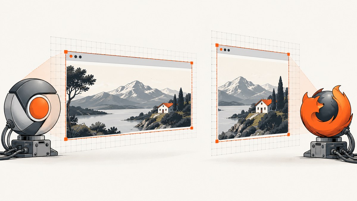
PhantomJS and Chrome can save screenshots with different pixel dimensions even when you set what looks like the same window size. The reason is that a browser viewport, the region captured, full-page behavior, and device-pixel scaling are separate controls. Align those settings and compare the resulting bitmap dimensions first. If the dimensions then match but the images still look different, investigate rendering, fonts, assets, and timing.
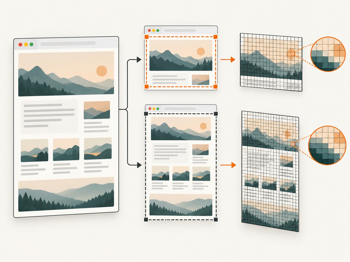
The practical answer to “Why are my PhantomJS and Chrome screenshots different sizes?” is: check the capture mode and output scale as well as the CSS viewport. PhantomJS explicitly separates viewportSize from clipRect; Chrome DevTools exposes viewport and full-page screenshot actions and a device-pixel ratio (DPR) setting. Those controls do not map one-to-one across every capture method. PhantomJS’s screen-capture guide and Chrome DevTools’ device-mode guide describe the key distinctions.
This guide gives you a repeatable way to set up both tools, measure the output, isolate the mismatch, and decide when a modern screenshot API is a better fit. PhantomJS is a legacy browser project, so use it where you need compatibility with an existing workflow; for new browser automation, select a supported capture path and record its version and configuration.
1. The four controls that determine dimensions
Think of screenshot dimensions as a result of several decisions, not as a direct copy of the viewport size.
| Control | What it affects | What to record |
|---|---|---|
| CSS viewport | The visible browser area used for layout and responsive breakpoints. | Width and height in CSS pixels. |
| Capture mode and bounds | Whether the visible viewport, a clipped rectangle, or the full document is captured. | Viewport-only/full-page and crop coordinates. |
| Device scale | How CSS pixels map to output bitmap pixels. | DPR or equivalent scale setting, plus capture mechanism. |
| Zoom or output resizing | May change rendering scale or resample the resulting bitmap. | Browser zoom and any post-capture resize. |
In PhantomJS, viewportSize sets the viewport used for layout. clipRect determines the page rectangle rasterized by page.render(); without a clip rectangle, the render method processes the whole page. The viewport property documentation and the clip rectangle documentation spell out these separate roles.
In Chrome DevTools, the standard screenshot command captures what is visible; “Capture a full size screenshot” includes content beyond the viewport. DPR describes how many screen pixels Chrome uses to draw a CSS pixel on a HiDPI display. Thus, a viewport that is 800 CSS pixels wide does not guarantee an 800-pixel-wide bitmap. The capture path and its scale matter.
A useful first approximation is:
output bitmap width ≈ captured CSS width × effective pixel scale
output bitmap height ≈ captured CSS height × effective pixel scale
This is a diagnostic model, not a promise that every tool simply multiplies dimensions. Full-page capture, clipping, zoom, and output processing can change the result. Inspect the actual image dimensions rather than relying on the formula.
2. Make a controlled comparison
Use the same stable URL or local page, the same readiness condition, and explicit settings. If a live page changes between captures, layout shifts or late-loading content can obscure the sizing issue.
PhantomJS: set viewport and crop explicitly
Save this as capture.js and run it with an installed PhantomJS binary as phantomjs capture.js https://example.com. It captures a fixed viewport-sized rectangle. Replace the URL with a page you can access.
var page = require('webpage').create();
var system = require('system');
var address = system.args[1] || 'https://example.com';

page.viewportSize = { width: 1280, height: 800 };
page.clipRect = { top: 0, left: 0, width: 1280, height: 800 };

page.open(address, function (status) {
  if (status !== 'success') {
    console.log('Unable to load: ' + address);
    phantom.exit(1);
    return;
  }
  window.setTimeout(function () {
    page.render('phantom.png');
    console.log('Saved phantom.png at viewport 1280x800');
    phantom.exit();
  }, 500);
});
The short delay is just a basic example. It does not prove that fonts, asynchronous content, or lazy-loaded images are ready. For repeatable captures, wait for a page-specific readiness signal or a known element. PhantomJS’s render API documents its image output; the screen-capture guide shows viewport and clip settings together.
For a full-document render, leave clipRect unset and check the output dimensions. Full-page output height depends on document content; it is not expected to equal the viewport height. If you set a crop, make sure its coordinates and dimensions describe the intended page region.
Chrome: use the same CSS viewport and capture mode
For a manual check, open Chrome DevTools, enable Device Mode, enter a responsive width and height matching PhantomJS, and set or record DPR. Use “Capture screenshot” for the visible viewport. Use “Capture a full size screenshot” only when your PhantomJS capture is also intended to cover the document. DevTools’ viewport zoom affects how the preview appears on screen; don’t mistake preview zoom for the page’s CSS viewport.
For a scriptable Chrome capture, the following runnable Node.js example uses Puppeteer. Install it in a project with npm install puppeteer, save as capture-chrome.mjs, then run node capture-chrome.mjs https://example.com. The example fixes the viewport and device scale factor, waits for document loading, and captures only the viewport.
import puppeteer from 'puppeteer';

const url = process.argv[2] || 'https://example.com';
const browser = await puppeteer.launch({ headless: true });
try {
  const page = await browser.newPage({
    viewport: { width: 1280, height: 800 },
    deviceScaleFactor: 1
  });
  await page.goto(url, { waitUntil: 'load', timeout: 60000 });
  await page.screenshot({ path: 'chrome.png', fullPage: false });
  const metrics = await page.evaluate(() => ({
    innerWidth: window.innerWidth,
    innerHeight: window.innerHeight,
    devicePixelRatio: window.devicePixelRatio,
    documentWidth: document.documentElement.scrollWidth,
    documentHeight: document.documentElement.scrollHeight
  }));
  console.log(JSON.stringify(metrics, null, 2));
} finally {
  await browser.close();
}
Use fullPage: true when you specifically want the whole document. Puppeteer’s deviceScaleFactor controls emulated device scale for the page context; set it explicitly rather than inheriting defaults. A corresponding DevTools capture and a scripted capture can still differ in implementation details, so record which route produced each file.
Record actual bitmap dimensions
Inspect the generated PNG metadata with a local image tool, or read it in Python. Install Pillow with python -m pip install Pillow and run this snippet with the output filename:
from PIL import Image
import sys

for filename in sys.argv[1:]:
    with Image.open(filename) as image:
        print(f'{filename}: {image.width} × {image.height} pixels')
Record both the runtime measurements and the file dimensions. In Chrome, log window.innerWidth, window.innerHeight, and window.devicePixelRatio. In PhantomJS, record page.viewportSize, page.clipRect if set, and the file’s dimensions. For a full-page comparison, also record the document’s scroll width and height.
3. Diagnose the mismatch in order
- Confirm the CSS viewport. Set width and height explicitly in each browser before navigation. Avoid assuming that the machine display or a DevTools preset supplies the same values.
- Match the region. Decide whether both images show the viewport, a fixed crop, or the full page. For PhantomJS, set
clipRectfor a fixed crop. For Chrome DevTools, choose the matching viewport or full-size action; in a script, set the corresponding full-page option. - Compare scale. Record Chrome DPR and the automation context’s device scale factor. Record any output scaling or resizing. Do not assume PhantomJS’s viewport dimensions alone imply a particular HiDPI output scale.
- Check zoom. Set browser zoom to its normal value where applicable and check for script-level zoom or image-resizing steps. PhantomJS exposes
zoomFactorin its page automation interface; use it deliberately if the legacy script has set it. - Measure files, then compare content. If bitmap width and height differ, fix dimensions first. If they match, compare layout, fonts, assets, and timing.
When publishing a comparison or filing a bug, include the CSS viewport width and height, scale/DPR, capture mode, clip rectangle, zoom or resize operation, browser and automation versions, operating environment, and resulting bitmap width and height. Without those details, “same size” can describe different capture configurations.
4. Why equal dimensions can still look different
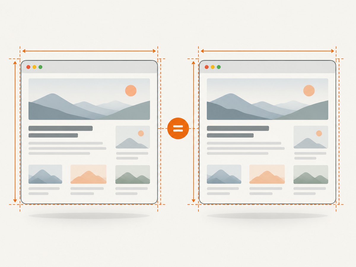
PhantomJS uses WebKit; Chrome uses its own browser rendering stack. Once the capture bounds and scale match, remaining visual differences may come from engine behavior or the page itself. Avoid naming a single cause before checking the actual page, scripts, versions, and output.
- Fonts: a local font may be absent, delayed, or substituted. Wait for fonts to load where possible and verify the environment has the expected fonts.
- Responsive layout: small viewport differences can cross a CSS media-query breakpoint. Compare the logged CSS viewport, not the apparent size of the image viewer.
- Images and lazy content: content below the fold may load only after scrolling. Full-page capture implementations can trigger different loading behavior. Wait for required assets and use a consistent page readiness rule.
- Timing and animation: carousels, transitions, ads, and client-side content can change between captures. Use a stable test page or disable animation in a controlled test stylesheet.
- Browser support: legacy WebKit and current Chrome may parse or render newer CSS differently. A matching bitmap size does not imply pixel-identical rendering.
5. Common errors and fixes
| Symptom | Likely cause | Fix |
|---|---|---|
| Output is taller than the viewport | Full-document capture or an unset PhantomJS clip rectangle includes page content beyond the visible area. | Choose viewport-only capture in both tools, or intentionally compare full-page captures. |
| Output is wider or taller by a scale factor | DPR/device scale or post-capture resizing differs. | Set and record scale explicitly. Inspect the file’s actual pixel dimensions and disable hidden resize steps. |
| Correct page, wrong crop | clipRect has unexpected origin or dimensions, or Chrome used a different capture action. |
Set top, left, width, and height explicitly; verify viewport-only versus full-page mode. |
| Responsive layout does not match | Different CSS viewport or a breakpoint boundary was crossed. | Log inner width and height from Chrome and configure identical viewport dimensions before loading. |
| PhantomJS reports a load failure | The navigation did not succeed, the page is inaccessible, or the network/resource environment differs. | Check URL reachability and PhantomJS load status; use a stable test page and inspect resource errors rather than rendering an assumed success. |
| Dimensions vary across runs | Page content height changes, fonts or content load late, or the capture waits inconsistently. | Wait for a page-specific ready condition, hold test data constant, and record document dimensions on every run. |
6. Performance, reliability, and cost
Dimension matching does not require repeated full-page captures. Start with a viewport screenshot and compare its dimensions; run full-page captures only when document height is part of the question. Large pages and high scale factors produce larger bitmaps and can take more memory to render and store. If you resize after capture, preserve the original dimensions and record the resize operation so that later comparisons remain interpretable.
For reliability, use a stable URL or fixture, pin and record browser/automation versions where the environment allows it, and wait for a specific page condition rather than relying on an arbitrary sleep. A successful navigation does not guarantee that every late asset has loaded. Capture a small set of repeated runs when diagnosing intermittent variation, then compare both file dimensions and page metrics. This is a method for isolating a cause, not a claim that any specific engine or service has a particular performance level.
Cost depends on how you run the capture: local browser processes consume your compute and maintenance time; hosted services price by their own plans and billing rules. Budget for the frequency of captures, output format and size, retries, and the effort of maintaining browser dependencies. For a one-off comparison, local scripts may be sufficient. For routine production capture, include browser setup, failure handling, and operational maintenance in the cost estimate.
7. Or skip the browser setup
ScreenshotNeo is a website screenshot API and MCP server. For a straightforward capture, one GET request returns an image or PDF; use the ScreenshotNeo API documentation for request options and integration details.
curl -G "https://api.screenshotneo.com/v1/shot" \
  -d access_key=YOUR_API_KEY \
  --data-urlencode url=https://example.com \
  -o shot.webp
Python:
import requests

r = requests.get(
    "https://api.screenshotneo.com/v1/shot",
    params={"access_key": "YOUR_API_KEY", "url": "https://example.com"},
    timeout=90,
)
r.raise_for_status()
open("shot.webp", "wb").write(r.content)
Node.js:
const q = new URLSearchParams({
  access_key: 'YOUR_API_KEY',
  url: 'https://example.com'
});
const res = await fetch(`https://api.screenshotneo.com/v1/shot?${q}`);
if (!res.ok) throw new Error(`Screenshot request failed: ${res.status}`);
await Bun.write('shot.webp', res);
ScreenshotNeo accepts cookie and consent banners like a visitor and removes 60+ known consent platforms, newsletter popups, and chat widgets before capture; each of those steps can be turned off. Bot checks/CAPTCHAs, blank pages, timeouts, failed loads, and cache hits cost nothing, and response headers identify page verdict and billing status. Its MCP server provides take_screenshot, get_page_info, and capture_pdf tools for Claude, Cursor, and other MCP clients. The free plan includes 1,000 screenshots a month with no card; paid plans start at $5 for 3,000 screenshots.
Create a free ScreenshotNeo account and get 1,000 screenshots a month with no card.
8. FAQ
Does a 1280-pixel viewport always create a 1280-pixel-wide file?
No. The viewport is measured in CSS pixels. Device scale, crop dimensions, full-page behavior, and capture processing can affect the bitmap. Inspect the saved file.
Should I compare PhantomJS and Chrome pixel by pixel?
Only after you have matched capture bounds and scale, and have a reason to require cross-engine pixel identity. For general debugging, first compare dimensions and then inspect the specific layout or asset difference.
Can I use a PhantomJS clip rectangle to capture the whole page?
A clip rectangle defines a specific rasterized region. For a whole-page render, leave the clip unset and check the actual output, or set a rectangle large enough for the intended region. Page height can change as content loads.
Which details should accompany a screenshot bug report?
Include viewport, DPR/device scale, capture mode, crop, zoom or resizing, browser and automation versions, environment, and actual file dimensions. Add the URL or a reproducible local fixture and readiness condition when possible.