Headless Chrome and Puppeteer: Window Size vs. setViewport
Learn exactly how Puppeteer’s setViewport, --window-size, and page.resize differ, and choose the right setting for reliable screenshots and tests.
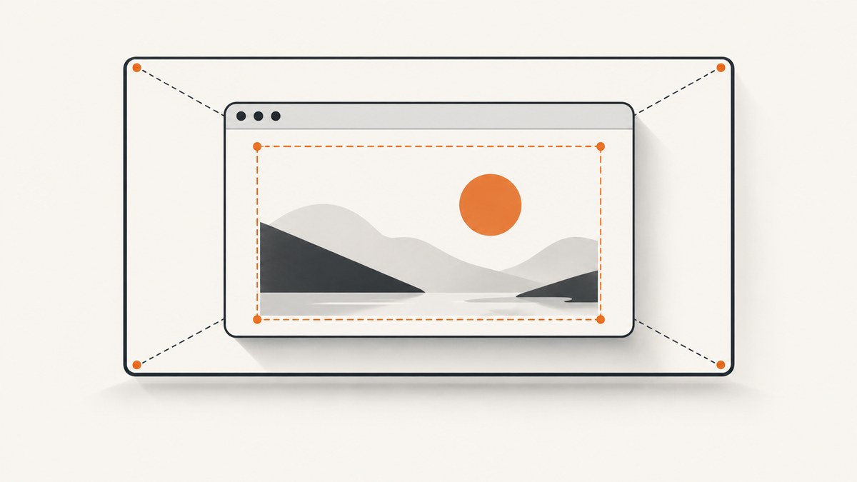
Short answer: page.setViewport() controls the page’s layout viewport in CSS pixels. Chrome’s --window-size=WIDTH,HEIGHT launch argument controls the headless screen or browser window layer. They can produce similar-looking screenshots, but they are different browser dimensions. Use setViewport when your test depends on responsive layout or window.innerWidth; use --window-size when you need to configure the headless screen; use Puppeteer’s window API when you need the browser content area itself.
This distinction explains many confusing results: a window-size flag can be set correctly while a page still reports an unexpected viewport, and a viewport can be correct while the outer screen remains a different size. The reliable approach is to identify the value your code measures, configure that layer, wait for asynchronous changes, and read the value back in the running browser.
What each setting controls
| Goal | Use | What it changes |
|---|---|---|
| Reproduce responsive CSS at a known size | page.setViewport({width, height}) |
Page layout viewport, measured in CSS pixels |
| Set the headless screen size | --window-size=WIDTH,HEIGHT |
Headless screen/window boundary |
| Set browser content dimensions | page.setViewport(null), then page.resize({contentWidth, contentHeight}) |
Browser window content area |
| Emulate mobile or touch behavior | isMobile and hasTouch in the viewport |
Viewport metrics plus mobile/touch behavior |
Puppeteer’s documented default viewport is 800×600 CSS pixels. In headless mode, Chrome’s default screen is also 800×600 when no --screen-info switch is supplied, unless --window-size is specified. Those matching defaults do not mean the two settings are interchangeable. The viewport describes page layout; the screen describes the browser’s available display space. See the Puppeteer ConnectOptions documentation and the screen configuration guide.
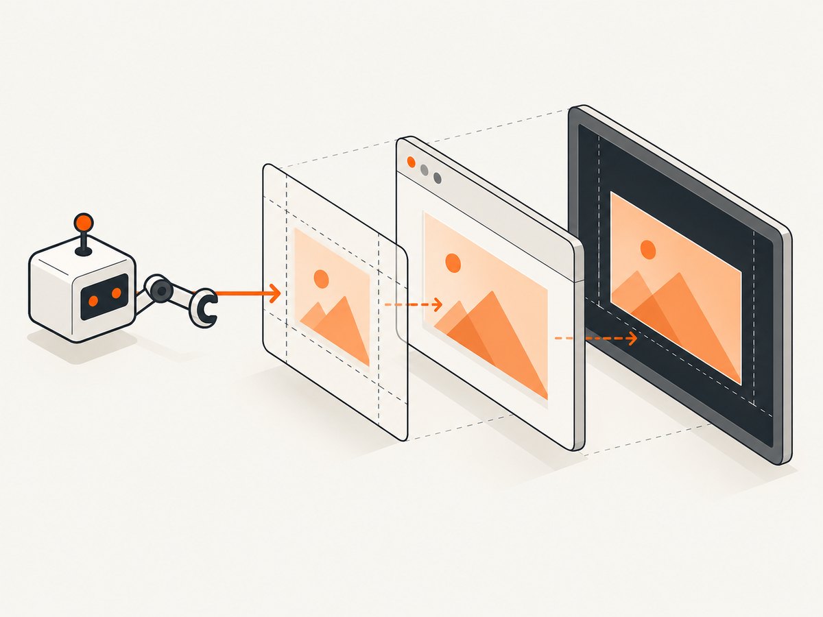
Set a CSS viewport with page.setViewport()
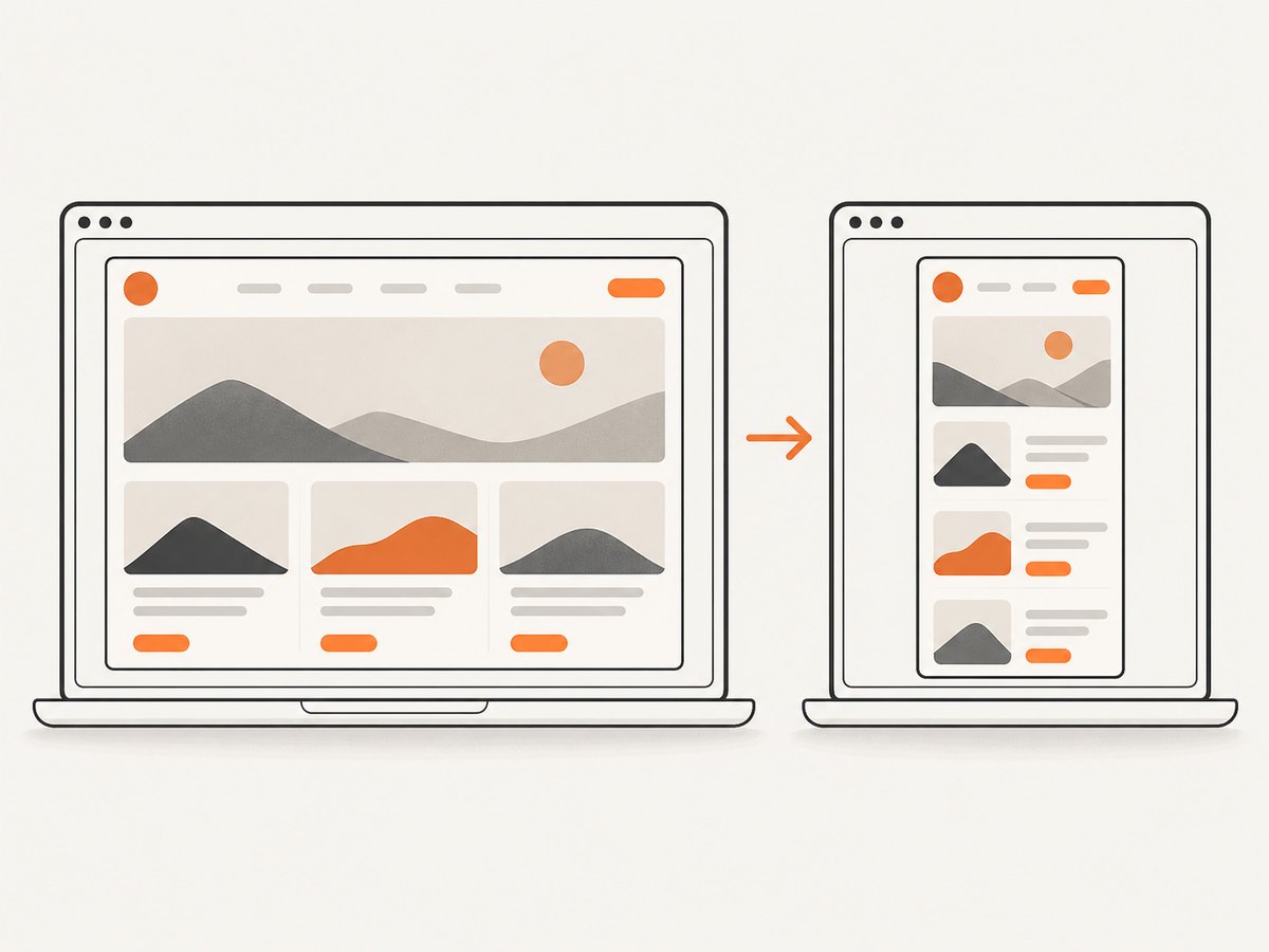
For responsive screenshots and layout tests, set the viewport before navigation. The width and height are CSS pixels, so device pixel ratio is a separate concern. A viewport of 1280×800 describes the page’s CSS layout area; it does not promise a 1280×800 physical monitor or outer browser window.
import puppeteer from 'puppeteer';

const browser = await puppeteer.launch({headless: true});
try {
  const page = await browser.newPage();
  await page.setViewport({
    width: 1280,
    height: 800,
    deviceScaleFactor: 1,
  });

  await page.goto('https://example.com', {waitUntil: 'networkidle2'});
  console.log(await page.evaluate(() => ({
    innerWidth: window.innerWidth,
    innerHeight: window.innerHeight,
    devicePixelRatio: window.devicePixelRatio,
  })));

  await page.screenshot({path: 'viewport.png', fullPage: false});
} finally {
  await browser.close();
}
Set deviceScaleFactor when the image’s physical pixel density matters. A scale factor of 2 can produce a sharper, larger bitmap while the CSS viewport remains 1280×800. Do not use a larger scale factor to solve a layout breakpoint problem; change the CSS viewport width instead.
Mobile and touch settings
A mobile viewport can include isMobile, hasTouch, and a scale factor:
await page.setViewport({
  width: 390,
  height: 844,
  isMobile: true,
  hasTouch: true,
  deviceScaleFactor: 3,
});
await page.goto('https://example.com');
Set these values before navigation whenever possible. Puppeteer documents that changing isMobile or hasTouch can reload the page. If you change them after loading, wait for the page to settle and re-check application state.
Set the headless screen with –window-size
Pass the flag in launch({args}) when the screen or outer window is the value your code needs to control:
import puppeteer from 'puppeteer';

const browser = await puppeteer.launch({
  headless: true,
  args: ['--window-size=1440,900'],
});
try {
  const page = await browser.newPage();
  await page.goto('https://example.com', {waitUntil: 'domcontentloaded'});
  console.log(await page.evaluate(() => ({
    innerWidth: window.innerWidth,
    innerHeight: window.innerHeight,
    outerWidth: window.outerWidth,
    outerHeight: window.outerHeight,
  })));
} finally {
  await browser.close();
}
In headless mode, the screen configuration guide describes an 800×600 screen by default when --screen-info is absent, unless --window-size is supplied. In headful Chrome, physical platform screens are involved, so results can differ between a developer workstation and CI. The newer default headless mode uses regular Chrome; Puppeteer’s headless: 'shell' option uses the separate chrome-headless-shell binary and may not behave exactly the same.
When you need the actual window content size
Puppeteer’s window-management example removes the default viewport constraint first, then resizes the browser content area. This is the appropriate model when you need browser-window dimensions rather than a fixed CSS viewport.
import puppeteer from 'puppeteer';

const browser = await puppeteer.launch({headless: true});
try {
  const page = await browser.newPage();
  await page.setViewport(null);

  await page.resize({contentWidth: 1200, contentHeight: 700});

  await page.evaluate(() => new Promise(resolve => {
    if (window.innerWidth === 1200 && window.innerHeight === 700) {
      resolve();
      return;
    }
    window.addEventListener('resize', resolve, {once: true});
  }));

  console.log(await page.evaluate(() => ({
    innerWidth: window.innerWidth,
    innerHeight: window.innerHeight,
    outerWidth: window.outerWidth,
    outerHeight: window.outerHeight,
  })));
} finally {
  await browser.close();
}
The inner-window size updates asynchronously. Waiting for the resize event, or polling until the expected values are observed, prevents a race where the screenshot or assertion runs against the old dimensions. Read the official window-management guide for the documented sequence.
Why –window-size may not change your Puppeteer viewport
The most common cause is that Puppeteer applies its default viewport to the page after Chrome starts. In that situation, the screen can be 1440×900 while the page layout is still 800×600. Explicitly call page.setViewport() for the layout you want, or call page.setViewport(null) before using page.resize().
Another cause is measuring the wrong value. These values answer different questions:
window.innerWidth/innerHeight: the page’s inner window and layout area.window.outerWidth/outerHeight: the browser window dimensions when exposed by the current mode.- Viewport metrics: the CSS layout configuration used by responsive pages.
- Screen or browser bounds: the display/window layer configured by Chrome flags and window APIs.
Always inspect the value in page context after configuration:
const metrics = await page.evaluate(() => ({
  inner: [window.innerWidth, window.innerHeight],
  outer: [window.outerWidth, window.outerHeight],
  dpr: window.devicePixelRatio,
  mediaDesktop: matchMedia('(min-width: 1024px)').matches,
}));
console.log(metrics);
Reliable recipes
Responsive layout screenshot
- Launch regular headless Chrome.
- Set the CSS viewport before navigation.
- Navigate and wait for the application’s real readiness condition.
- Read back
innerWidthand any relevant media queries. - Capture with
fullPage: trueonly when the full document, rather than the viewport, is required.
const page = await browser.newPage();
await page.setViewport({width: 1024, height: 768});
await page.goto('https://example.com', {waitUntil: 'networkidle2'});
await page.waitForSelector('#app');
await page.screenshot({path: 'desktop.png'});
Window-content experiment
- Call
page.setViewport(null). - Call
page.resize({contentWidth, contentHeight}). - Wait for the resize event.
- Assert the observed inner dimensions before taking the screenshot.
Compare desktop and mobile in one run
Use separate pages or reset the viewport before each navigation. Reusing a page can retain application state, service workers, storage, and responsive code paths. New pages make test isolation clearer.
Edge cases and configuration details
- Full-page captures:
fullPageextends the screenshot to document height; it does not change the CSS viewport width. - Lazy-loaded content: scrolling or waiting for the site’s loading signal may be necessary before a full-page capture.
- Device scale factor: affects bitmap pixels and screenshot size, not CSS breakpoints.
- Headless mode: regular Chrome and
headless: 'shell'are different execution environments. - Headful CI: physical display constraints and window managers can change outer dimensions.
- Scrollbars: available layout width can be smaller than the nominal window width when a vertical scrollbar is present.
- Browser chrome: tabs, toolbars, and OS borders are not part of a page screenshot.
- Navigation timing: setting mobile or touch properties after navigation can trigger a reload.
Troubleshooting
| Symptom | Likely cause | Fix |
|---|---|---|
Page reports 800×600 despite --window-size |
Puppeteer’s default viewport is still applied | Call setViewport with the desired CSS size, or use setViewport(null) before resize. |
| Screenshot has the right width but wrong physical pixel count | Device scale factor differs | Set deviceScaleFactor explicitly and check window.devicePixelRatio. |
| Assertion intermittently sees old dimensions | Window resize is asynchronous | Wait for resize or poll until the expected inner size is observed. |
| Mobile layout changes after navigation | isMobile or hasTouch was changed too late |
Set them before goto; if unavoidable, wait for the reload and readiness condition. |
| Headless and headful results differ | Different screen/window environments | Pin the headless mode, inspect metrics in page context, and run the same Chrome configuration in CI. |
| Elements are clipped in a full-page image | Content is lazy-loaded or changes height after capture begins | Wait for selectors, fonts, images, and application idle state before capturing. |
Performance, reliability, and cost
Changing viewport settings is inexpensive compared with launching Chrome and loading a page. Reuse a browser process when isolation allows it, create pages for independent viewport cases, and avoid unnecessary reloads. For deterministic output, wait on a concrete selector or application-ready signal instead of relying only on a generic network-idle event; analytics, WebSockets, and long polling can keep a page active indefinitely.
Pin the Puppeteer and Chrome versions used by CI, record the configured viewport and observed metrics in failure logs, and keep screenshots tied to the same fonts and OS environment. A screenshot that is visually different may be caused by font availability or device scale rather than window sizing.
Or skip the browser setup
If your goal is a clean website screenshot rather than browser-window experimentation, ScreenshotNeo provides a single HTTP request. Its API accepts the URL and returns PNG, JPEG, WebP, or PDF output; the full option set is documented at the ScreenshotNeo API docs.
curl -G "https://api.screenshotneo.com/v1/shot" -d access_key=YOUR_API_KEY --data-urlencode url=https://stripe.com -o shot.webpimport requests
r = requests.get("https://api.screenshotneo.com/v1/shot", params={"access_key": "YOUR_API_KEY", "url": "https://stripe.com"}, timeout=90)
open("shot.webp", "wb").write(r.content)const q = new URLSearchParams({ access_key: 'YOUR_API_KEY', url: 'https://stripe.com' });
const res = await fetch(`https://api.screenshotneo.com/v1/shot?${q}`);Before capture, ScreenshotNeo accepts cookie or consent banners and removes more than 60 known consent platforms, newsletter popups, and chat widgets. Each step can be turned off. Bot checks or CAPTCHAs, blank pages, timeouts, failed loads, and cache hits cost nothing, and the response identifies the result with X-Page-Verdict and X-Billed headers. It also offers an MCP server with take_screenshot, get_page_info, and capture_pdf tools for Claude, Cursor, and other MCP clients.
For scale, the service supports full-page captures with lazy images loaded, CSS-selector element captures, dark mode, device presets and custom viewports, retina scale, PDF paper sizes and page ranges, custom CSS and JavaScript, clicks, selector or network-idle waits, request and resource blocking, headers, cookies, user agents, authorization, timezone, geolocation, transparent backgrounds, resizing, selectable cache TTLs, signed links, asynchronous jobs with signed webhooks, bulk capture for up to 100 URLs per call, a usage API, and an OpenAPI specification. Its parameter names also match those used by other screenshot APIs, which can simplify migration.
The Free plan includes 1,000 screenshots per month with no card. Paid plans start at $5 for 3,000 screenshots; yearly billing gives two months free, and every feature is available on every plan. Create a free ScreenshotNeo account.
FAQ
Does setViewport resize the operating-system window?
No. It sets page viewport metrics in CSS pixels. Use the window or screen controls when the outer browser dimensions matter.
Should I always pass –window-size?
No. Pass it when the headless screen/window layer is part of the behavior you measure. For responsive layout tests, explicitly set the viewport.
Why does a 1280×800 viewport produce a different image size?
Check deviceScaleFactor, scrollbars, full-page mode, and whether the page changed size after fonts or lazy content loaded.
Is page.resize available for ordinary viewport testing?
The documented window-management sequence uses setViewport(null) followed by page.resize for browser content dimensions. For ordinary responsive testing, setViewport is the clearer API.
Which value should I log in a failing test?
Log innerWidth, innerHeight, outerWidth, outerHeight, devicePixelRatio, headless mode, and the configured viewport. That shows which browser layer differs.