How to Set the Browser Viewport for Website Screenshots
Set CSS viewport dimensions before navigation, choose the right capture mode, and avoid mobile, scaling, and full-page screenshot mistakes.
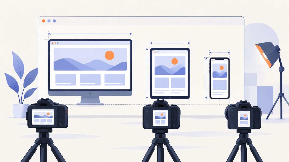
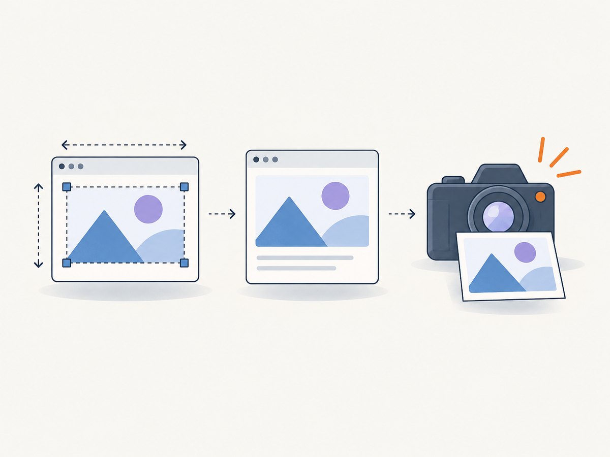
Set the viewport width and height before navigating to the page. A viewport is the rendered page area measured in CSS pixels. Responsive breakpoints, media queries, and layout scripts use those dimensions. In Playwright, set viewport on the browser context (or call page.setViewportSize() before navigation). In Puppeteer, call page.setViewport() before page.goto(). Then choose whether you need a visible viewport, one element, or the full scrollable page.
This guide explains the complete workflow, including CSS pixels versus device pixels, mobile emulation, deterministic CI captures, full-page screenshots, scaling, waiting for dynamic content, common errors, and a hosted option when you do not want to maintain a browser.
1. What a browser viewport controls
The viewport is the page’s layout rectangle. A width of 1440 and a height of 900 means the page lays itself out as if it has 1,440 CSS pixels horizontally and 900 CSS pixels vertically. CSS media queries such as @media (max-width: 768px) evaluate against this width.
| Setting | What it changes | Typical use |
|---|---|---|
| Viewport width | Responsive breakpoints and available layout width | Desktop, tablet, and mobile snapshots |
| Viewport height | Visible area before scrolling | Hero sections, above-the-fold checks, fold behavior |
| Screen size | window.screen values exposed to page scripts |
Testing code that reads physical screen dimensions |
| Device scale factor | Output device-pixel density | Retina-quality images and pixel comparisons |
| Mobile emulation | Mobile layout behavior, touch, and user agent details | Checking mobile-specific code paths |
Viewport dimensions and output dimensions are different. If the viewport is 1440 CSS pixels wide and the device scale factor is 2, the resulting bitmap can be about 2880 device pixels wide. The CSS layout still uses 1440 pixels.
2. Choose the screenshot type first
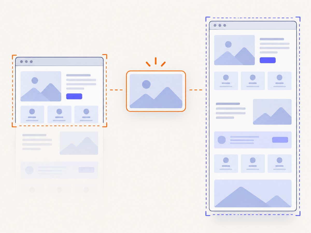
- Viewport screenshot: captures the currently visible rectangle. Use it for breakpoint snapshots and above-the-fold reviews.
- Element screenshot: captures one component, such as a card, form, or hero section.
- Full-page screenshot: captures the entire scrollable document, including content below the fold.
Do not use a full-page image when you are testing a viewport breakpoint: a tall image can hide where the first viewport ends. Conversely, do not stitch many viewport shots when the requirement is one complete page.
3. Playwright: set viewport before navigation
Playwright recommends setting the viewport before navigating because many websites do not expect the phone or window size to change after loading. A browser context is the most repeatable place to configure it.
const { chromium } = require('playwright');

(async () => {
  const browser = await chromium.launch();
  const context = await browser.newContext({
    viewport: { width: 1440, height: 900 },
    screen: { width: 1440, height: 900 }
  });
  const page = await context.newPage();

  await page.goto('https://example.com', { waitUntil: 'networkidle' });
  await page.screenshot({ path: 'viewport.png' });

  await browser.close();
})();
The screen option is separate from viewport. Set both when application code reads window.screen.width or window.screen.height. Playwright’s default context viewport is 1280 by 720; relying on that default can make an explicit test less clear.
Change an existing Playwright page
await page.setViewportSize({ width: 390, height: 844 });
await page.goto('https://example.com');
await page.screenshot({ path: 'mobile.png' });
Calling page.setViewportSize() resets the screen size. If the screen and viewport must remain coordinated, create a context with both values instead of changing only the page.
Viewport, element, and full-page Playwright captures
// Visible viewport
await page.screenshot({ path: 'visible.png' });

// One element
await page.locator('.pricing-card').screenshot({ path: 'card.png' });

// Entire scrollable document
await page.screenshot({ path: 'full-page.png', fullPage: true });
For visual verification, screenshots are the right artifact. For reading text or checking accessibility structure, use an accessibility snapshot or DOM assertions instead; those jobs are more reliable than OCR on an image.
4. Puppeteer: set width, height, and density
Puppeteer also expects viewport dimensions in CSS pixels. Set them before page.goto(). The deviceScaleFactor controls captured device-pixel density.
const puppeteer = require('puppeteer');

(async () => {
  const browser = await puppeteer.launch();
  const page = await browser.newPage();

  await page.setViewport({
    width: 1440,
    height: 900,
    deviceScaleFactor: 1
  });

  await page.goto('https://example.com', { waitUntil: 'networkidle0' });
  await page.screenshot({ path: 'viewport.png' });

  await browser.close();
})();
Use deviceScaleFactor: 2 when you need a retina-style output. It increases image dimensions and usually increases memory and encoding work, so keep it at 1 for ordinary regression snapshots unless density is part of the requirement.
Mobile-style Puppeteer emulation
await page.setViewport({
  width: 390,
  height: 844,
  deviceScaleFactor: 3,
  isMobile: true,
  hasTouch: true,
  isLandscape: false
});
await page.goto('https://example.com');
await page.screenshot({ path: 'phone.png' });isMobile, hasTouch, and isLandscape can change application behavior beyond simple CSS resizing. Use them only when you want mobile emulation. A 390-pixel desktop context and a real mobile emulation context are different test cases.
5. Picking dimensions that answer your question
| Question | Suggested capture | Reason |
|---|---|---|
| Does the desktop breakpoint render correctly? | 1440 × 900 CSS pixels | Wide layout with a predictable fold |
| Does the tablet breakpoint render correctly? | 768 × 1024 CSS pixels | Common breakpoint boundary and portrait height |
| Does the phone layout render correctly? | 390 × 844 CSS pixels | Representative narrow portrait viewport |
| Does content below the fold exist? | Any fixed viewport plus fullPage: true |
Separates layout width from document height |
| Does a component have the right dimensions? | Element screenshot | Avoids unrelated page content and scrolling |
These are starting points, not universal device specifications. Use the dimensions required by your product, design system, or test matrix. Test just above and below important breakpoints when a one-pixel change can switch navigation, columns, or typography.
6. Wait for the page to become capturable
Correct dimensions cannot fix a screenshot taken too early. Combine navigation waiting with a page-specific readiness condition.
await page.goto('https://example.com/dashboard', { waitUntil: 'domcontentloaded' });
await page.locator('[data-ready="true"]').waitFor();
await page.screenshot({ path: 'ready.png' });
Use a selector when the application exposes a stable ready marker. A short delay can help with animations, but a fixed delay is less robust than waiting for the actual element or state. For pages with lazy-loaded images, scroll or use a full-page capture method that loads content before taking the image. Disable animations in visual tests when motion creates inconsistent frames:
await page.addStyleTag({ content: `
  *, *::before, *::after {
    animation: none !important;
    transition: none !important;
    caret-color: transparent !important;
  }
` });
7. Chrome DevTools for manual checks
Open Chrome DevTools Device Mode, choose a device preset or enter custom width and height, and inspect the responsive layout. When the page extends below the fold, use the “Capture a full size screenshot” command. This manual pass is useful for discovering the dimensions you should encode in Playwright or Puppeteer. Once the dimensions are known, automate them so CI does not depend on an operating-system window.
8. Make screenshots deterministic in CI
- Set an explicit viewport in every browser context.
- Set the browser, operating system image, and fonts consistently.
- Use a fixed timezone and locale when dates or number formats appear.
- Wait for application readiness, fonts, and important images.
- Disable animations and blinking cursors.
- Use a stable device scale factor.
- Keep network fixtures or test data stable where possible.
A viewport of null makes sizing depend on the host operating-system window. That can be convenient for local exploration but is unsuitable for reproducible CI comparisons. Also remember that the same CSS viewport can render differently with different fonts, browser versions, or platform text rasterization.
9. Common errors and fixes
| Symptom | Likely cause | Fix |
|---|---|---|
| Mobile layout does not appear | Viewport was changed after navigation, or the width is above the breakpoint | Set the viewport before goto(); verify the CSS breakpoint and width |
window.screen reports unexpected values |
Only the viewport was configured | Set screen with the context; avoid setViewportSize() when both must stay aligned |
| Image is twice as wide as expected | Device scale factor is 2 | Set scale to 1 or assert against device-pixel dimensions intentionally |
| Full-page image cuts off content | Lazy content loads only after scrolling, or capture happened before readiness | Wait for content, scroll to trigger loaders, and use the tool’s full-page option |
| Screenshot differs between laptop and CI | Host window, fonts, browser, or animations differ | Use explicit context dimensions, pinned environments, loaded fonts, and disabled motion |
| Text or cards overlap | Page was captured during layout or font swap | Wait for the ready marker and document fonts before capture |
| Touch menu never opens | A desktop viewport was used without mobile emulation | Enable the mobile and touch options in Puppeteer or configure the corresponding Playwright device |
| Navigation hangs | Third-party requests keep the network busy | Use a selector or application-ready signal instead of waiting forever for network idle; set a sensible navigation timeout |
10. Performance, reliability, and cost considerations
Larger viewports and higher device scale factors create more pixels to rasterize and encode. Full-page captures add document height and may require additional scrolling or stitching. Keep ordinary regression images at scale 1, reserve scale 2 or 3 for deliverables that need high density, and capture only the element or viewport relevant to the assertion.
Reuse a browser process and create fresh contexts for independent viewport configurations. Contexts isolate cookies and settings without paying the full browser launch cost each time. Avoid waiting for global network idle on sites with analytics, streaming, or long polling; a stable selector is usually faster and more reliable.
For visual diffs, compare images created with the same browser version, fonts, viewport, scale, and color scheme. A mismatch in any of these can look like a product regression. Store the viewport settings beside the baseline so a reviewer can reproduce the capture.
11. Or skip the browser setup
If you need a hosted screenshot instead of maintaining Playwright or Puppeteer, ScreenshotNeo accepts one GET request and returns PNG, JPEG, WebP, or PDF. The viewport and related capture options are available through its API; see the ScreenshotNeo documentation for parameter names and the complete option list.
cURL
curl -G "https://api.screenshotneo.com/v1/shot" \
  -d access_key=YOUR_API_KEY \
  --data-urlencode url=https://stripe.com \
  -o shot.webp
Python
import requests

r = requests.get(
    "https://api.screenshotneo.com/v1/shot",
    params={"access_key": "YOUR_API_KEY", "url": "https://stripe.com"},
    timeout=90,
)
r.raise_for_status()
open("shot.webp", "wb").write(r.content)
Node.js
const q = new URLSearchParams({
  access_key: 'YOUR_API_KEY',
  url: 'https://stripe.com'
});
const res = await fetch(`https://api.screenshotneo.com/v1/shot?${q}`);
if (!res.ok) throw new Error(`Screenshot failed: ${res.status}`);
const fs = require('node:fs');
fs.writeFileSync('shot.webp', Buffer.from(await res.arrayBuffer()));
ScreenshotNeo can set a custom viewport, use 12 device presets or any viewport, apply retina scale, capture full pages with lazy images loaded, and capture one element by CSS selector. It also supports dark mode, custom CSS and JavaScript, clicks, waits for a selector, delay or network idle, request blocking, headers, cookies, user agent, Authorization, timezone, geolocation, transparent backgrounds, resizing, caching with a chosen TTL, signed links, asynchronous jobs with signed webhooks, bulk capture for up to 100 URLs per call, usage reporting, and PDF options.
Before capture it accepts cookie or consent banners like a visitor and removes more than 60 known consent platforms, newsletter popups, and chat widgets; each step can be turned off. Bot checks or CAPTCHAs, blank pages, timeouts, failed loads, and cache hits are not billed. The response identifies the result with X-Page-Verdict and X-Billed headers. Its MCP server provides take_screenshot, get_page_info, and capture_pdf tools for Claude, Cursor, and other MCP clients.
The Free plan includes 1,000 shots per month with no card. Paid plans start at $5 for 3,000 shots; yearly billing gives two months free, and every feature is on every plan. Create a free ScreenshotNeo account to start with 1,000 screenshots a month and no card.
12. Viewport capture checklist
- Choose CSS width and height that represent the breakpoint under test.
- Set the viewport before navigation.
- Set
screenseparately when page scripts depend on it. - Choose viewport, element, or full-page capture deliberately.
- Set device scale factor intentionally and compare device pixels correctly.
- Wait for fonts, images, and an application-ready signal.
- Disable animation for visual regression baselines.
- Use fixed dimensions and pinned environments in CI.
- Record browser, viewport, scale, locale, timezone, and color scheme with each baseline.
13. FAQ
Should viewport width include browser chrome?
No. Playwright and Puppeteer viewport values describe the web page in CSS pixels. Browser tabs, toolbars, and operating-system borders are outside that layout rectangle.
Is a 390 × 844 screenshot a real phone screenshot?
It reproduces a CSS viewport size. A real phone can still differ because of browser UI, user agent behavior, touch support, fonts, and device scale. Enable mobile emulation when those behaviors matter.
When should I use full-page capture?
Use it when the deliverable must show the entire scrollable document. Use a normal viewport capture for responsive breakpoint tests and fold-specific reviews.
Why does changing the viewport after loading cause a reload?
Mobile-related properties and some browser emulation settings can trigger a reload so page scripts reinitialize. Configure them before navigation for predictable results.
Can I use screenshots to verify accessibility?
Screenshots can show visible contrast, focus, and layout issues, but they cannot represent the accessibility tree. Pair visual checks with accessibility snapshots and automated assertions.