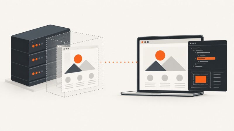
Headless or Headed Browser: How to Choose and Debug
Headless runs without a visible browser window; headed shows one. Learn how Playwright, Puppeteer and Chrome differ, and choose the right mode for automation, testing and debugging.
Step-by-step guides to capturing the web: screenshots, full pages, elements, devices and more.
Headless runs without a visible browser window; headed shows one. Learn how Playwright, Puppeteer and Chrome differ, and choose the right mode for automation, testing and debugging.
Put URL-addressable images in the root public/ folder, or statically import local files beside the code that uses them. Here’s how to choose and reference each option.
Use 1200 × 630 px as a practical featured-image default for social previews, then validate crops, metadata, and file-size limits.
A practical guide to responsive, accessible, fast photo galleries, with complete HTML, CSS, JavaScript, loading, lightbox, and testing advice.
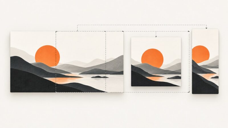
Choose website image dimensions from the rendered slot, crop, and layout—not a generic preset. Learn responsive images, intrinsic sizing, and practical workflows.
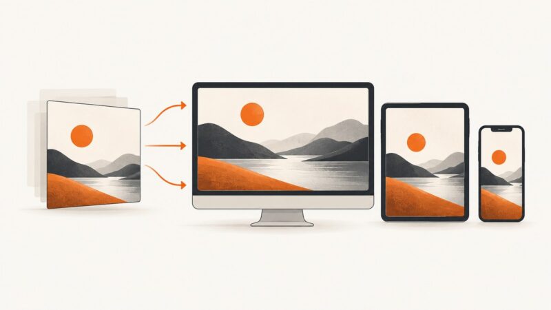
Choose website image sizes from the rendered layout, then use responsive candidates, the right format, and stable dimensions to balance clarity and page weight.
Playwright scripting lets you automate Chromium, Firefox, and WebKit with code. Learn setup, locators, waits, screenshots, debugging, and production practices.
Facebook doesn’t notify someone when you screenshot a normal post. Here’s what happens with photos, Stories, Reels, profiles, and Messenger disappearing messages.
HTML is the web’s markup language; HTML5 is a historical label for the modern, continuously evolving HTML standard.
Learn how to assess dark mode website examples for hierarchy, readable text, functional color, imagery, theme switching, and responsive behavior.
Compare practical dark and light mode patterns for navigation, articles, forms, and dashboards, then build themes that stay readable and consistent.
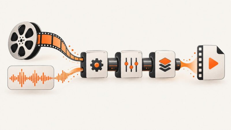
Learn what ten everyday FFmpeg options do, where to place them, and how to combine them safely when converting, trimming, or selecting media streams.
Screenshots can be PNG, JPEG, HEIF, or another format depending on the device and capture settings. Learn which format to choose, how to convert images, and what to check before sharing or submitting them.
Use 1200 × 800 px for a general blog header, 1280 × 720 px for a wide hero, and at least 1200 px wide for Google Discover.
Learn which Cloudflare Web Analytics API to use, how RUM setup differs from GraphQL, and how to build reliable analytics workflows.
Choose web image dimensions from the rendered CSS slot, then use responsive candidates, correct ratios, and efficient formats for every screen.
Scroll Capture is Samsung Galaxy’s tool for turning a scrollable page into one long screenshot. Learn how it works, its limits, and alternatives.
No. The Wayback Machine archives publicly available pages selectively, and a saved page may still be incomplete or behave differently from the original.