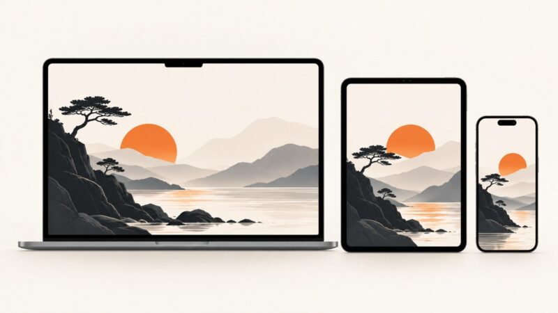
Website Hero Image: A Complete Guide to Size, Responsive Crops, Performance, and Accessibility
Choose, build, and optimize a website hero image with responsive sizing, stable layouts, fast loading, and accessible alt text.
Step-by-step guides to capturing the web: screenshots, full pages, elements, devices and more.
Choose, build, and optimize a website hero image with responsive sizing, stable layouts, fast loading, and accessible alt text.
There is no universal header image size. Learn how to choose the right ratio, protect mobile crops, optimize performance, and verify every breakpoint.
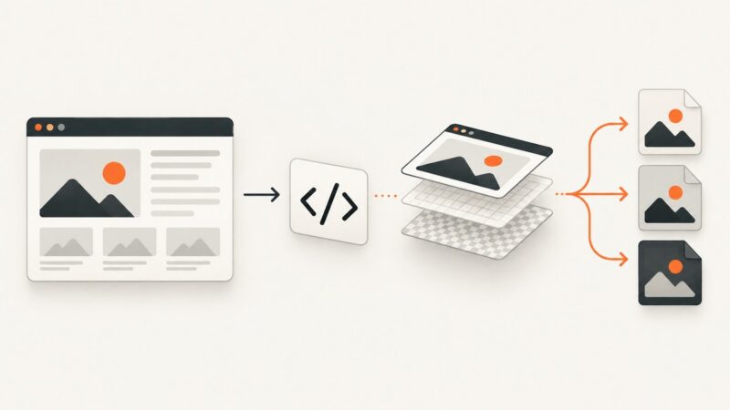
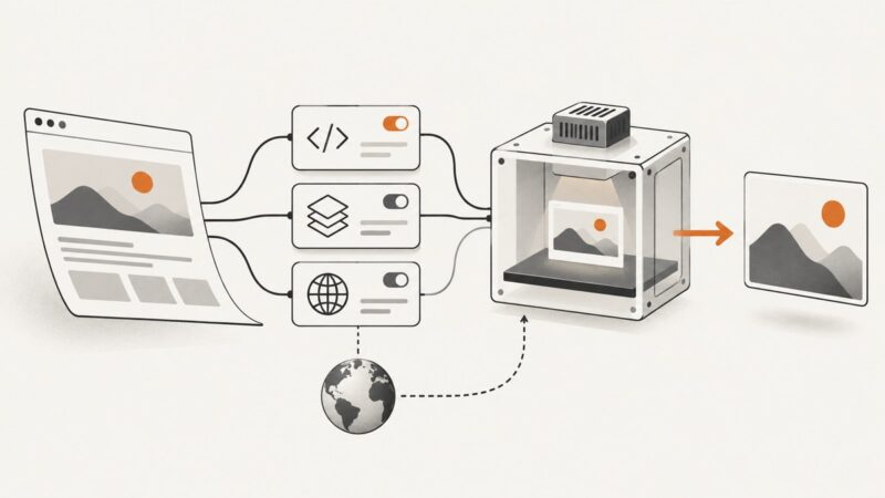
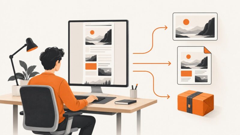
Learn how to convert webpages or HTML into PNG, JPEG, WebP, or PDF with browser automation, APIs, and production-ready troubleshooting.
Learn the types of regression testing, how they differ from retesting, and how to choose scope, levels, automation, and visual checks.
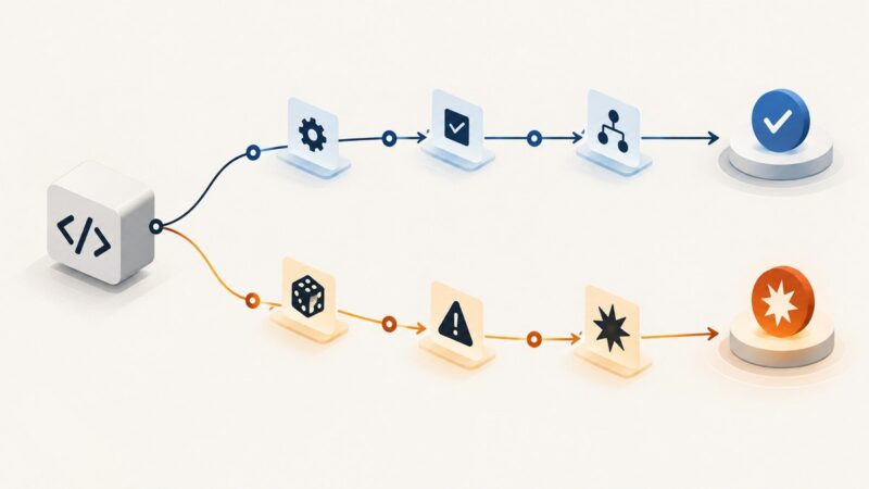
Regression testing checks whether a change broke unchanged areas; negative testing checks behavior under unintended use. Learn when to use each and how they can overlap.
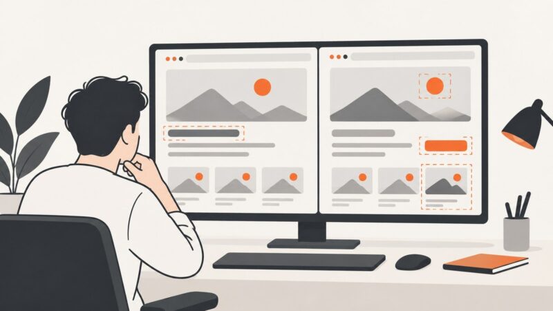
Learn how LambdaTest SmartUI screenshot comparison works, what its API documents, and how to prepare consistent captures for visual review.
Cypress’s default application viewport is 1000 × 660 pixels. Its separate headless browser screen defaults to 1280 × 720, which is why both answers appear in the docs.
First decide whether you need employee monitoring or interactive remote support. Then compare access, privacy, security, platform fit, auditability, and total cost.
Configure Cypress screenshots confidently: folders, failure captures, full-page modes, privacy controls, cleanup, CI artifacts, and troubleshooting.
Learn how to configure wkhtmltoimage for JavaScript, assets, requests, local files, and rendering—and how to diagnose failures across builds.
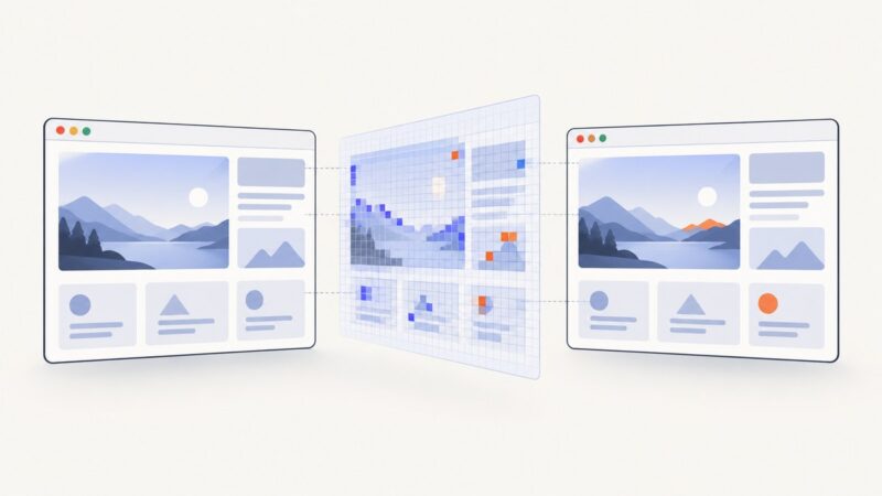
Learn when to use Playwright visual, data, and ARIA snapshots, write runnable tests, keep baselines stable, and review updates safely.
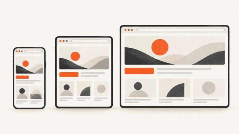
Learn how to generate responsive website screenshots at mobile, tablet, and desktop widths with browser automation, APIs, and repeatable visual checks.
A blank screen is a symptom, not a diagnosis. Use this step-by-step guide to find whether the cause is your browser, device, network, or the website.
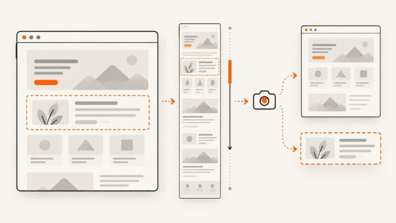
Learn when to use a screenshot, standalone HTML file, or web archive—and how to capture full pages reliably with browser tools or an API.
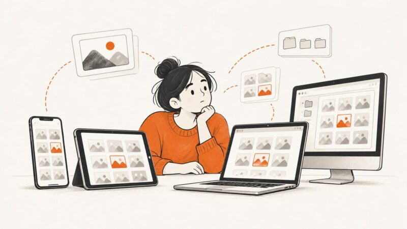
Find screenshots on iPhone, Android, Mac, Windows, and Chromebook. See the default locations, how to check save settings, and what to try if a screenshot is missing.
Learn Playwright screenshots from viewport and full-page captures to masked, deterministic visual tests, with runnable JavaScript, Python, Node.js, and cURL.
There is no universal website header image size. Measure the rendered layout, then choose responsive dimensions, crops, and formats for desktop and mobile.
Use a 1.91:1 landscape image for X’s large link preview. Compare practical export sizes, set the right metadata, and troubleshoot the preview.