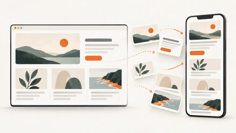
Website Thumbnail Design Ideas for Articles and Social Sharing
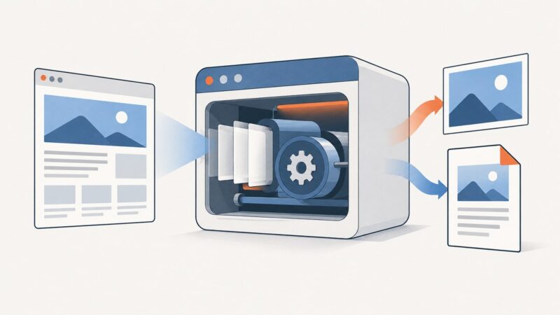
Create clear, platform-ready website thumbnails with practical design ideas, Open Graph metadata, sizing guidance, and a reliable screenshot workflow.
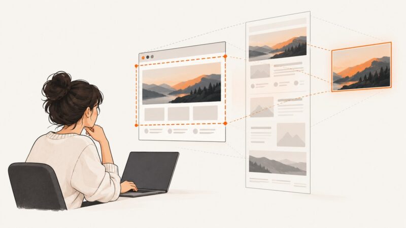
Step-by-step guides to capturing the web: screenshots, full pages, elements, devices and more.
Create clear, platform-ready website thumbnails with practical design ideas, Open Graph metadata, sizing guidance, and a reliable screenshot workflow.
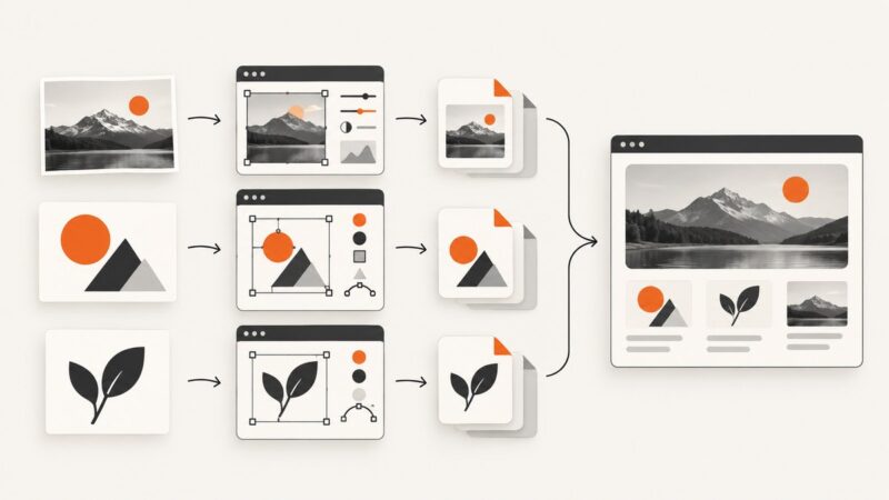
Explore website image maker examples for editing photos, creating graphics, converting formats and placing assets in designs, plus practical tips for web-ready images.
Make website images that stay sharp, accessible, responsive, and fast. Choose formats, write useful alt text, and build a repeatable export and QA workflow.
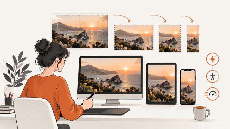
Choose hero image sizes, crops, formats, and loading strategies that stay readable, fast, accessible, and stable on every screen.
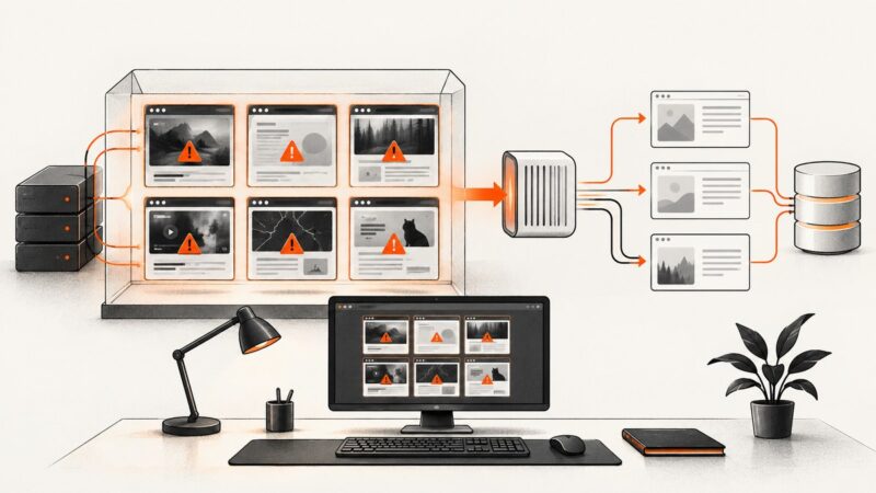
Compare phishing screenshot datasets, feeds, labels, and capture methods, then build a safe, reproducible collection for research.
Tweet screenshots rarely trigger a documented alert, but visible clues and X records can still identify the post, account, or person behind it.
Cloudflare protection checks web traffic at the network edge before it reaches your server. Learn how its WAF, DDoS mitigation, bot controls and challenges work—and where coverage ends.
Compare responsive web design software, breakpoint workflows, CSS tools, testing methods, and a practical screenshot automation setup.
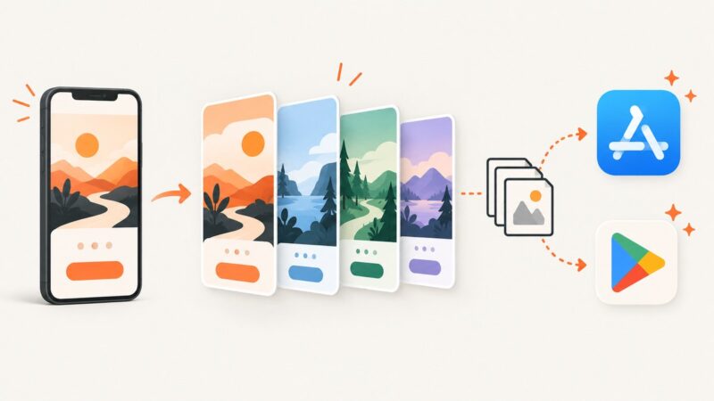
Apple App Store screenshot sizes, minimums, formats, device rules, upload steps, and a repeatable workflow for iPhone and iPad assets.
Learn when to use `srcset`, `sizes`, and `<picture>` so browsers can choose images that fit your layout, screen density, and format support.
Learn how online screenshot APIs turn URLs into images or PDFs, configure full-page and dynamic captures, and choose between a hosted service and Playwright or Puppeteer.
Create Google Play screenshots that meet size and device rules. Learn capture, composition, export, upload, automation, troubleshooting, and costs.
Learn how mobile app screenshot generators create store-ready visuals, meet Apple and Google Play rules, and automate repeatable exports.
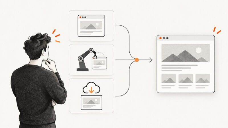
Choose screenshot software by capture area, repeatability, visual testing needs and setup effort. Compare browser capture, Playwright and a hosted API.
Choose Cypress screenshot options by capture area, scope, and artifact handling. Get runnable examples for viewport, full-page, element, and failure screenshots.
Responsive design adapts a page to the space available in the browser. Learn how viewports, CSS media queries, flexible layouts and accessibility checks work together.
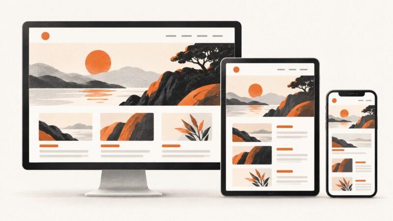
Responsive web design makes one website adapt to different screens. Learn how it works, see practical examples, and follow a complete implementation checklist.
Regression testing checks whether a software change broke behavior that used to work. Learn how it differs from retesting, which tests to rerun, and practical examples.