Web Vector Image Formats
SVG is the standard vector format for the web. Learn when to use SVG, PNG, WebP, JPEG or AVIF, how to add fallbacks, and how to deliver each safely.
Step-by-step guides to capturing the web: screenshots, full pages, elements, devices and more.
SVG is the standard vector format for the web. Learn when to use SVG, PNG, WebP, JPEG or AVIF, how to add fallbacks, and how to deliver each safely.
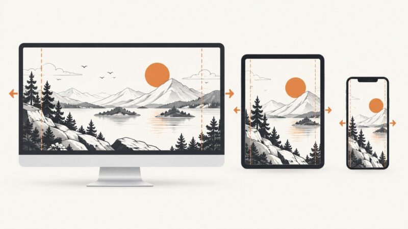
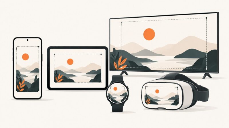
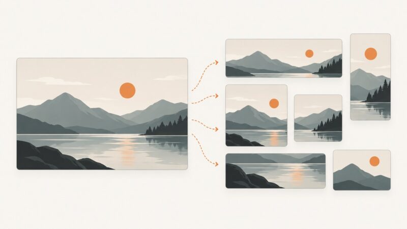
Choose responsive image dimensions from your real layout slot, density and crop rules—not a universal pixel size.
Use 3840×2160 pixels at 16:9 for a 4K YouTube thumbnail. Learn file limits, Shorts dimensions, export settings, and upload checks.
Choose the right wkhtmltopdf 0.12.6 build, generate a PDF, and understand its patched Qt differences, security limits, and maintenance status.
Headless Chrome runs without a visible window for screenshots, PDFs, DOM inspection, browser tests, and CI automation.
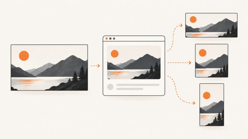
OG image generation creates the image shown in social link previews. Learn the metadata, dimensions, static and dynamic workflows, Next.js code, and testing steps.
Use 1200×630 px for WhatsApp previews, then meet Meta’s URL, file-size, width, ratio, and HTML-head requirements.
There is no universal hero size. Build a flexible section that fits content, reserves image space, and adapts its crop across viewports.
Google Play has no single screenshot size. Use the correct pixel range, aspect ratio and device-specific rules before uploading.
There is no universal thumbnail size. Use the right dimensions for YouTube, WordPress, WooCommerce, Open Graph and API-generated images.
Use Microsoft’s recommended 192×64 site logo and 64×64 thumbnail dimensions, with formats, setup steps, and troubleshooting.
Yes. Playwright runs headlessly by default. Learn how to configure headed debugging, Chromium headless modes, CI installs, and troubleshooting.
YouTube recommends 3840 × 2160 px for standard video thumbnails and 2160 × 3840 px for Shorts. Here are the dimensions, limits, and upload details.
A thumbnail is a compact preview of a larger file. Learn how thumbnails are sized, cropped, made accessible, and optimized for web pages and video platforms.
Use Next.js Image with local and remote sources, responsive layouts, and the right loading and security settings.
A practical guide to collecting reproducible website screenshots with provenance, quality filters, evaluation splits, and legal safeguards.
Learn how Selenium WebDriver and TestNG fit together, then build, organize, run, debug, and scale Java browser tests.
Use your theme’s image rules first, then target 1200px-wide 16:9 images for Google Discover and responsive WordPress delivery.